Mend
Background
App Description
Mend is a mobile mood tracking app made by a group of five students for a third year university course on interface design over the duration of 6 weeks. The goal of the project was to create a mobile app or website within a selected design space. Our team chose the field of mental health and depression, and designed an app that would aid 20-30 year olds dealing with depression relapse.
Type: UX/UI Design
Tools: Illustrator, Photoshop, Axure
Goal: Design an app that improves the lives of people dealing with mental health or depression
The Process
Personas
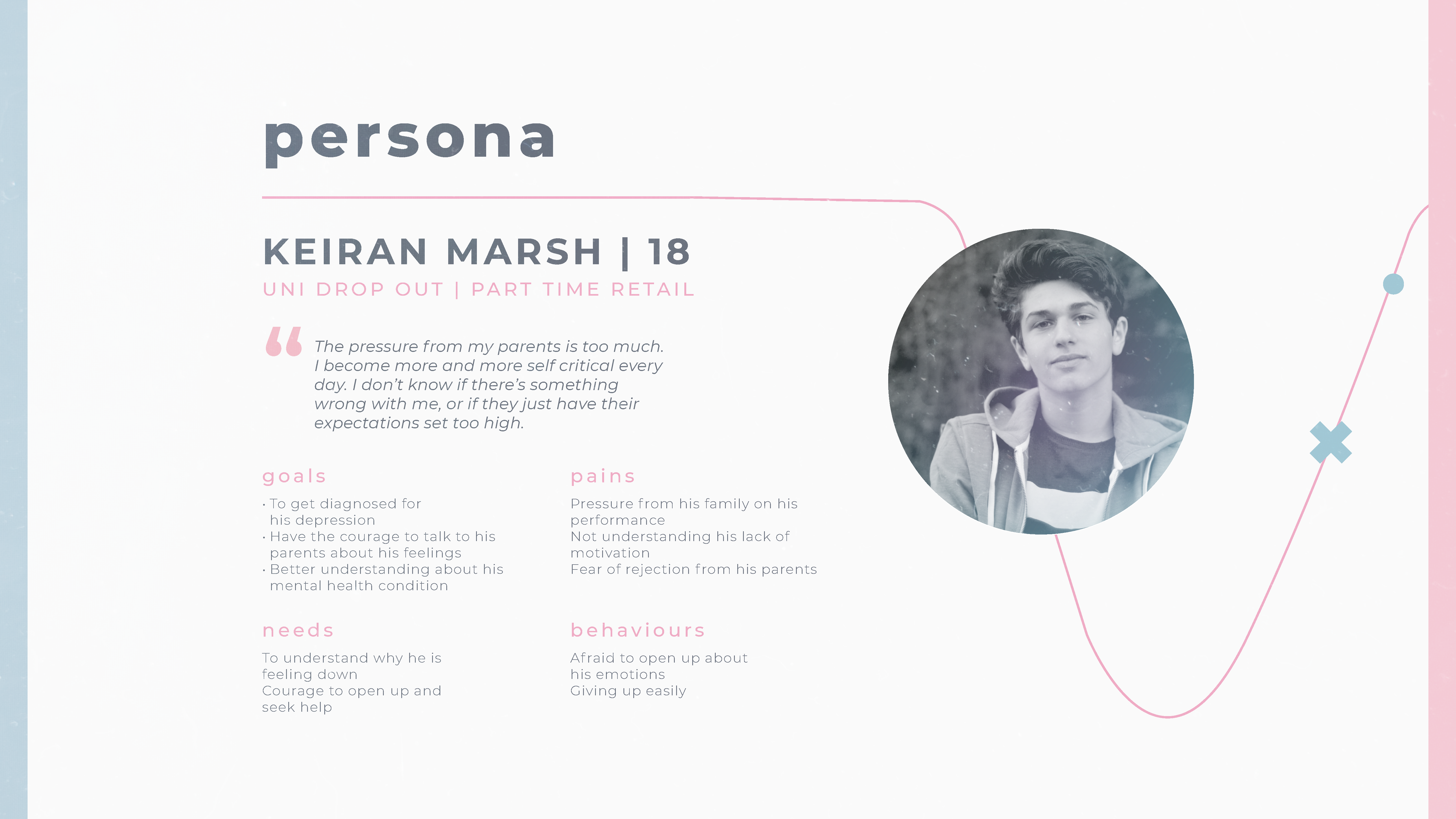
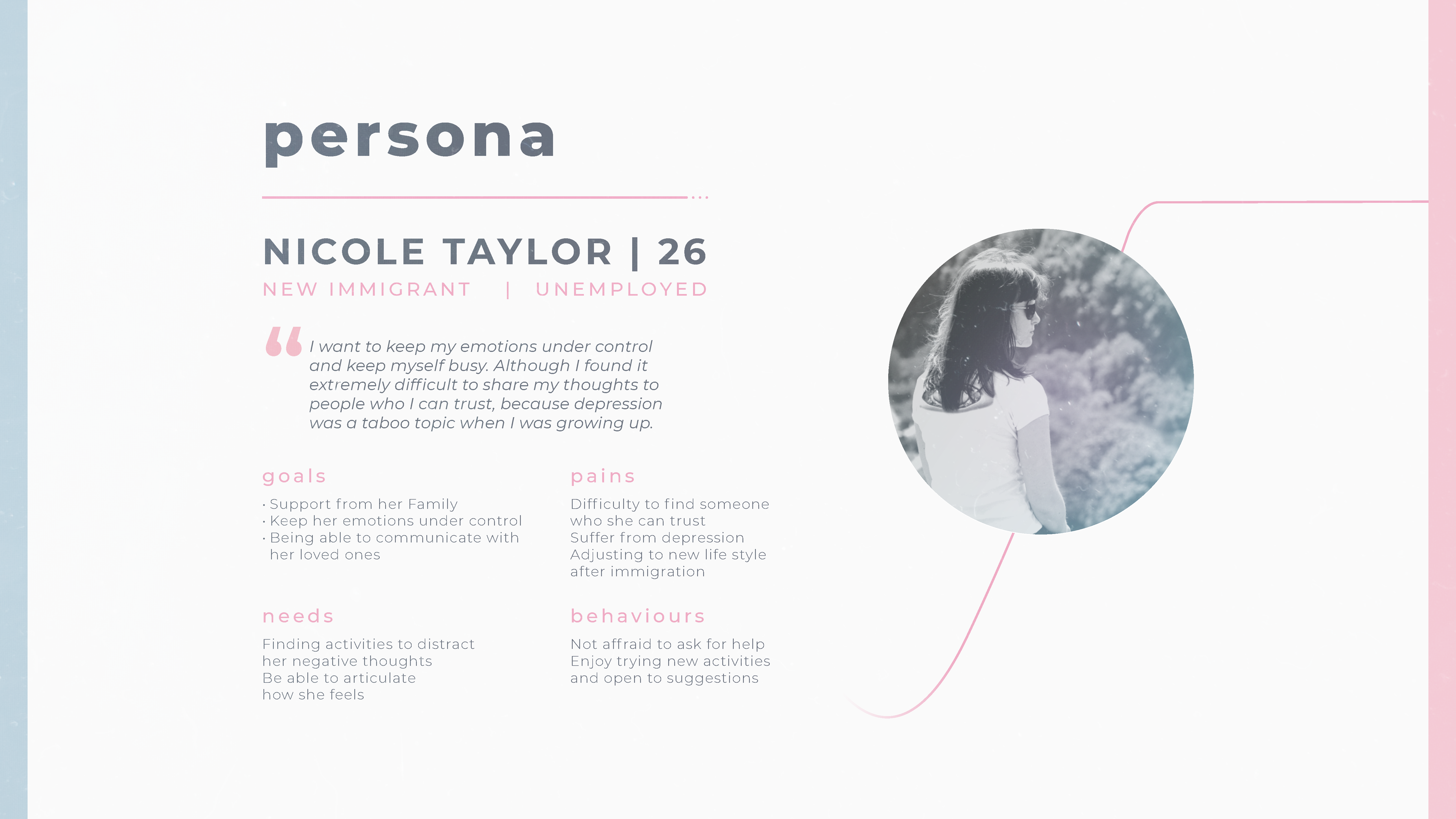
The first task was to research our target users. We knew we wanted to design an app for people aged 20-30 that are dealing with depression and are technologically savvy so we spoke to a few friends that met that criteria to understand the nature of the problem for them. We also performed research online and discovered some useful info from the Canadian Mental Health Association on the subject of depression relapse that helped guide our app's design.
User Flow
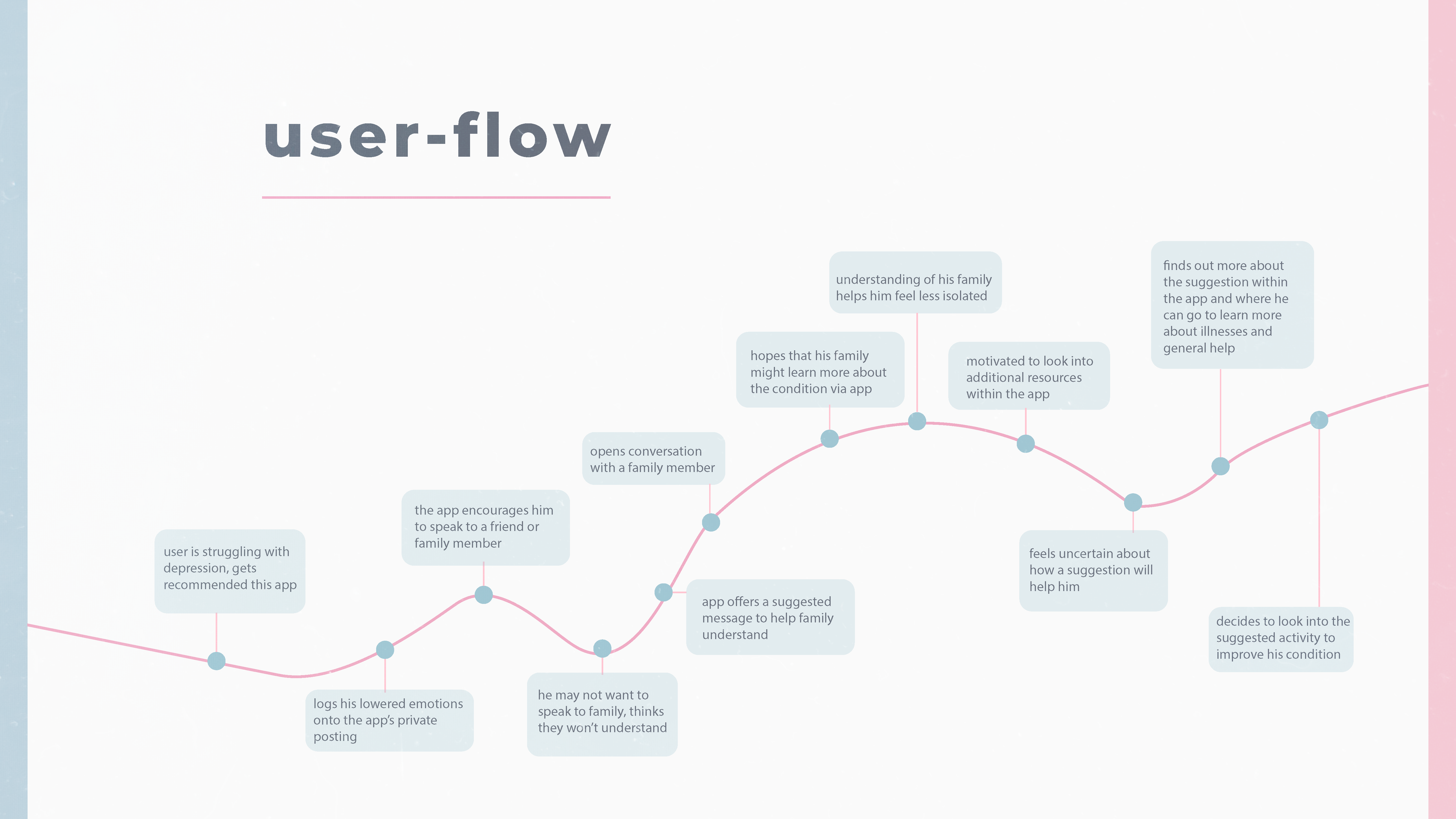
I designed the user flow diagram to convey our findings into a user journey map. The effects of the app are shown in the user flow and it is visually clear which points in the journey the user interacts with the app.
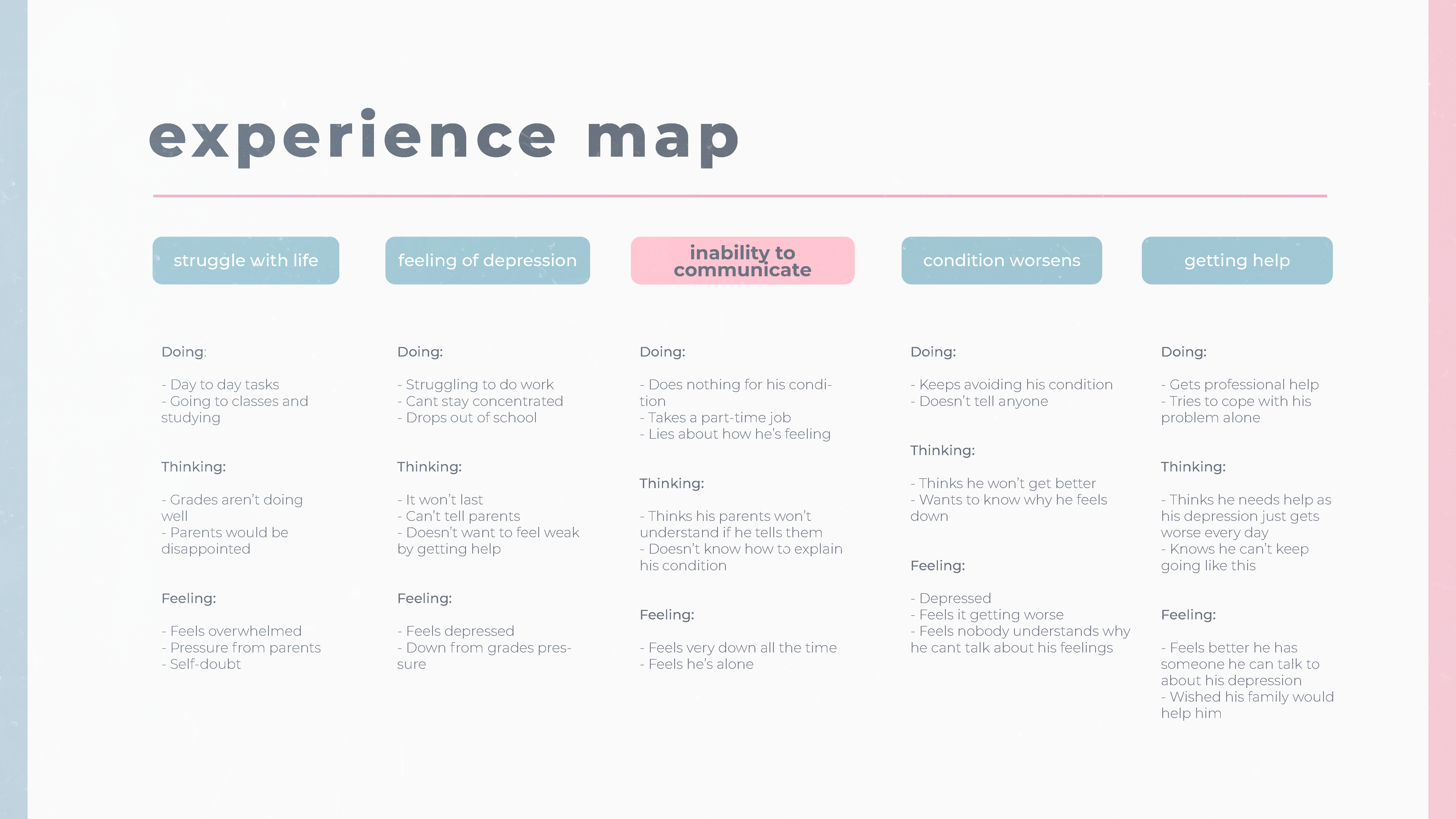
Experience Map
The experience map is another way of showing the user journey, with emphasis on the users actions and thought process at each touchpoint. This helps showcase the main painpoint of communication that we decided to make our main goal for the app.
Ideation
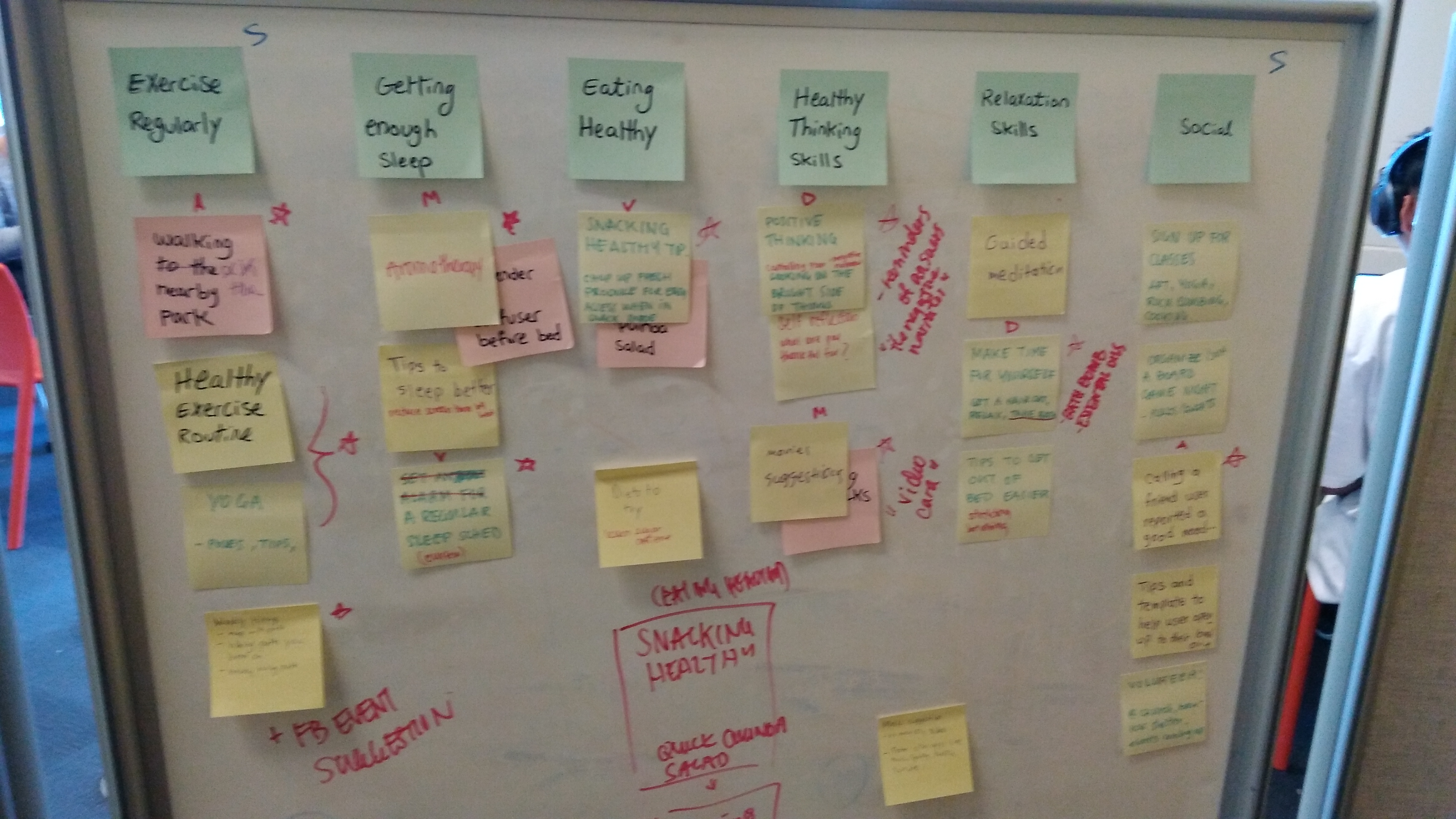
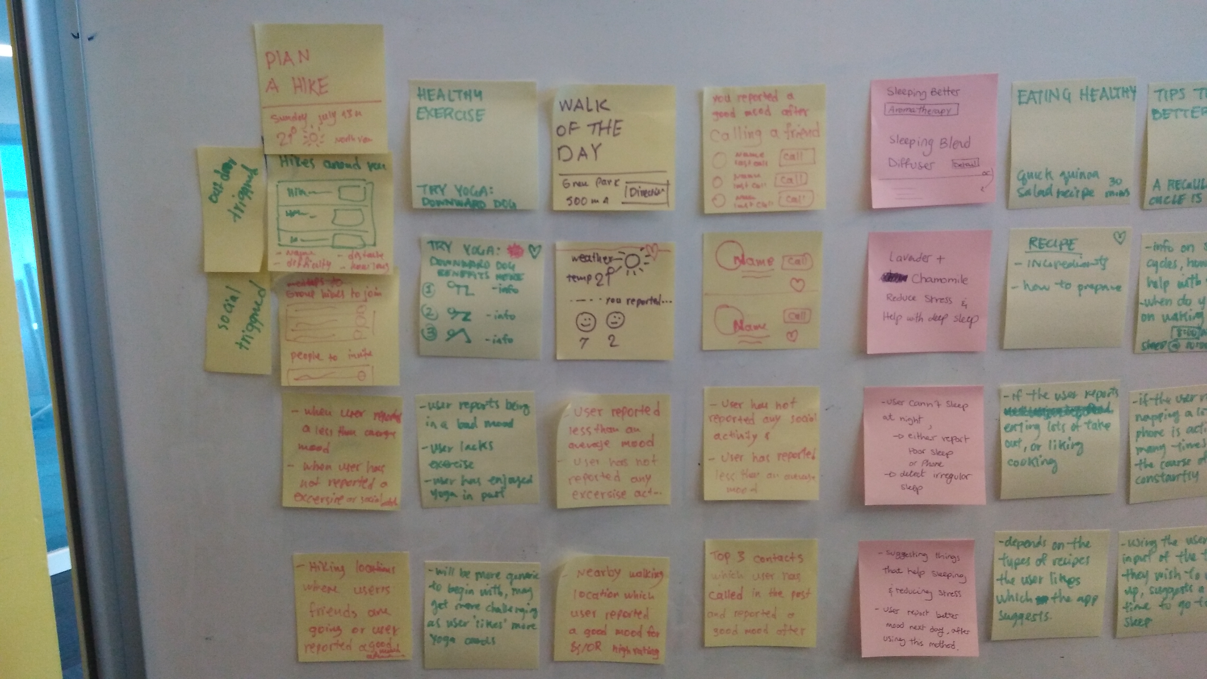
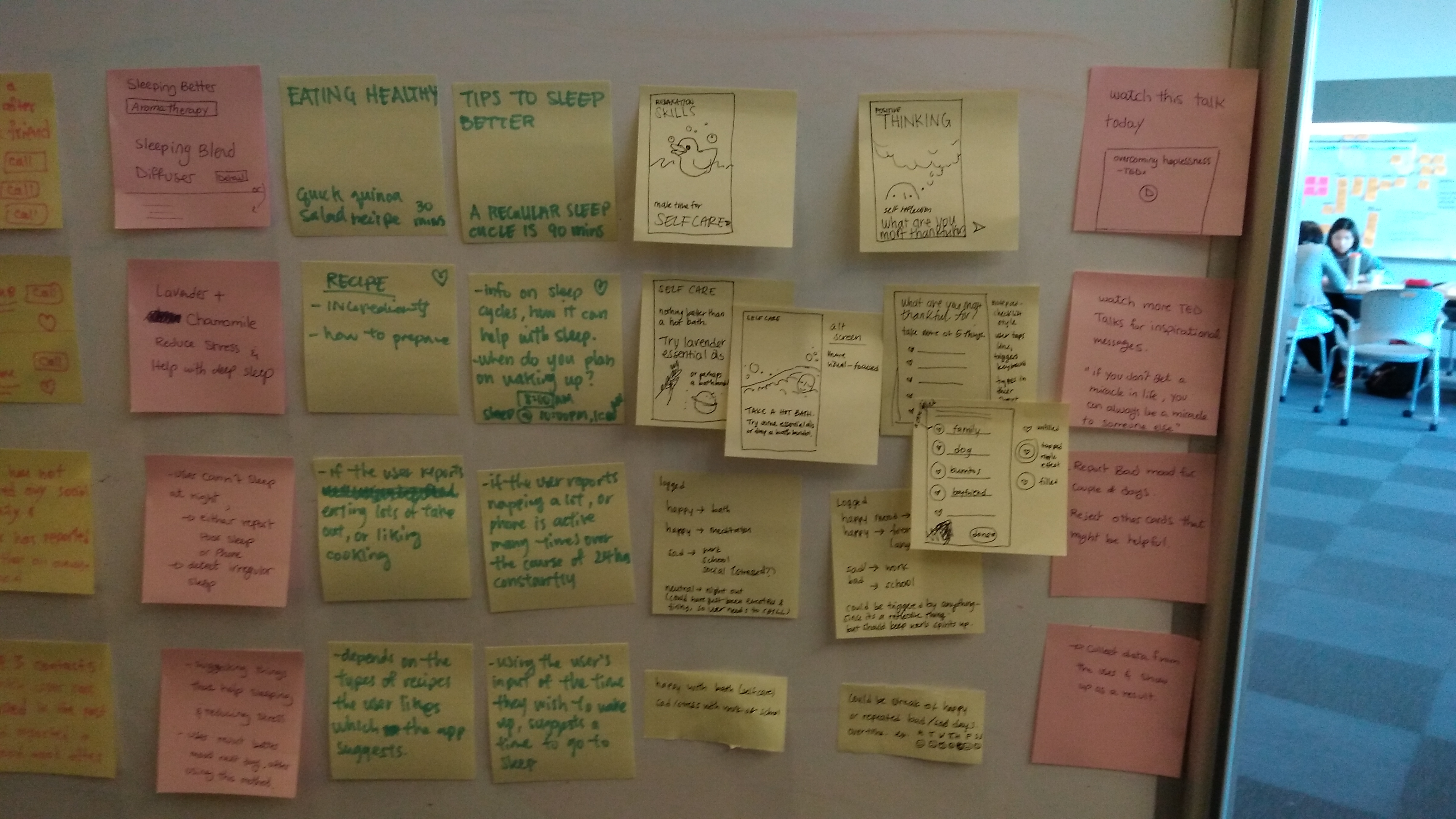
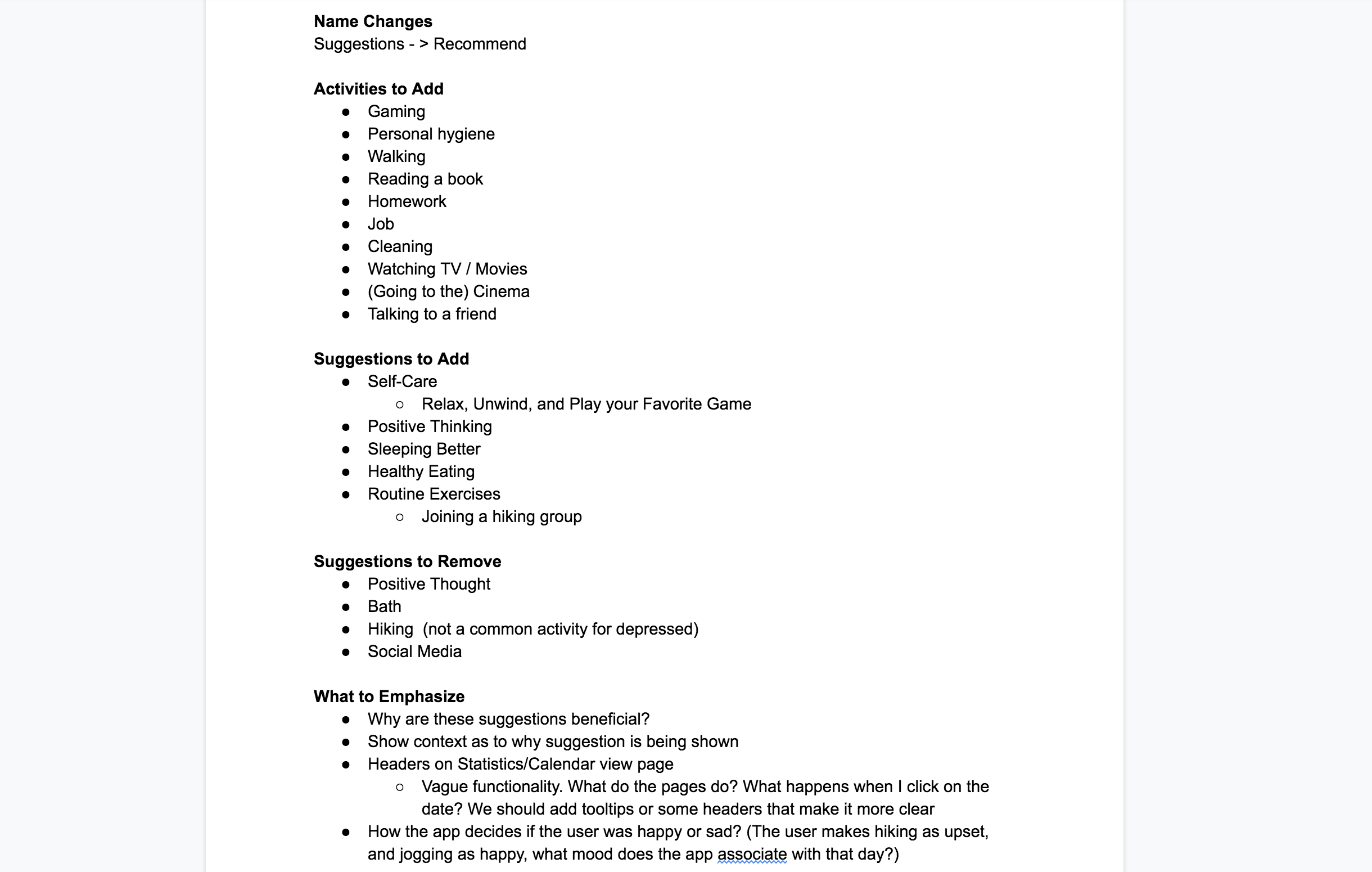
With our idea in mind, we came together to come up with the individual parts of the app. Using affinity diagramming, we came up with the core activities that we would support through the app, based on the types of activities that are considered beneficial in preventing depression relapse.

Wireframe and Flow
I then took our final ideas into Axure to create an initial low fidelity wireframe and wireflow of the app.
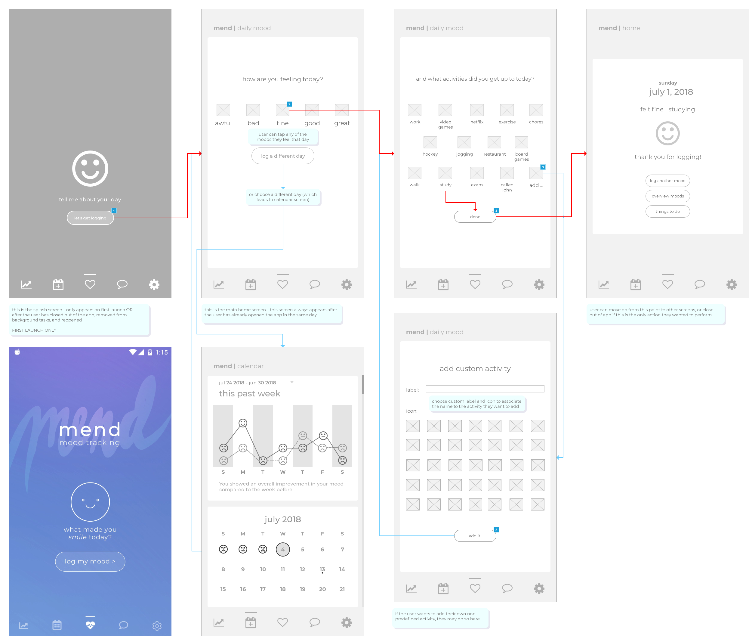
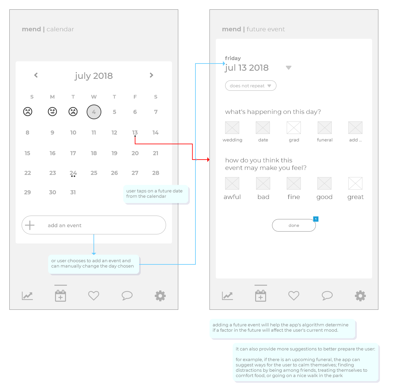
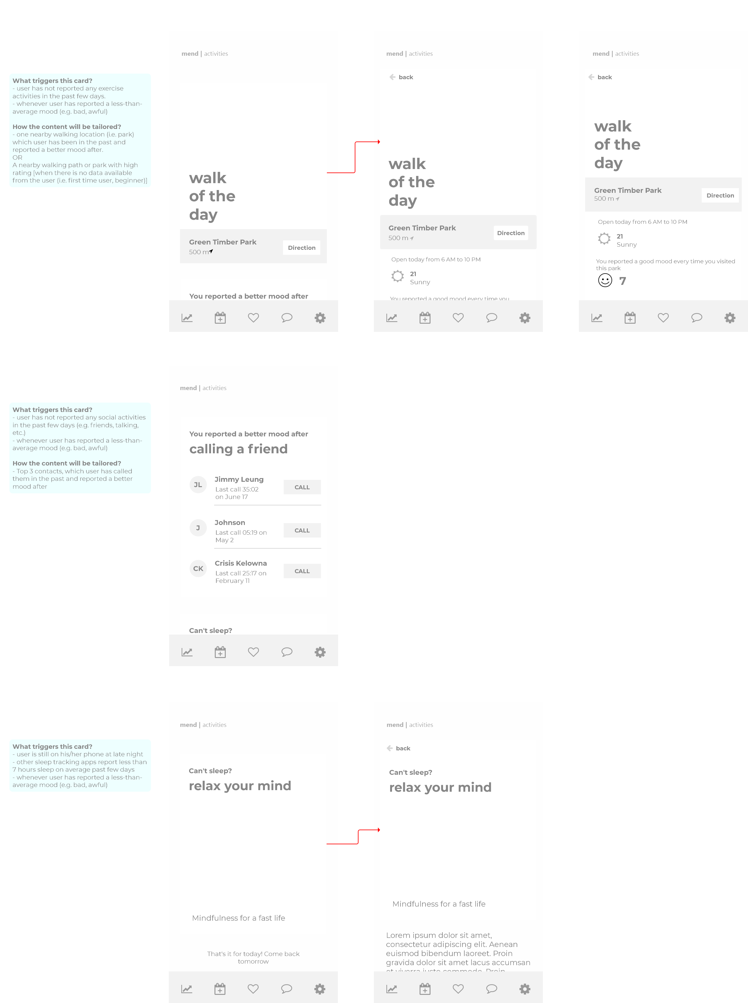
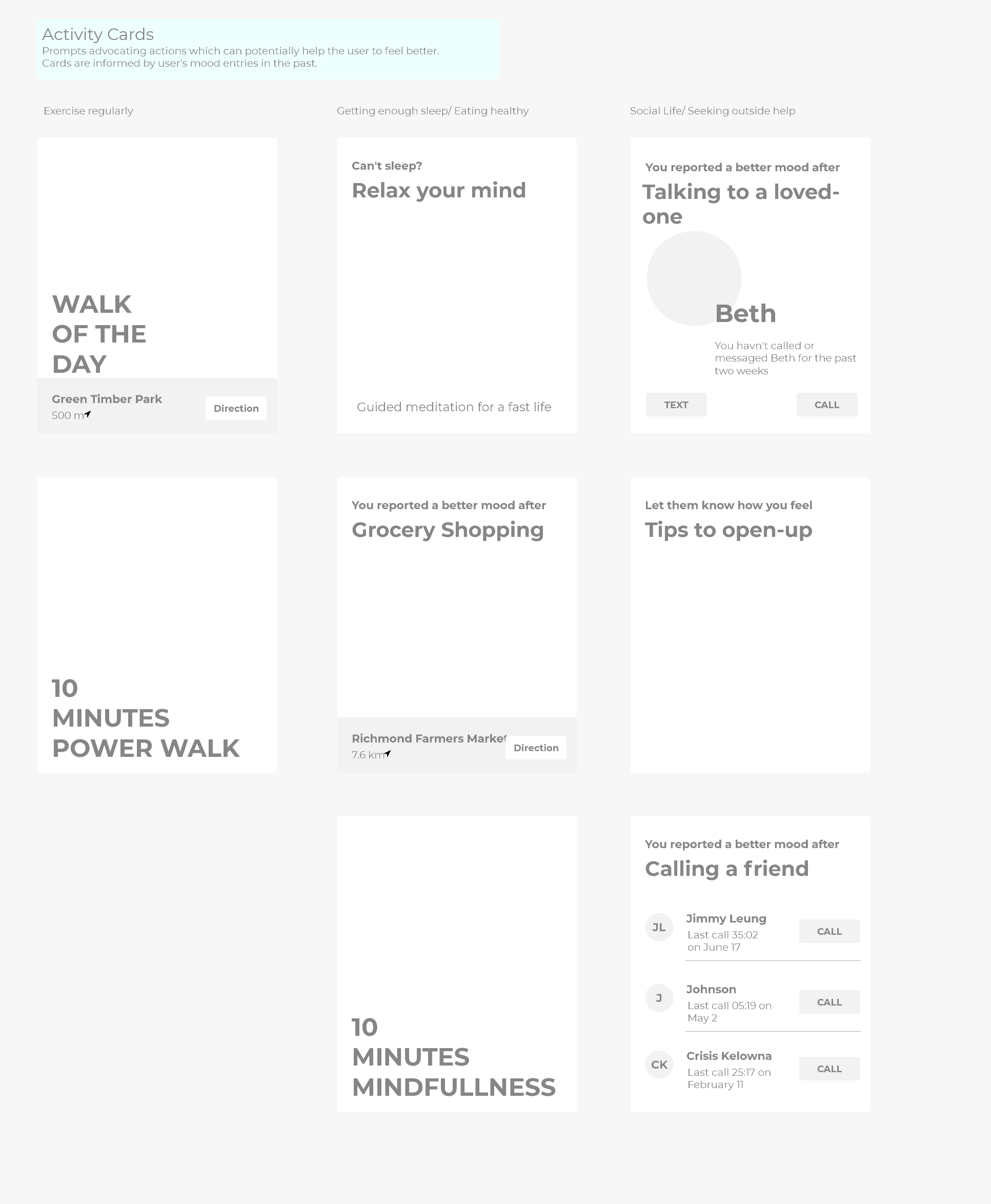
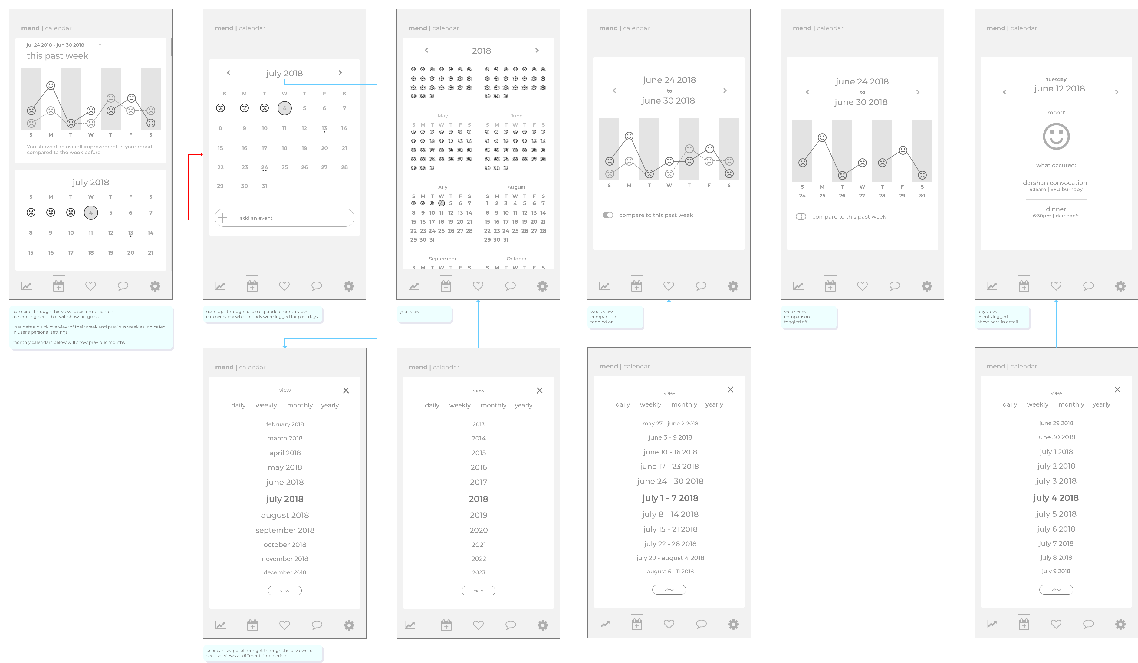
Initial Interactive Prototype
Then I took the low fidelity wireframe and split out the pages into an interactive wireframe. I worked on creating the iconography and helping out on the card styling. The style we went for is flat iconography with reversible color channels for active and inactive states.
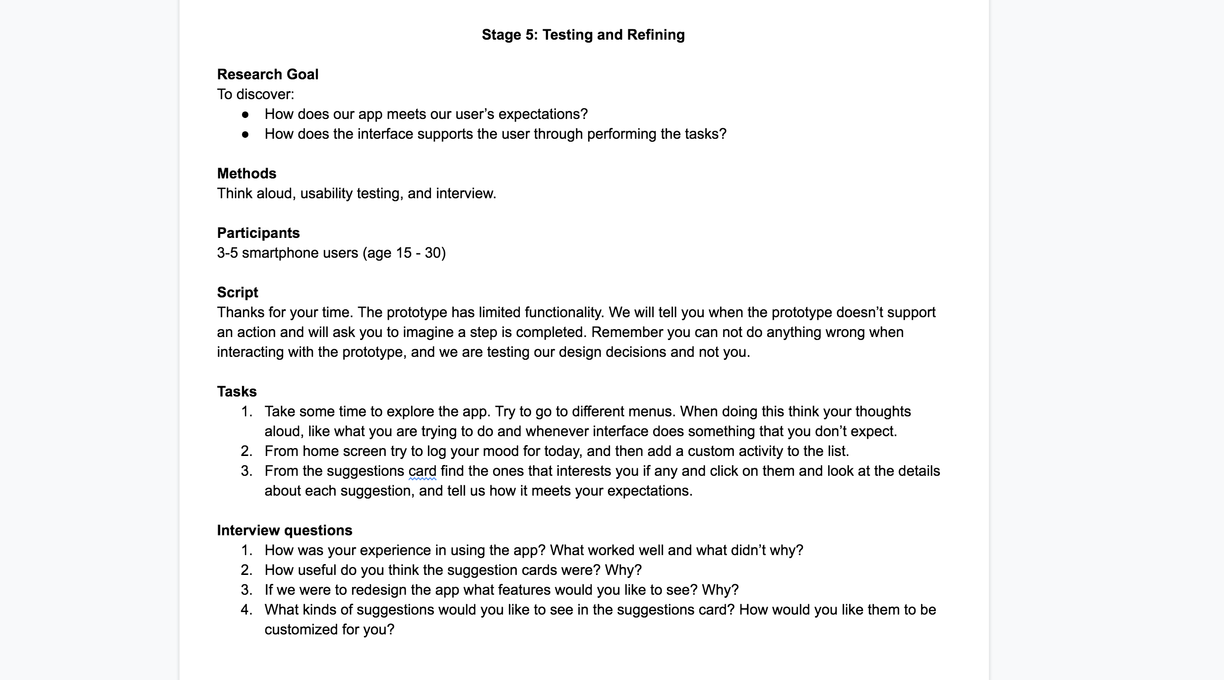
Interviews
With the initial prototype, we did some think aloud usability testing and interviews with friends within the target audience. I wrote the questions and performed two of the interviews. We came together to analyze the feedback and determined that onboarding and language usage needed improvement.
Final Interactive Prototype
Our final interactive prototype took into account the findings from the interviews to improve the user experience. Now there was a clear structure to the experience for new, intermediate and advanced users.
Reflection
This project helped me understand the intricacies of user centered design. Everything from the microinteractions of the mood logging to the page flow of the app effects the user experience. I also learned how tough certain topics can be to design for. Our initial idea was to improve upon the communication pain point for depressed individuals, but we opted for a more personal app when we realized that an app is probably not the best way to solve the communication problem. I also learned how to quickly create prototypes within Axure.