Styleguide

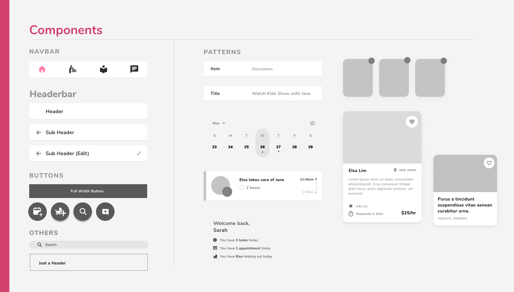
Styleguides are very valuable for consistency. Our styleguide defines our visual design language, including colors, typefaces, and layouts, such as components and modules.
Colour Palette

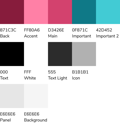
The colour palette for our UX design was primarily pink (D3426E), blue(42D452) and grey(333). Pink(D3426E) is used to highlight the brands, blue(42D452) was used for floating action buttons and icons whereas grey(333) was used for the second option in the full-width button. Secondary colours like black and white were used for text floating action buttons, icons and texts which provide important information like locations or the distance on nanny’s profile.

Font Face

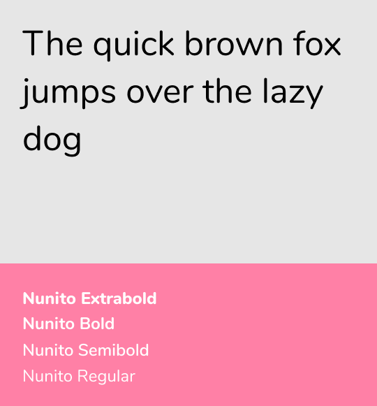
The Font face of the UX design is Nunito. It is a sans serif font which has been implemented throughout the UX design. Different sizes and different styles of the same font have been used throughout the project.

Component Design

Our components were inspired by a minimalist, humanist design. We were particularly inspired by Google's material design in desiging our components. Keeping it simple, familiar and clean was a big part of our guiding principle of making our app as usable and efficient for our demographic as possible.

Interaction Pattern: Horizontal Scroll

" This use of two dimensions helps users by showing a variety of options without making them visit separate category pages. " - UX Planet

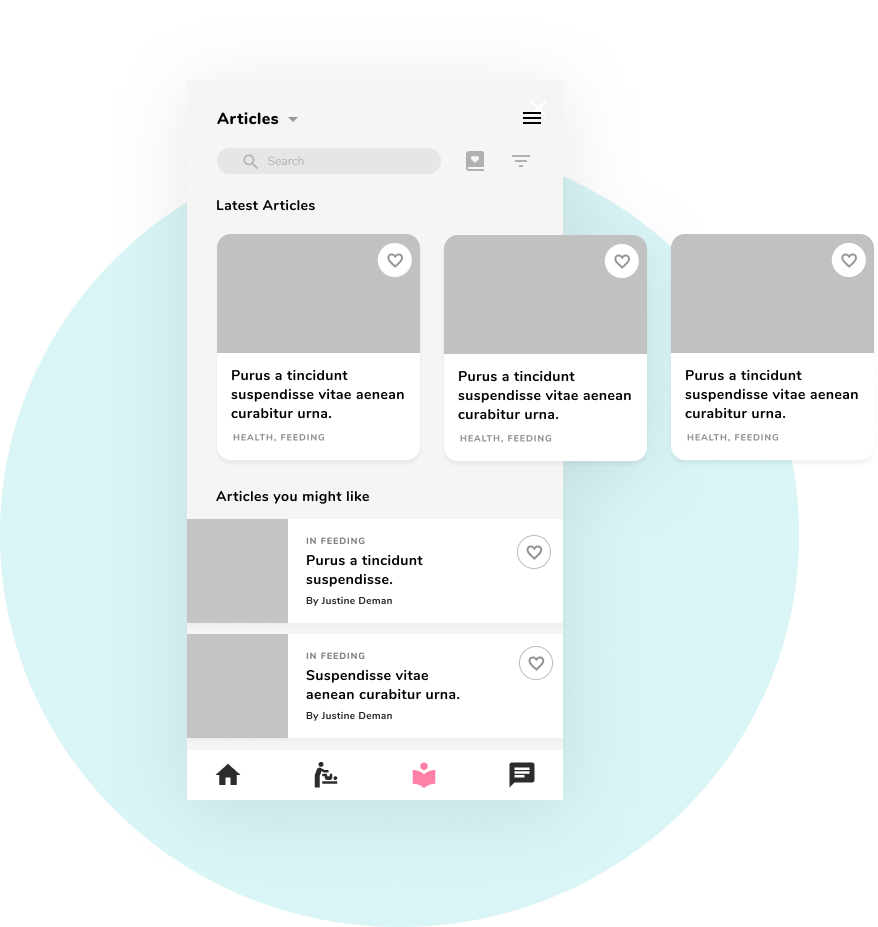
We wanted to use horizontal scroll in our app as we had many types of components scattered across our app in the form of a list in one way or another, be it a listed article, list of nannies, even the list of messages. Giving these list a distinct form allowed us to add various types of content to coexist on a single screen. We also applied the design heuristic of keeping our app externally consistent with other apps that have began to adapt this horizontal scroll model as a solution to visualizing listed content.

Modality

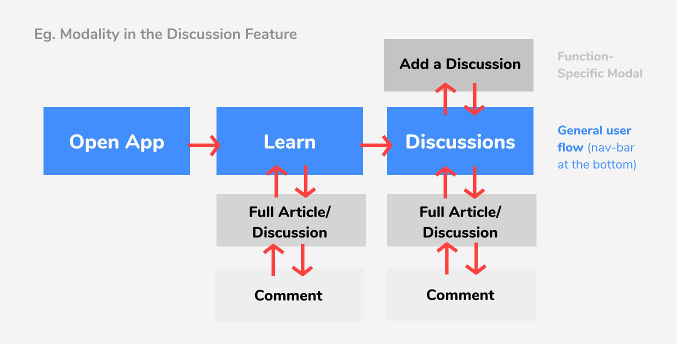
A “self-contained process” is every action that has a clear start and endpoint to it. For the limited time frame of this action, it takes the user out of the general user flow, lets him focus on the action and then takes him back to where he started. - UX Planet

We used modality in our app because it was important for us to integrate a way for users to effortlessly go back whenever they needed to and establish a clear 'general user flow' as suggested in the image above with the example of how to navigate to the discussions part of the app. This way, users have a clear idea of the key pathways in the app and can, over time, understand the hierarchy of feature importance through modality.