 Amae
Amae
Feedback and Iteration
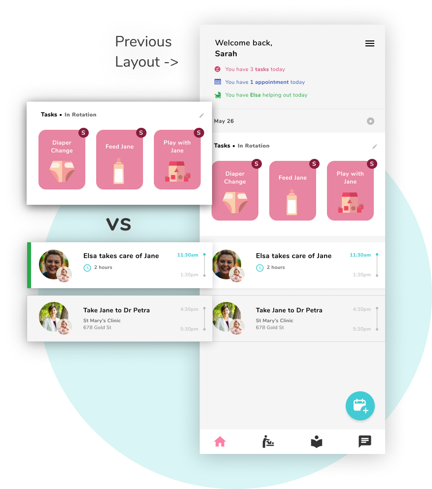
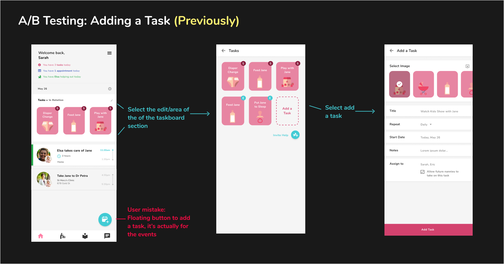
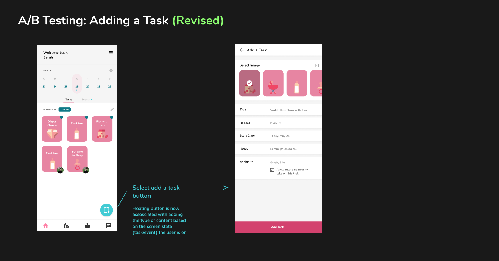
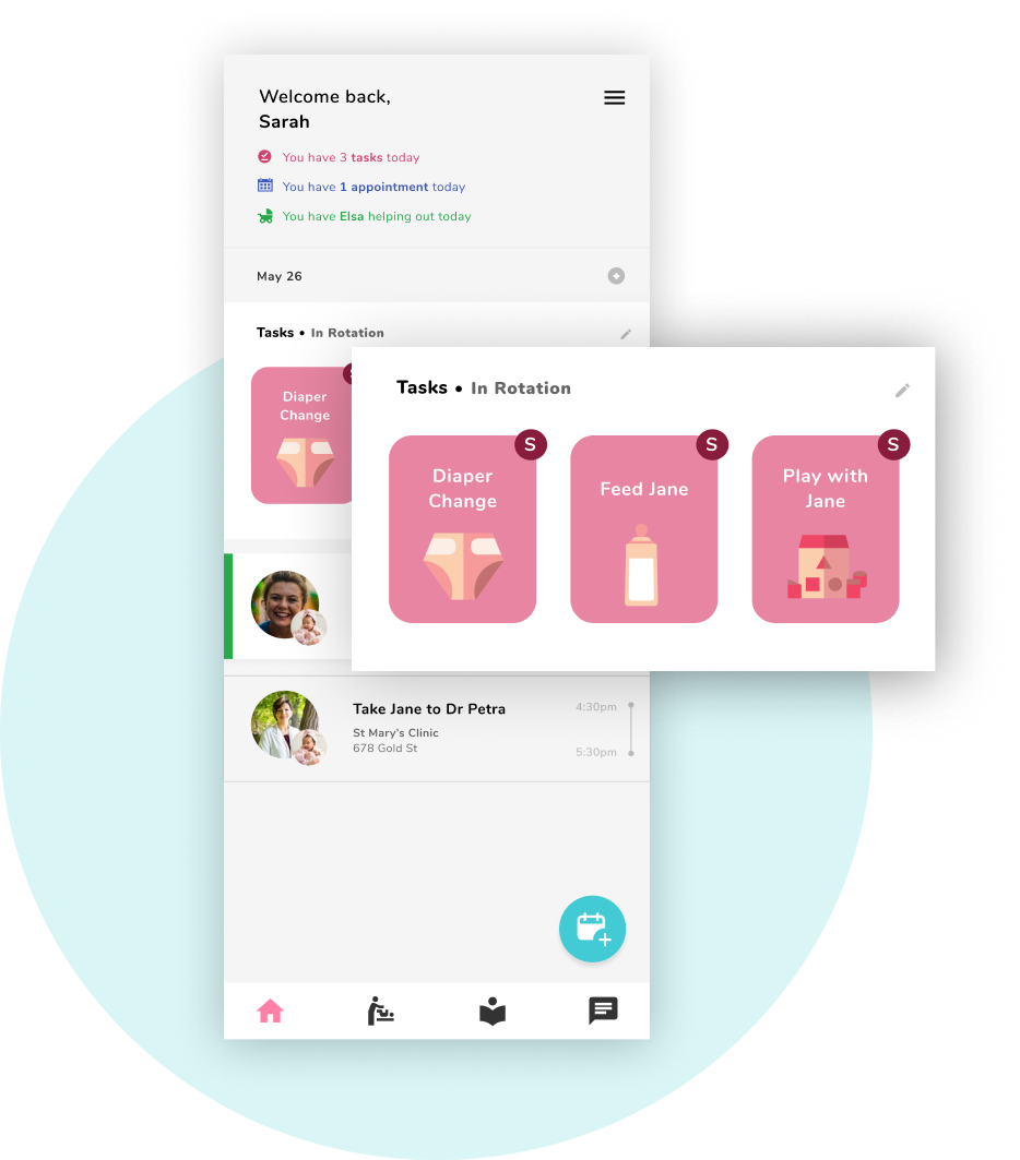
Design is an iterative process - you can't get it all right on the first try. Our design went through many cycles, each time considering new external feedback from instructors and user testers.


Design is an iterative process - you can't get it all right on the first try. Our design went through many cycles, each time considering new external feedback from instructors and user testers.
