5. Gap analysis with Continuous Variables
Recall the purpose of Gap Analysis: determine whether two samples of data are different. In our running example, we want to determine whether Sample 1 (salaries of female employees in the bank) is different from Sample 2 (salaries of male employees at the bank). We generally come at Gap Analysis in two steps:
Plot the data in such a way that we can visually assess whether a gap exists. These visualizations also come in handy later when communicating the results of any formal analysis.
Conduct a formal gap analysis using statistical techniques.
5.1. Preliminaries
I include the data import and library import commands at the start of each lesson so that the lessons are self-contained.
import pandas as pd
bank = pd.read_csv('Data/Bank.csv')

5.2. Visual gap analysis
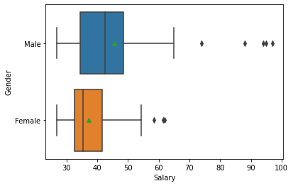
The boxplot in Seaborn permits both an x and y axis. For the resulting boxplot to make sense, the x variable must be continuous (like salary) and the y variable must be categorical (like gender). This permits a very quick comparison of the distribution of salary by gender.
#ensure Seaborn is loaded
import seaborn as sns

sns.boxplot(x=bank['Salary'], y=bank['Gender'], showmeans=True);
As an aside: We can do the same kind of analysis by “JobGrade”. But recall that we left JobGrade as an integer and did not convert it to a category variable (as we did for Gender and PCJob). We can make this conversion on the fly in order to get a boxplot:
sns.boxplot(x=bank['Salary'], y=bank['JobGrade'].astype('category'), showmeans=True);
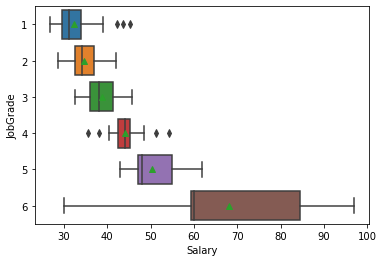
We see that the higher job grades (managerial roles) have both higher mean salaries and higher variability in salaries than the lower job grades.
5.3. Histograms
As in R, comparative histograms are a bit trickier. Given that boxplots provide much the same information, it might not be worth the effort to generate meaningful comparative histograms. Having said that, histograms (and kernel density plots) seem to be slightly easier for some people to understand. This is important when communicating your results.
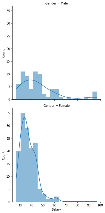
5.3.1. Faceted histograms
We used the notion of a “facet” in R to create a grid of histograms. In this case, we want a grid with one column and two rows. The rows correspond to different values of the “Gender” variable. This is a bit easier in Python with Seaborn’s displot function, which creates a faceted distribution plot. Here the row argument tells Seaborn to create one row for each value of gender. I have also set the linewidth property to zero and added kernel density plots.
sns.displot(x='Salary', row='Gender', data=bank, linewidth=0, kde=True);
5.3.2. Overlaying kernel density plots
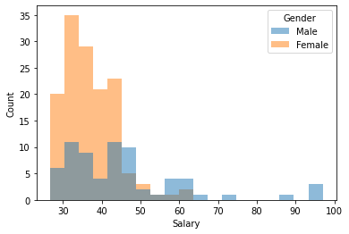
As mentioned in our discussion of R, overlaying histograms almost never makes sense—the result is typically a mess, which is why SAS Enterprise Guide stacks them one on top of the other (as we just did above). Here is an overlayed histogram for the bank salary data. Note that the color are added, so we get a third color in regions of overlap:
sns.histplot(x='Salary', hue='Gender', data=bank, linewidth=0);
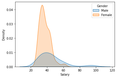
A better approach is to stack kernel density plots. Note that I have also added some shading to make the result look marginally cooler.
sns.kdeplot(x='Salary', hue='Gender', data=bank, shade=True);
5.4. t-Tests
We use the t-test at this point to formally test the hypothesis that two distributions have the same sample mean (and thus are “the same”—or at least close enough). As in Excel and R, the two main preconditions to running the test in Python are:
Getting the data in the right format
Determining which version of the t-test to run: equal variance or unequal variance
5.4.1. Formating the data
The easiest way to format data for t-tests in Python is to use the filtering and selection techniques already covered to create two arrays of data: salaries of female employees and salaries of male employees.
The steps to do this are straightforward, although the syntax may look a bit odd initially:
Start with the data frame
bankCreate a Boolean vector (209 true or false values) based on the value of the “Gender” column (true if female, false otherwise)
Filter the data frame based on the Boolean vector. This creates a subset of the original data frame.
Extract the “Salary” column from the subsetted data frames into two new vectors:
female_saland ‘male_sal
female_sal = bank[bank['Gender'] == "Female"]['Salary']
male_sal = bank[bank['Gender'] == "Male"]['Salary']
If we list the contents of female_sal, we see it contains the salaries of the 140 female employees.
female_sal
1      39.1
2      33.2
3      30.6
5      30.5
6      30.0
       ...
186    50.0
187    61.8
188    43.0
190    58.5
207    30.0
Name: Salary, Length: 140, dtype: float64
5.5. Testing for equality of variance
By default, R uses the F-test to determine whether the variances of the two samples are similar enough to be considered “the same”. The authors of Scipy, a popular Python library for statistics, object to this choice for various technical reasons and, as a consequence, did not implement a method to perform F-tests. Instead, they offer two refinements: Levene’s test and Bartlett’s test (Levene’s and Bartlett’s tests are also available in R). We will use Levene’s test:
# ensure the scipy stats module is loaded
from scipy import stats
stats.levene(female_sal, male_sal)
LeveneResult(statistic=26.208558688866834, pvalue=7.013920590029544e-07)
The output is not particularly impressive, but it contains the one number we need: the probability (pvalue) that the two variances are equal. Any number that ends with “e07” (
5.6. Running the t-test
Although the Scipy library has a t-test, the statsmodels library offers a bit more functionality. To run a t-test in statsmodels, we do the following:
Load the library
Call the library’s
CompareMeans.from_data()method to convert our two vectors of salary data into a CompareMeans object, which I callmodelCall the
summary()method which provides a nice summary of the test.
Note that I have to specify the unequal variance assumption in the call to summary() by passing the usevar='unequal' argument.
import statsmodels.stats.api as sms
model = sms.CompareMeans.from_data(bank[bank['Gender'] == "Female"]['Salary'], bank[bank['Gender'] == "Male"]['Salary'])
model.summary( usevar='unequal')
| coef | std err | t | P>|t| | [0.025 | 0.975] | |
|---|---|---|---|---|---|---|
| subset #1 | -8.2955 | 2.003 | -4.141 | 0.000 | -12.283 | -4.308 |
The summary includes:
the difference in sample means (-8,295.50, as we have seen before)
the p-value (appropriately rounded)
the 5% confidence intervals around the difference in means. Here we 95% certain that the true difference between female and male salaries is somewhere between 4.3K and 12.2K
Yes, these are the same results we got in Excel, SAS, and R.