RESET Merchandise is a game merchandise shopping site I created in a team of two for a web design course in 2016.
The project was to design the user experience and user interface of an online shopping site. The website contains two product listings, as well as enough steps for a user to complete a product purchase and test the shopping experience. RESET features products from select games and specializes in wearables and collectibles.
HTML/CSS, user experience and interface design, research, and creating preliminary mockups in Photoshop.
My partner and I created a mindmap of the user experience a user might go through when using our site to browse products, look up events hosted or sponsored by the company, and buying a product. The mindmap helped us plan how navigating the site would work, as well as which pages we should build.
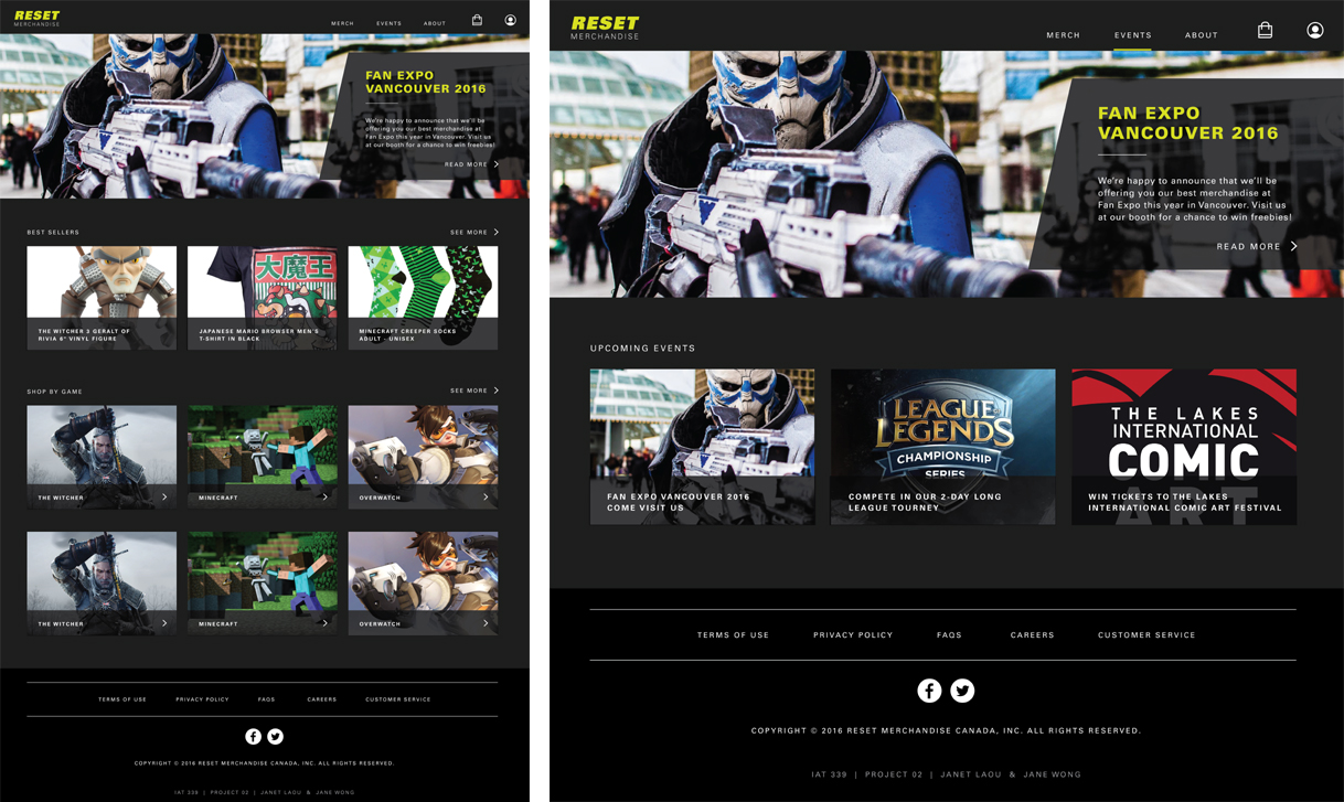
After we discussed the site theme and layout, I created several preliminary wireframe mockups of general designs we wanted for the website (shown above: home page on the left and events on the right), and my partner fused our ideas into final mockups of what the site would look like as a finished product (shown above). We had a mockup for every page that significantly differed in layout from other pages (for example, we had a mockup for one general product listing but not for both). These images helped us envision what our site would look and how to style it.
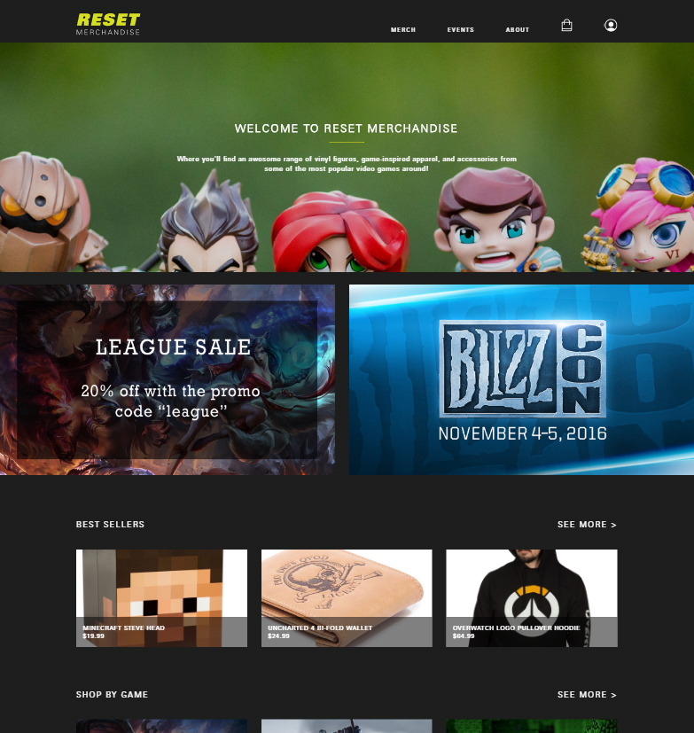
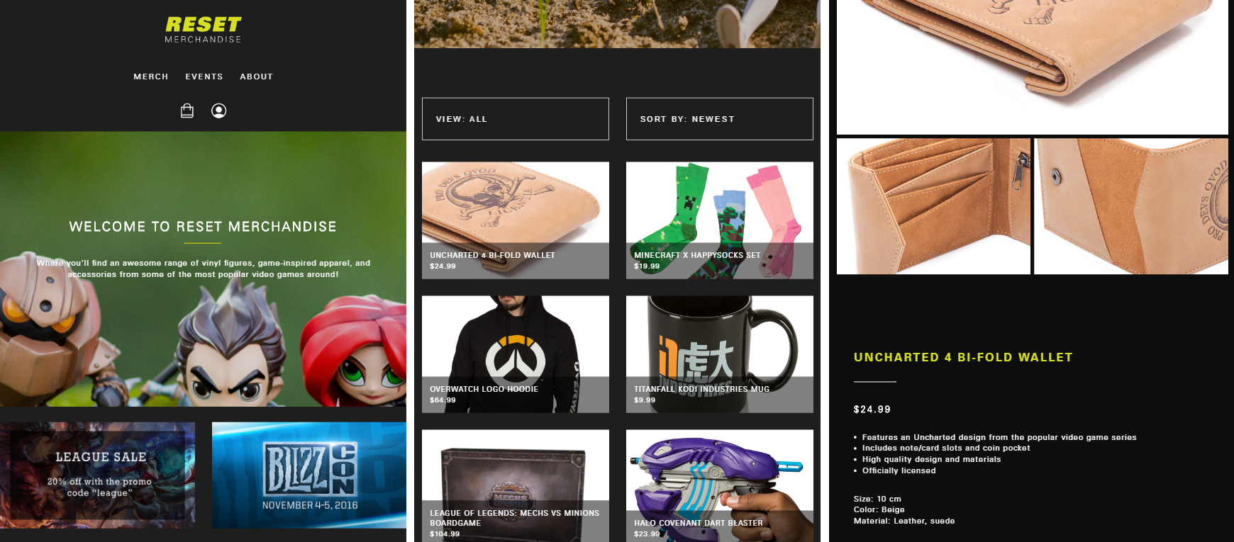
As the person responsible for the majority of the HTML/CSS coding, I worked on re-creating the static mockups into fully coded web pages. The first iterations had the goal of looking as close as possible to the mockups, and they were not yet responsive. I determined the site to work best with a 9-column grid structure and used that as a framework to begin. I had only touched upon grids once before this project, so I did not understand how to use them, and taught myself using online tutorials over the course of a weekend. The initial version of the home page is shown below.
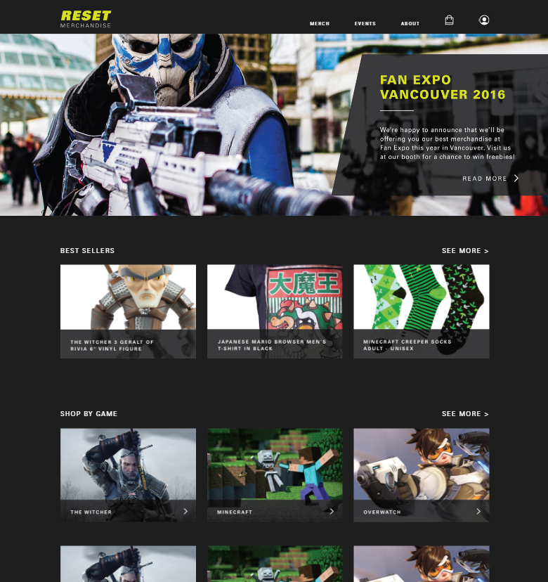
After conducting the first user tests, I discovered, based on the users’ feedback, that they thought the home page was the merchandise page, as the banner did not even have our site name and the page immediately introduced product modules. My first iteration to improve the home page was to change the banner image and text so it spoke more of the site itself. However, after another round of testing, users were still confused by the home page, so my second iteration was to research other merchandise sites and determine what they had in common that made their home pages obvious. I discovered the majority had coupons or sale banners, so I add two sale/advertisement banners above the "best sellers" section and tested it with the users one more time - to success.
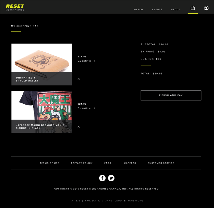
I realized when creating the page above that the UX was unconventional for a merchandise site and would not create a pleasant shopping experience for the user if more products were in the cart, as subtotal would remain at the top-right of the page even if the page was long due to many product listings on the left. I researched how other merchandise sites I admired, such as David's Tea, set their shopping cart up and redesigned the page to the current version using inspiration from those sites.
To create the smaller resolution layouts, I browsed other merchandise sites on my phone until I found a few I thought had good interfaces with easy browsing. I took notes on how they resized their images and navigation, then collapsed parts of my site into a more compact state to create the tablet version of the website. Elements such as the top navigation bar's icons were moved underneath the text links instead of beside them as they disrupted the line's balance. Shown below are the home (left), merchandise (middle), and wallet product listing (right) pages on an Ipad.
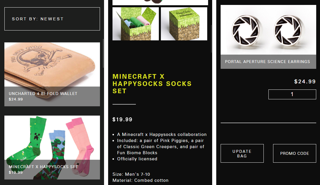
The tablet version of RESET Merchandise already had elements of a mobile site in the layout, so to create the mobile version, I collapsed the site even further into a single-column setup easy for scrolling and viewing each product listing. Pages such as the shopping bag were more difficult to design for, as the mobile view differed greatly from the desktop or tablet. I reorganized elements on the shopping bag page to a vertical flow instead of a horizontal flow, in order to fit the single-column style. Shown above are the merchandise (left), sock product listing (middle), and shopping bag (right) pages on a Samsung Galaxy S5 phone.