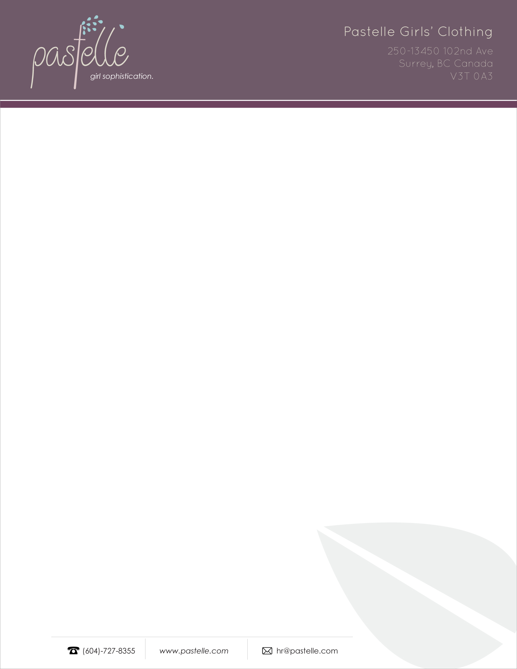
Pastelle is a children's clothing line I created in a team of two for a graphic design course in 2014.
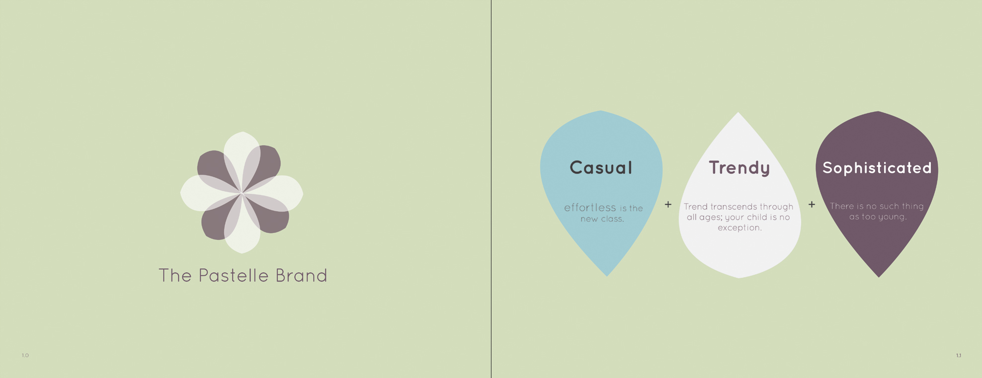
The project was to create a fictional company, then design a branding book and identity for that company. Pastelle is a clothing line that takes trendy adult fashion and makes them suitable for girls ages 4-10, and the colors and font used in the branding materials represent this.
Adobe Suite, print design, color theory, logo prototyping, and research.
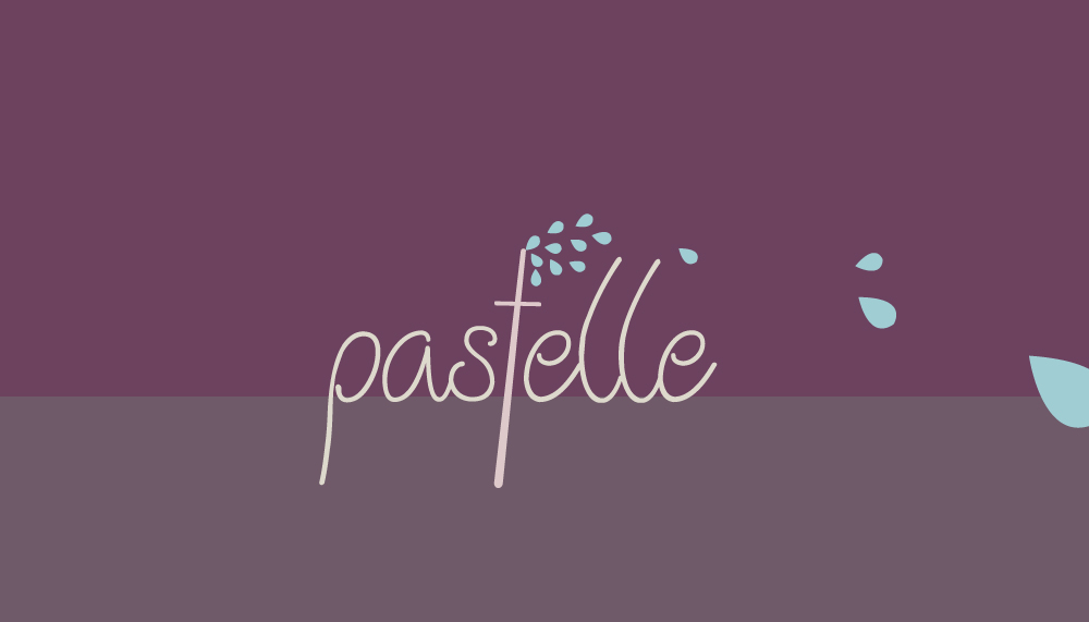
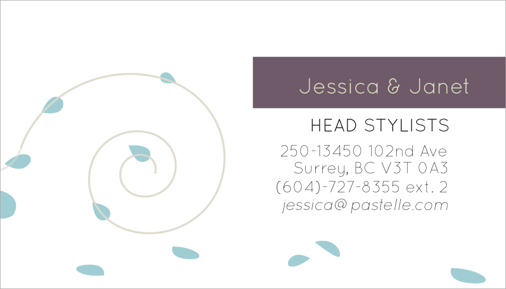
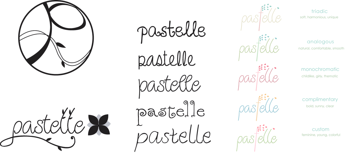
I researched the interests of our target audience and looked at how other companies marketed towards the same audience when preparing our logo ideas. Both my partner and I then created thirty different logo designs based on the information we found and narrowed our logos down to two suitable ones, which were then combined. Our final logo uses an elegant logotype with leaves blowing off a letter to symbolize the seasons.
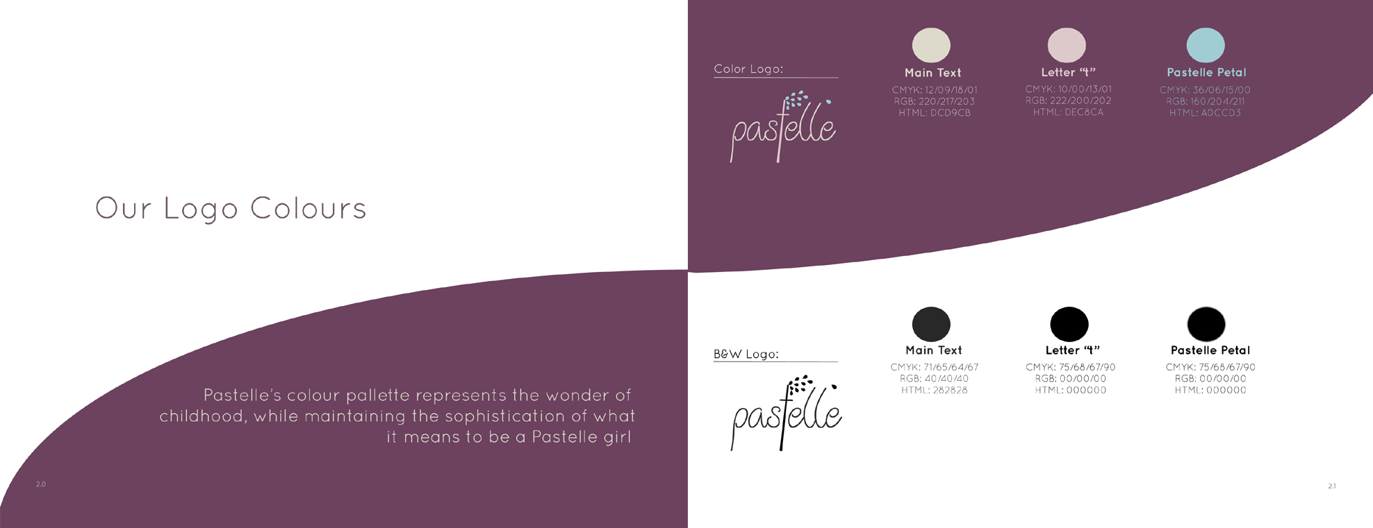
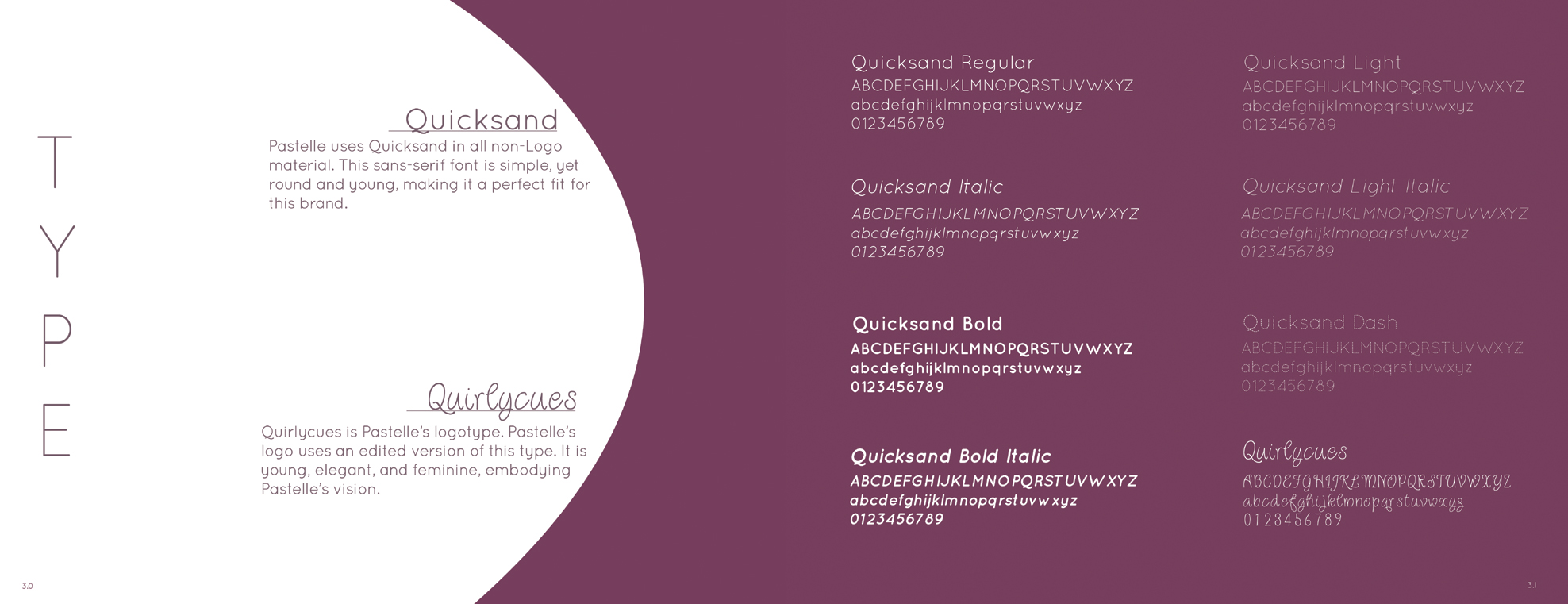
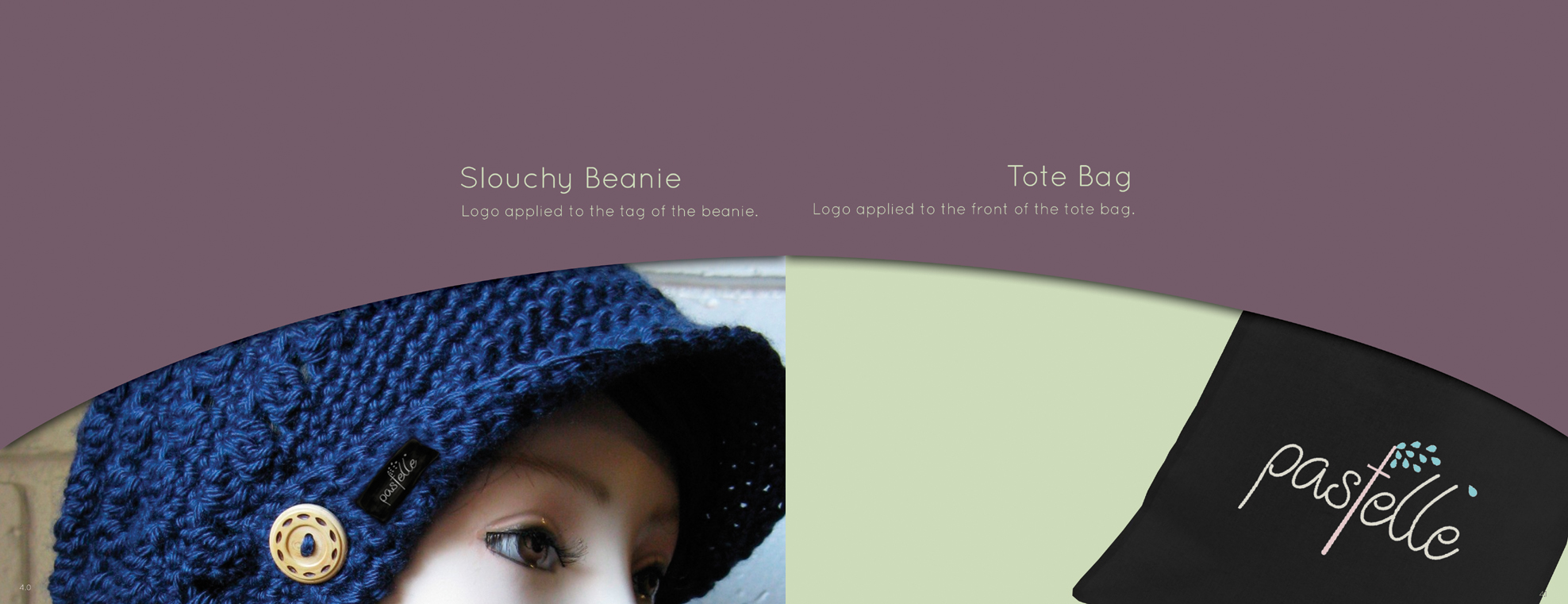
I selected fonts and colors that were both youthful and feminine, focusing on pastel and spring colors, when thinking of Pastelle's identity and how it embodies the brand. The book is created as a spread, with its contents spanning across two pages side by side. The use of curves and round shapes coincides with our logo.
The left image below shows the two logos I chose out of the thirty original logos I brainstormed. Since our brand focuses on seasonal clothing, I implemented natural elements in the form of leaves or flowers. After deciding that the bottom logo would be easier for children to remember because it did not look as abstract as the top logo, my partner and I decided that the flower beside the name was too distracting and we should incorporate nature-like elements directly into the logotype instead. Since the letter 't' is similar to a tree, we added leaves blowing from the top of it to strengthen the plant-like aspect.
The middle image contains the various font choices I examined for our logotype - all fonts that show youth and femininity. I based my choices on the brand's three words, and we ultimately decided on the middle font, due to it embodying our brand's values while also having the right amount of sophistication. The image on the right side displays the different possible color combinations I picked for our logo.