Rosydays is a mobile application I created in a team of two for an interface design course in 2016.
The application is designed to provide users with short, customizable, and positive activities after waking them up to start their day off in a relaxing way. It also has activities to help the user wind down before sleeping. The user will be able to customize a personal routine of activities for both mornings and nights, which may include looking at uplifting news, inspirational images, cute animal videos, and a stretching routine.
Mobile UI/UX design, researching other mobile applications, interaction flow mapping, prototyping in Axure, and Adobe Photoshop for static wireframing and screen design.
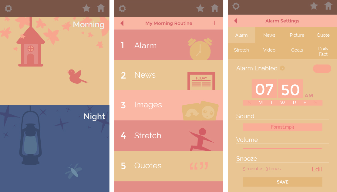
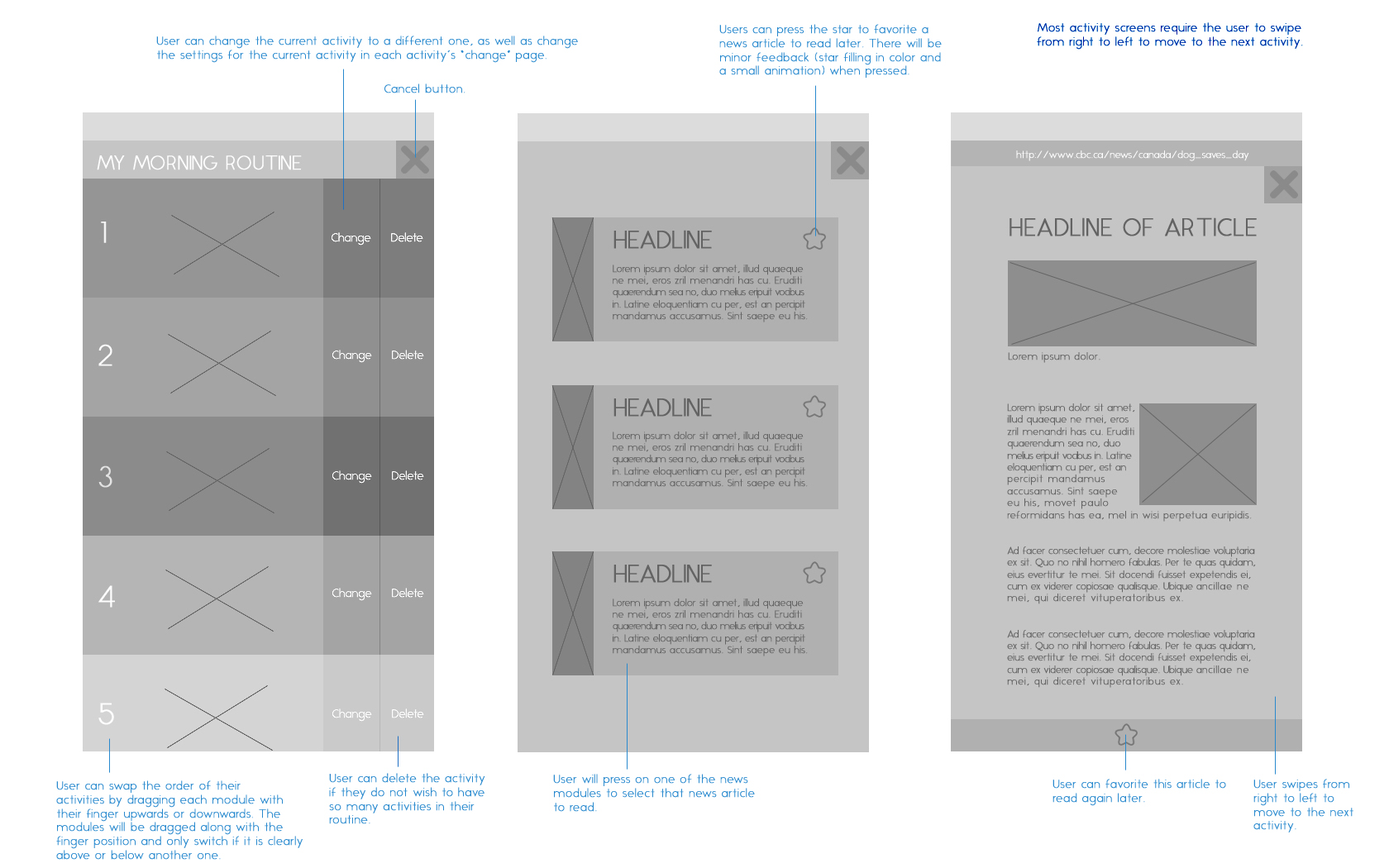
Click on either images below to view the Rosydays prototype. The morning routine starts automatically when the app's alarm sounds, but due to restrictions of the prototype, the alarm icon on the Morning Routines page starts the routine instead.
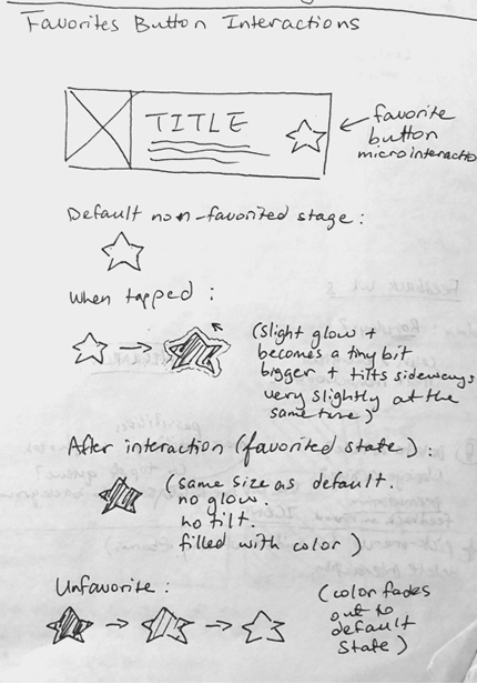
For our final prototype, I was tasked with the role of putting the final graphical components of the screens into Axure and creating the different pages. I made sure all screens and pages were linked together in some way, and also created the different user interactions in the prototype, with some examples being swiping left and right, dragging activities down in the routines screen, adding visual feedback in the form of small animations such as glowing to buttons the user would interact with, creating adjustable volume bars, and popups that would slide down or fade away.
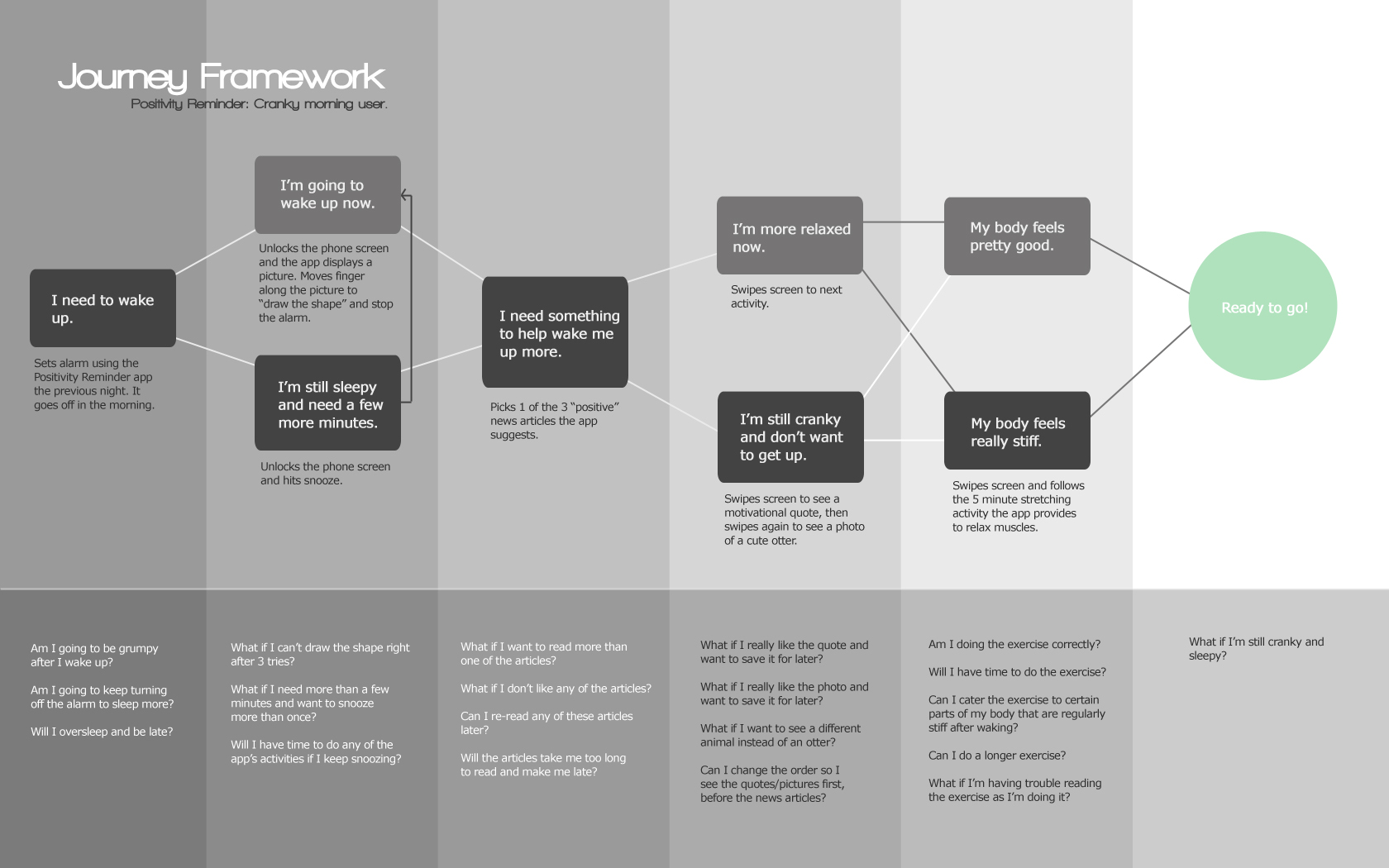
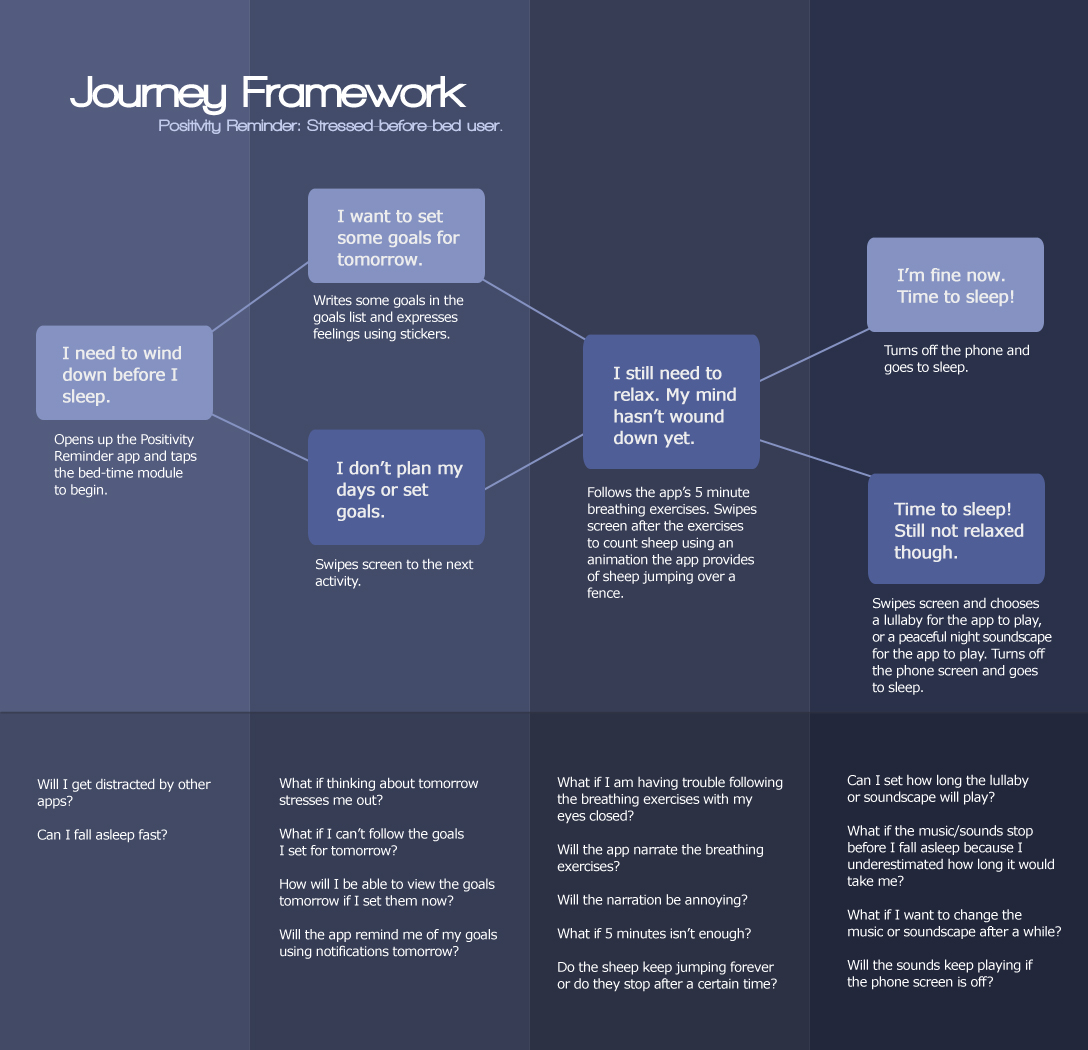
I created experience maps of what a Rosydays user may think and feel when they wake up and when they prepare to sleep in order to help my partner and I understand what a user may require in our mobile application. I thought of any possible problems or scenarios the user may have as they go through the mobile app, and mapped the flow of activities they would go through before reaching the end of their morning or night activity session in the app. These maps were useful when creating the wireframes and final prototype for pinpointing issues that a user might have at each stage of their morning or night routine.
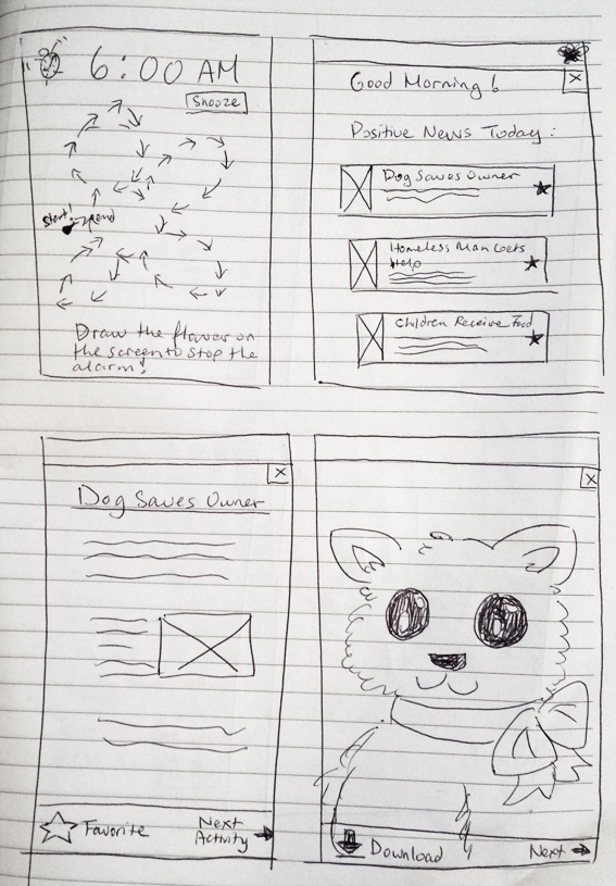
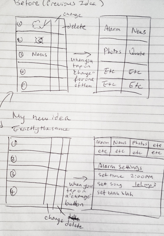
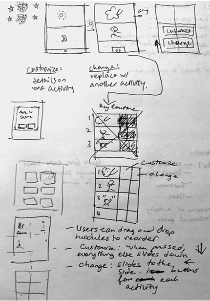
Prior to digital wireframing, I sketched different screens of our mobile app to get a visual of what it would look like, as well as what types of button interactions the user would have. Any updates or changes to the wireframes were also sketched, such as updating the "alarm settings" page so that it would look more organized. Sketching proved crucial in the mobile app creation process, as it gave me a framework for my digital wireframes.
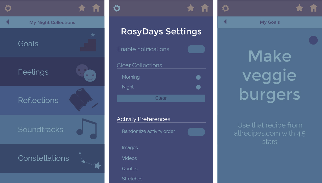
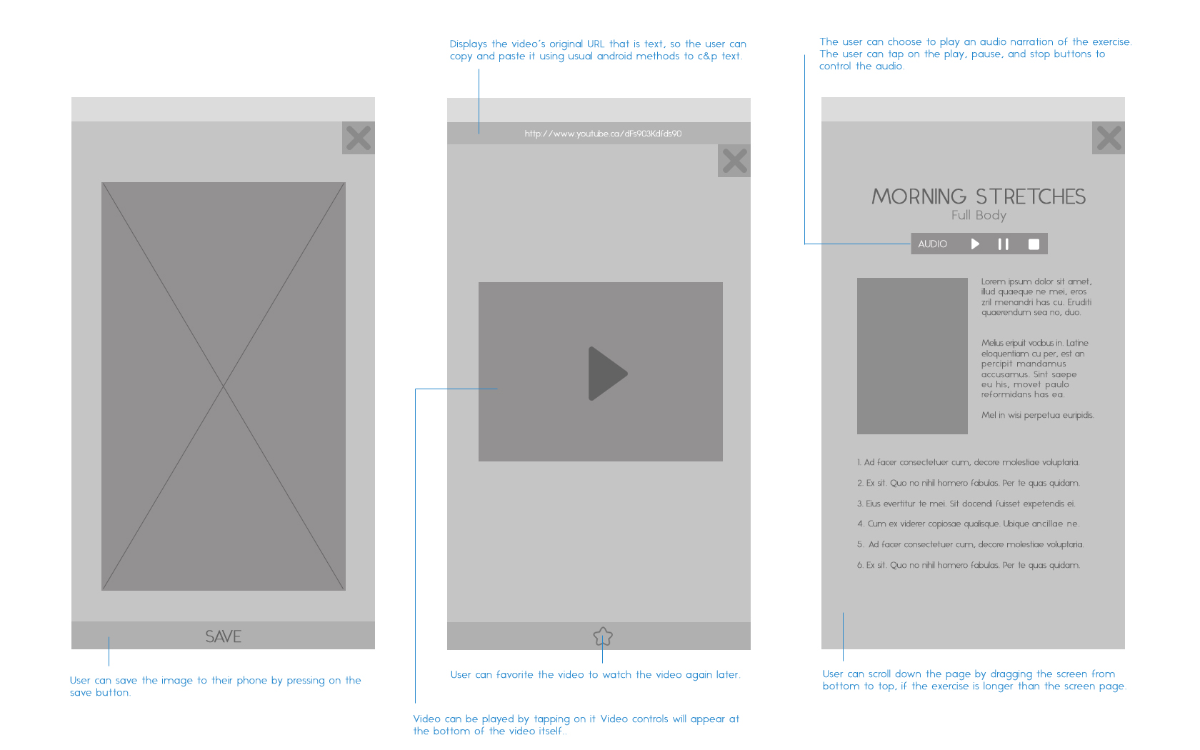
I created wireframes for different screens in our mobile application, with an important one being the main routine screen where the user can create a customized activity routine for their mornings. The wireframes are based off of the earlier sketches I did on paper. I used different weights of grayscale to indicate images as well as contrasts in colors for the final piece. The process was crucial, as it would help visualize the mobile application on screen so we could get a better sense of how the final product would look. Click on the images below to view the full versions.
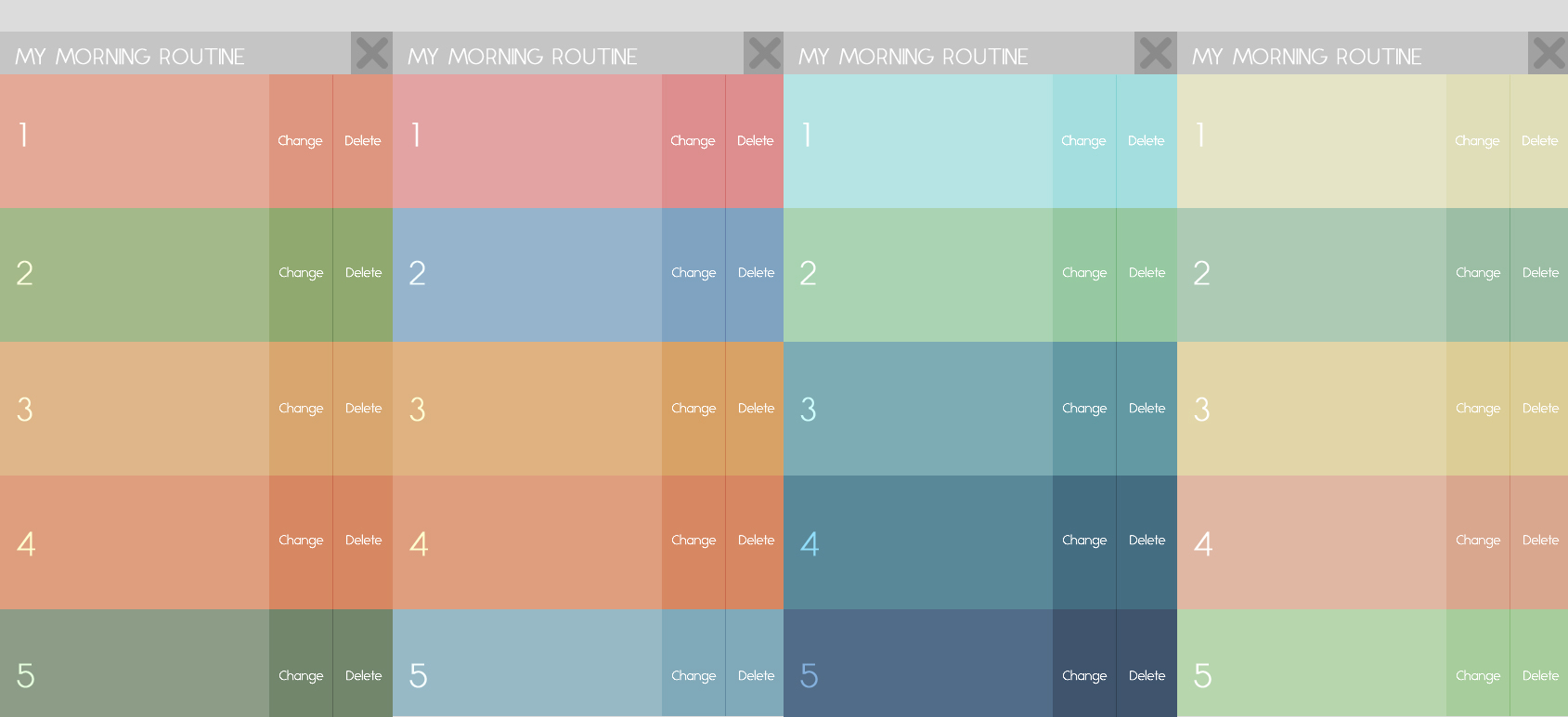
The color schemes shown above are combinations I brainstormed for 'morning' section of the application. We originally planned to go with 5 colors for each section, but decided that too many colors would be too distracting, so we narrowed it down to three per section.
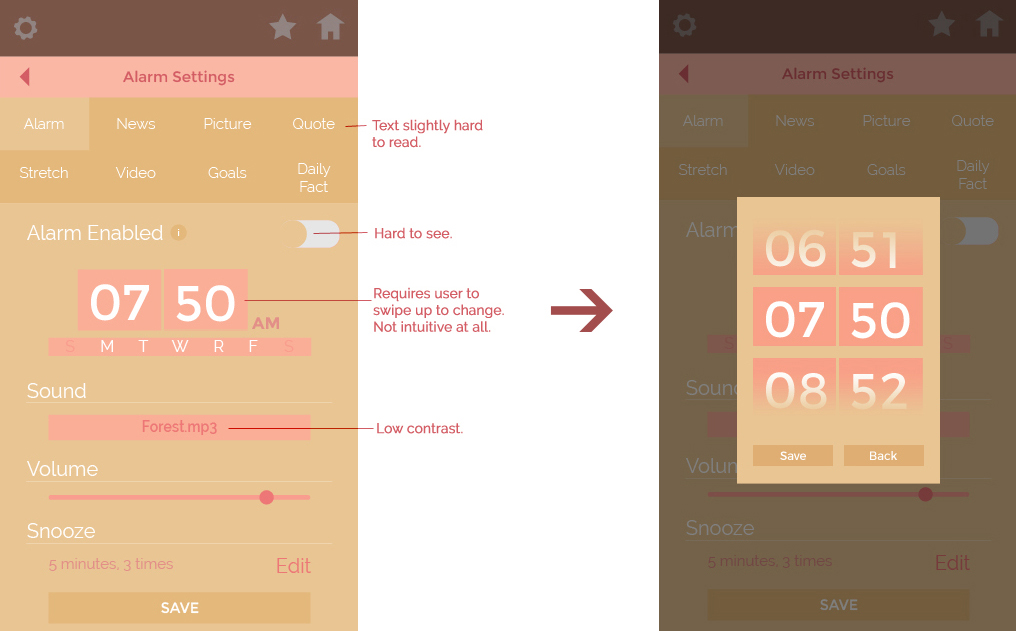
Some aspects of the prototype were changed based on feedback after I presented the app to users to test. For example, users were confused on how to change the numbers on the alarm clock (swipe up and down on the numbers) and could not figure it out for over five minutes. I found this to be a major design flaw and changed the alarm clock so when the user tapped on the clock, a popup would appear with a visual interface that afforded the user to swipe up or down. I tested this new change with the users and they found it to be a great improvement.