Introduction Conceptual Outline Methodology Data Collection Spatial Analysis Results Design Problems
Spatial Analysis
All files were originally vector and were imported in IDRISI using the shapeidr module. All files were given a spatial resolution of approximatley 10M (800x1800 cells) and spatial parameters of all images were copied from the dissemination area layers. . Individual layers for seperate socio-economic variables was then created using rastervector module (polygon to raster). They were re-scaled using the image calculator in order to give them equivalent weights. These layers are shown as the following five figues ( % of Population Owning a Car, population density, % of population employed, income, and % population between ages 0-19, and 60 and over. Ordered respectively)
The images were then overlayed reclassed (5 classes, from 1 -5).to create 5 levels of transit demand in Nanaimo. The next figure is the image created from this overlay.
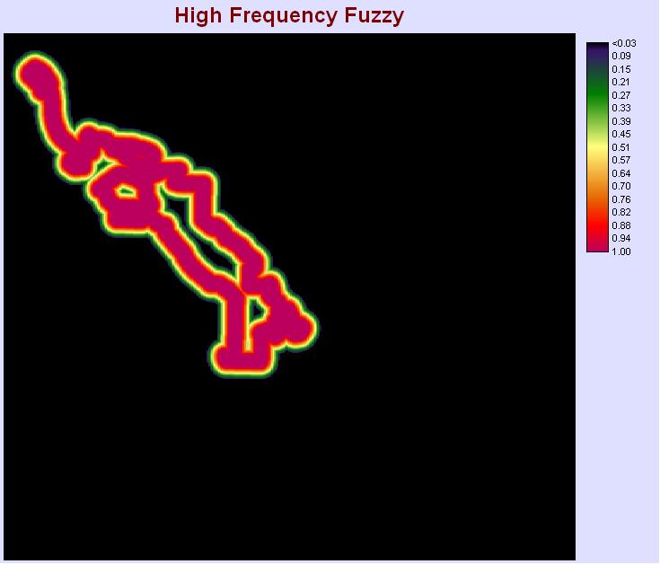
The next step was to create the service layer similar demand layer in the previous figure. Seperate layers created in ArcGIS for high, medium and low frequency bus routes. These were then imported into IDRISI using the shapeidr module and converted into raster using rastervector module (line to raster). The distance module provided the distance from each bus routes, a preamble to createing the approximate service catchment areas. The catchment areas were created using the fuzzy module. The 'Membership function type' in Fuzzy was set as linear for all seperate layers, and the 'Membership Fuction Shape' was set to monotonically decrease. The control points for individual frequency route were:
High - control point a = 200M, control point b = 300M
Medium - control point a = 150 M, control point b = 500M
Low - control point a = 100M, control point b = 400M
This resulted in the following three layers (High, Medium and Low respectively)

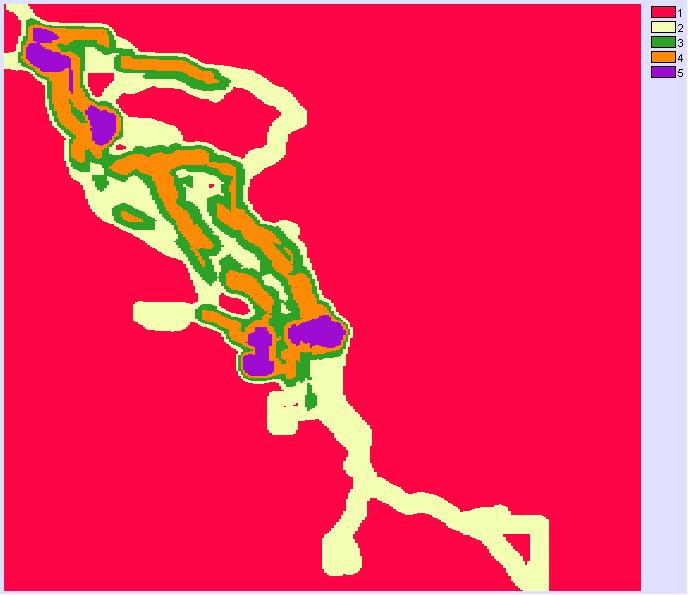
These layers were overlayed and reclassified (5 classes, 1-5) and the results are shown in the next figure. The number of classes were chosen to match the number of classes from the demand image, so they can easily overlayed again calculate a demand/service ratio.

The overlay of the demand and service re-classified images provided the following result.

This image was further reclassified to create two seperate classes: demand neighborhoods (ratio exceeding 1) and non-demand neighborhoods (ratio less than one). This image was overlayed with the raster image of residential-only landuse to find residential neighborhoods with demand, rendering the next image

To reduce the excess noise in this image, the demand pixels were grouped using the group module (next figure), and then sorted by size using the Area module. The image was reclassified to provide only the large clusters of cells only (above 1000).
The final image of the spatial analysis was the image created by relassifying for large clusters as aforementioned. This image (next figure) created illustrates 5 seperate neighborhoods that have transit demand.
