Spatial Analysis
When it came time to run a spatial analysis on auto-crimes in Vancouver, with relation to thier proximity to Skytrain stations, the first thing I realized was that my data was over saturated. By this I mean that having auto-crime points for the entire year was too much data to analize for a specific question. I felt discouraged that my entire project was a bust, until I noticed that I could cut back the number of auto-crimes by selecting for specific months. I chose to analize and compare Summer and Winter auto-crimes. For Summer I chose the month of June, because my data for 2011 ended at this month (otherwise I would have chose the height of summer, July). For Winter I chose the month of January as a contrast to my selected Summer month. The idea here was to pose the question: "Is it more likely that your car will be broken into in the Summer or the Winter, when parked close to Skytrain Stations?".
Of course, I now had to repeat all of my previous steps for converting my CSV data to a workable RST dataset in IDRISI. However, now that I knew how this was done it was a relatively simple, albeit tedious process. To ease the pain of having to explain these processes again, I have provided an image of one of my new rasterised auto-crime maps, of which I now have 12 rather than 6. Most of my settings remained the same resulting in similar, yet less saturated data on auto-crime for the years from 2006-2011.
- This link provides a visual representation of my progress.
When compared to the above image, this image shows how much more saturation of auto-crime there is when including data from the entire year. From this comparison, I was satisfied with the extra work required to extract the month-specific data from my dataset.
For contextual purposes I wanted to know the trend of petty auto-crime from 2006 to 2011, for this I created a graph using OpenOffice Clac, to determine whether this specific crime had increased or decreased during these times. The image below gives the results of this trend, showing both that these crimes are more frequent in January than June, and that they have declined overall from 2006 to 2011.
 |
Evidence, based on this graph, that petty auto-crime was more prevalent during the Winter months when compared to the Summer, allowed me to continue with confidence that I had made an accurate selection of data. I now had to prove this graphically. With my constraints set to the months of January and June, I needed to select factors by which to create boolean maps for my analysis. Considering that criminals who were targeting vehicles would have been on foot, having just come from or heading to the Skytrain, I decided that my first factor would be distance from Skytrain Stations. This I set to a reasonable distance of 500m. Because I had compiled census data for Vancouver neighbourhoods, I decided to use positive population growth as my second factor. This decision was made considering that a higher population would mean more people living in the area who owned vehicles and thus, more parked cars for targets of auto-crime.
The creation of my first factor, distance from Skytrain Stations, was a simple process of compiling a boolean map. From my map for Skytrain Station locations, I simply ran the distance operation BUFFER, setting my distance to 500m.
- This link provides a visual representation of my progress.
For my second factor, I ran the database query operation OVERLAY, using the census data on neighbourhood populations I had created earlier. For my first image I used population data from 2011, and data from 2006 for my second image. Finding the difference between the first and second image produced a map with the relative population change between these two times. Reformatting this map to a vector with the RASTERVECTOR operation allowed me isolate polygons with positive change from those with negative change. Reformatting it back to a raster with RASTERVECTOR and then running the RECLASS operation to turn all positive values to "1" and everything else to "0", produced my boolean map of positive population growth in Vancouver neighbourhoods.
- This link provides a visual representation of my progress.
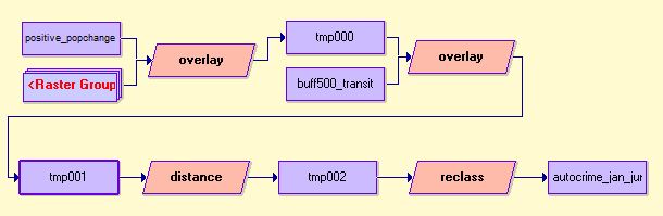
With my factors in place I was ready to run my final spatial analysis. The image below is the macro modeler I used to perform this. First I used OVERLAY with my positive population growth boolean map and autocrime maps from my select months and years, multiplying them together to produce a map that showed all auto-crimes in areas that had positive population growth. I then used OVERLAY again with this new map and my buffer map created in the step above, multiplying them together to produce a map that now showed all auto-crimes in areas with positive growth and 500m from Skytran Stations. I ran the DISTANCE operation on this map. I then ran the RECLASS operation, selecting equal-intervals from 0 to 500 with a class width of 100. This produced a map that met both my constraints and my factors: auto-crimes in January and June 500m from Skytrain Stations, in areas of positive population growth, with a 500m "zone" around these crimes.
 |
From here, I exported my maps using the software-specific format ENVIIDRIS to create IMG files, which I imported to ArcMAP where I manipulated their properties to create the final maps shown below.
 |
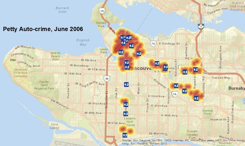 |
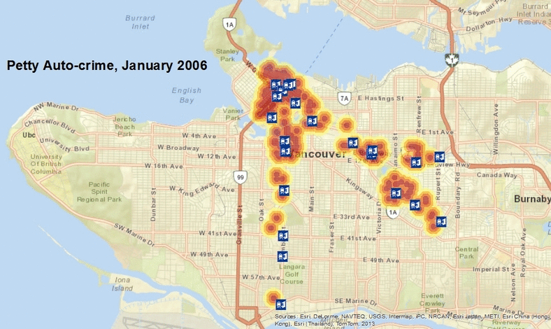
The dark red in these images is where petty auto-crimes occured within 500m of Skytrain Stations, represented by this symbol:
 |
These zones fade to yellow to represent a drop in intensity as you move away from where the crimes occured. Although these images represent auto-crime, it should be noted that they only represent those crimes that fit within my select constraints and factors. The range of locations of auto-crimes in Vancouver is very broad, this Spatial Analysis shows only the relationship between different Skytrain Stations in the city over time.
From these maps, I can infer a few things about auto-crime. First of all, Downtown Vancouver is likely the worst place to park your car close to a Skytrain Station. If I had to choose the safest station, I would pick those on the Canada Line from King Edward to Marine Drive Station. Particularily Langara 49th Station, which appears to be the safest place to park. Olympic Village/City Hall and Broadway/Commercial also seem to be hot-spots for auto-crime, with a drop in occurances as you move away from the city center. In addition, these maps clearly show the difference between the Summer and Winter months, showing that you are much more likely to have your car broken into in the Winter. There is more positive population change in Vancouver than negative change, with this in mind it is difficult to infer a correlation between population growth and auto-crime, it would seem that these crimes occur regardless of population change.