How We Played with Preschoolers to Get Their Design Ideas for Family Messaging
Jun 11, 2024 by Benett Axtell
There are a lot of different ways for families to stay in touch over distance. We can text, share pictures, or video call. We have ways to keep up some connection even if there isn't a technology that's exactly like being physically together. But this isn't so easy for young kids.
In person, young kids, like 3-to-5 years old, can chat and play with grandparents, cousins, or whoever else. They can build relationships in ways that make sense for where they are developmentally; like through play.
But a lot of the ways we stay in touch when we're far apart need us to read (like texting) or assume that the user knows a lot about how technology works (like video calling assuming no one will touch the big red button unless they're hanging up). This means that when young kids socialize with far away family, they usually need a grown up, like a parent, there to help them.
I started this project to find out how we can make ways of communicating when we're far apart that lets young kids join in on their own, just like everyone else.
I decided to get design ideas from young kids directly as co-designers, since we (adults) aren't used to imagining ways of communicating that don't need at least some reading skills. To do this, I wrote a story and designed a make-believe game about astronauts and the gadgets they use to talk to each other. Astronauts work far away from their teammates and keeping up communication between those teams is really important. So it makes sense as a make-believe setting for talking about distance-separated families. It's also fun to pretend to be an astronaut.
So I put together some building blocks, colouring supplies, and my story about astronauts finding a space flower together in a box and delivered it to the homes of 3-to-5 year old kids. The last piece was how was I going to learn about their ideas without being there myself. To do that, I made an audio recording website that looked like the other team's spaceship, and asked parents to record on that while the kids played. That way, I could hear them talking about their play and the gadgets they were designing.
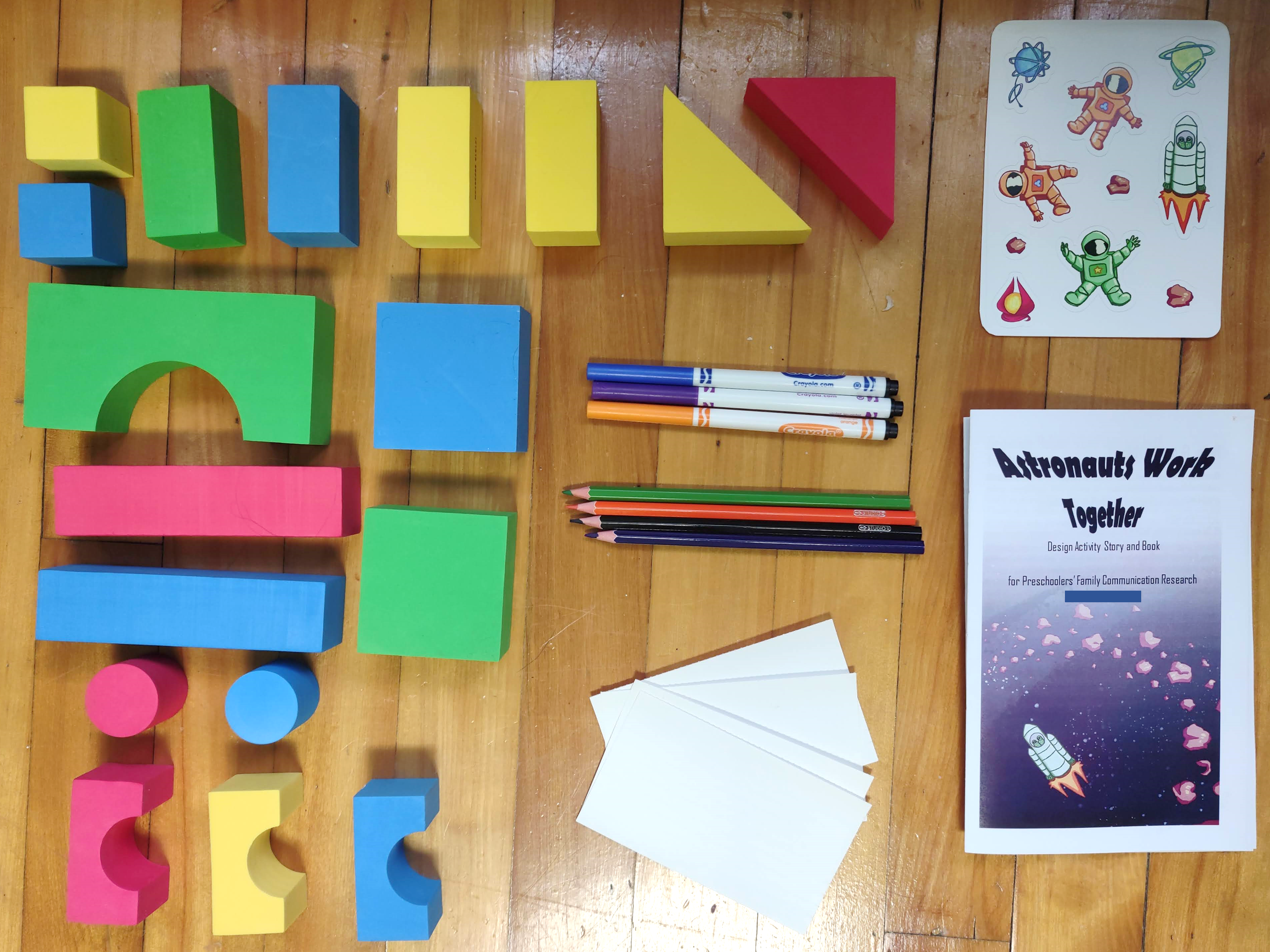
Our design activity box had simple building and colouring supplies along with our co-design activity book and some stickers
So how do astronauts communicate? Well our young co-designers shared a lot of detailed ideas about that. First, a gadget has to be connected to another gadget before it can send things back and forth. Once you have that connection, you (an astronaut) are ready to make a message using different parts of your gadget. Then, your gadget can send that message to another gadget. It's going to have to send it through space without wires, and flying through space might take too long. So the gadget will need to use the connection to get the message across to the other gadget.
All these ideas came from the preschool-age designers' descriptions and play with their gadgets. And I learned a lot about how young kids understand and imagine tech for communication.
First, let's talk about connection. Take a moment to think about how your phone is connected to your friend's phone? Do you consider that connection before texting them? These astronauts definitely do. These young co-designers wouldn't describe what went into a message (like a picture of a flower or a voice note) until they set up how the gadgets were connected to each other. They weren't literally connected across space with a really long extension cord, but their design ideas used physical metaphors, like bridges and tunnels, to describe the invisible link.

Examples of gadget connections include a target, a bridge, and mirrors.
So with the gadgets connected, now the you (an astronaut) can make a message. That message will probably not be typed or written. Our young co-designers didn't bring those up, probably because they haven't learned to read and write yet. Their messages sent what they could sense (like pictures or the smell of the flower) or descriptions of what they sensed (like a voice note describing what the flower looked like), and some sent the whole flower petal by petal. Whatever that message is, it needs to be able to travel across that invisible bridge-like connection no matter what is in it.
Now, how does a message travel across an invisible bridge through outer space? These young co-designers thought about other things they knew about that move parts invisibly, like evaporation, or that move really fast with a lot of energy, like lightning, and used those to get the message through space. Amazingly, these ideas work a lot like how digital messages are sent: broken down into smaller parts, called packets, and put back together somewhere else. Just like evaporation!
All in all, the design ideas from these young co-designers had a lot of detail and showed that they already understand how devices need to work together to let us communicate. They've given me a lot to think about how to design for communication between families, but also how we design.
From their designs, I'm making an app for a new kind of communication between far away family. Some way of staying in touch that includes young kids by alongside everyone else. And I'm going to make this free for families to try out. Hopefully we'll get to see new ideas about how we stay in touch when everyone is part of the conversation.
Full paper: Benett Axtell, Cheng Zhu, and Carman Neustaedter. 2024. Bridges, Glitter, and *Spaceship Noises*: Young Children’s Design Ideas for Communication Across Distance. IDC.[pdf]
Grandparents and Grandchildren Share their Stories in a Digital Tree of Cultural Heritage
November 1, 2022 by Benett Axtell
A single family story doesn’t stand on its own. When a grandparent tells a family story to a grandchild, that is one part of the long-standing practice of family history and culture exchange; one piece of all the stories crossing generations. For families of immigrants, these stories also need to cross the distance and language differences that can keep generations apart.
We brought together grandparents and grandchildren in families of immigrants to imagine magic solutions to documenting family stories, which they drew together while sharing different stories. In our work, we guide people to create designs for some Magic Thing because that way their ideas won’t be caught up in ideas of what technology can or can’t do today or how they are supposed to use it. Magic is bigger than technology, so magic designs shows us what we need to aim for in the future.
With magic, these families imagined ways to keep all their family stories together, growing and connected to each other. Picture a tree with retellings and new stories branching off from older narrators and generations. Together they created magic wands, teleporters, and story maps.
![Two drawings from separate designs are side by side. Left, a close up shot of a teleporter drawn by a grandchild and labeled “Time traveling teleporter” with an arrow. Right, a drawing shows a child saying “Reud [sic] to me and I’ll reud [sic] to you” in front of their magic posterboard.](./img/CSCW2022_1.webp)
A time traveling teleporter design (left) and using a magic wand design (right)
These imagined solutions didn’t just preserve the stories themselves (like books on a shelf). Their magic ideas stored the connections between different stories, retellings of the same story, and the different prompts that start a story. We call these prompts hints after a grandparent who told us that “with just a hint” their grandchild can remember that family story.
The magic didn’t stop at stories and hints. They also saved the different narrators, authors, and illustrators of different parts of a story (like a grandparent telling a story while a grandchild draws a picture of what they hear). All of these parts were kept together in the imagined story tools.
While families were drawing their designs, we didn’t need to remind them to share stories. Once one story was started, usually by a grandparent, someone would easily pick up the thread and start telling a new story from there. Stories snowballed from one into the other, sometimes even overlapping. Stories become hints, which become the more stories, and so on. And this matches that tree of stories the families created in their magic designs.
We started this project because immigrant families often miss out on common prompts for family story sharing, like old photographs. We wondered if an app or website could help these generations to connect and prompt stories in some way, like by creating drawings of stories to be prompts like photographs would be. What they showed us is that you only need to prompt that first story. And beyond prompting, families need to save their stories and all that goes with them.
We’re now working towards a digital tool that does something like those magical trees of stories created together by grandparents and grandchildren. Growing from a first hint to a rich family tree will take time. I wonder what those trees will look like with generations of stories and memories shared and reshared across cultures, languages, and generations.
Full paper: Benett Axtell, Raheleh Saryazdi, and Cosmin Munteanu. 2022. “With a hint she will remember”: Collaborative Storytelling and Culture Sharing between Immigrant Grandparents and Grandchildren Via Magic Thing Designs. CSCW. [pdf]
Pictures on Screens Aren’t Good For Storytelling. Here’s How We Change That.
June 9, 2022 by Benett Axtell
The way digital pictures are displayed on screens changes the way we share our stories. Pictures are great prompts for memories and family storytelling; think of a family gathering around an album or passing around loose pictures. However, galleries of tiny pictures and one-at-a-time slideshows don’t let us tell the whole story. They make it too hard to see pictures together. But digital pictures can connect us to our memories if we make pictures on screens more like those family gatherings.

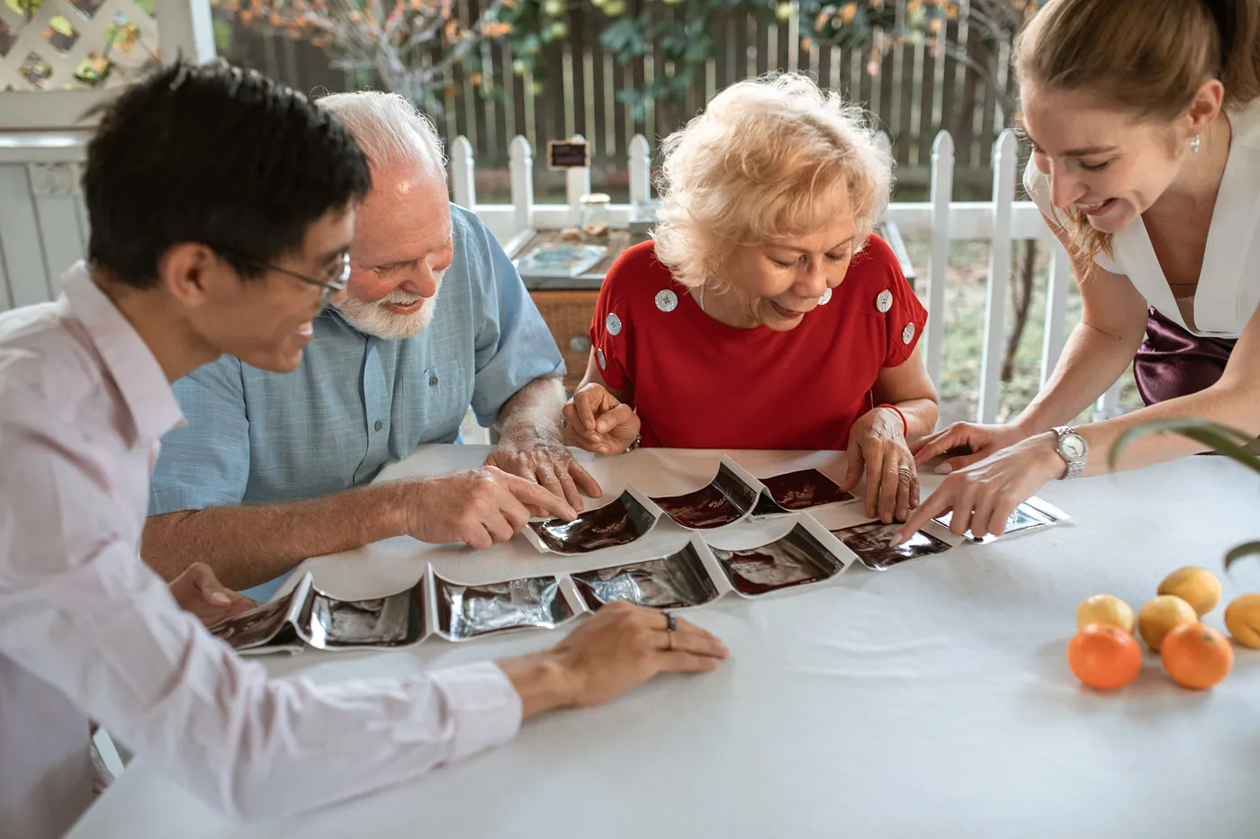
Sharing pictures around a table. Photo by RODNAE Productions from Pexels.
We keep pictures for a lot of reasons. A big one is reminiscence: looking back on the past and sharing stories or memories. Pictures are really good at this and at prompting memories in general, but this doesn’t seem to work with digital pictures. Looking at a photo album isn’t the same as looking at a picture on a phone screen. We wanted to figure out exactly why (and how) that is. More than that, we wanted to know how to fix it.
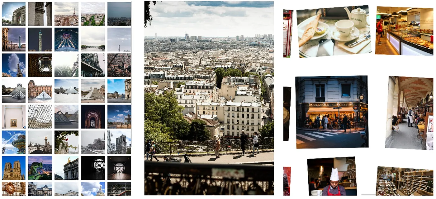
We put pictures on galleries, slideshows, and something new — a “tabletop” of digital pictures that we created to be like the dining room tables and coffee tables where paper pictures are sometimes spread out. When people looked at pictures on those different displays, what stories they shared changed. With classic galleries and slideshows, people didn’t share many memories or if they did share memories they shared more remembered facts (like, “This is the Eiffel Tower”). But the tabletop told a different story.

Our three ways of looking at pictures: gallery (left), slideshow (centre), and tabletop (right).
We designed the tabletop to show several pictures on a screen at once, but balanced that with keeping the pictures big enough to actually see what’s in each one. One picture doesn’t always tell the whole story. That’s just one moment out of many. So we look at a few pictures together, like a page in a photo album, and being reminded of what else happened around that picture reminds us of richer stories. Even though this was new and people were more familiar with the other two options, it was the best of the three for prompted memories.
The gallery is probably the worst option for sharing stories. People shared fewer memories there than with either of the other options. It shows many pictures at once, but very small and often cropped to fit a neat square grid. It’s too hard to see enough detail in any one picture, let alone see a common thread across several.
On the slideshow, people shared more memories than the gallery and we didn’t see a difference in the number of memories between that and the tabletop. But it prompted more external facts than either the gallery or the tabletop. Memory sharing from a slideshow has more quick facts than an actual story sharing an experience, so reminiscence is unlikely. By showing just one picture at a time, we can see all the detail in that one picture close up, but it’s just that picture. Our experiences are more than single moments in time, and it’s hard to be reminded of a longer memory from just one moment.
So, we found out that existing ways of looking at digital pictures don’t prompt memories, but the new way does. This means that the only thing stopping digital pictures from prompting memories like photo albums do is how we can see and interact with them. To be fair, the gallery probably wasn’t meant to be a memory prompt (really, it’s likely just an update on computer folders), but it’s also one of the two major ways to see our pictures. The slideshow, the other major option, is definitely meant for viewing pictures, but still doesn’t prompt storytelling and memory sharing well.
The good news is that those options aren’t falling short just because they’re digital. We now know that we can create ways for digital pictures to connect us to our memories. In our case, we did it by looking at the physical world and bringing that into the digital, but that is just one idea. Now we know what designing for memory prompting looks like, and we know what not to do (looking at you, gallery). And I’m looking forward to the new ways digital pictures will connect us with each other.
Full paper: Benett Axtell, Raheleh Saryazdi, and Cosmin Munteanu. 2022. Design is Worth a Thousand Words: The Effect of Digital Interaction Design on Picture-Prompted Reminiscence. CHI. https://doi.org/10.1145/3491102.3517692. [pdf]


![Two drawings from separate designs are side by side. Left, a close up shot of a teleporter drawn by a grandchild and labeled “Time traveling teleporter” with an arrow. Right, a drawing shows a child saying “Reud [sic] to me and I’ll reud [sic] to you” in front of their magic posterboard.](./img/CSCW2022_1.webp)
