.
Making digital pictures social again through user observation and InfoVis
Challenge
Looking at digital pictures just isn't the same as physical pictures. But it's not because they're digital. It's because of how we can('t) interact with them.
We need a way to interact with our pictures that gets at the social part of that. In this project, I find how to move between our huge collections of pictures and small "albums" of those pictures by looking at what we do with physical pictures and why that works.
Looking at Personal Pictures
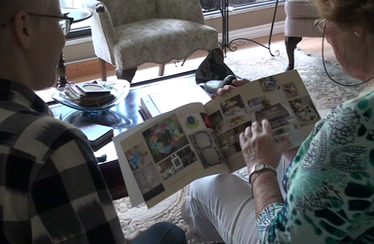
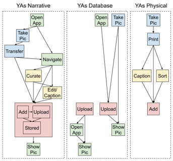
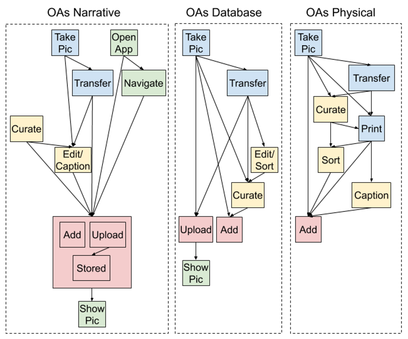
I started with user observations and interviews to get a full idea of what we are doing with our pictures now. And I built user workflows for different generations of user.
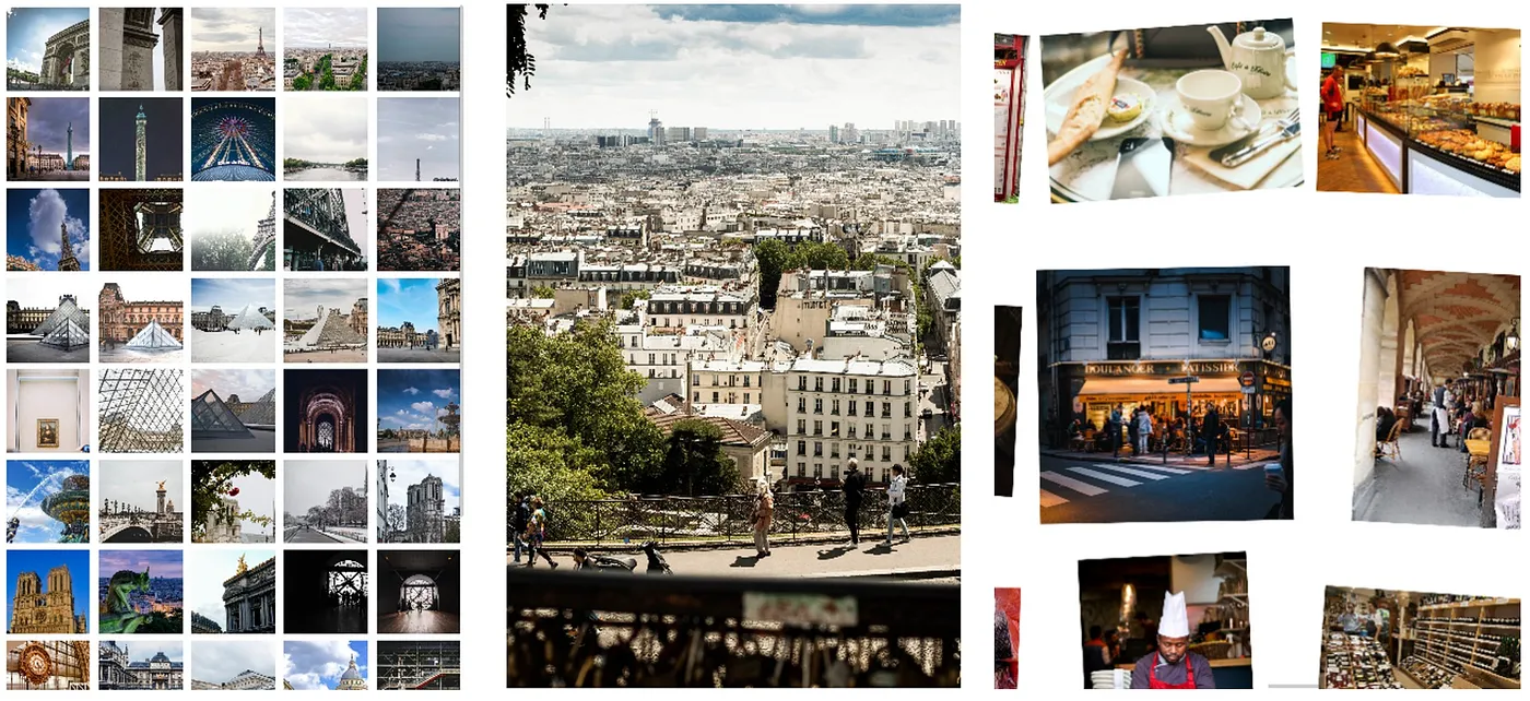
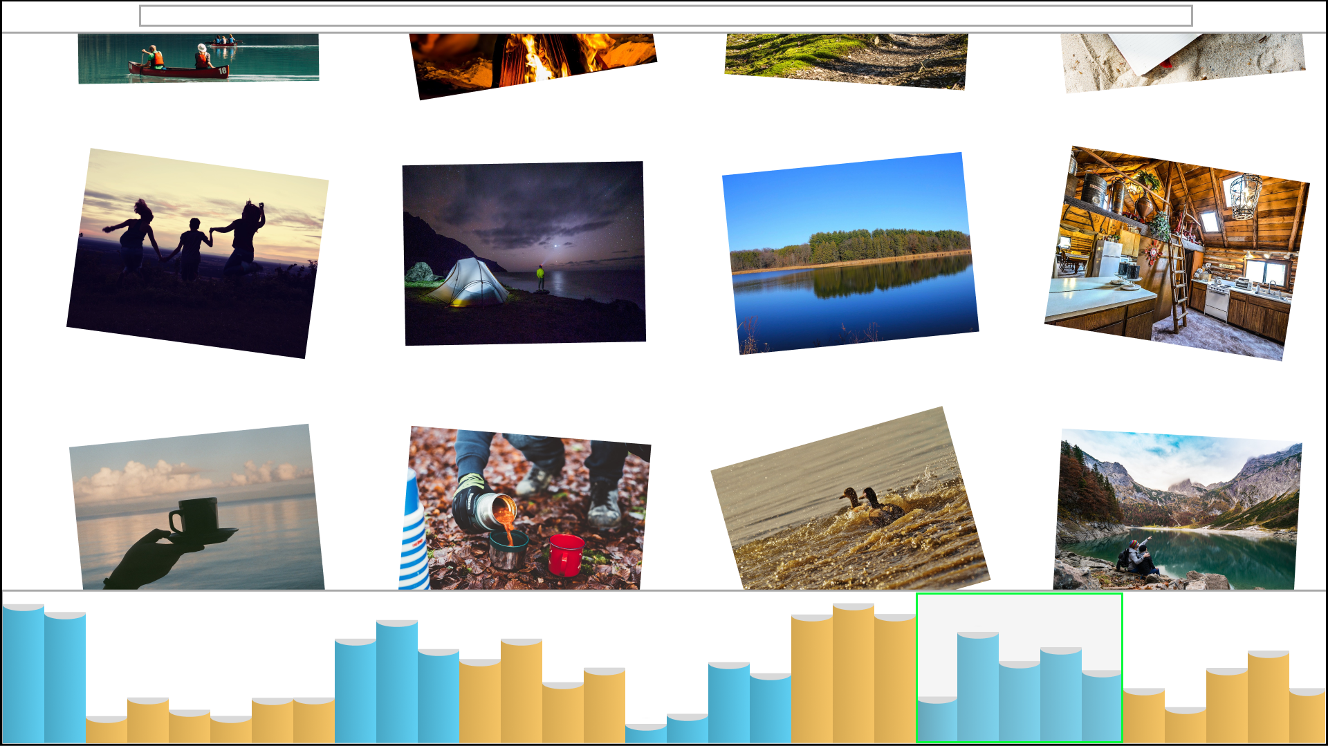
From this starting point, I designed a digital tabletop for our pictures. This metaphor is more like what we do with physical pictures: spreading pictures out on an actual table or flipping through an album. And it doesn't tie us to a strict linear timeline (more on that later on!).
Pictures on a Tabletop
But how do I know the tabletop metaphor actually works better than other digital designs? I did a controlled study. I compared what we do on all three designs (gallery, slideshow, and tabletop) and showed that when we use the digital tabletop to look at pictures, we share more detailed memories and stories than a using gallery or a slideshow.
User Feedback
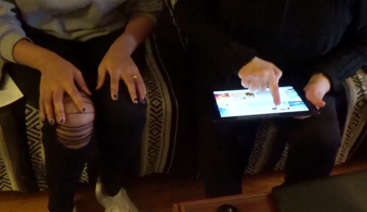
I wanted to get some feedback on what I'd made so far, so I made a simple functional prototype of just this tabletop idea and took it to users to try with their own pictures side-by-side with their digital and physical tools. The tabletop was well-recieved and easy to use, but it was missing a lot. Focusing on getting one piece working at a time clearly wasn't going to work here.
So, I was sure that a tabletop metaphor would support my design goal... for about 50-100 pictures at a time. Most of us have a few more digital pictures than that though (more like in the 10s of thousands). So from that feedback I got my next design step: How to get just 50-100 pictures onto the tabletop.
Albums on a Shelf
Remember how the tabletop gets us away from pictures stuck on a timeline? I wanted this because a tidy, in order timeline isn't actually how we remember things or how pictures prompt us to remember things. It's more like clumps or clusters around big or memorable things. The exact order of pictures from a birthday party doesn't matter so much as having those pictures together. And this is what photo albums do!
Manually putting pictures into an album takes time, and it was doable when we were limited by analog pictures and how many could fit on a roll of film. But now we can take pictures all the time with almost no limits. So I wanted to design a way to find these interesting clumps of pictures -- across our thousands of pictures -- automatically. And from there we can choose one album-like group to spread out on the digital tabletop as if we had pulled them out from an actual envelope or album.
So I thought about what made different groups of pictures go together. Sometimes we take a lot of pictures at once, like at an important party.
Sometimes we take more pictures than usual over several days, like on a vacation.
And then there's the day to day occasional photos between that. (Or maybe you take a pictures of your coffee every day, no judgement)
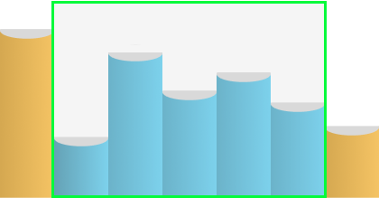
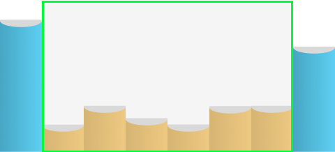
Each of these is like an album of pictures. What changes here is how much time passes between taking pictures. So if I look for where the time gaps between pictures get longer or shorter, I can split up 10s of thousands of pictures into albums.
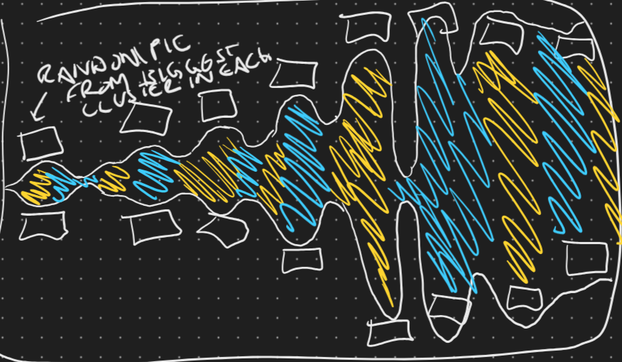
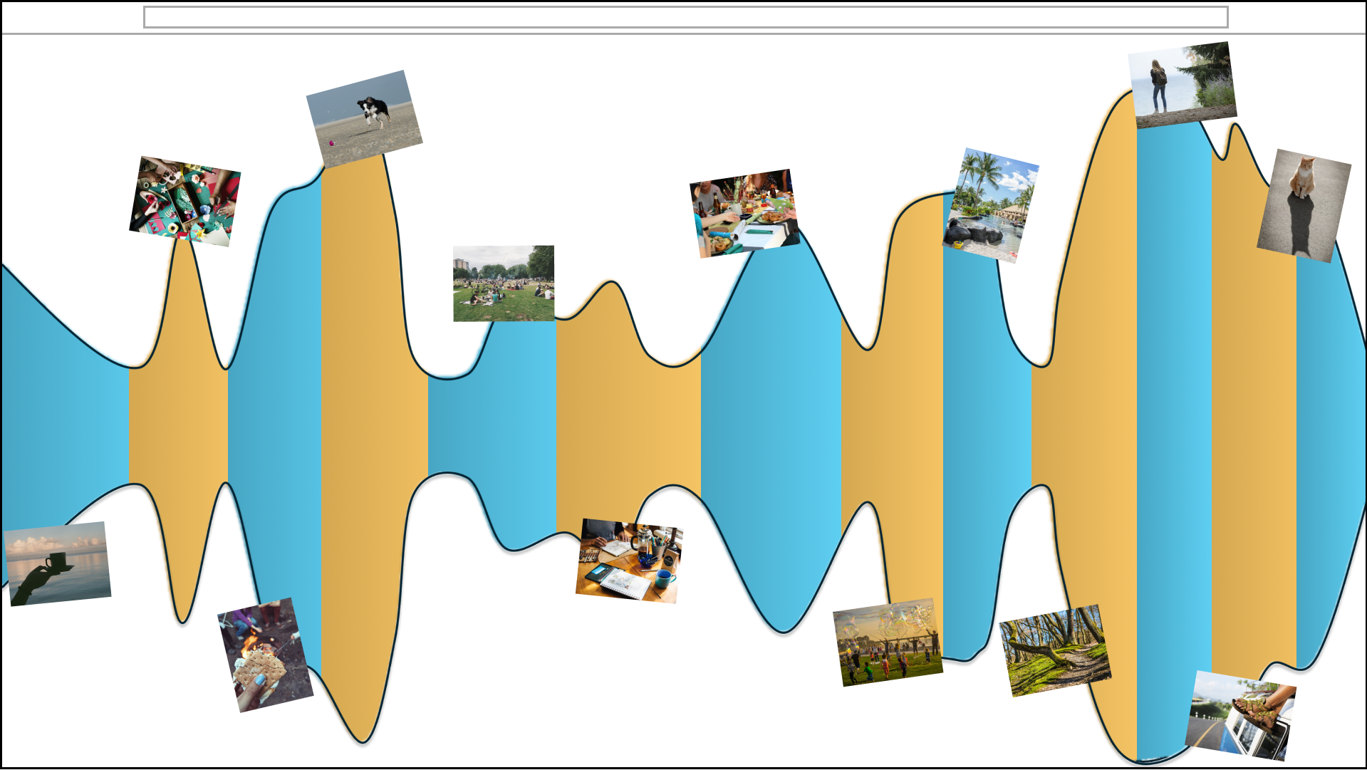
So, to get to the tabletop from our 10s of thousands of pictures, I looked at the gaps of time between when pictures were taken and use that to find where related pictures and major events start and stop. Visualising those starts and stops as a lot of albums on a shelf.
Albums and Tabletops
Zooming these albums all the way out to show everything, sort of blurs together, so I chose a river visualization to show this highest level. This long river of all of our photos across time makes it easy to see patterns and find the general area of pictures we're looking for.
Choosing one part of the river gets us to the tabletop next to a row of related albums that we can browse. By putting these two basic pieces together -- the tabletop and the river -- I created a simple way to socially look at our digital pictures.
