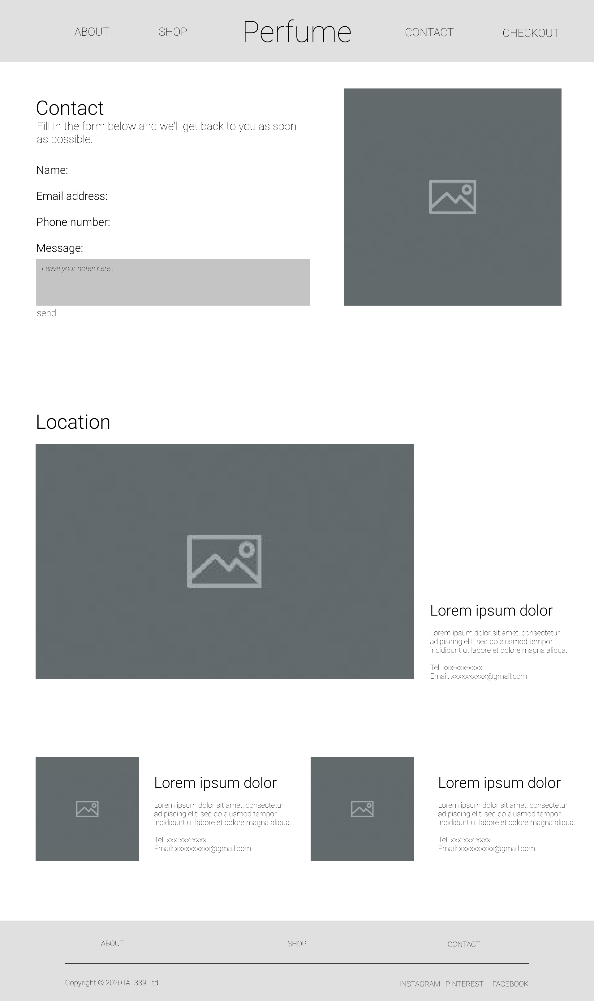
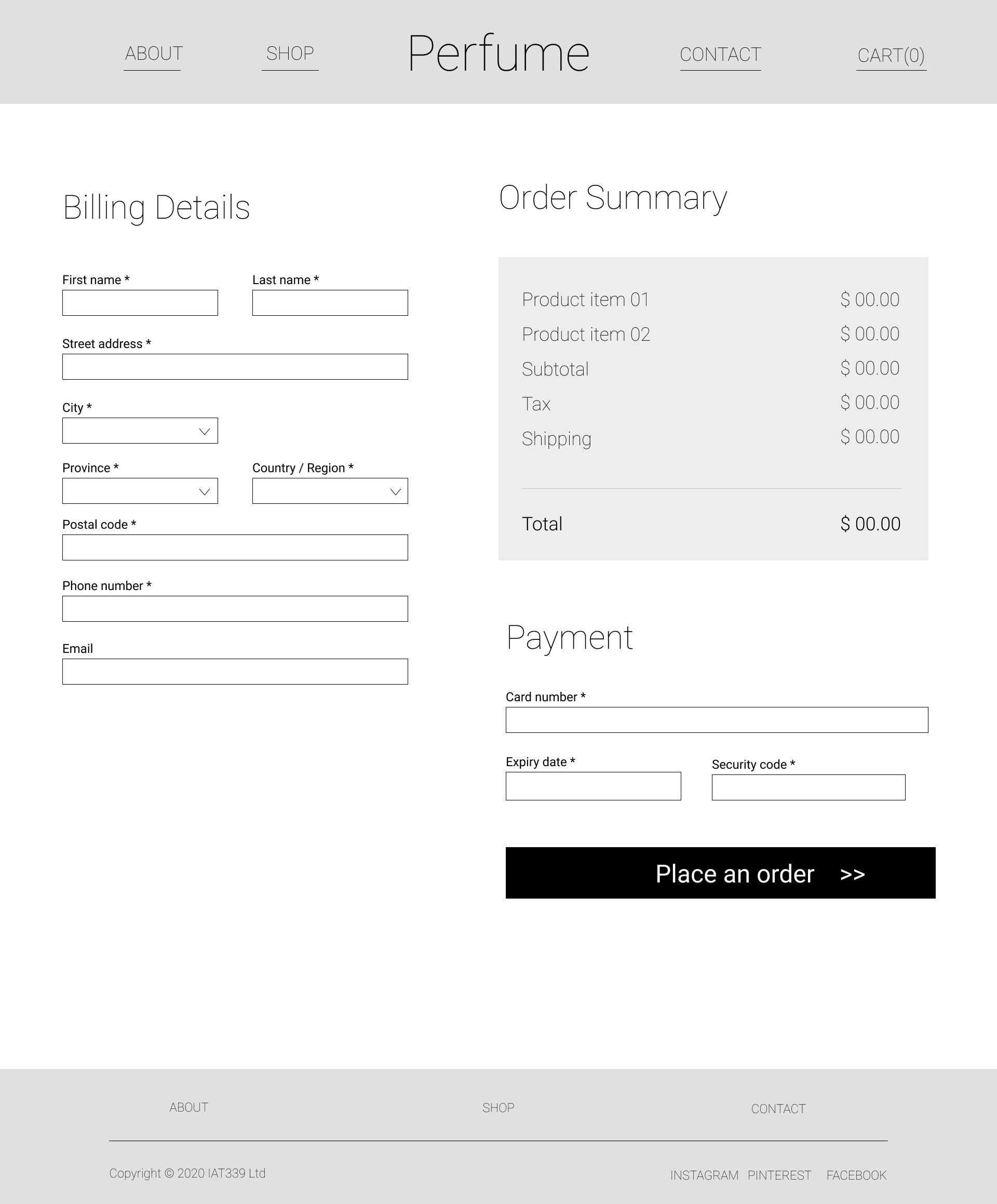
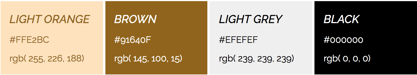
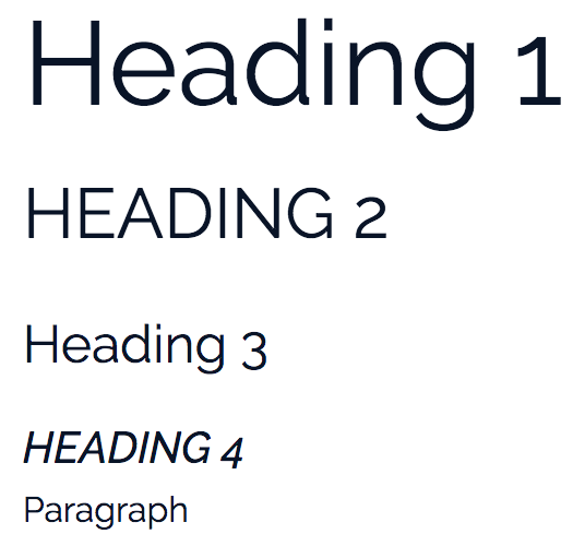
DAN PENG

D.P.

Menu.

Team

Dan Peng, Nat Li, Memory Ji

My Roll

Web Designer & Developer

Applied Skills/Tools

Wireframing, GitKaren, Html5, CSS3 & Javascript

E-Commerce Website

Context

This is a coursework to design an e-commerce website for a fictitious perfume company. We applied a minimalism style to avoid distracting customers' attention by over-loaded visuals. Moreover, we intended to develop an easy-to-use website to faster the process that customers make a decision to purchase our perfumes.

Process

Step 01

Create wireframes collaboratively to illustrate page layouts.
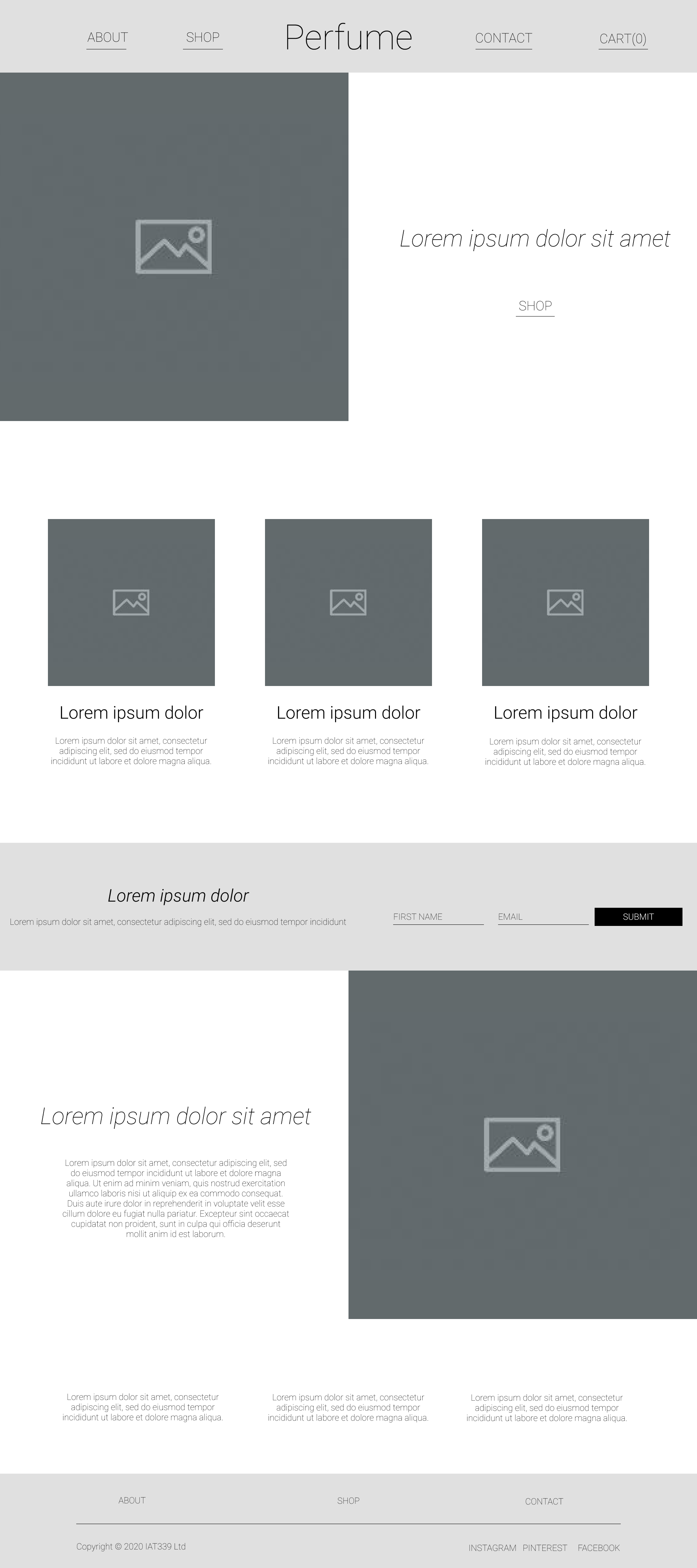
Wireframe for home page
Home page wireframe made by Nat
Wireframe for contact page
Contact page wireframe made by Memory
Wireframe for checkout page
Checkout page wireframe made by Dan

Step 02

Prepare a style guide to define a set of visual elements on the site.

Website Color Swatches
Typography
Typography
Call-to-action Buttons

Step 03

Refine UX and visuals based on user feedback.
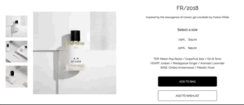
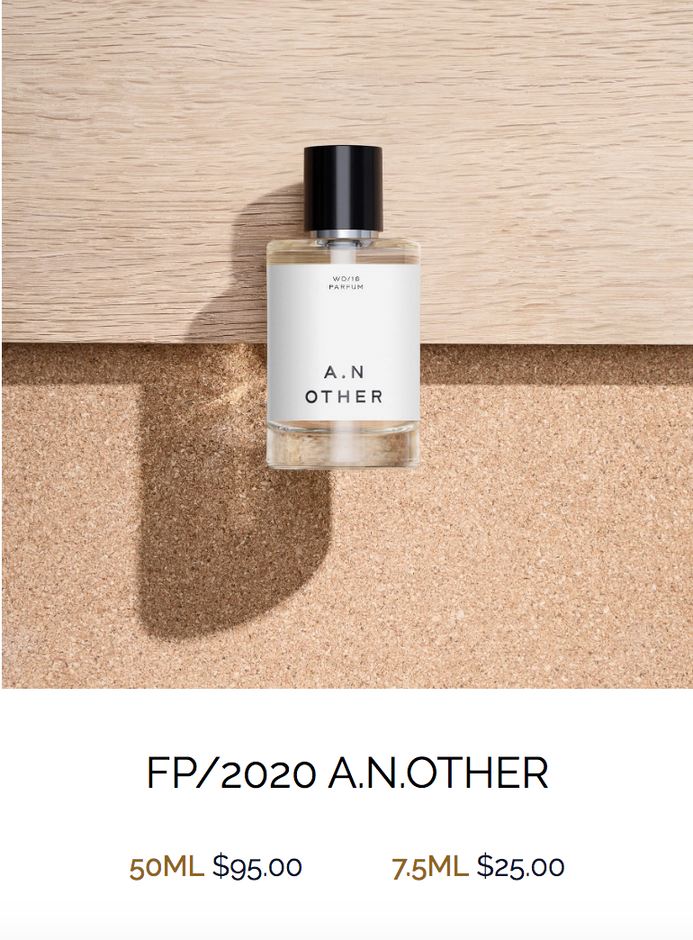
What did users say?

"I want to know the price when I'm browsing the products without clicking to see the details."

What did we do?

Screenshot of product listing without prices
Screenshot of product listing with prices

Step 04

Implement it with coding and update prior style guide.

Challenges & Solutions

UX Concerns

The biggest challenge is to design a good user experience on an e-commerce website. Originally, we made some assumptions based on our prior experience of online shopping, but assumed UX design was not realistic or believable. Fortunately, in the late stage, we conducted usability test that observing users’ behaviours when they were browsing our website. Beyond that, I also studied related researches for improving the user experience further.

01

Give users in-time visual feedback about their actions.

Select a size
Change text color and add an underline as the visuals confirming a user's choice.
Add to bag
A pop-up message aims to confirm that a user has successfully add this product into the cart.
Place an order
A confirmation message will appear to tell users that they have successfully placed the order.

02

Explain professional words or phrases to users.

Use tooltip for explaining Security Code to users.

Coding Challenges

Additionally, in the implementing process, many interaction effects on the website need developing with Javascript. However, we had little knowledge about that. Therefore, I had to watch tutorial videos and went through online resources to learn it further by myself, and then applied my learnings to implement these interactive features on the site.

Create a pop-up message
(click the buttons to see code snippets)

HTML

CSS

Javascript

HTML:
<!-- Buttons -->
<a href="#" class="button-1" role="button">Add to bag</a>
<a href="#" class="button-2" role="button">Add to wishlist</a>

<!-- Popup Content -->
<div class="popup" id="popup">
  <div class="overlay-bg"></div>
  <div class="content">
    <div class="close-btn" onclick="popup()">☓</div>
    <h3>You have successfully added this perfume
    into your cart.</h3>
    <a href="checkout.html" class="button-1" role="button">
      Checkout
    </a>
    <a href="products.html" class="button-2" role="button">
      Continue shopping
    </a>
  </div>
</div>
CSS:
.popup .overlay-bg {
  position: fixed;
  top: 0;
  left: 0;
  width: 100vw;
  height: 100vh;
  background-color: rgba(0,0,0,0.8);
  z-index: 1;
  display: none;
}

.popup .content {
  position: absolute;
  top: 50%;
  left: 50%;
  transform: translate( -50%, -50%) scale(0);
  background-color: white;
  width: 60%;
  height: auto;
  z-index: 2;
  text-align: center;
  padding: 2rem;
  transition: all .2s ease-in-out;
}

.popup .close-btn {
  cursor: pointer;
  position: absolute;
  top: -1.5rem;
  right: -1.5rem;
  width: 3.5rem;
  height: 3.5rem;
  font-size: 2.25rem;
  line-height: 1.6;
  text-align: center;
  background-color: rgb( 145, 100, 15);
  border-radius: 50%;
  color: white;
}

.popup.active .overlay-bg {
  display: block;
}

.popup.active .content {
  transform: translate( -50%, -50%) scale(1);
}
Javascript:
function popup() {
  document.getElementById('popup').classList.toggle('active');
}

Takeaways

When designing for a good user experience, I walked close to my users, observed their behaviours, and listened to their needs. In this process, I improved my understandings of user-centred design that every design decision should be based on authentic needs not on visual appeal. In other words, the way visuals work is to satisfy the needs of target users. That is what I will obey with in my future web projects.

>

BACK TO TOP