Selections by Design Within Reach
Context
- 4 Week Academic Project
- Goal: To help solve a client's business problem via a technological intervention
Role
- Research
- Brand Strategy
- Interacton Design
- Contente Strategy
- Video Production
Team
- Cyrus Lau
- Danny Blackstock
- Valerie Cheng
- Malcolm Kutar
The Pitch
We redesigned the in-store experience to be like having a personalized tour of a design museum. Selections by Design Within Reach helps new, design-curious customers easily find design inspiration, compelling stories, and comprehensive information about the pieces that suite their taste as they navigate the store. Additionally, we are increasing engagement between them and the brand, store, and product.
Main Challenges
1. Design Within Reach's underlying business problem was that they still retained a very negative brand perception from previously producing knock-off products - distancing themselves from their core brand values.
2. The people problem was the intimidation of visiting a B&M store like Design Within Reach, primarily due to lack of information regarding a product*. This problem is emphasized in designer and knock-off furniture, as many consumers will lack the knowledge of what makes a product authentic or designed, and may even distrust the store staff (their primary source of knowledge) that they perceive to be sales-centric.
*Stats from Think with Google Research (2013) - 90% of consumers turned to devices to help them make a product decision, 66% of consumers couldn't find the details of products they needed while visiting a store, 33% of consumers prefer to use their smartphone to find additional info rather than seek an employee.
Establishing the Brand

Design Within Reach CEO John Edelman, who took over DWR and ceased the knock offs, on his strategy regarding DWR's negative brand perception and educating consumers of authenticity. His message helped guide us towards what our solution needed to achieve.

After further researching DWR's brand values, we connected them together in a process that would help inform consumers and realign DWR with their brand values, thus aiding their brand perception problem. Since the concept of authenticity is a fairly intangible brand value, we deconstructed authenticity as one part Designer (manufacture, history, process) and one part Product (detailing, materials, inspiration).
Sprint
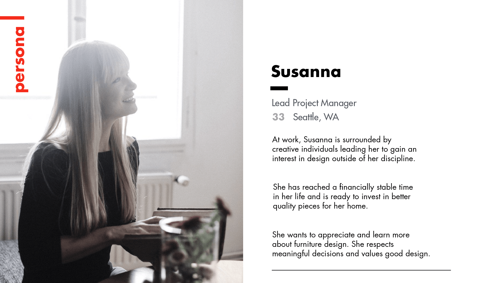
As part of our 5-day GV sprint, we created a persona that reflected our target audience to help constrain and guide our sprint process. Our goal was to convert everyday consumers (who may or may not be familiar with design) into loyal followers of design and DWR through the storytelling and education of the brand's values (via their products) in store.
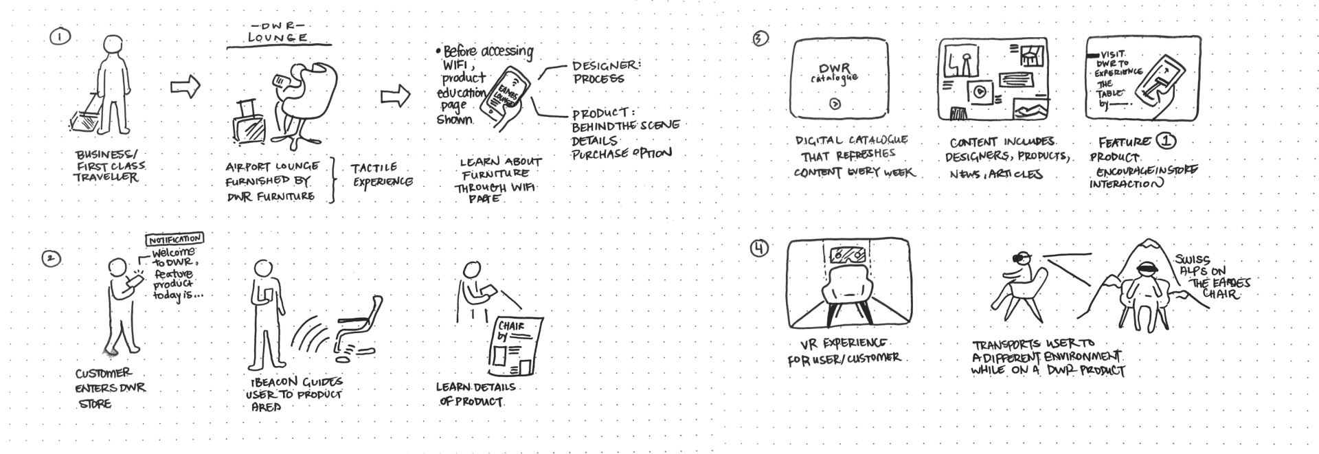
Through the sprint process, we managed to ideate on several solutions before deciding to implement and test the in-store app. The outcome of the sprint was very successful, with our app testing yielding positive reviews and insights that reaffirmed to our team that we were heading in the right direction. For example, we learned that (in a similar luxury furniture store), customers still questioned the authenticity of products and were often scared, intimidated, or off-put by staff.
Case Study
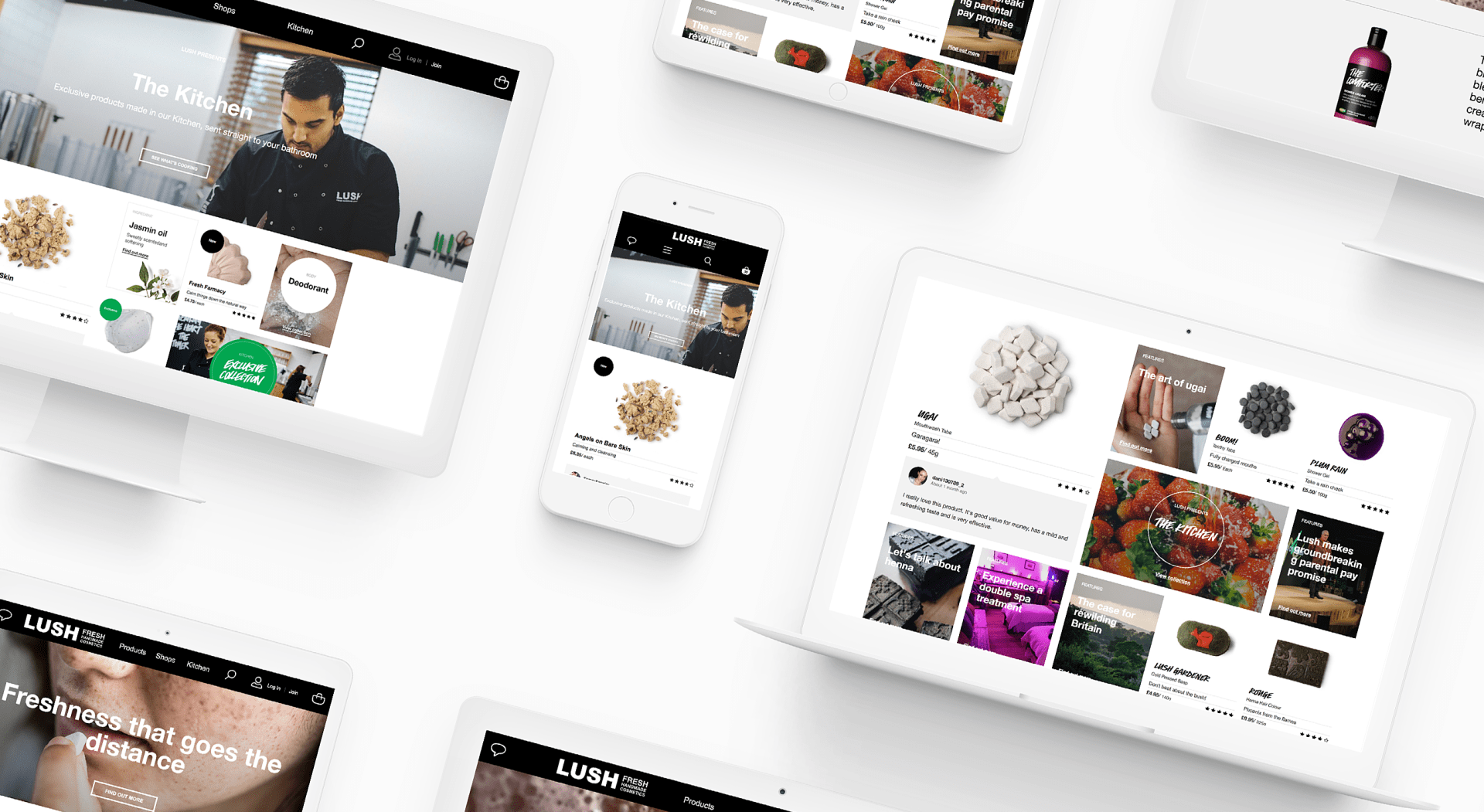
In order to gain a stronger understanding of how to do design for a storytelling experience, we looked at the work Method did for Lush. Method's work heavily paralleled ours as their goal was to use Lush's products to illustrate their brand values and change their brand perception of "just another soap shop". We incorporated Method's style of visual storytelling using strong type, concise copy, and inspirational photography and filmography in hopes of maximizing engagement during the in-store experience.
Our Solution
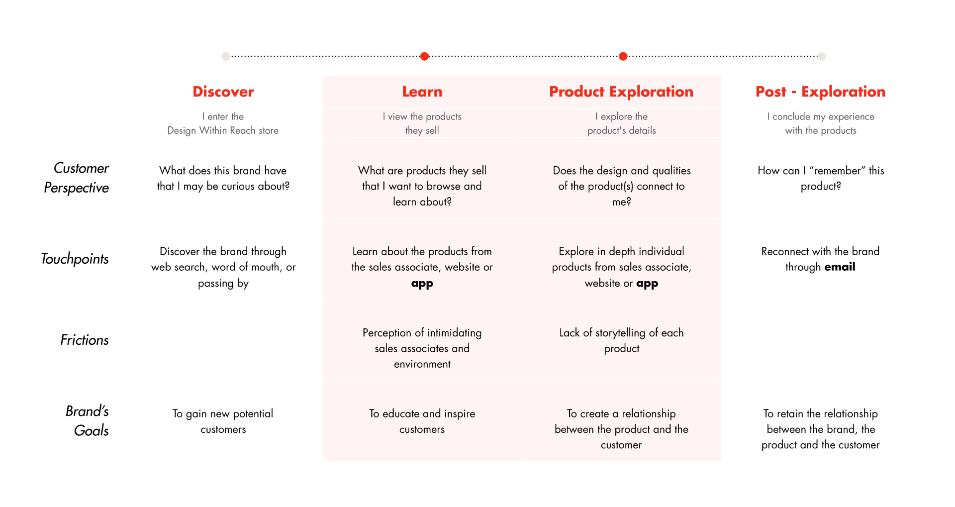
Our journey framework for our solution that we constructed for our persona. We observed customer experience in DWR’s retail environment and identified the key frictions and potential touch points for intervention, specifically in the first interactions with products. The major painpoints of the retail experience are friction with sales associates and the lack of storytelling or in-depth information.
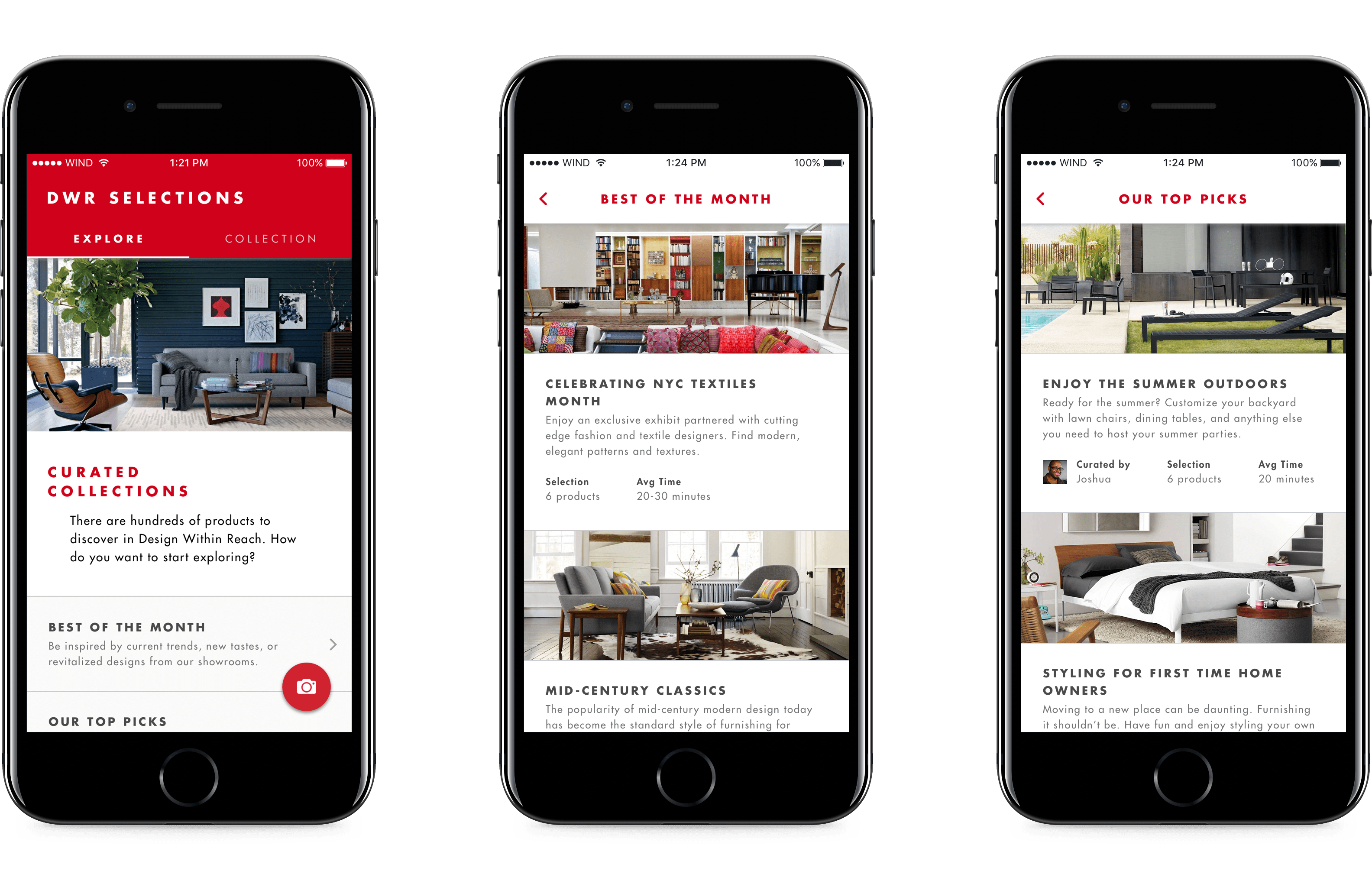
Starting the Tour
Once the user enters the store, they will be handed a mobile device with the DWR Selections app pre-installed. Users will be prompted through a quick onboarding to show them how to use the app. Afterwards users can browse through various curated tours categorized into three types to help DWR highlight different types of products.
"Best Of the Month" is specifically curated by DWR to inform and inspire customers about latest design trends. This helps DWR's reputation as design tastemakers and educators.
“Our Top Picks” is curated locally by in-store employees to highlight their personal tastes/style and showcase their knowledge. This affords a dialogue between employees and the customer, with users potentially connecting with someone with similar design taste. Additionally, it makes it easier for people to approach sales associates for help when needed.
“Exclusive Products” (not seen) features new pieces exclusively sold at DWR while highlighting DWR's continued relationship with the design community, such as giving emerging designers a spotlight for their work.
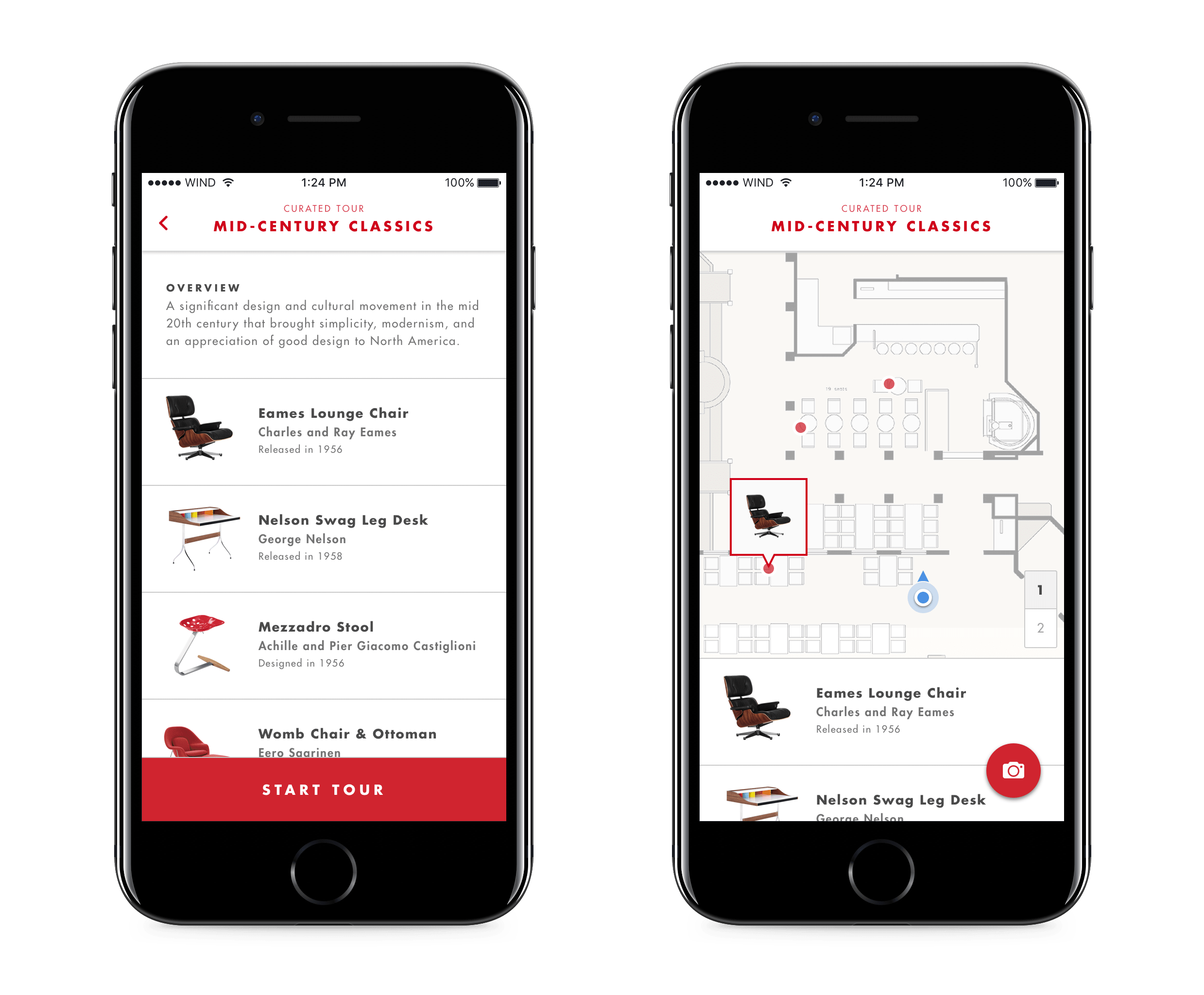
In-Store Navigation
After a tour is selected, user's are guided through the store with a wayfinding map (integrated with iBeacon technology). This helps reduce the cognitive overhead of physically finding products and minimizes the paradox of choice and intimidation from the large studio space.
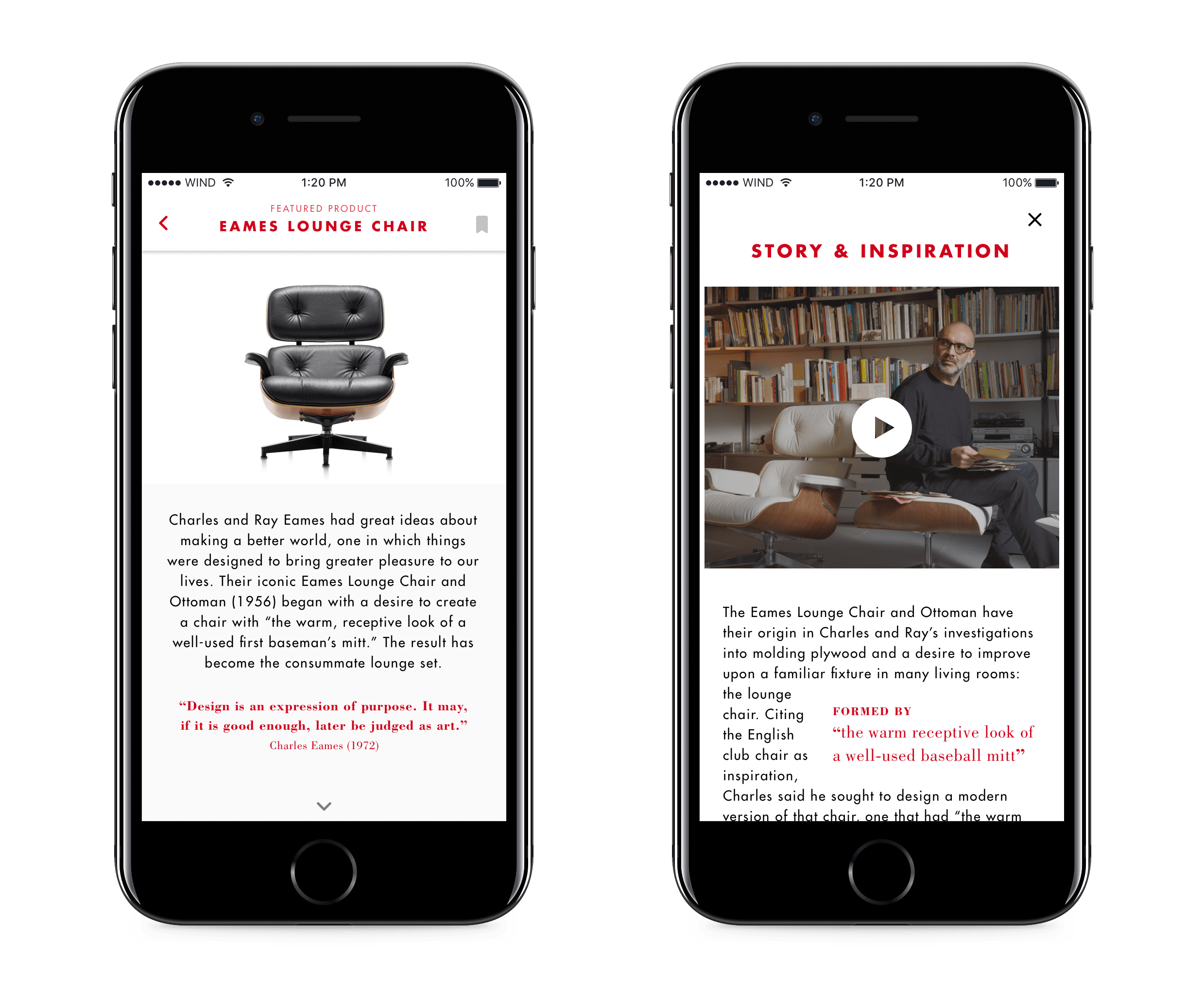
Engaging with the Product
Once users are near, the product's story will popup and they can see the product’s designer, process, details, as well as material qualities and options, helping them explore the product and it's narrative - all while still being able to physically engage with the product. Users can also save any of the tour products they like into their own collection for later.
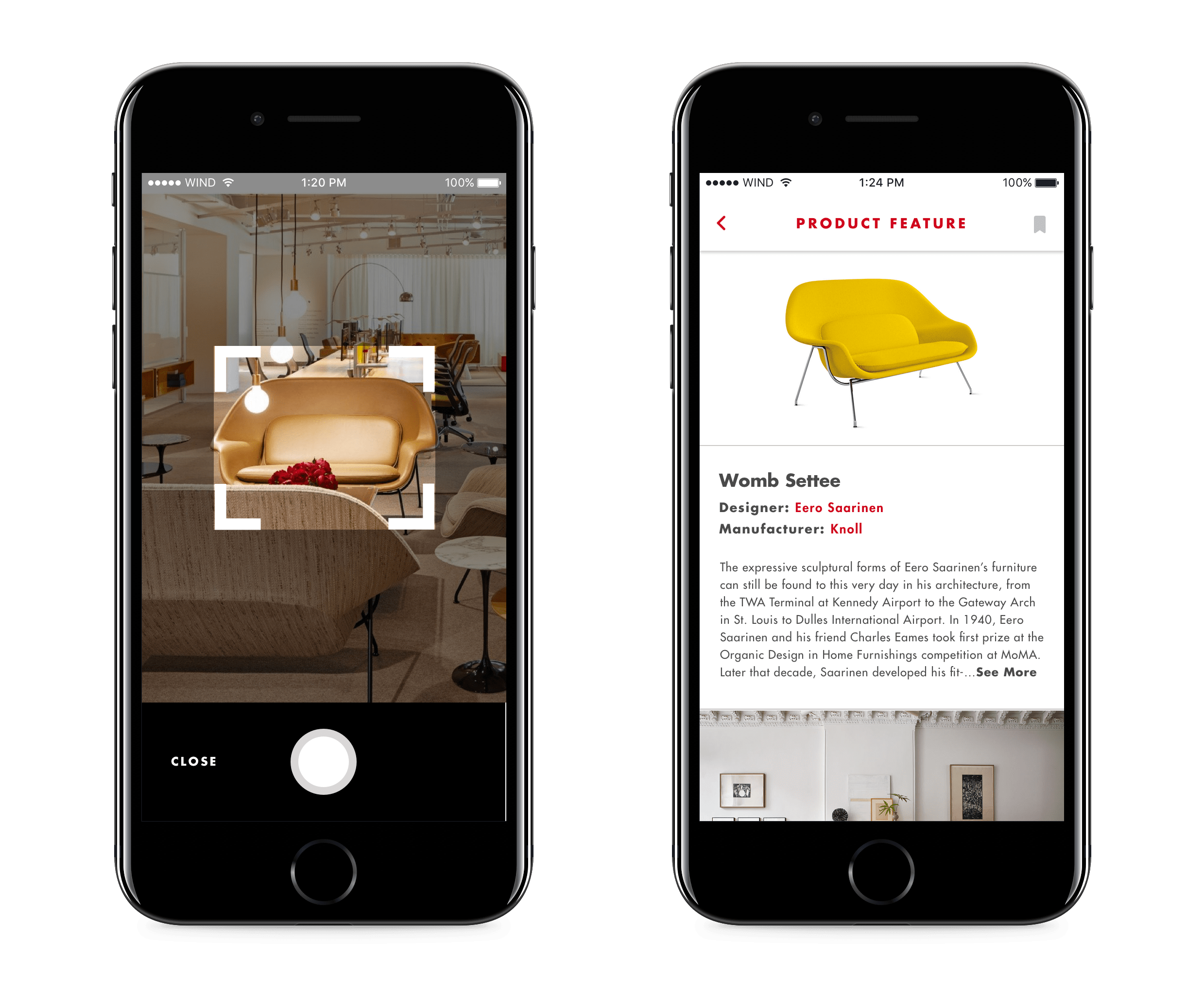
Snap Feature
We realized that a tour should never be static and allowed our users to follow their curiosity. If the customer is following the tour and sees something else that catches their eye, they can quickly scan it with the phone’s camera to learn more and add it to their collection.
Post-Tour Experience
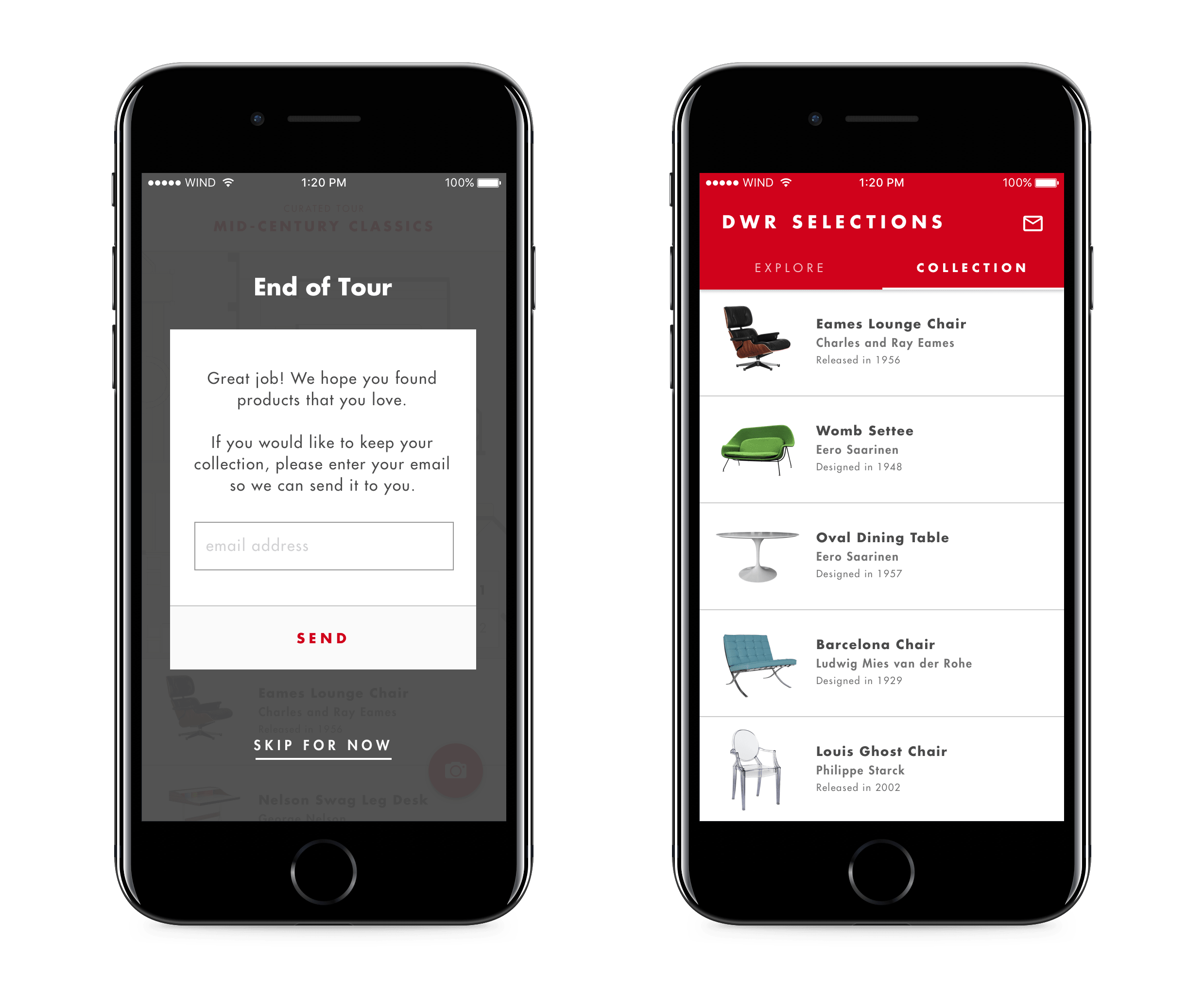
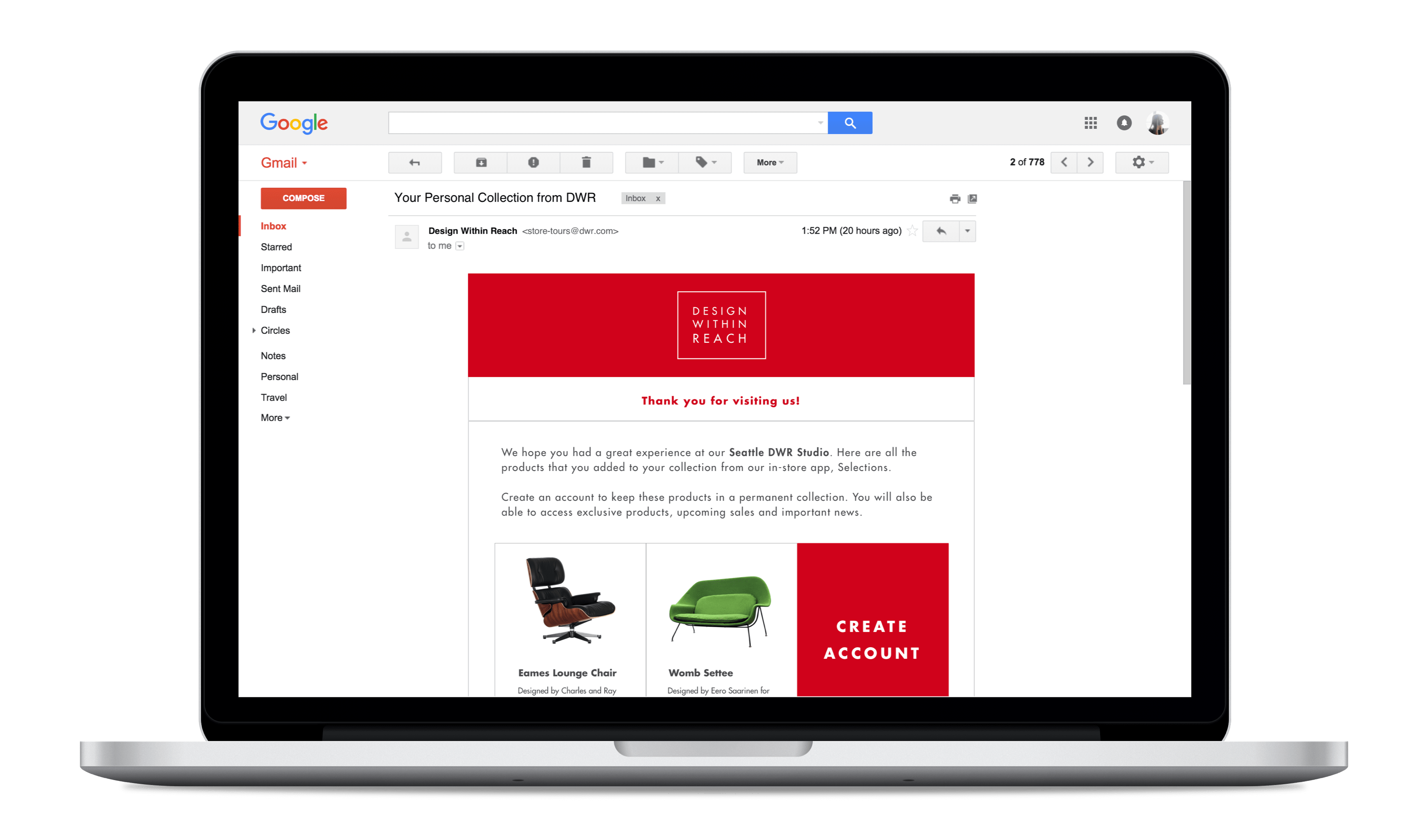
Once the tour is concluded and customers are done exploring the store, users are prompted to register their email to receive their saved collection of products. This keeps them within the DWR ecosystem, where they can contiue to browse, learn, and shop from their home.
Measuring Success
In order to test and measure the success of this project (if it were to ship), an initial MVP could be created and tested that could be as simple as supplying or displaying the content on a tablet along side popular products in a Design Within Reach store. Alternatively, the use of a simpler technology such as NFC cards or QR codes could be implemented as well. Some key metrics we could measure on the shipped product could be engagement-based (such as number of tours conducted), number of collections created, as well as overall store foot traffic.
With the nature of brand perception problems and the common customer frictions in store, qualitative data would likely have to be collected over a longer time period to truly gauge if Design Within Reach is going in the right direction. Our solution would likely be one of many small steps.