Proposal
The goal of the first deliverable was to establish a target audience, understand the different challenges they face, and identify possible opportunities to address their needs. We decided to focus on business travelers who want to maximize their time on business trips while maintaining a work-life balance, so we set out to conduct some preliminary user research with members of our user group to understand their experiences.
Based on our research, we created a persona to embody our user group, and each member of our team generated one idea for an app that would address our audience's needs, while keeping the design requirements of a functional sensor/API in mind.
The three app ideas we came up with were Bizplore, a travel guide with tailor-made recommendations for "Quick Bites" and "Quick Sights", B-Plan, a contingency plan app that would provide users with the nearest emergency services, and Logistical.ly, a trip planning app designed to help users maximize time spent with clients by selecting optimal venues to minimize travel time between locations.
First Iteration
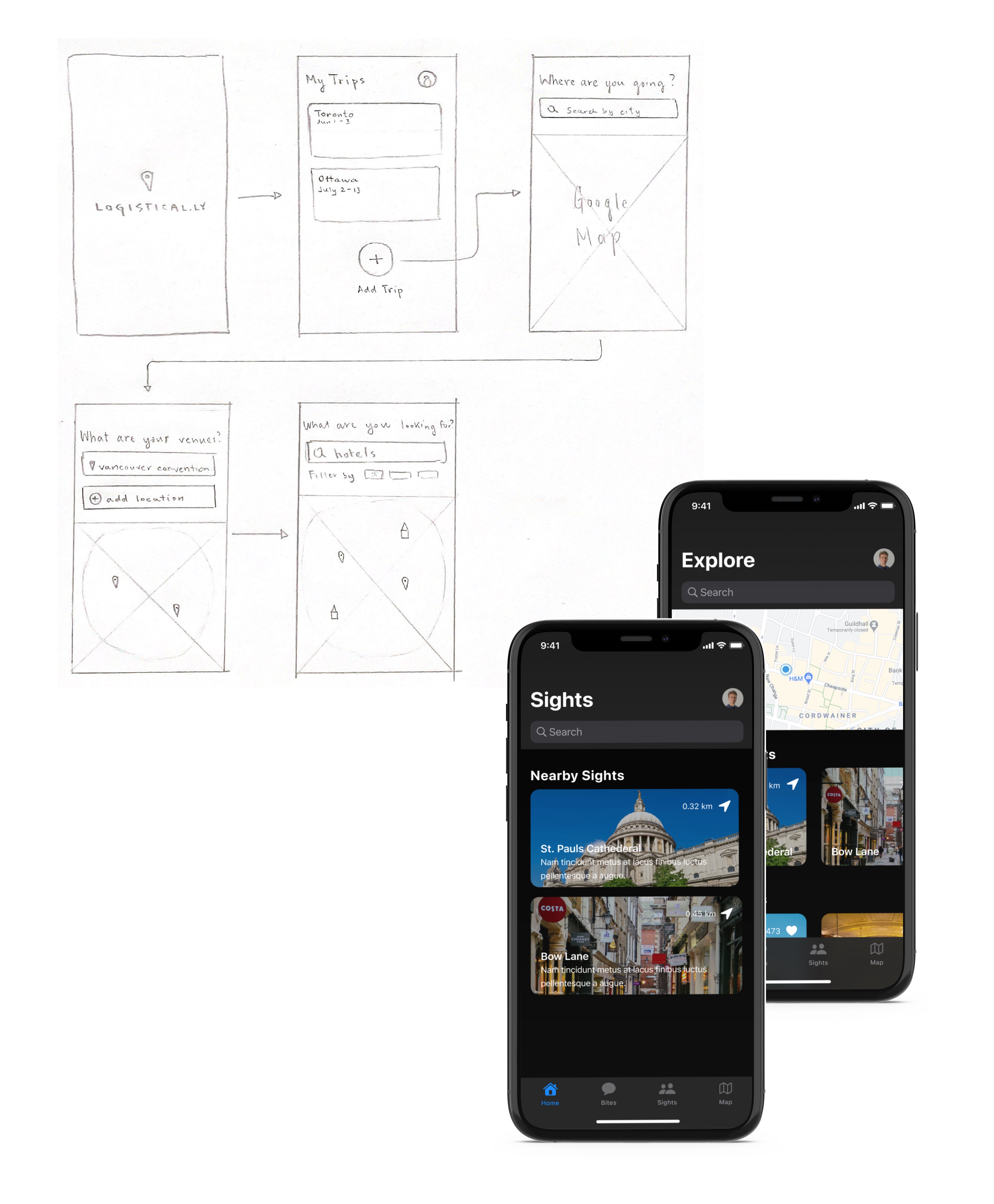
Once we had decided upon one idea to move forward with, the next step was to elaborate on our initial user flow by creating a storyboard to map out the interactions, inputs, outputs, and sensors the app would use. Logistical.ly was chosen as the primary design direction, so our main interactions focused on utilising the Maps API to provide our persona, Natalia, with the ability to plan trips with ease and generate an itinerary that she could handily share with her colleagues.

Second Iteration
Based on the critique we received in the previous week, we
recognized that the direction we had chosen for our application was already too entrenched
in the market to see any kind of real success, so we set out to redefine what Logistical.ly
could offer for a different demographic.
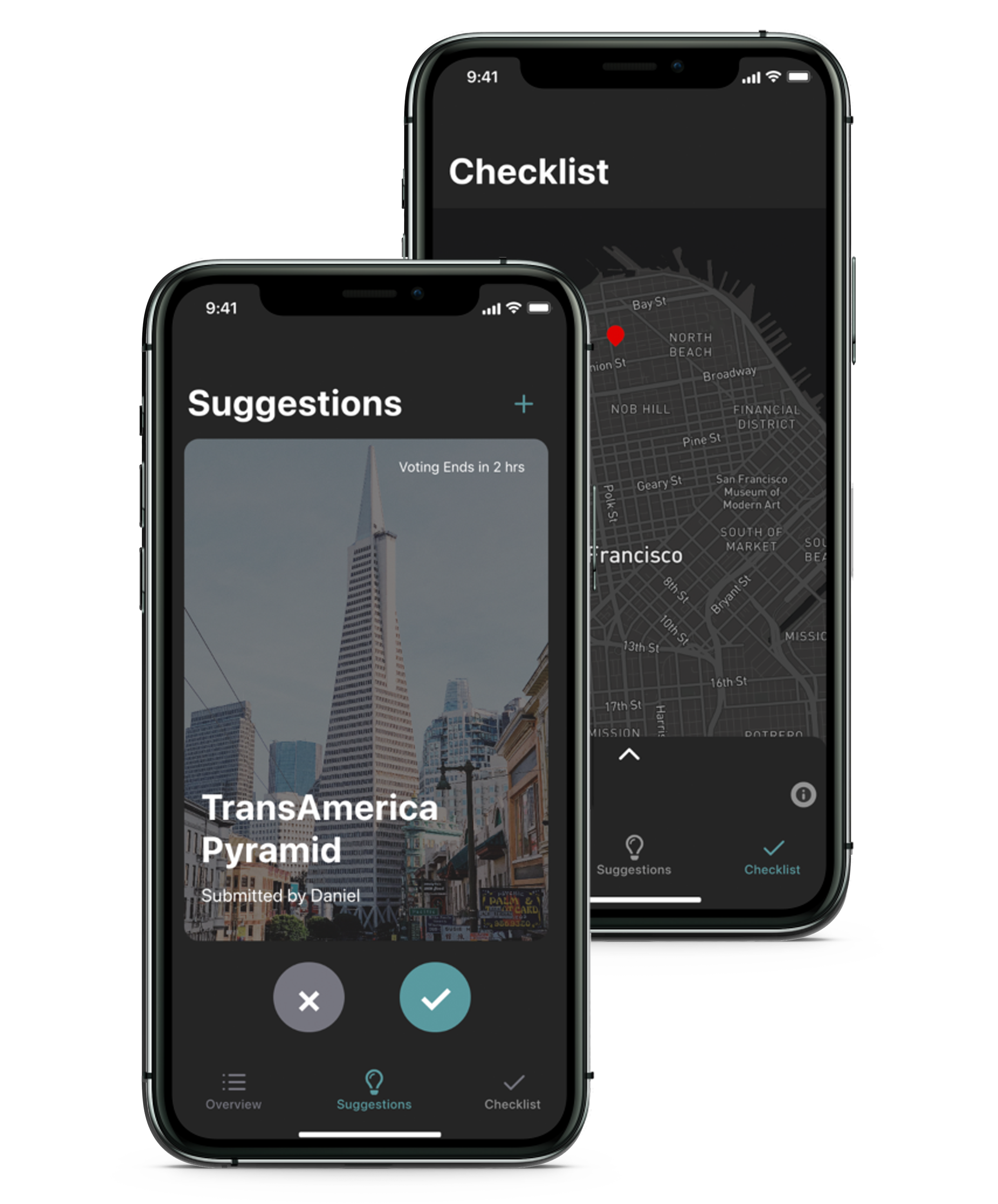
We shifted our target audience to leisure travellers, specifically young adults ages 18-26,
who enjoy traveling with groups of friends. Our refined idea focused on providing users with
a collaborative platform to plan trips with friends by adding suggestions for places to
visit and voting on suggested locations so every member in the group can share their
input. Since we had to refocus the direction of our application, we also needed to reshape
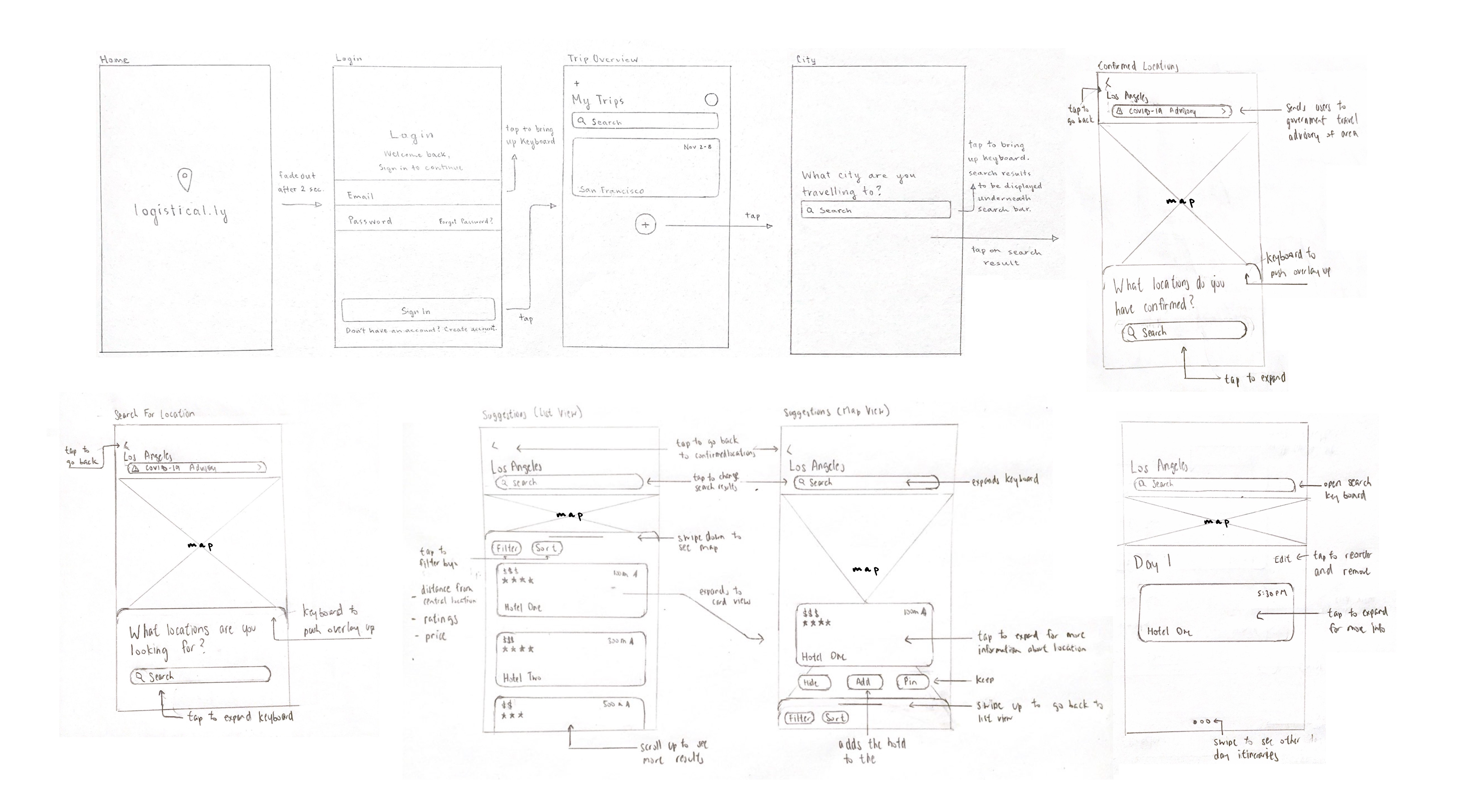
our user flow, so each team member created their own user flow design based on a unifying
style guide for the brand.
First Prototype
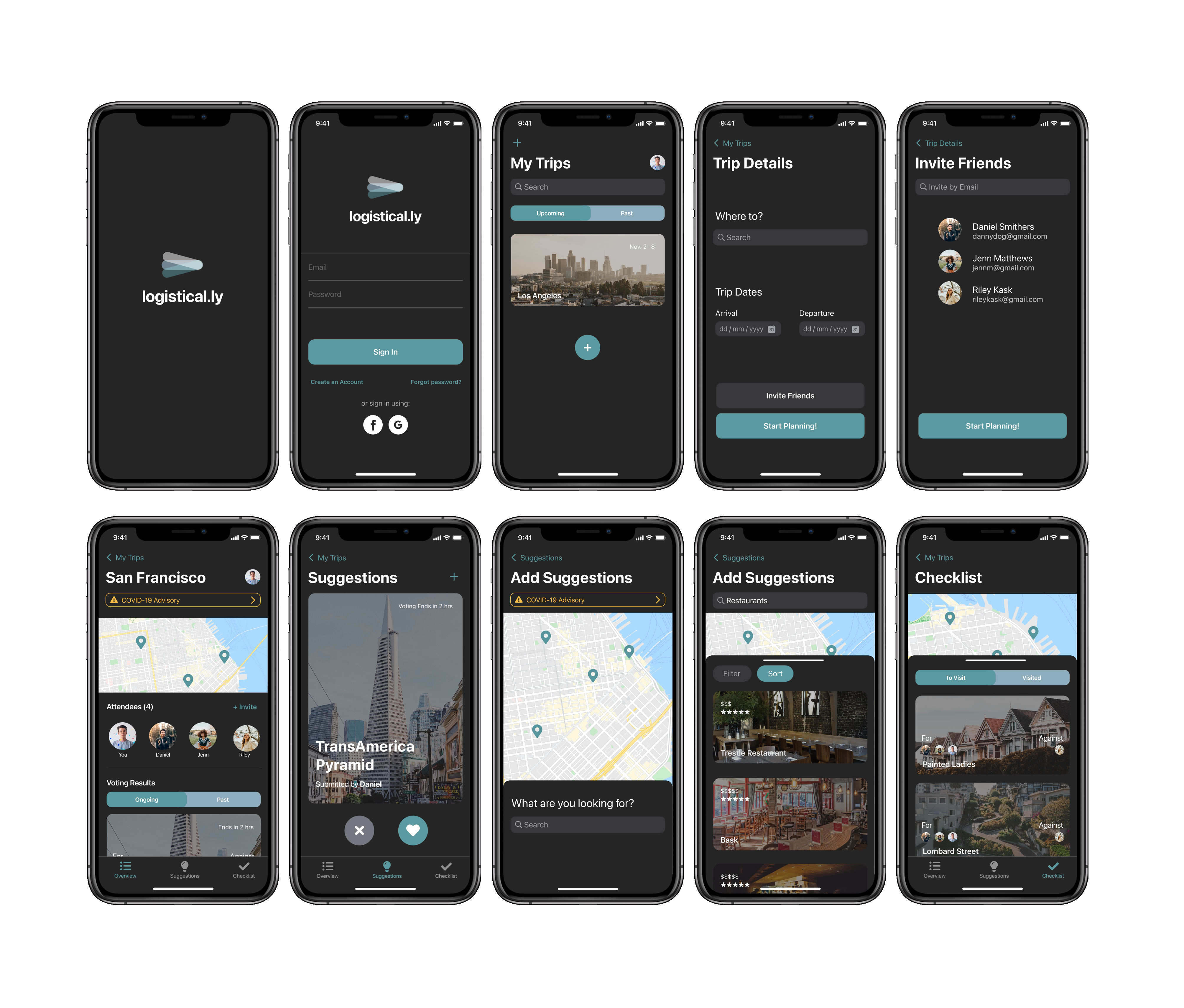
This week, we consolidated each team member's designs into one consistent interface, using the best aspects from each design. This prototype featured a fully fleshed out user flow, a refined interface design, micro interactions for specific actions, and an integrated use of a Maps API.
User Study
At this point, it was time to test out our design by conducting a user study to determine whether Logistical.ly's user flow was effective and logical in the hands of new users. Based on the data we collected, we created an improvement plan for our final design, specifically focusing on incorporating clearer visual cues, conveying more feedback through microinteractions, establishing stronger hierarchy within our interface, and providing more context to the our key features through the use of microcopy.
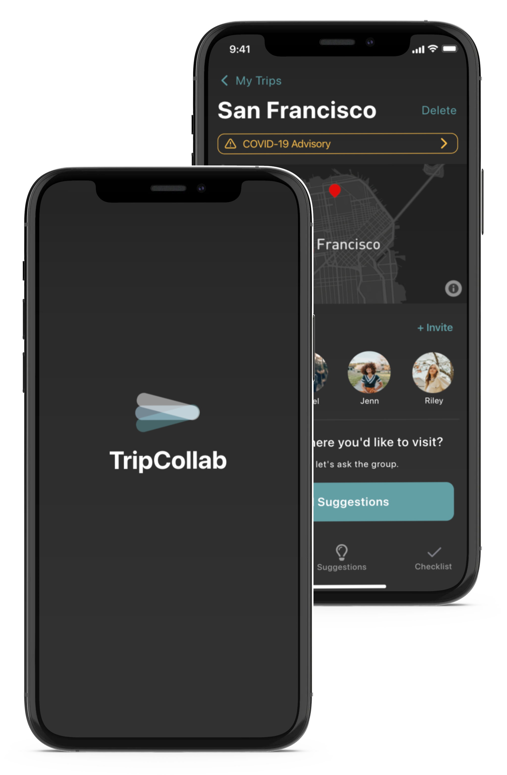
Final Design
In the final stage of development, we decided to change the name of our application from Logistical.ly to TripCollab to better reflect as the previous title did not match the content of the application as well as it could. In terms of changes, the focus was towards better clarity for certain pages and microinteractions so the user would feel no uncertainty when using TripCollab. The end result is a seamless, interactive planning experience that follows the users journey from the start of the plan until the end of the trip.