Vanvero
Brand guidelines for photography startup Vanvero
Overview
In August 2014, I was tasked with developing Vanvero's brand. Vanvero was a photography gear startup company that sold a marquée product known as the Camvertible, a compact camera stabilizer. I was asked to design the company's logo, and create a set of guidelines that encompassed Vanvero's values, voice, and image.
Process
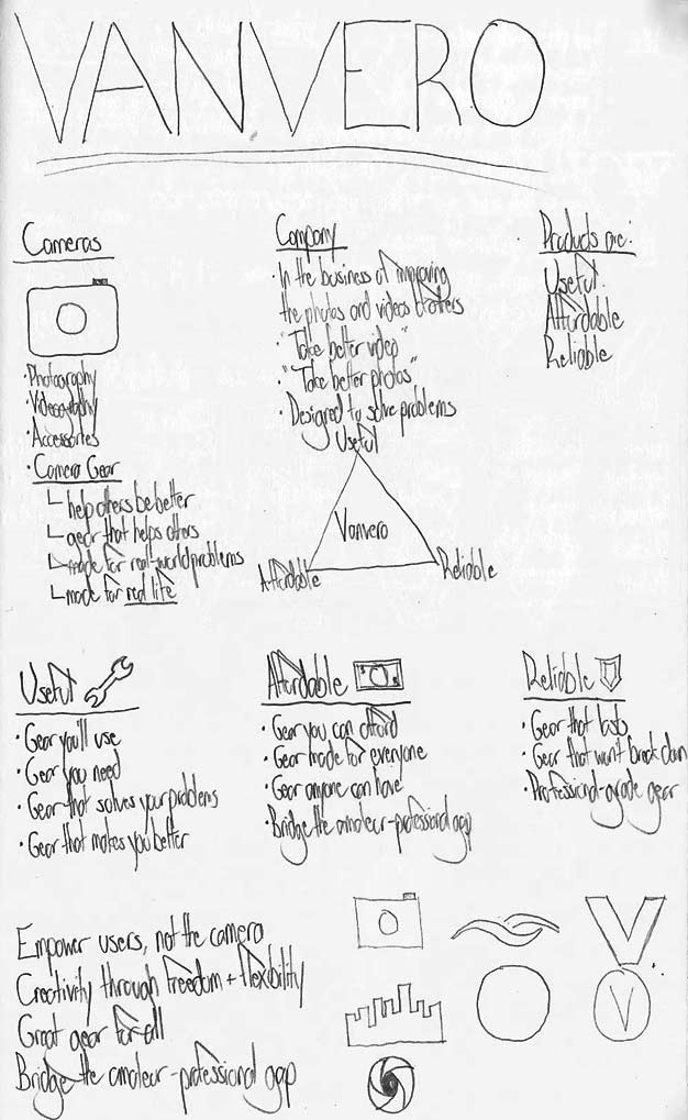
I began by meeting with the company's CEO in order to talk about Vanvero's goals, aspirations, and values. My aim was to chat with the CEO, learn the company's vision, its mission, and its key values, and take copious notes. As I took these notes, I found myself clustering words and phrases together into key themes, and determined that based on what the CEO told me, the brand revolved around 3 key values: usefulness, affordability, and reliability. The idea was that the gear that Vanvero produced solved real problems and could be made available for anyone. "Empower users, not the camera" was a phrase I jotted down to synthesize what I had learned in the meeting.
Meeting Sketches
My initial meeting notes clustered into three key values: usefuless, affordability, and reliability. One key takeaway was "empower users, not the camera".
With a general brand outline in place, I began to sketch out ideas for the logo. I needed a logo that respected and encapsulated Vanvero's consumer-focused brand while also representing the company's name. Because Vanvero was simply an invented word derived from "Vancouver", much of my early sketching focused on representing the letter V in a unique way.
Logo Sketches
The early logo sketches riffed off of the letter V, because there didn't seem to be any clearer way to represent the word Vanvero.
As I played with the letter V, I recognized that the twin V sounds in the word Vanvero were quite pronounced and recognizable. As I continued to iterate on the logo, I expanded on the idea that the logo could portray two Vs at once.
Logo Refinements
As I refined the logo design, I focused on representing Vanvero's two Vs. The focus was on an elegant, simple logo that could communicate the brand's reliability and trustworthiness to a consumer.
The final logo is incredibly simple, made up of just 4 lines and the logo's text - its simplicity and elegance communicates the barnd's reliability and trustworthiness to consumers. With the logo and colour scheme in place, I selected clean and readable typefaces and colours to design Vanvero's brand guideline book. The brand book followed the logo's lead - short, simple, and to the point, letting the content speak for itself. Photographs taken from the CEO's own portfolio were used to emphasize the company's focus on great photography.
Brand Guidelines
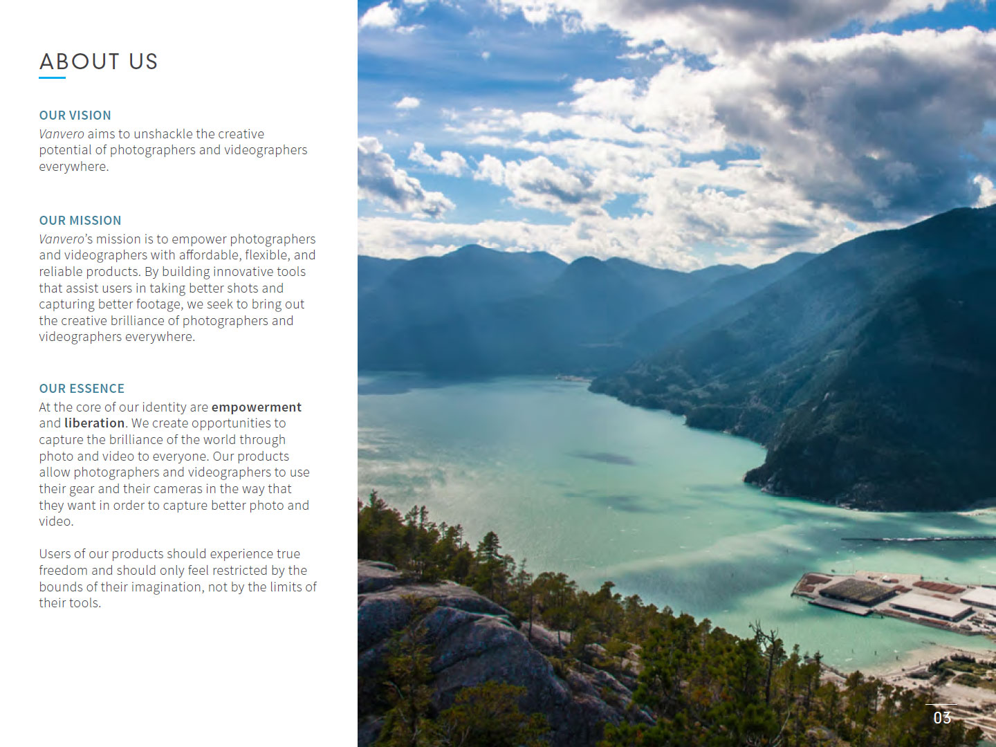
Vanvero's brand guidelines are right-to-the-point, clearly stating the company's mission, vision, and brand essence. The photo on the right was taken by the CEO from Vancouver's Stawamus Chief mountain, emphasizing both the company's dedication to great photography as well as its Vancouver-based roots.
Results
Vanvero loved the brand guidelines, and thought that they did an excellent job of representing the company's values. The brand guidelines were also selected as one of Content Harmony's 36 Great Brand Guideline Examples for their minimalism and conciseness. And the fact that Vanvero's brand guidelines were displayed alongside the brand guidelines of powerhouse companies such as LinkedIn, ESPN, and Uber is an incredibly humbling experience, to say the least!