Carnarvon Cougars
Redefining the Carnarvon Community School identity
Overview
In July 2015, I had the honour of helping Carnarvon Community School redefine its identity. My job consisted of two large tasks - redesign Carnarvon Community School's logo, and brand a new school and community engagement program. I worked closely with Colin Chan, a teacher from Carnarvon Community School, at multiple points throughout the design process to ensure that my work stayed true to the vibrant Carnarvon Community School spirit.
The Logo
I'd like to have the logo printed on a purple base in dark yellow and maroon similar to the current colour scheme. I'd like to make the logo more aggressive.
Colin Chan, Carnarvon Community School teacher, on the design requirements for the logo
The original logo was a cartoony cougar waving a flag, a bit of a letdown for such a dynamic creature. I was tasked with bringing energy to the new design while staying true to the original design tenets.
Carnarvon Cougars Old Logo
This cartoony cougar didn't match the dynamic vibrancy of Carnarvon Community School. And yes, this was the highest resolution file that existed.
Staying true to the original design meant that I had to continue using a cougar, as well as the original yellow-and-maroon colour scheme. I decided to amplify the aggressiveness of the cougar by basing its design off of a real cougar, rather than creating a cartoony abstraction. This meant creating a more angular, geometric face for the cougar, and creating a sense that the cougar is growling, perhaps preparing to pounce.
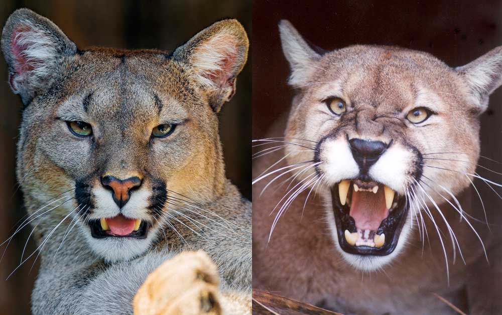
Cougar Reference Images
Real, living cougar images such as these were my references as I sought to bring a more dramatic presence to the cougar logo. The sharp facial structure and intimidating snarl were aspects I particularly wanted to capture.
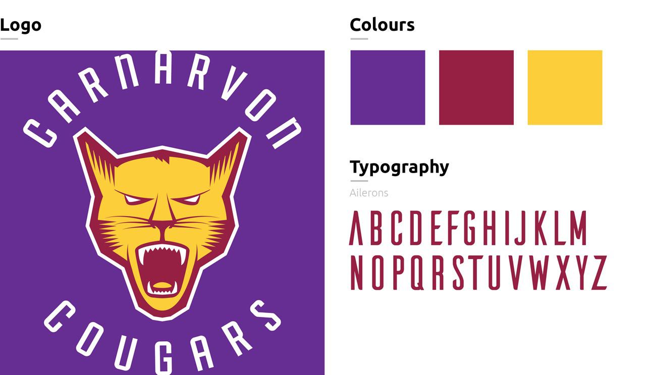
I found that subtly increasing the vibrancy of the colours also brought energy to the design, so the colour palette was made a bit bolder while still conforming to the classic yellow-and-maroon. Finally, I changed the font to Ailerons, a taller, more angular font that emphasized the cougar's aggressiveness. Every choice added up to a far more vicious, ready-to-pounce cougar that better represented the school's vibrancy.
Carnarvon Cougars New Logo
The new logo utilizes a more aggressive depiction of a cougar, more vibrant colours, and a more angular typeface to express the school's high energy.
The Engagement Program
Essentially, it's a concept that looks to integrate teachers, students, parents, schools, community members, stake holders, and local companies to bring pride back to being a member of a public school.
Colin Chan
In addition to the school's new logo, Chan identified the need for a program that would instill in students a sense of pride for attending a public school. As many students were being drawn to private schools with the allure of better education and extracurricular programs, the goal of the engagement program was to reinforce the sense of local community and pride that only public schools could offer.
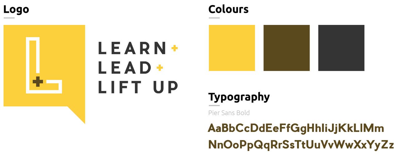
The first step was to give a name to the engagement program. Chan and I eventually settled on the name Learn + Lead + Lift Up, because of its catchy alliteration as well as its focus on engagement outside the classroom. The aim was for students to recognize that learning was only the first part of what made public school great - they would also be counted on to lead and lift up others in the community. With a new name came a new logo, so I designed another logo to elegantly represent Learn + Lead + Lift Up.
Learn + Lead + Lift Up Logo
The Learn + Lead + Lift Up logo references the repeated 'L's and plus signs in the program's name, making it very clear what the logomark stands for.
Once the name and logo were finalized, I was tasked with creating a slide presentation that could be used to pitch the idea to parents at a Meet The Teacher Night. The ideology of the program was loaded, so I needed to make sure that both the slides were simple enough to not overwhelm the students or parents. I aimed to minimize wordiness and focus on brief descriptions of each component (Learn, Lead, Lift Up).
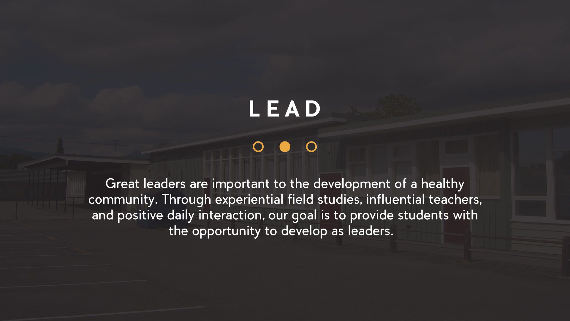
The Presentation
The presentation needed to be minimal yet effective, so I designed one slide around each of the specific components of the program (Learn, Lead, Lift Up) and used a faint background image of Carnarvon Community School.
Results
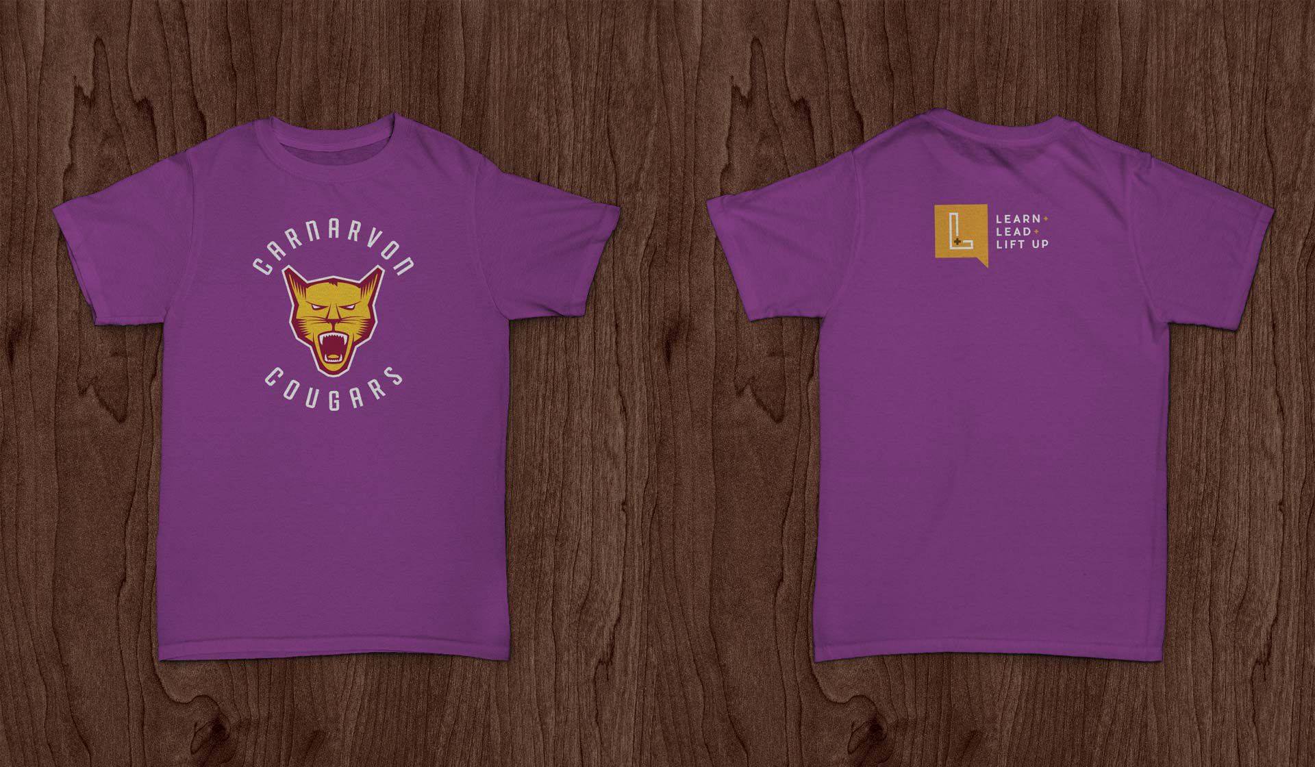
Both the new Carnarvon Cougars logo and the Learn + Lead + Lift Up program were instant hits with the students and staff, who now want to wear their Carnarvon school spirit on their literal sleeves. In response to this demand, I arranged the two logos onto t-shirts - the Carnarvon Cougars logo on the front, and the Learn + Lead + Lift Up logo on the upper back - which will soon be sold to students and staff. It's been pretty amazing to see my work go from a concept to a shirt that students and staff are paying to wear!