During IAT 235 Information Design, students partnered with the Vancouver Plan to help facilitate changes in Vancouver that reflect community needs.
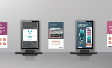
The companion website is intended to provide information for the public to learn what is driving change in Vancouver, specifically regarding the high cost of living. To gather input from the public a large interactive display units would be around the city where users can input their spending habits, and download a personalized infographic from the website. Currently, the website uses placeholder text and images to show a broad overview of the concept. Working in tandem the website and kiosk are meant to be tools that Vancouver Plan can use to educate the public.
My main focus was creating the sitemap, wireframes, visual identity. However over the course of the project I wore many different hats such as the initial prototype concept and basic web development.
6 Weeks
April 2020
Adobe XD, Adobe Illustrator, HTML & CSS
Alex Grant & Bowie Rheault
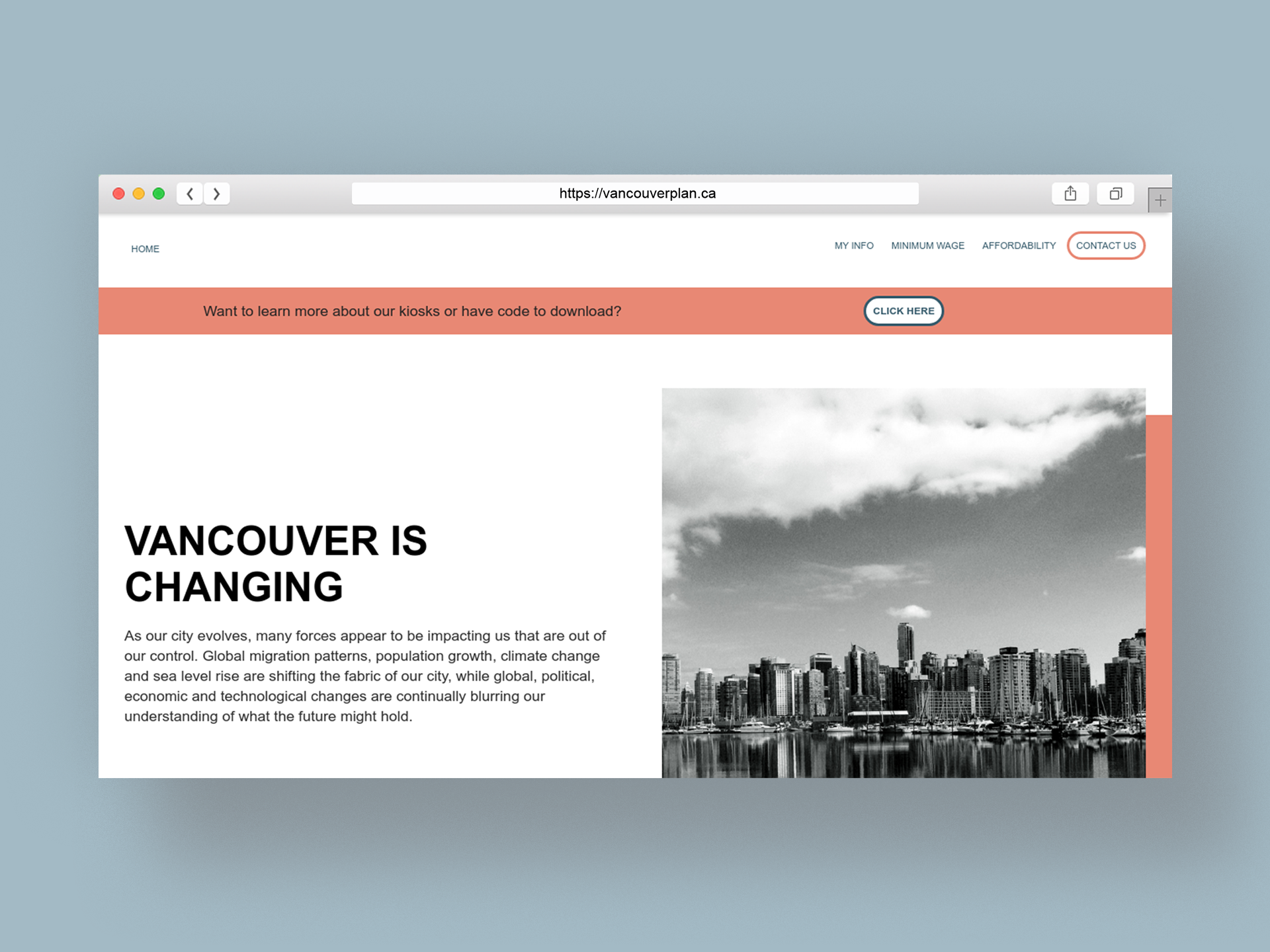
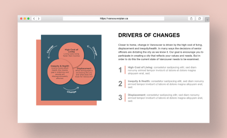
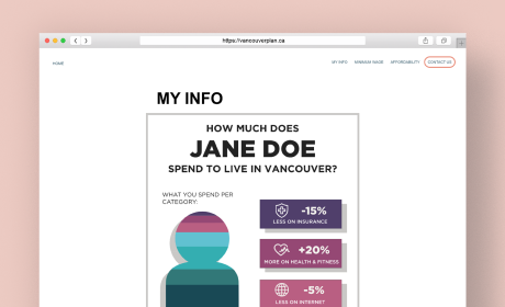
I structured the website to go from a general overview of the concepts on the homepage to include specific information on the issues relating to cost of living. Crafting the organization and categorization to have a logical structure is important for users to an intuitive experience while navigating the website
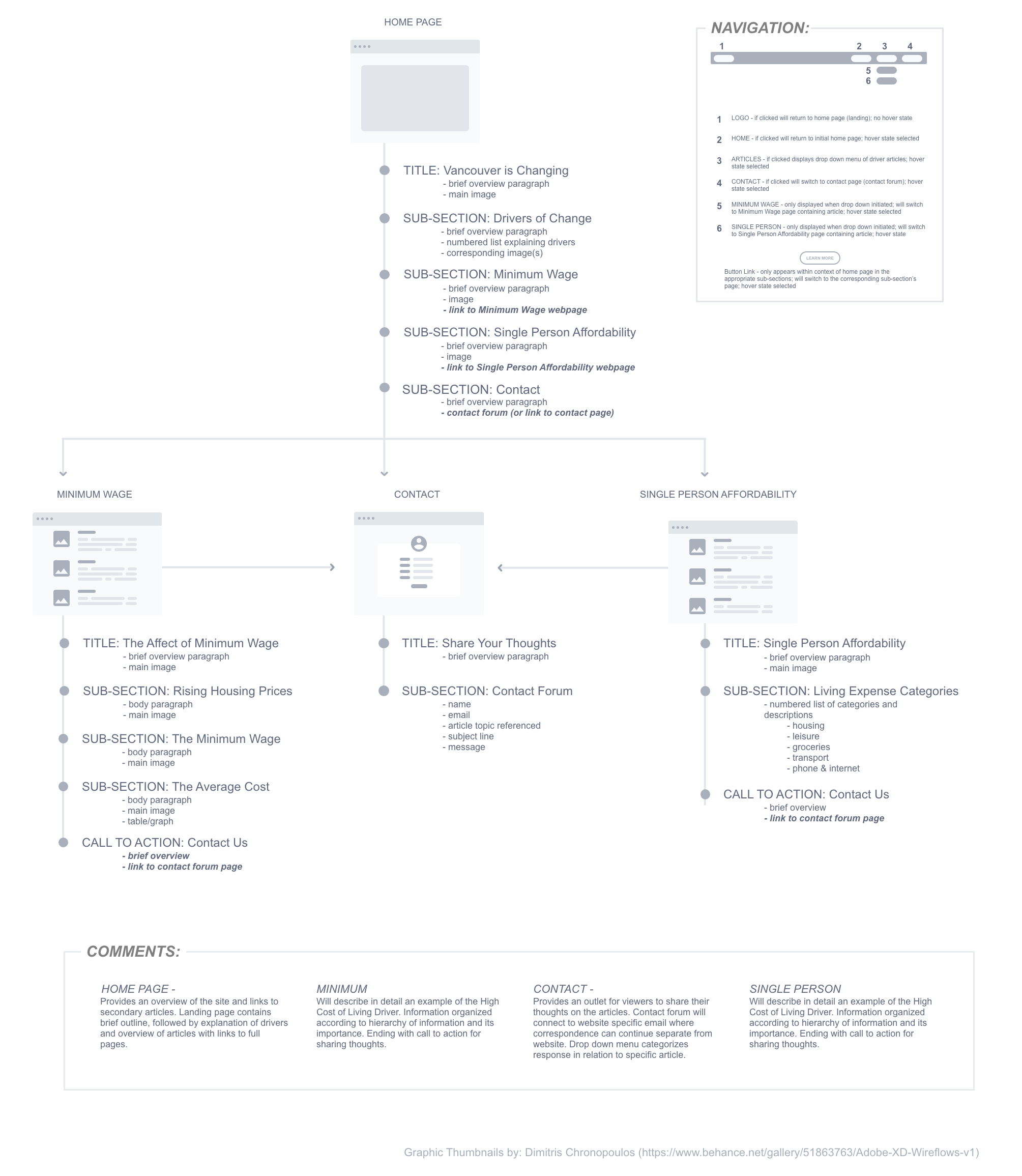
I used the wireframing process to iterate on the design style and layout that suited the content of the website as described in the sitemap. To achieve this I first created a set of sketches to get a general idea of placement and layout. From here I created high fidelity mockups in Adobe XD to work through the mechanics of the design, such as interactive features, image placement, and text sizing. To ensure a responsive design I made sure to make wireframes for both mobile and desktop size so that the content would be scalable.


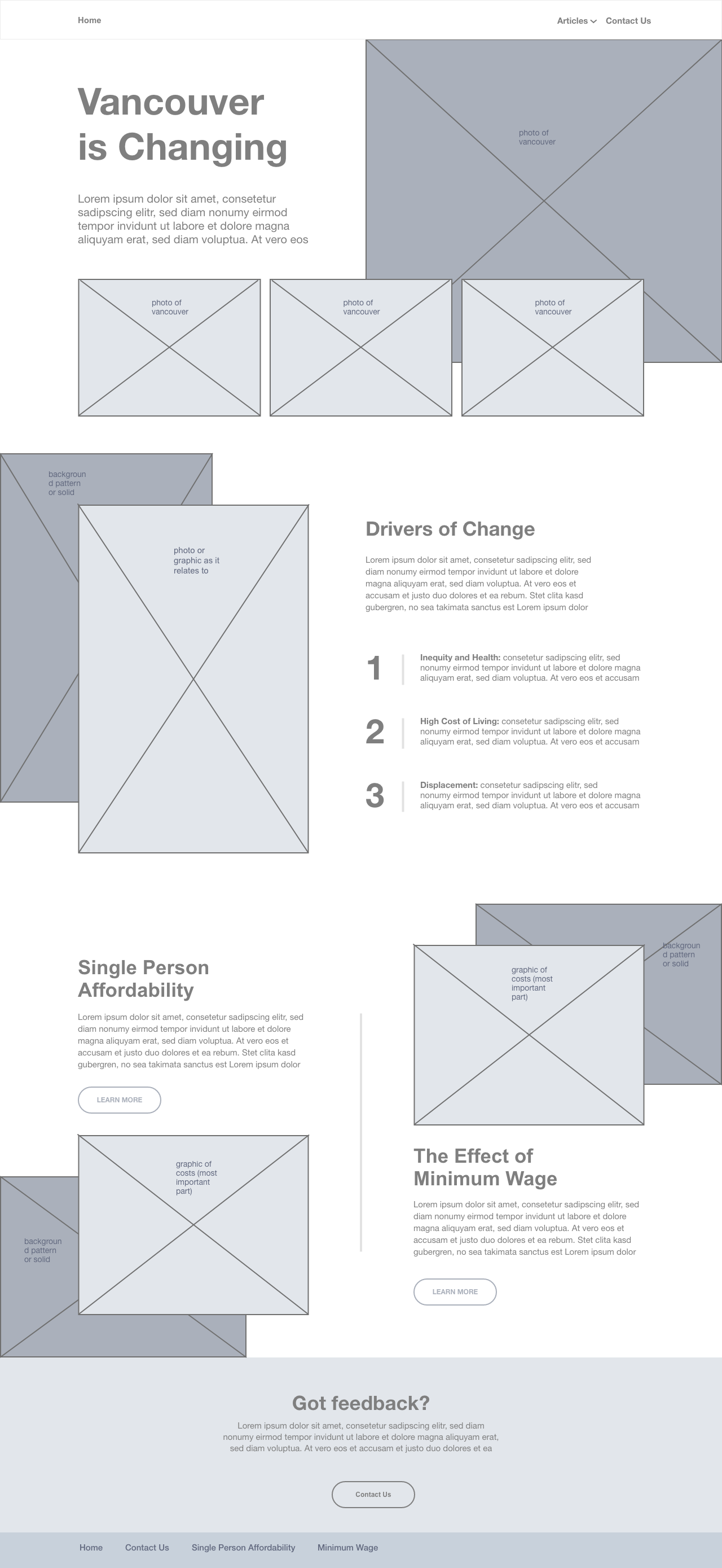
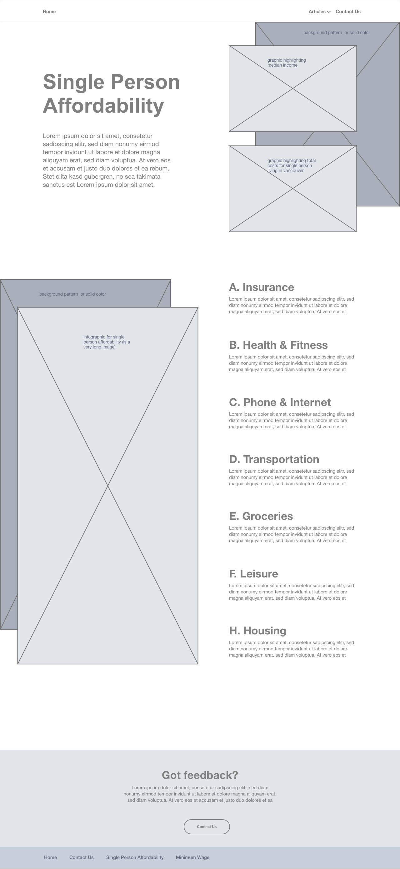
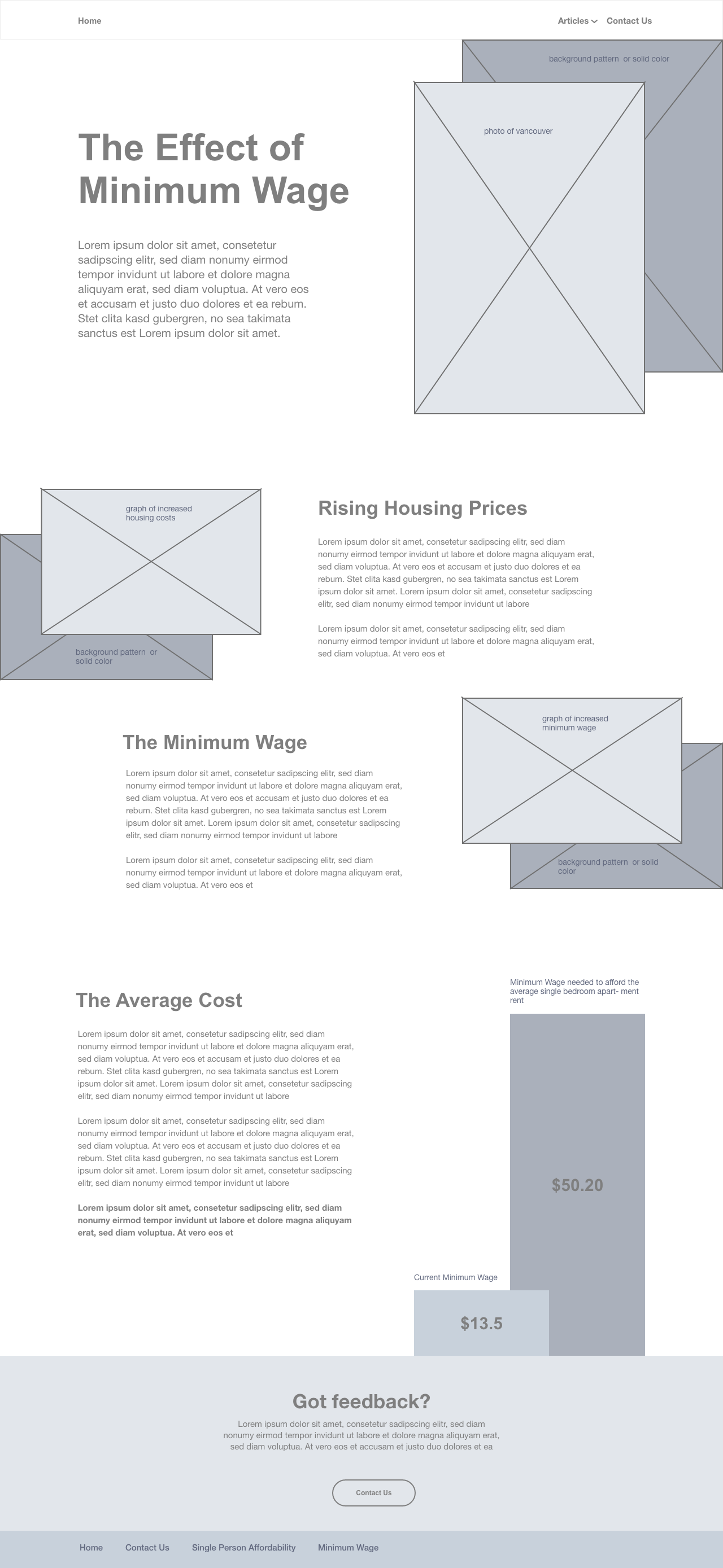
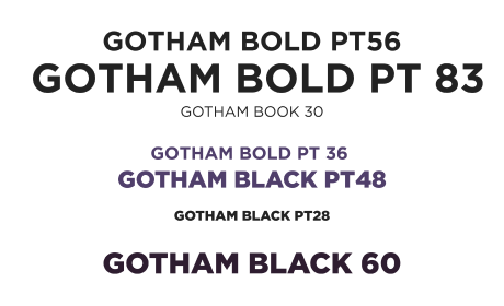
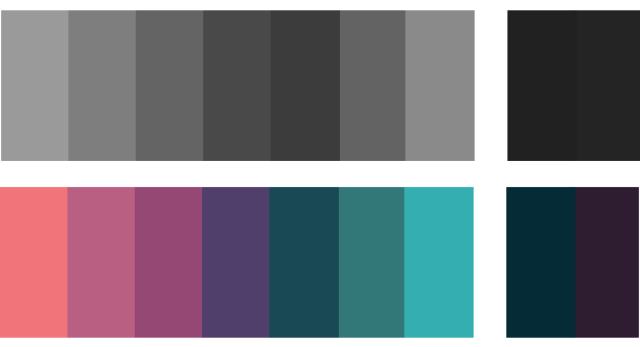
For the visual design, it was important to incorporate the branding and ethos of Vancouver Plan since the project was going to be an extension of their network. For this reason, I chose to use the same font and expand their existing colour scheme.
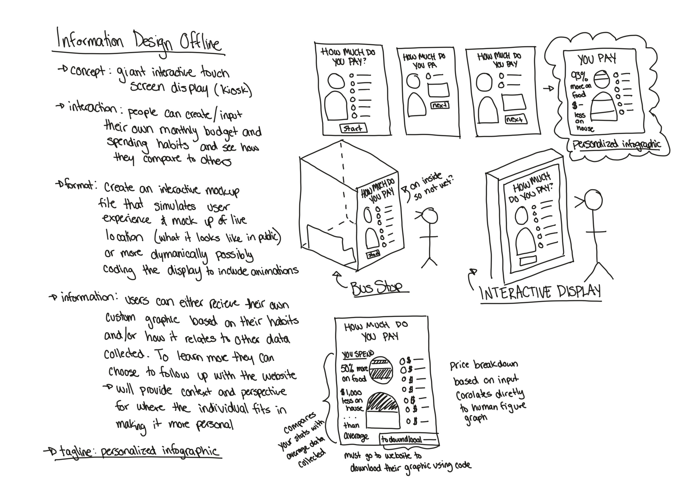
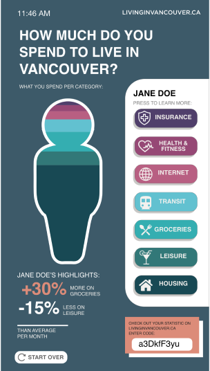
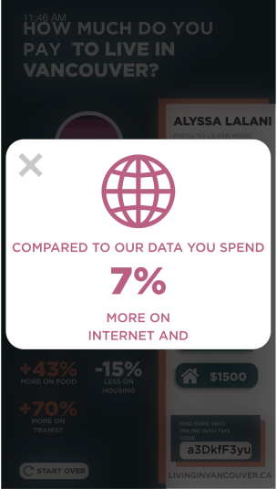
I came up with the idea for the kiosk by considering what might attract users to our website. The goal was to have people fill out a short questionnaire on their spending habits and compare the results to other entries. The kiosk would produce a personalized infographic that users could download from the website and post to social media.
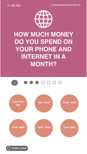
One major flaw in the concept of the display unit was that the data can only be as reliable as its users. This means it can easily be skewed and inconsistent with real-life results. Another area for improvement would be the general aesthetic of the website. Since this was our team’s first time programming a website and learning HTML/CSS we focused on creating a responsive website following proper semantics and best practices. I feel like the trade-off to accomplish this was sacrificing on design elements that could have made the website much more appealing.