As part of a project in IAT 102 Graphic Design students were tasked with creating a monochromatic logo, accompanied by a logotype. The goal of the project was to focus on the form, typeface and kerning of the logo.
Sunnies & Specs is a fictional prescription glasses and sunglasses company that has a focus on eccentric, and funky style while improving eyesight. They provide a large collection of hipster frames built for prescription glasses. Sunnies & Specs targets people from ages 18 to 35, and who have a unique sense of fashion. These people should view glasses as a way of expressing their personal style rather than just a necessity.
This project was completed in teams of two. My responsibilities included assisting in the design of the finalized logo mark, and branding materials which included a business card and letterhead designs.
3 Weeks
Sept 2018
Adobe Illustrator & InDesign
Alex Grant
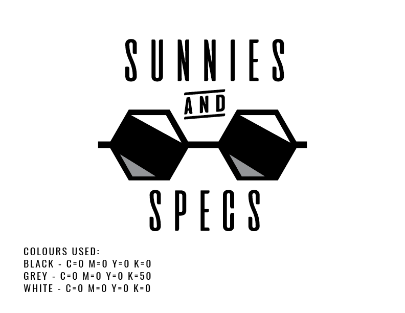
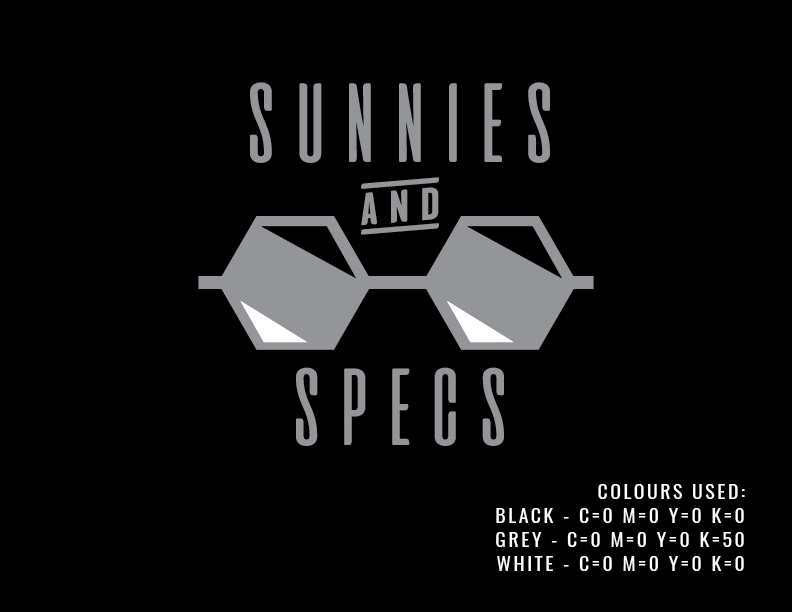
Our team decided to develop a niche for the brand to make it stand out in the market. I started by sketching out possible names and glasses illustrations for the form of the logo. At this point I was focused on the overall form and style of glasses. Rapidly iterating designs by sketching allowed me to work quickly to get my ideas on paper.
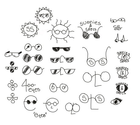
The evolution of our symbol came from an exploration of shapes. Starting with the classic circle design I experimented with different reflections. Our team settled on the honeycomb shape because the uniqueness of the glasses represented our ‘funky’ brand identity. My partner Alex Grant created the honeycomb glasses shape in Adobe Illustrator, I was responsible for refining the final logo by checking the alignment, colour shades, stroke width, and spacing.
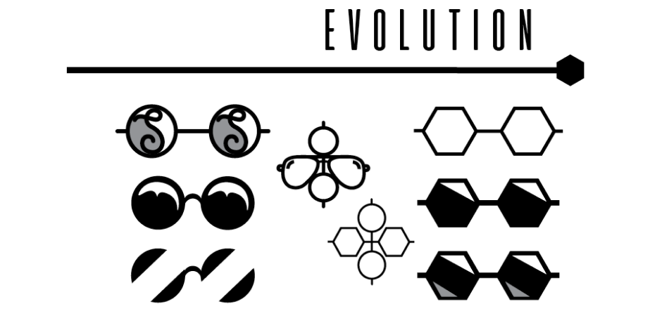
To further expand the design of the logo, I created a business card, letterhead and eyeglass case for the brand. Implementation is an important step because I could see how the logo form interacted with other visual elements, and how it could be applied to products. In this case, the design promotes the brand identity, keeping the logo at the centre and creating a hierarchy around it.
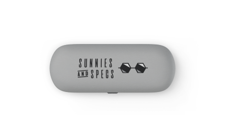
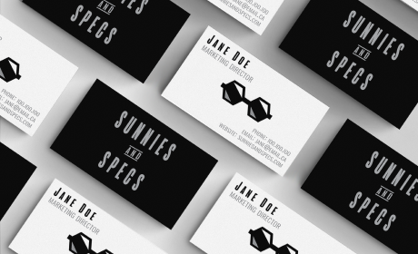
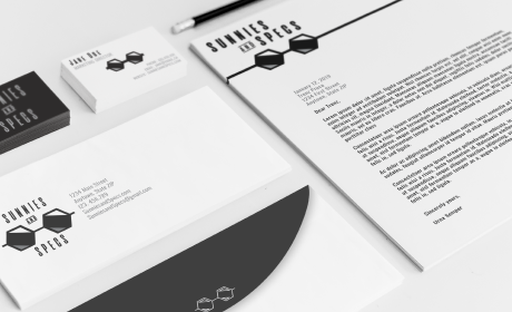
Upon reflection on this project, I enjoyed the constraints of a monochromatic design as it allowed me to focus solely on the form of the logo. At first I found it difficult to portray the tone and passion of the company without using color, however, I think it was exactly this challenge that pushed me as a designer. Looking back I think there is room for improvement in the typography, paying attention to the readability.