In the Fall of 2018, I enrolled in a spatial design course that taught us the basics of architectural forms and graphic design. The class ended with a six-week final group project that had each group compete for their 3D architectural design and a well-thought-out slide deck illustrating our inspiration and explanation of our design and process. My group included five students who each played a significant role. Each member partook in the building design process; three members worked through copywriting and building formation, one worked on image photography, and I did a slide deck design. My role was as the graphic designer of the group. This task involved creating a mood board, finalizing an art direction, selecting typefaces, and creating the slides.
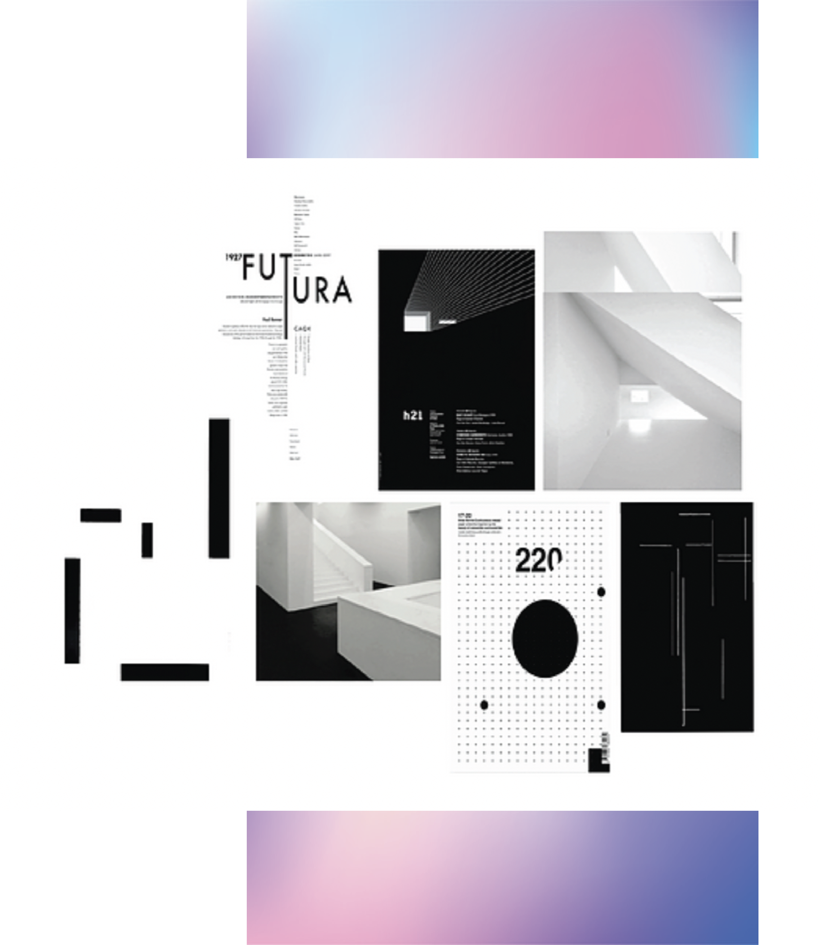
The first step in tackling the graphic design portion of the project was the create a mood board. This was the first step as a mood board is a collection of internet collected images that inspire your project aspects such as fonts, spacing, colours, and image treatment. Before this project, our group struggled with graphic design and was nervous about creating an architectural building as we had no prior experience. Therefore, we decided to pursue a black, white, and futuristic aesthetic to alleviate the stress. Black and white are standard and simple colours, and the futuristic approach inspires us to design something innovative. I selected and grouped the images found to the right, in an organized grid via adobe Illustrator. I was intrigued by the creative twists used towards such a traditional black and white approach. Also, I selected Futura as the font because of its futuristic appearance. However, after our first feedback session, we were told that the mood board was too clichè and not adequately integrated into the slides.
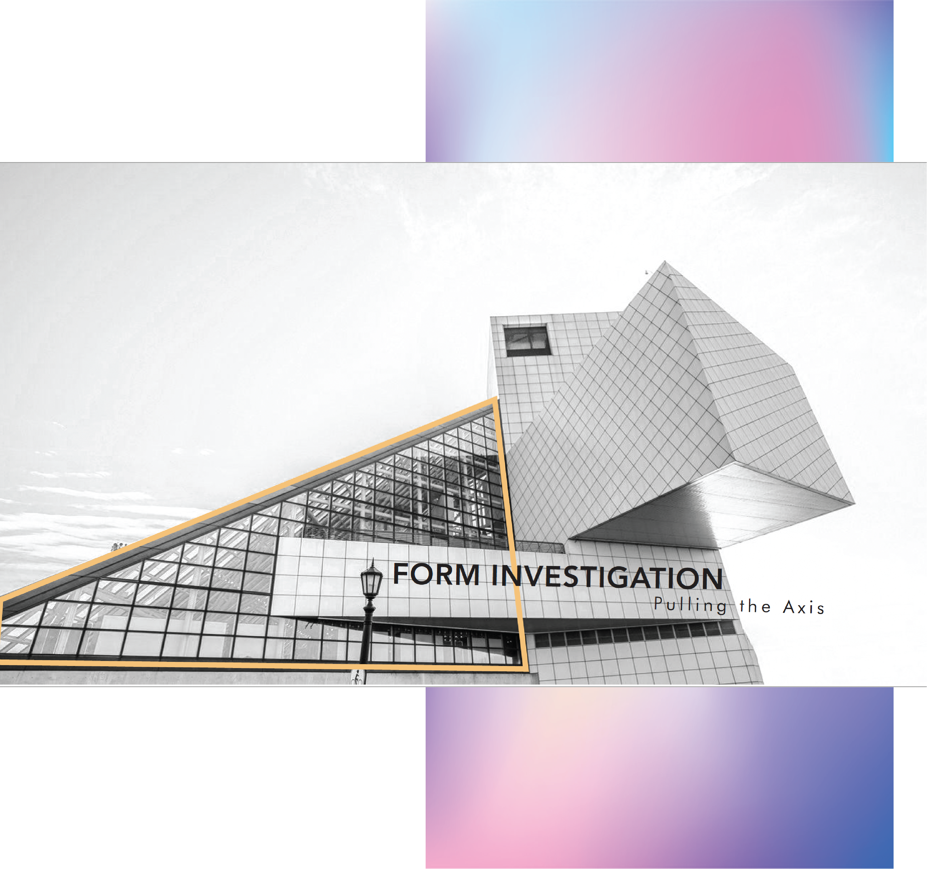
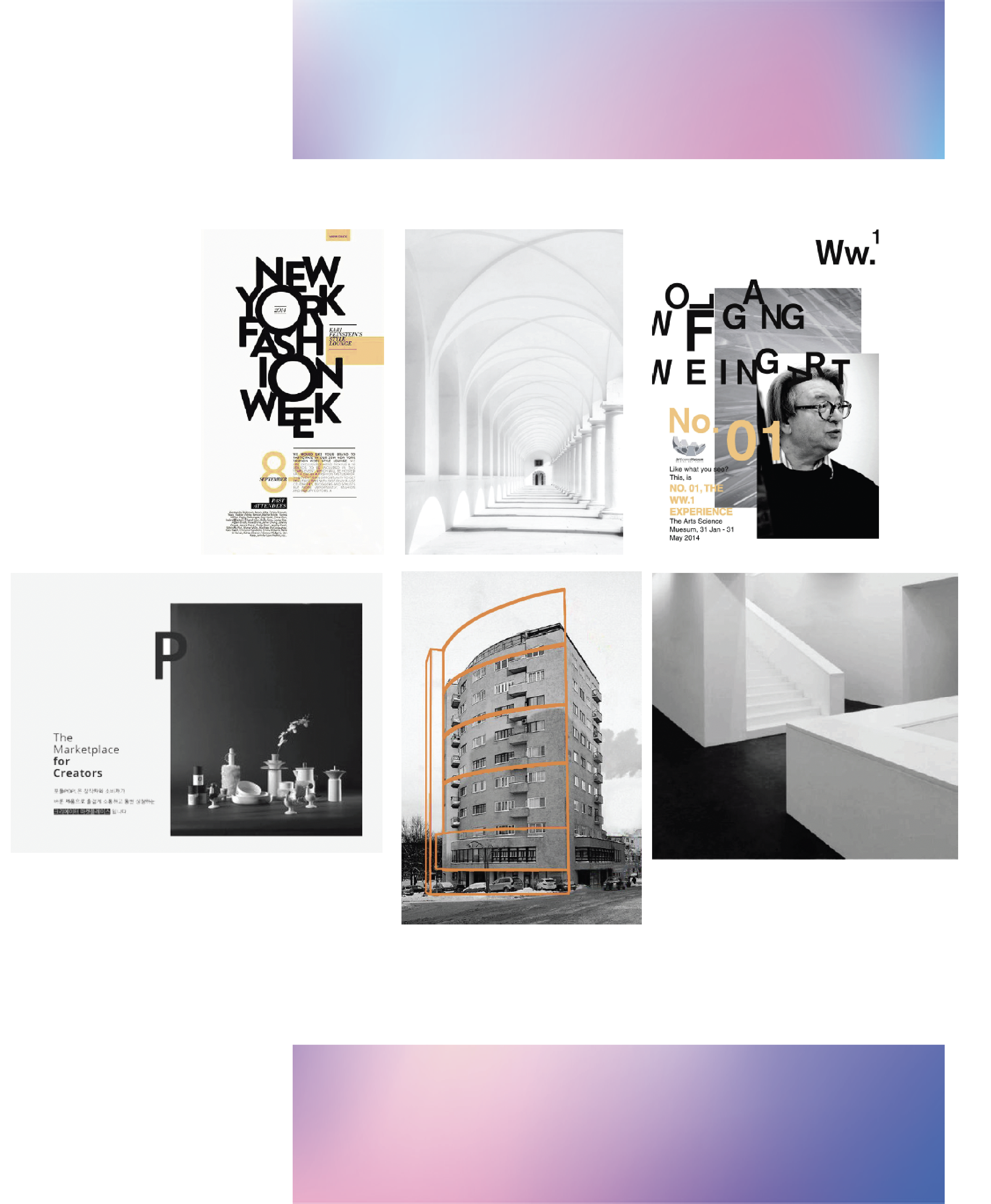
After our first feedback, we were given several weeks to prepare for the class competition in Seattle. We decided to have a meeting with the professor to discuss how we could approach the mood board. He advised us to step outside our comfort zones and not to play it safe. He began by showing us several famous and innovative graphic designers to gain inspiration and imitate our way. Wolfgang Weingart most inspired us as a group due to his funky, energetic, and overlapping layout. We knew that we wanted to photograph our building and edit it in a greyscale fashion, much like the images attached in the mood board to the right. We enjoyed the high contrast between the cristal white building and the black background, in addition to some grey to help transition those two elements together. As for all element positioning, I decided to use Weingart's approach to high overlapping. In addition, I selected a bright orange as it would highlight essential aspects of each slide. This included page numbers, arrows and captions.To tie all my ideas together in the mood board, I treated each image to ensure that the orange was the correct shade, traced elements of buildings in that colour, and integrated two-element overlapping photos. All photos were treated within Photoshop using the pen and bucket tool and then placed in a grid formation in Illustrator.
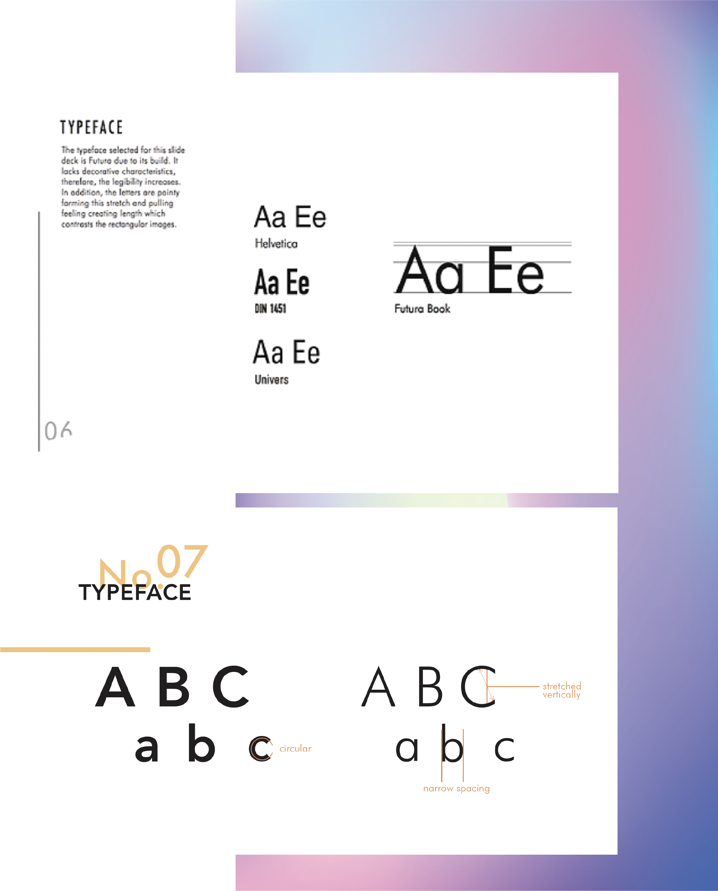
As previously explained, our team initially decided on a futuristic architectural form and wanted to translate that idea into our slides for consistency. However, in addition to the idea being overused, we found that the fonts selected for the header and the body were not distinguishable enough. As you can see with the top image to the right, it isn't easy to differentiate between the title and the body. Therefore, in addition to our new bold and contrasting art direction, we chose fonts that further amplify that. I decided to keep Futura as the body paragraph due to its thin and tall look. This font shape matched the elongated look of our building. In addition, the form would contrast nicely with the selected header font, Avenir. This font is quite circular, and with the bold setting, it would catch the reader's attention . To ensure proper communication between ourselves are the audience, I labelled the essential features of the fonts to illustrate the contrasting shapes further.
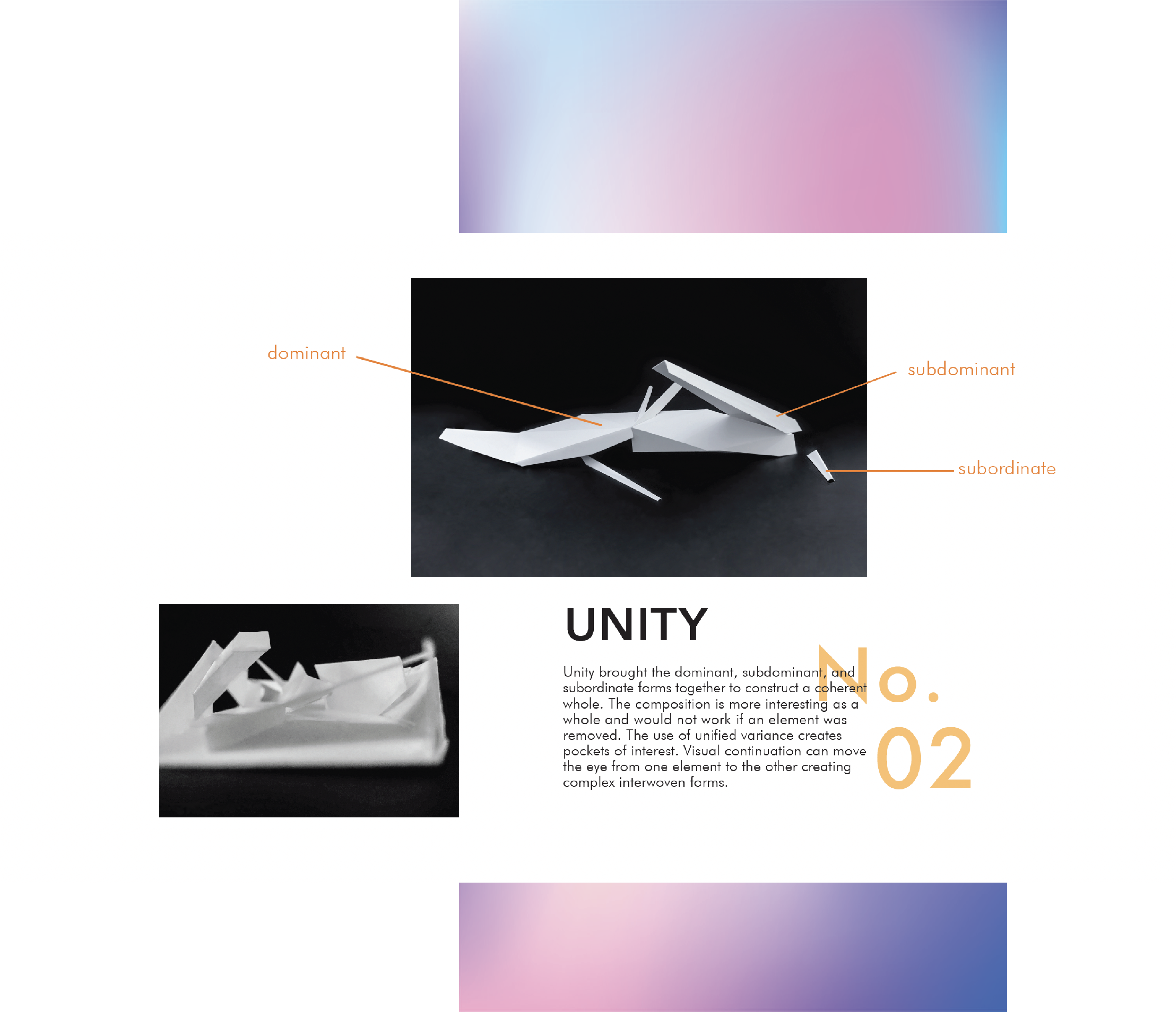
After our art direction and typeface slides were completed, it was time to create the layout for the rest of the deck. Properly researching an art direction and organizing the inspiration images on illustrator allowed me to narrow down my top choices and select the ultimate collection of images that truly inspired us. With this strong basis built, a teammate and I worked together on the remaining slides. This step was a critical moment where communication was vital, as we only had one hour left until the competition began. As we were under pressure, it was essential to be transparent and honest with our opinions to achieve our goals. We rotated per slide, where one person would quickly draft a grid. We then reflected on the current layout and made some adjustments until we were satisfied. Shown in the image to the right are two slides that received the most compliments.
While our team did not win a top prize, we received great praise from the professor, TAs, and classmates for our efforts and growth within the last week before the competition. We were five students struggling with adapting to the great difficulty and demand on the course, and we had to push ourselves outside our comfort zones. This in itself was a great triumph as we gained massive respect from our professor. We were very proud of the work we had completed and believed that our skills improved significantly. I have decided to use this project in my past, present, and future portfolio as it is the start of my graphic design passion and learning experience. The bold, contrasting, overlapping layout that you see in these slides, are a design direction that I seem to take often, with different changes each time. I feel as though it is an excellent representation of my improvement and potential to grow.
Although the results of the project were excellent, many issues hindered my iteration process. Therefore, if I were to do this project again, I would work upon my time management by setting time or day limits on certain sections. I found myself fixating on finding images and editing them, which left me little time to complete the remaining slides. While it is optimal to put in your best effort, knowing when to stop with a section is also essential. This would help improve on the organization skills that I highly prioritize in my work process. In addition, managing my time would have provided me with more hours to work alongside my teammate on the slides; this would have allowed us to communicate more calmly rather than franticly within the last hour. With those issues aside, I find this project has led me to my design ethos and has allowed me to step outside my comfort zone and explore my creativity.