- Step One
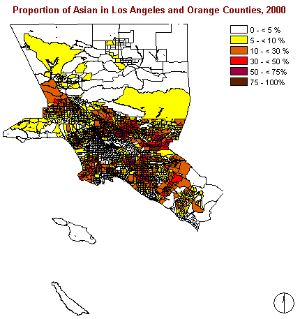
As this image clearly shows the Asian people are not living equally
distributed within the two examined counties. One can see that there
are areas in the north, the southeast, and in the centre where the proportion
of Asians is less than 5%. Otherwise a rather high concentration can
be recognized around the centre, forming a ring or ellipsoid like shape.
This form of distribution can also be referred to as a 'doughnut'.
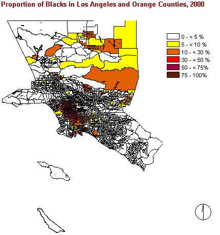
Interestingly the distribution of Blacks differs completely from the one of the Asian groups. As the picture to the right shows us, there are a lot of areas where less than 5% of Black people are living. Instead they are highly concentrated in the western central area (i.e. downtown) which is not occupied by Asians. Obviously there is a high tendency towards segregation between Blacks and Asians.
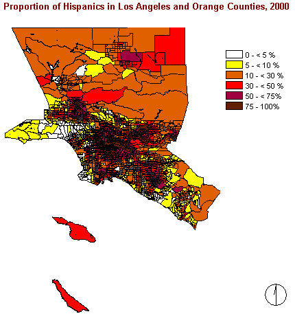
Again, the pattern of this picture looks completely different from the two preceding images.
There are very few areas with less than 10% of Hispanics among the total population. Instead they are widely spread over the two counties, but nevertheless forming a concentration in the centre which is just slightly north-eastern from the area of highest concentration of Black people.
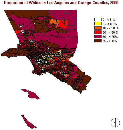
The distribution of Whites shows another pattern, too. In most of the areas Whites are forming the majority within the total population. They are highly concentrated at the edge of the examined area, especially in the western corner, the northwest, and the southeast. But on the other hand there is an area with less than 5% of Whites in the centre.
What does that mean?
First of all the maps above show clearly that there is nothing like an integration of ethnicities. Instead we can see that there seems to be a tendency towards segregation, people prefer to live in an rather homogenous area with mostly other people of their own ethnic group.
Assuming that Whites are forming the wealthiest layer of population one could think that either they try to avoid the 'poorer' people or that the image of distribution of Whites shows perfectly the process of suburbanization. In that case Whites are leaving the inner city areas which are in turn filled by different kinds of immigrants.
Furthermore one can assume that new immigrants tend to move into areas where already people of the same ethnicity - or even relatives - are living. This would provide them with a lot of advantages. Among these are a certain kind of infrastructure, including people who speak the same tongue, avoiding any language barriers as a newcomer, and who can tell them where to get a job or where to go for any authority services.
- Step Two
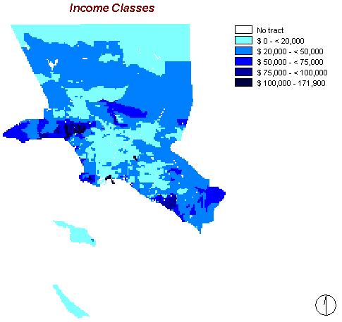
The map to the right shows the distribution of the average per capita income per year within the census tracts.
The numbers vary between a minimum of $ 0 and a maximum of $ 171,900. The mean is $ 22,837 and the standard deviation $ 16,264.
The pattern of income distribution shows areas with less than $ 20,000 per capita in the northern most areas and in the centre. The wealthier regions are situated among the edges. The wealthiest areas are rather small and concentrated, located north-western and south-eastern of the large centre.
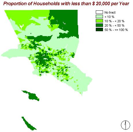
To improve the expression of the image above, this picture shows the proportion of households which earn less than $ 20,000 per year.
The 'poorer' areas are located in the centre and 'spreading' from there to the west. The northern regions and the Catalina Islands belong to them, too.
The average proportion of these households is 18.21% with a standard deviation of 14.20% and a variety between 0 and 100%.
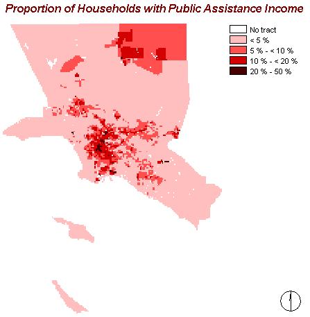
As a result of the preceding, this map displays the proportion of households with public assistance income. The pattern is - of course - similar to the maps above, showing areas with rather high proportions of public assistance in the northeast and in the centre.
The spread of public assistance varies from 0 to 50%, with a mean of 6.10 % and a standard deviation of 5.87%.
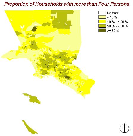
This map shows one more factor I have chosen to indicate relative wealth or poverty, respectively: the proportion of households in which more than four persons are living. I considered this knowledge as important because most often wealthy families do not have more than two kids or are living together with the grandparents' generation. Beside familiar relationships the reason for a larger number of persons living in one household can be poverty, which forces e.g. refugees to live together with others.
The average of households with five and more persons amounts to 20.63 %, with a standard deviation of 14.02%.
Similar to the map about Public Assistance Income the majority of households consisting of more than four persons are situated in the central area.
What have we learnt so far?
Up to now we know that the different ethnic groups in Los Angeles and Orange Counties are not distributed equally among the region. Furthermore there are differences between the prosperity factors. Obviously there is a strong downward gradient of wealth from the edge to the interior of the two examined counties.
If we now compare the maps created in steps one and two above, one can easily see that there is apparently a connection between ethnicity and income.
To confirm or prove wrong this assumption, we continue with ...
- Step Three
Although my project does not indicate the need for a decision (e.g.
getting to know suitable places for the provision of new housing facilities),
the assumption made above needs to be proven wrong or right with a scientific
method. Therefore I decided to make use of the Multi-Criteria Evaluation
(MCE) with the Boolean Intersection Approach. That means that I did not
weight my factors but rather created logical AND expressions. These include
the combination of ethnic and income factors.
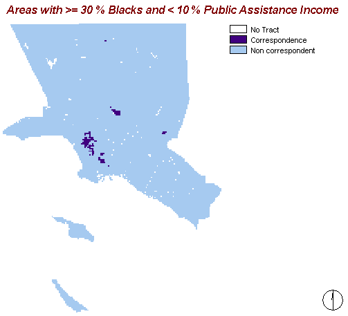
This map shows areas in which both criteria, namely a proportion of more than 30% of Blacks and less than 10% of the households receiving public assistance, correspond (represented by the darker blue). The intention is to get to know whether "black" regions are rather wealthy or poor.
Obviously there are very few areas where these criteria match. Thus one can say that Black people rather often receive a public assistance income.
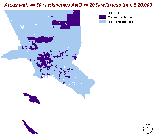
This map shows the areas where the percentage of Hispanics is at least 30% and where at least 20% of the households have an income below $ 20,000 a year. It displays a couple of regions with this feature combination. But in contrast to the map above, this one assumes directly that Hispanics belong to a disadvantaged group.
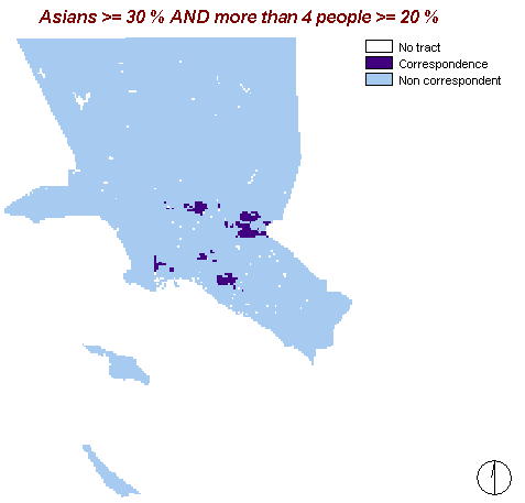
That map shows areas with the feature combination of at least 30% Asians and 20% households with more than four people living in them.
Obviously there are not so many regions that match these criteria. What does this tell us? Maybe we can say that Asians are not as disadvantaged as Blacks and Hispanics but it can also mean that Asians simply do not like to live in bigger households.
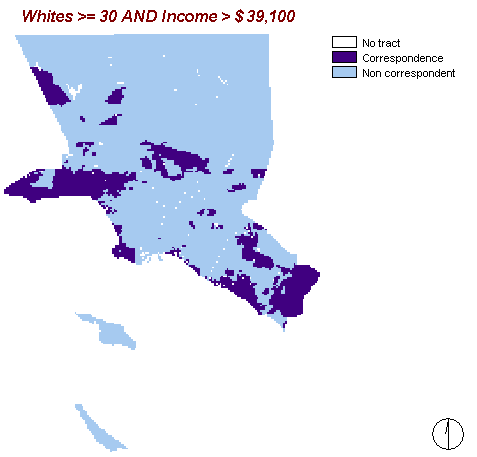
Finally this maps displays areas where the proportion of Whites is at least 30% and the per capita income is above $ 39,100. The aim is to examine whether there is a connection between being White and receiving an above average income. The number of $ 39,100 was achieved by adding the mean income of $ 22,837 and the standard deviation of $ 16,264.
Apparently there are several areas with this combination of features.
Additionally I made a query about areas where the proportion of Whites is 50% and more and at least 20% of the households receive public assistance. Interestingly this feature combination could be found in none of the 2,631 census tracts.
- Conclusion:
Obviously there is nothing close to an integration of different ethnic groups or an equal distribution of income factors. Instead my analysis shows that the population characteristics in Los Angeles and Orange Counties are very diverse. It implies that there is a connection between the segregated ethnicities and the uneven economic factors. The results of my analysis acknowledge what probably most people have assumed: White people are generally the ethnicity with the highest level of prosperity whereas the other three large ethnic groups are not as wealthy as Whites.
With this statement my analysis ends. Now it is the responsibility of others to decide whether they want to use my results for projects concerning the examined region or neglect them.