Various
approaches were undertaken during the development phase of
this project to identify best suited representations of population
clusters within the GIS.  Approaches were based on vector and raster database models
and were tested in the same environment to see what advantages
and disadvantages each held over the other.
In
one example, raster cells were created based on union of the
DA centroids with a point grid, which was generated based
on point distance from the nearest DA centroid. This technique
allowed the cartographer to visualize the GVRD in a series
of evenly spaced grid cells (1km²). Other adaptations
of this method were employed to gather information concerning
distances from population centroids to health care facilities
and transportation routes. These methods proved advantageous
for traditional multi criteria analysis, thus allowing the
cartographer a glimpse of the GVRD under many, and often opposing,
situations (click here
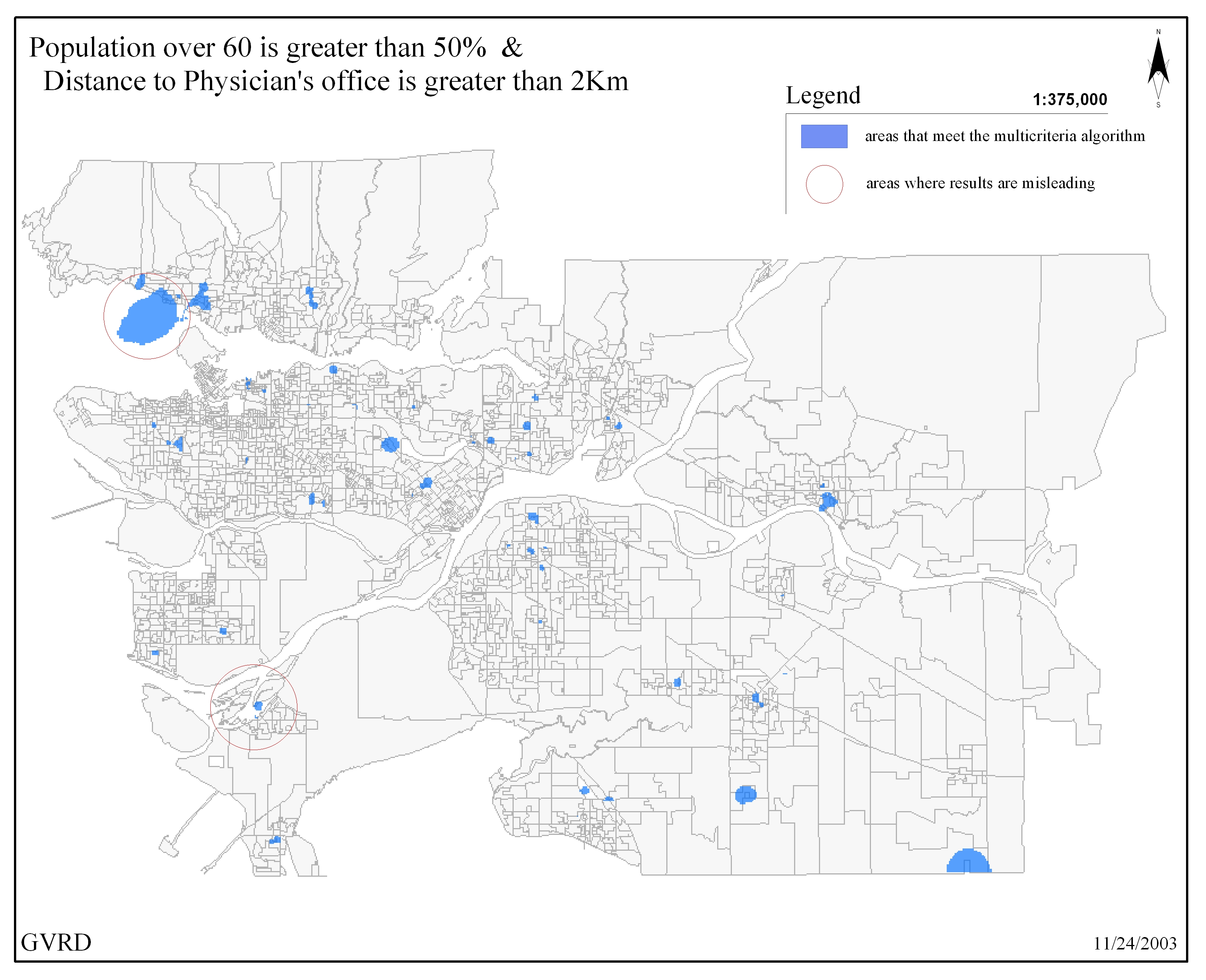
for a sample raster basemap). In addition, interpolation techniques
were undertaken in order to identify high density areas of
certain criteria(s). This method proved advantageous to visually
recognize areas within the GVRD that involved high density
clustering of like-attribute data.
These
approaches, although informative, were not without their disadvantages.
Some pitfalls of this technique were observed in the allocation
of clusters using the GRID approach. In certain events, grid
clusters generated through interpolation, although useful
to observe high density, would place clusters in uninhabitable
regions of the GVRD, such as in rivers and inlets. This stemmed
from the interpolation process, which did not take into effect
geographical land barriers. Equally important was data compatibility
and entity identification. The advantages of vector data to
hold multiple attributes and to be layered with other data
layers proves much more useful then traditional logarithmic
mapping techniques (for the purposes of this project).
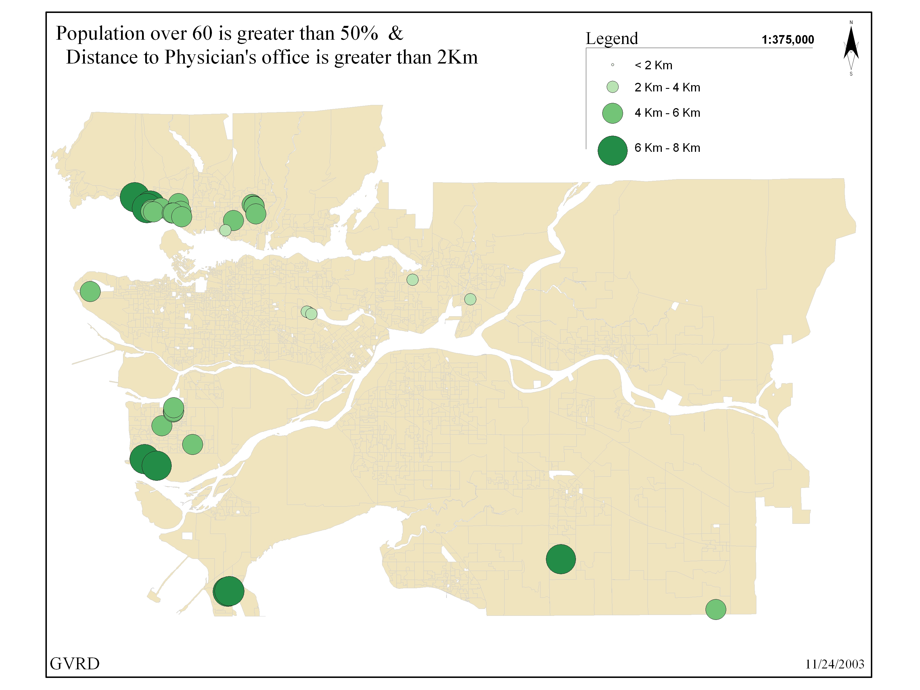
Mapping
the spatial attributes of the GVRD Census tables through point
data representation is a delicate matter. In order to make
clear map products centroids were created from the DA polygons.
This allowed the cartographer to model the information in
an ordinal scale using a standardized gradient technique to
represent different DA's according to a pre-determined value
(age, density, etc.). The creation of centroids, although
beneficial for visual comparison, is inherently error driven
as it transforms the location of the entire population in
a given area (km²) by averaging the number of X and Y
vertices in the polygon and to produce a point that lies somewhere
in the mean center of the area. One has to ask if the entire
population lives within a single point of a DA? This problem
is only intensified in DA's that are of large areas versus
those that are located in the downtown region and generally
much smaller in size.
The
power of maps to manipulate and transpose information according
to the views of the cartographer is a powerful skill and one
that demands a strong understanding not only in map making,
but also in economic, political, and geographic thought. This
project, although goal focused with producing a useable product,
also took into consideration the underlying techniques that
go into the production of a map.
Ultimately,
it was found that both data models were composed of various
capabilities for obtaining and comparing spatial data in relation
to this project. To ensure accuracy, the data validation techniques
were repeated under each mapping stage in order to transfer
the attribute tables of the the GVRD Census tables into spatial
form. Below are two sample maps that were created to determine
how centroids were to be represented in the 1:12 000 scale
maps.
vector
model  raster model
  |
 Approaches were based on vector and raster database models
and were tested in the same environment to see what advantages
and disadvantages each held over the other.
