| A Geographical Information
System is an extremely influential tool. The process in which
map developers and users visualize the information depicted
from a map often sways, in one direction or another, where
resources are to be allocated. The following contains a brief
discussion on the strengths of a GIS.
Considerations were implemented during the course of this
assignment in which the cartographer subjected himself to
numerous questions pertaining to the validity of this project
to disclose accurate information. During the course of which,
it was observed how various maps could be created from a single
data source, yet provide information that could be construed
one way or another to sway the observer into seeing similar
information in an opposing light.
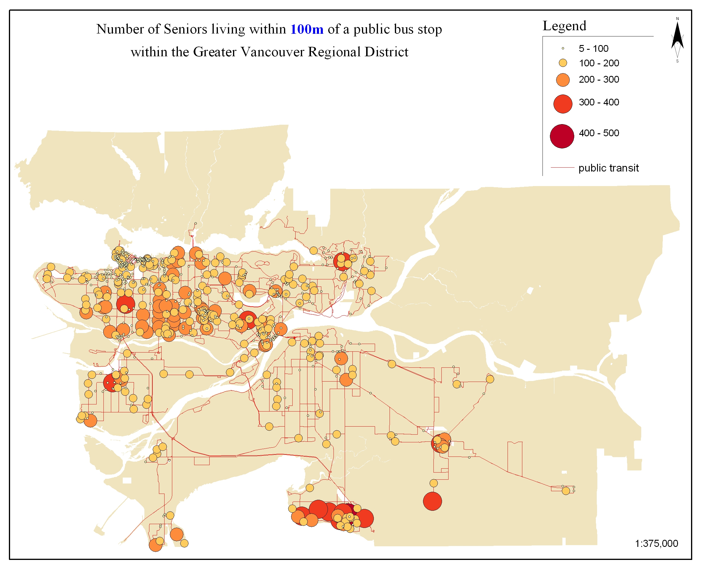
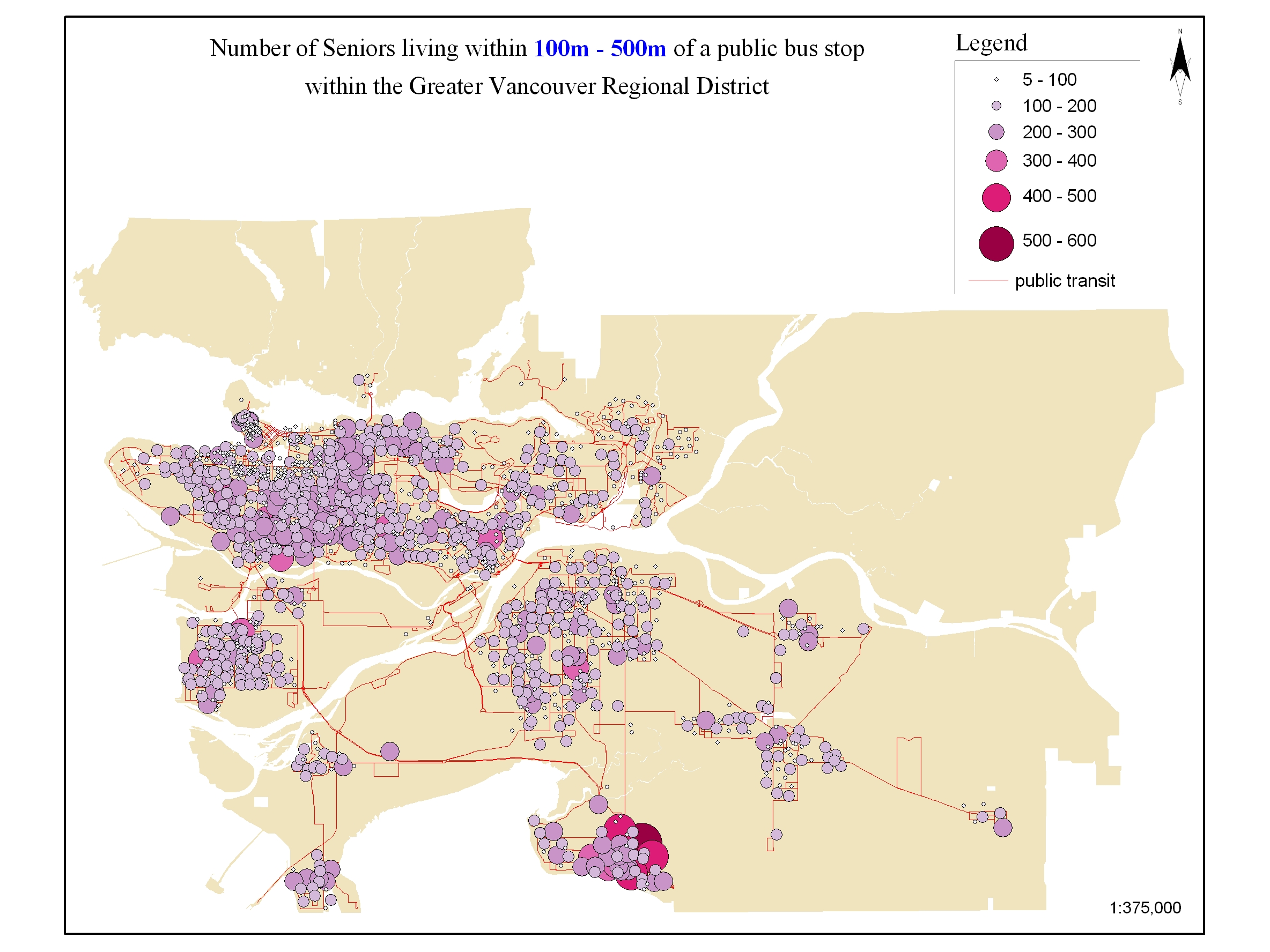
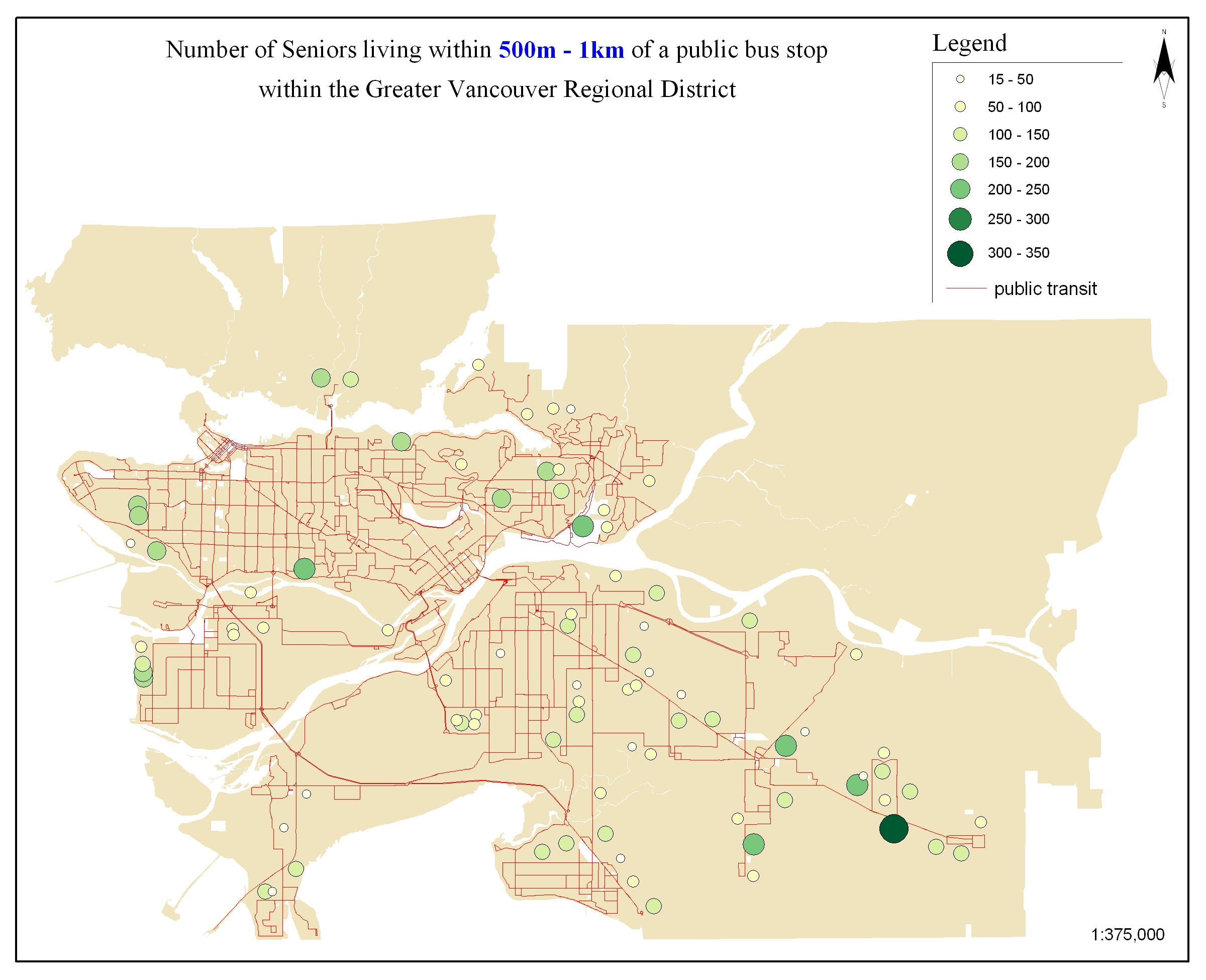
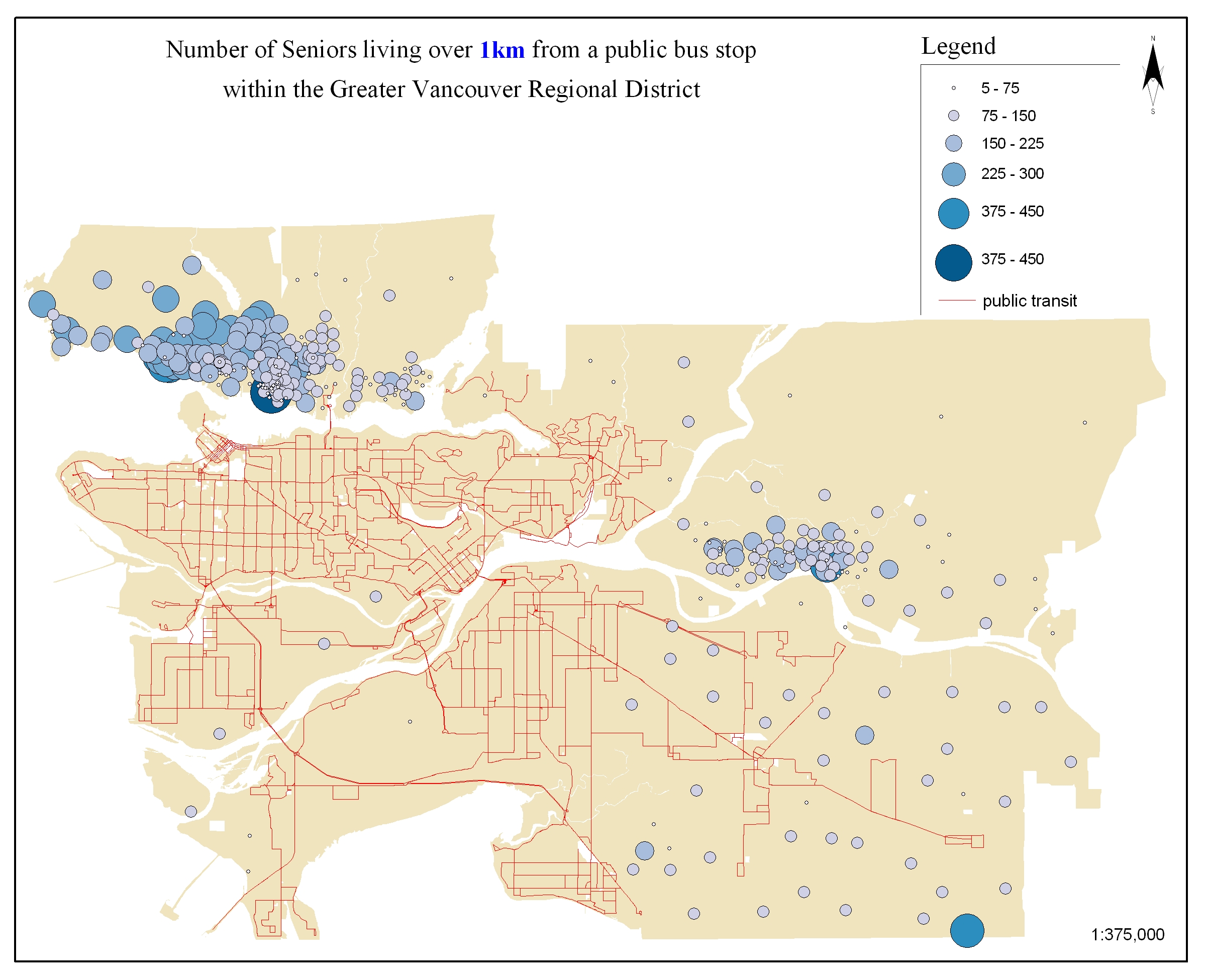
The basis for this study was undertaken during the creation
of the map atlas skeleton. In this instance, population clusters
were calculated to compare levels of the population with citizens
age 60 and over at various distances from public transportation
facilities. In the first map group, the population was categorized
by the percentage of individuals within the Dissemination
Area (DA) that were over 60 years of age. In the second map
group, age groups over 60 were depicted on the map according
to their density in relation to the total population of the
DA.
The final map products uncovered various strategies that
might be implemented by various map makers while creating
a map atlas for public health use/planners. The process should
help researchers understand that even though a particular
district may show a high concentration of seniors (large symbol
representation) it does not necessarily constitute that this
area consists of a high density of residents. As well, maps
depicting smaller symbol representations of population clusters
does not necessarily represent the percentage of seniors in
relation to the remainder of the population. These techniques,
as well as proper choropleth shading approaches can help cartographers
ensure that their maps represent the population in a logical
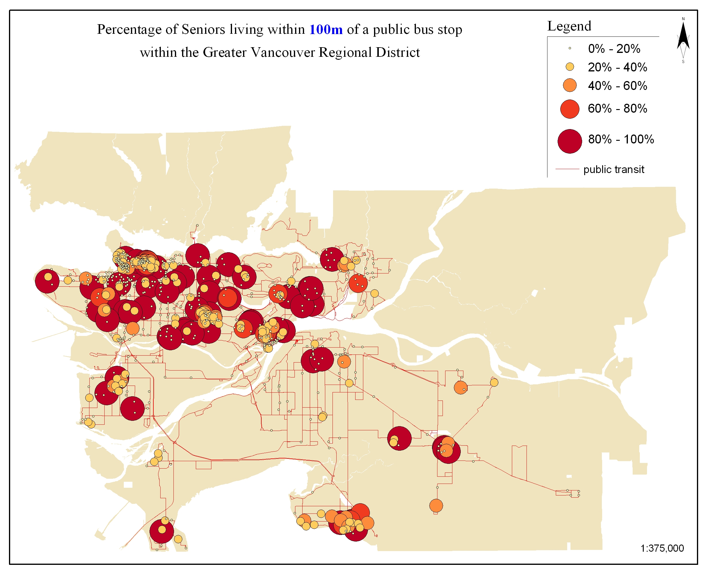
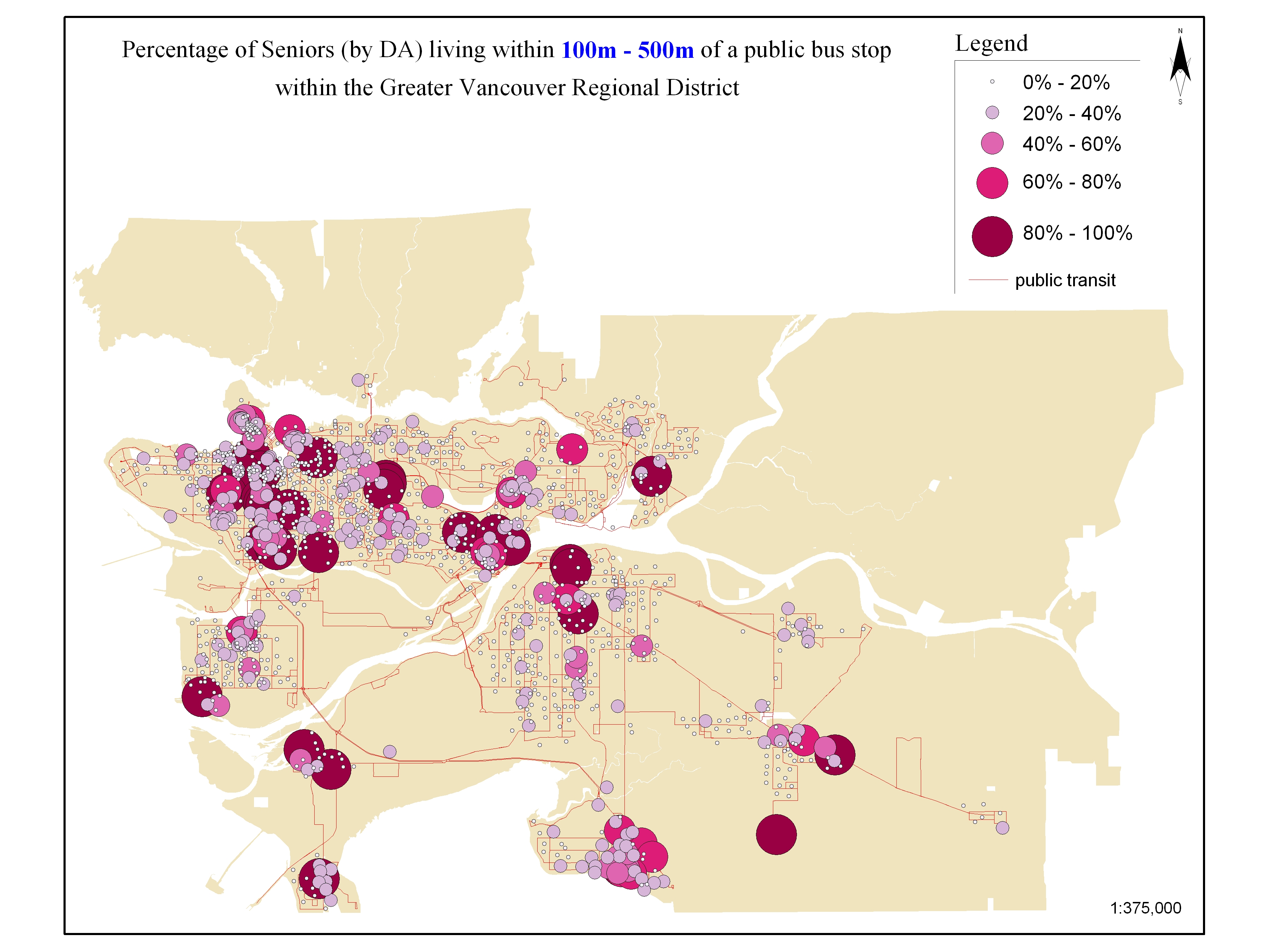
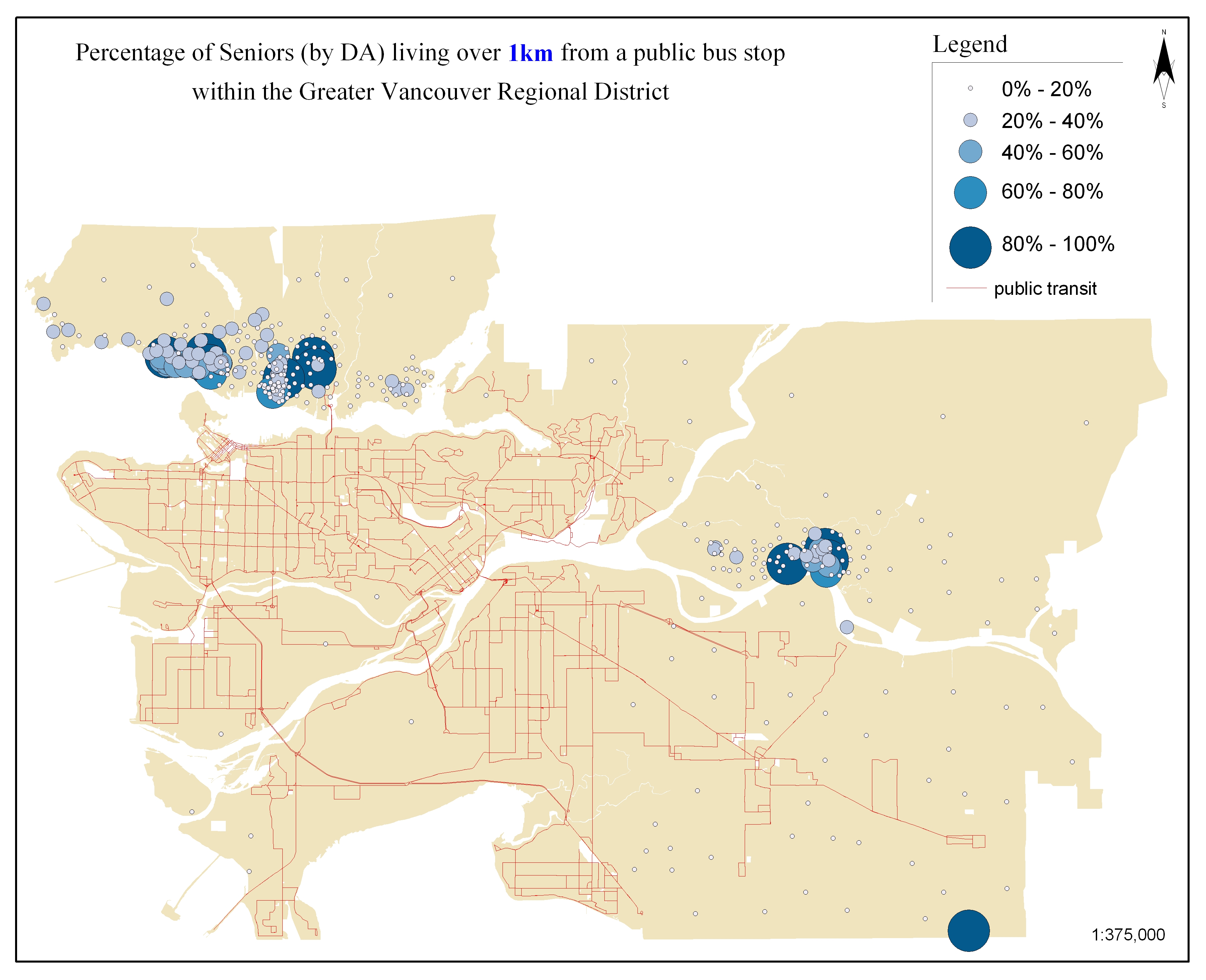
and intuitive manner. Below are a view sample images used
during the development process of this project.
Maps depicting the number of seniors 


Maps depicting the percentage of seniors 


|
