Job Title: UX Designer at Plasmatic Technologies
Project Name: Alana Keypad Prototype
Project Year: 2017
Alana offers connected home solutions including the world's first truly connected security keypad. Installed within minutes the keypad integrates seamlessly with security systems offering households better insight, control and peace of mind. - Alana Connected Keypad
The Alana Keypad project goal was to make a prototype of the keypad interface for the product's alpha phase. I was responsible for the interface and user experience design, and worked with the CEO, marketing department, and engineers of Plasmatic to create an interactive prototype of different screens in several possible user flows for alpha.
User interface and experience design, wireframing and prototyping in Adobe Experience Design, vector drawing in Adobe Illustrator, product research.
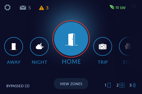
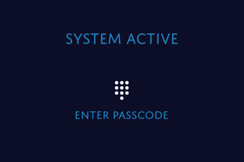
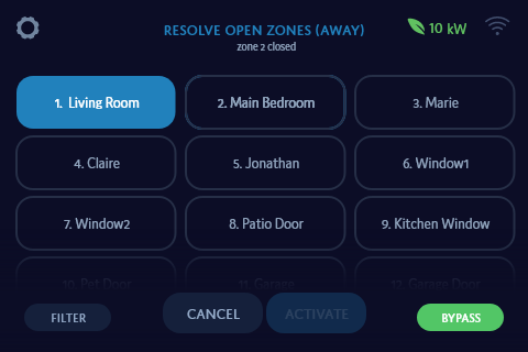
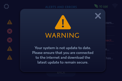
The prototype screens display user features similar to current security keypads. The prototype uses the Bank of Montreal's color scheme as a test color scheme because the interface is supposed to be adaptable to different company colors. The user is able to choose different modes to arm their keypad with from the dashboard, as well as view the zones in their house and bypass any if necessary.
My first step was to identify the technical and business requirements of the project, as well as the needs of people who would be using this keypad. As there was limited time to do research, I spoke to people in-house who currently used security keypads, and learned of experiences of current keypads, including desires, pain points, and any features that were lacking, or features that they liked. I looked at personas of users that had already been developed before I started at my position, and at feature requirements in the mobile app that would be used alongside the keypad (which was being designed by another designer). I also did secondary research online about security keypads and looked at a few real security keypads that we had in the office.
None of the keypads we had in the office, nor any of the commonly used, popular keypads, had a touchscreen digital interface. Their interfaces were limited to monochromatic screens similar to calculators.
So how could I design an interface for a product that had never had such a digital interface before?
I looked at another product of a similar size that was touchscreen and had millions of different digital interfaces: smart phones. Even though our security keypad was not a smart phone, nor did it have the functionality of one, they still shared the same basic concepts. Touchscreen, small screens, displays information, a navigation system, buttons, options, etc. I browsed various online sources such as Dribbble, Behance, and Pinterest for smart home mobile app designs to gain inspiration and creative understanding.
I began designing concepts of the most important screen for the Alana Keypad: the dashboard, or "home" screen. I started with black and white wireframes, and came up with several different ways users could interact with the screen. At the time, the home screen requirements were to have different modes for the user to switch between and to have some way to view house zones. My goals for the home screen were:
I also made the decision to go for flat design because it is not only in trend, but also seen as 'modern'. Current security keypads in the market look outdated and old - as though they were made in the early 2000's.
I, as well as the company I worked at, wanted the Alana keypad to look like the future.
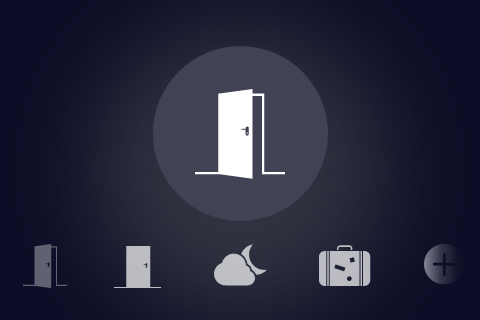
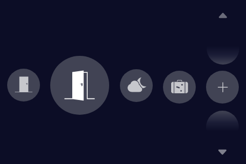
Eventually, after iterating more on my beginning concepts, I created 3 main concepts for the home screen to present to the team and business leads involved in the project. The color choice was for an Alana-branded keypad.
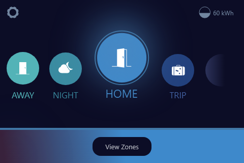
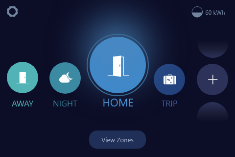
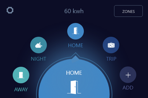
After receiving feedback and having a team discussion, I combined the first and second concepts, and scrapped the third. Although the third 'looked cool', I determined that the intended interaction of selecting a mode and viewing more modes by swiping sideways would not be apparent or intuitive to a user. The first concept's interactions was the most intuitive, while the second looked cleaner.
Hence, the alpha prototype screen is a combination of the two.
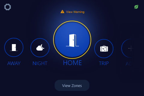
New required features came up during my design of the keypad by the business leads. One feature - which proved to be a challenge for a while - was for the keypad interface to have a primary and secondary color that could be changed to anything, for branding purposes. I edited my design to accomodate for such a feature. I chose a design where the primary color is prominent throughout, while the secondary color is minimal.
This could provide branding, while still keeping a good visual design (so there would not be too much color clashing).

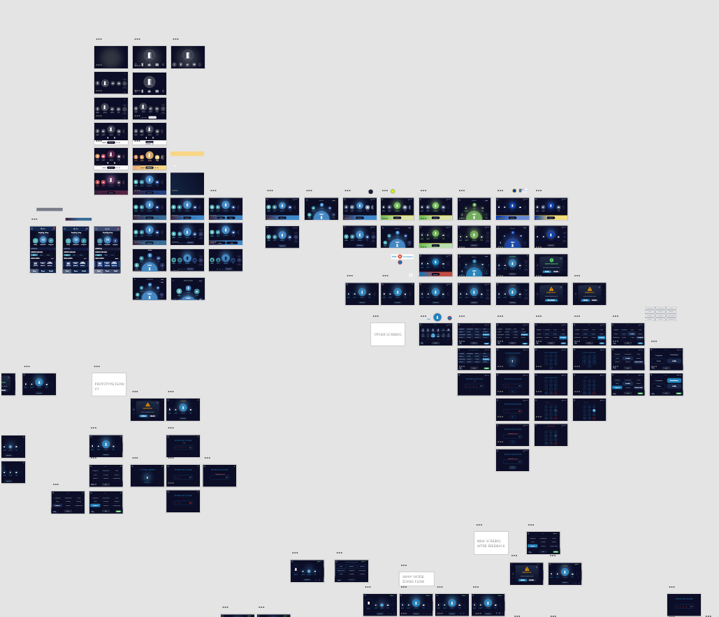
Pictured below are two screenshots of my digital workspace in Adobe Experience Design. The first is an overview of portion of my different concepts. The second an interactive prototype I created for key alpha screens and user flows. These images are to give an idea of my work flow. Both are zoomed out for work confidentiality.
