◄ Go back to home page
Exploring the Land of the Rising Sun
I collaborated with two fellow peers in designing a magazine layout for my Graphic Design (IAT 102) course. This large, four-week team project challenged my skills and principles in fonts, layouts, and hierarchies within text and images. My role as the designer was to try different ways in placing various text and images in our magazine.
All external images used can be found in this PDF file.
Project Design Process
▼
IDEATION
I faced designer’s block with deciding on a concept flexible enough to be translated and replicated into different font styles and page layouts. Luckily, I used visual research on Google Images to look for possible travel magazine layouts and remove the mental block.
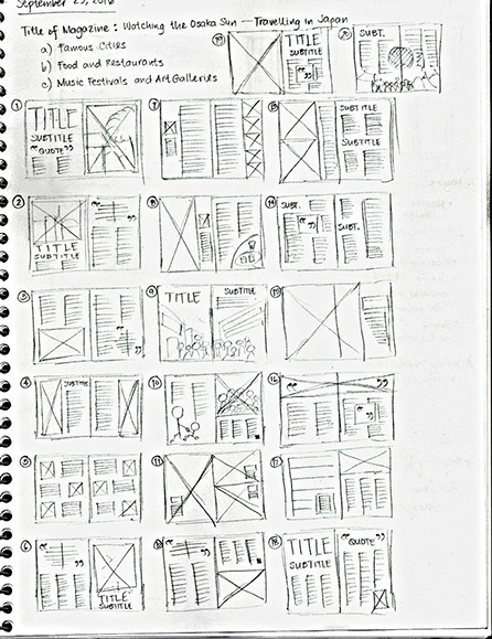
SKETCHES
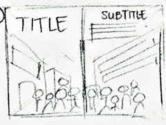
Because of Japan’s sense of aesthetics and innovation, my sketches needed to demonstrate a sense of adventure. Translating an abstract vision into drawings became difficult because I understood the amount of work and time needed to design them in InDesign.
In these sketches, I considered hierarchy between text and images and obvious use of whitespace using text kerning and leading.
INITIAL ITERATION
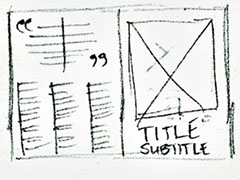
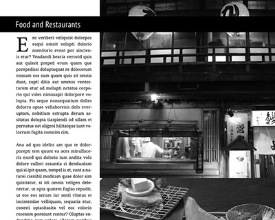
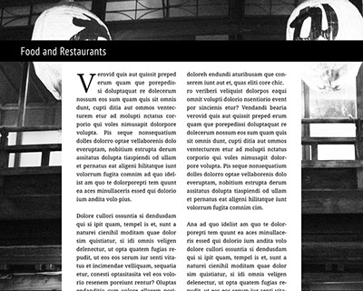
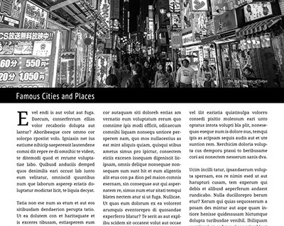
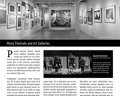
I first wanted to delegate our pictures to different magazine roles such as header banners, caption images and background textures.
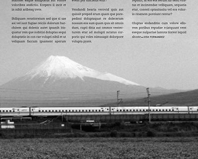
In adding text, I wanted to follow the sketches we used and align it with the three-column grid structure.
FINAL ITERATION
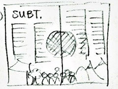
I suggested adding more black to our pictures and organizing body and caption texts so they can appear more dynamic and random.
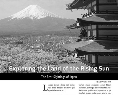
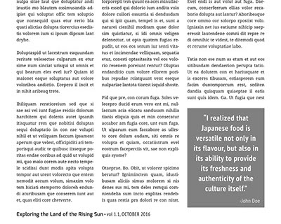
My group also received feedback from our classmates about our dense, body text. Some classmates thought pages 3 and 5 had similar layouts, while others observed font similarities between title, subtitle, and body text. Unfortunately, we did not realize the importance of this issue since the start.
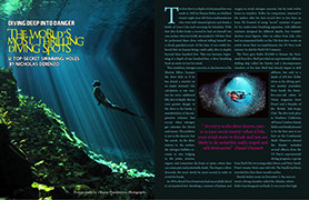
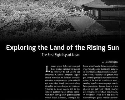
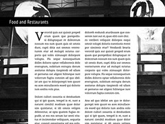
Page 3
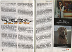
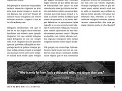
Page 5
REFLECTION
Our magazine layout displayed the appropriate aesthetics and feel because I was satisfied that the text and images appeared more dynamic and playful. However, our dense body text weakened its unity and composition.
Spending more time asking for critiques from my peers would have helped improve our layout.


JOSH FERNANDEZ
2016 Portfolio Website