While there are a lot of different platforms to seek out visual and typography inspirations, there is no one repository dedicated to conveniently explore, identify, and experiment with digital typography.
Our goals with Type for our users include:
To help us gain a better understanding behind the habits of our prospective users, we conducted primary research using a survey with a series of multiple choice and short answer questions posted on Reddit.com.
We found that most of our survey respondents were young, possibly due to the reason that our survey was posted online.
Our results indicate that the younger respondents gravitate towards image-based online platforms such as Behance, Dribbble, Medium, Instagram to browse for inspiration while older respondents get inspiration from text-based content and experiences in real life.
Based on the data collected through our background research, we created the persona of Nina and created a journey map of potential use-case scenario.
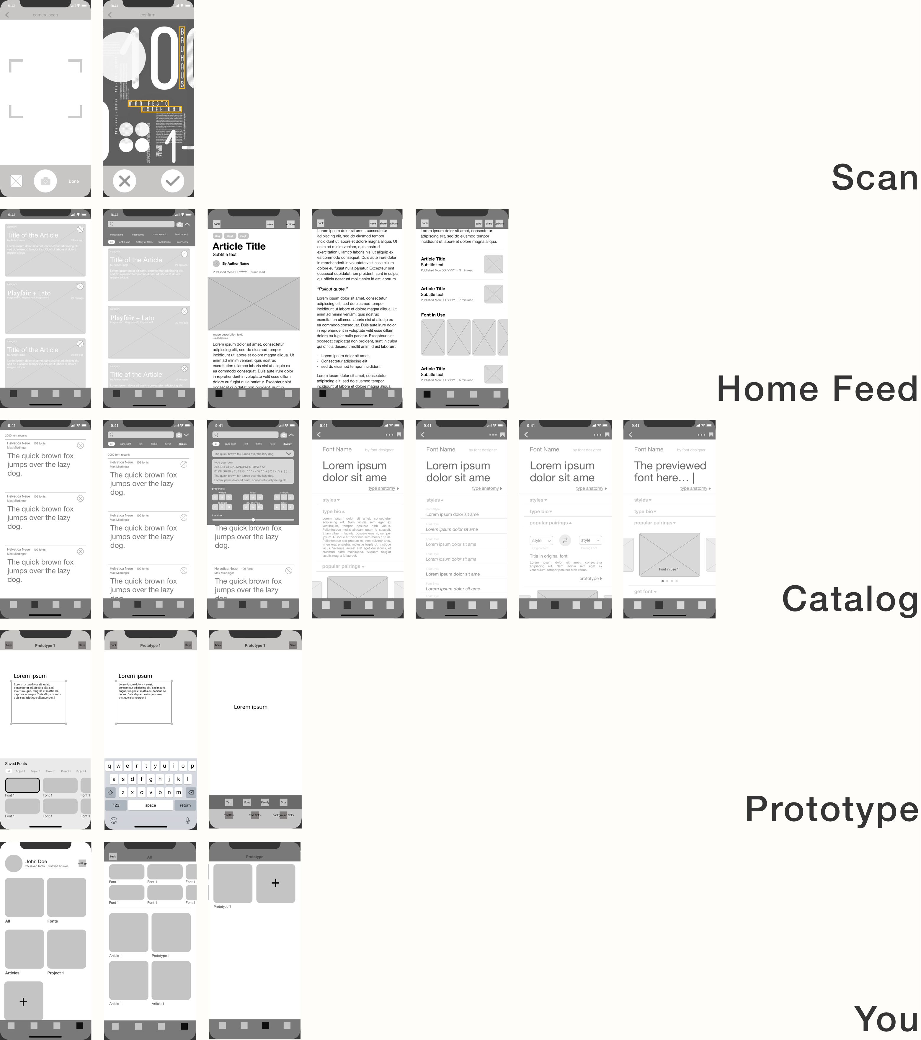
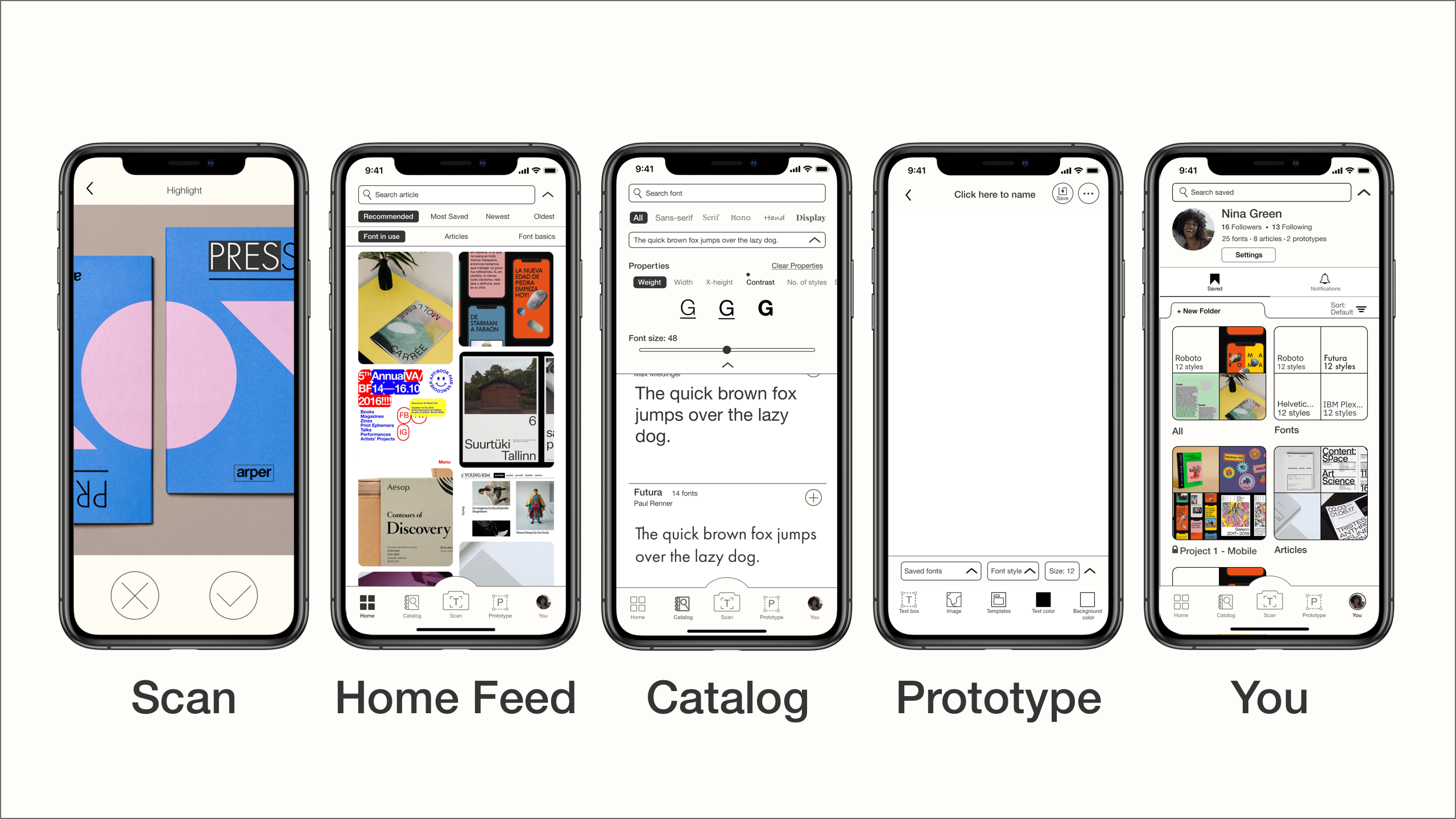
The Scan, Feed, Catalog, Prototype, and You are the features that we chose to include within Type to house a holistic source of inspiration, exploration, and knowledge of different typography options - grasping both image and text-based spectrum.

These are the three ideas we wanted to visually communicate to our users. Type’s goal is for users to explore limitless typography possibilities, we don’t want our app to hinder users’ design ideation in any way.
Mimicking the impression of blank canvas, we chose gray, off-white, and off-black. For type, we chose Helvetica Neue because it is a type that is known to stand the test of time for its neutral characteristics. In terms of layout, Type took note of visually-driven app, Pinterest and Behance, which are interfaces that our demographics regularly use.


Overall, there were no major usability or experience errors while participants navigated through the app to complete the given tasks. They liked how the app offers something different from other existing resources - particularly how it is more focused towards typography.
Participants found that presented design trends, styles and font pairings are convenient source of inspiration. Additionally, our participants expressed that since real-life typography inspirations come at any time of the day, the mobility of our application helps to streamline the steps of discovery and rapid prototyping.
We received minor feedbacks about the interactions within the app. 2 out of 4 participants found that the filter buttons underneath the search function is too small. Additionally, font inclusion in the saved project does not sit well with the rest of the content. As well, some inconsistent vocabulary hindered users from exploring the app to its fullest extent. For example, some users did not understand what “styles” within a font entail.
If the opportunity for future development presents itself, we would like to explore the onboarding process to promote the customization of user preferences. As well, we would consider micro-interactions that we can add within Type to continue improving the user experience of the app.