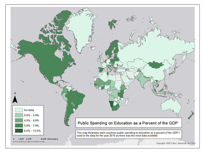
Public Spending On Education as a percent of the GDP

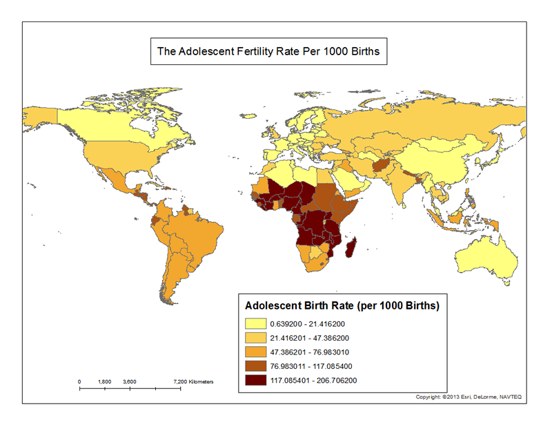
Adolescent Fertility Rate Per 1000 Births
For this Map I also chose to use natural breaks. This data is also from the World Bank data repository. I wasn't able to make the first class equal to zero values, so the first class should be thought of as a low adolescent fertility rate also areas where the data wasn't available. It show the best distribution of the percent of adolescent births. I think it's interesting to compare the developing countries, but also the developed countries in this map.
