Project Requirements
Develop a fully functional product webpage using HTML and CSS, including a Home Page, Product Listings, Contact Page, and an interactive mock Checkout Page. Work in a team of two, dividing tasks efficiently for seamless integration, ensuring responsiveness and incorporating interactive elements for enhanced user experience. Focus on a cohesive design that aligns with the overall theme and user experience.
Team partner: Anant Bamba
My Impact
Overview
I was responsible for building out the HTML for the majority of the webpage, including the About Us, Contact sections, and mainly the checkout section. This involved coding the structure and ensuring that all elements were implemented correctly and aligned with project requirements.
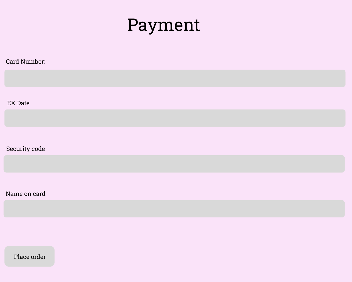
The checkout page is a crucial part of the user journey, with the goal of increasing user satisfaction and sales by making the purchasing process straightforward and efficient. In the following sections, I will detail the steps taken to build the checkout page, from initial planning and creating mockups to the final design, highlighting the importance of each section and the decisions that contributed to a seamless checkout experience.
Checkout Page Goals
When developing the checkout page, I focused on creating a user-friendly interface that allowed users to simulate the product purchasing process. My work included ensuring smooth navigation and functionality throughout the checkout experience.
Creating an easy-to-use checkout page is crucial for several reasons:
- User Experience: My goal was to create a straightforward checkout process to reduce friction and frustration for users, leading to a more positive shopping experience.
- Mobile Accessibility: An easy-to-navigate checkout page ensures that users on mobile devices can complete their purchases without unnecessary hassle, catering to a growing segment of mobile shoppers.
Initial Planning
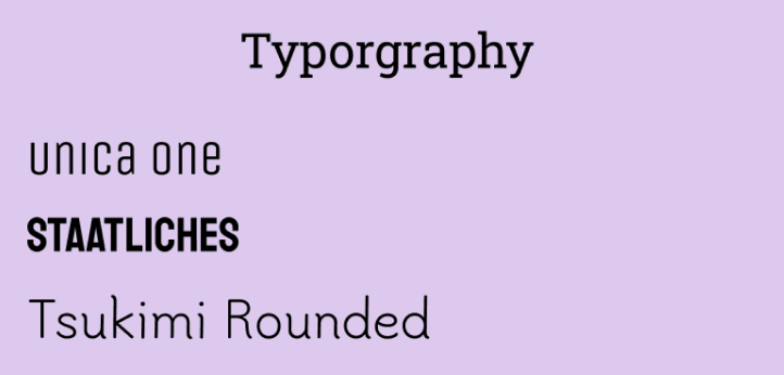
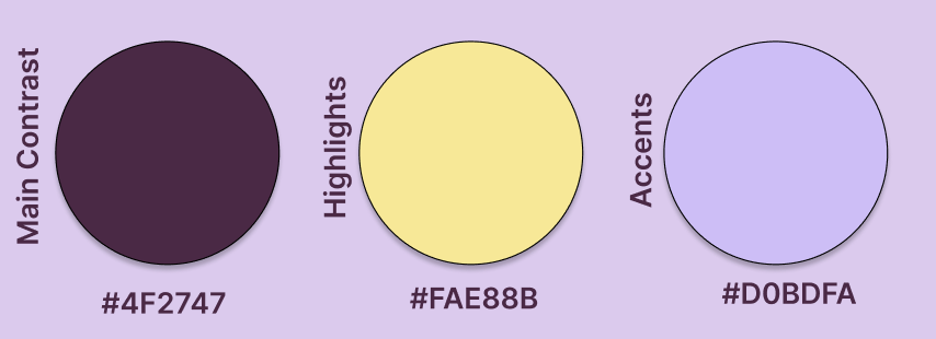
To start the process of building this checkout page, I began with rough Figma mockups of fonts, mood-board, and color scheme to make a cohesive checkout page with the rest of the webpage.
The chosen fonts – Unica One, Staatliches, and Tsukimi Rounded – blend modern, bold, and approachable styles, making the product page engaging and versatile. The color scheme, featuring Main Contrast (#4F2747), Highlights (#FAE8BB), and Accents (#D0BDFA), creates an appealing palette. The deep purple conveys luxury, the soft yellow adds warmth, and the light lavender brings a delicate touch. These elements align with the branding for lash extensions, ensuring a cohesive and attractive design.
Mockups
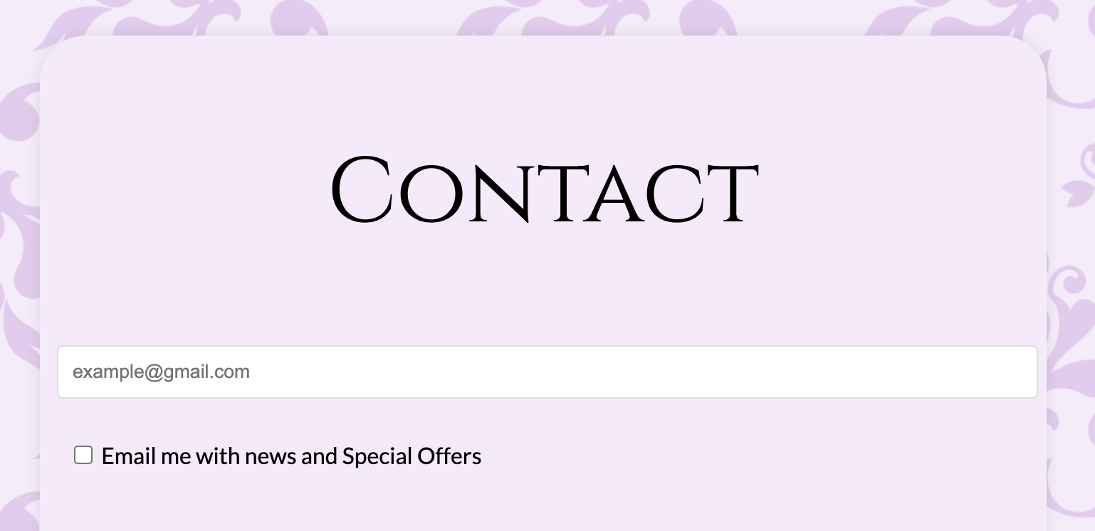
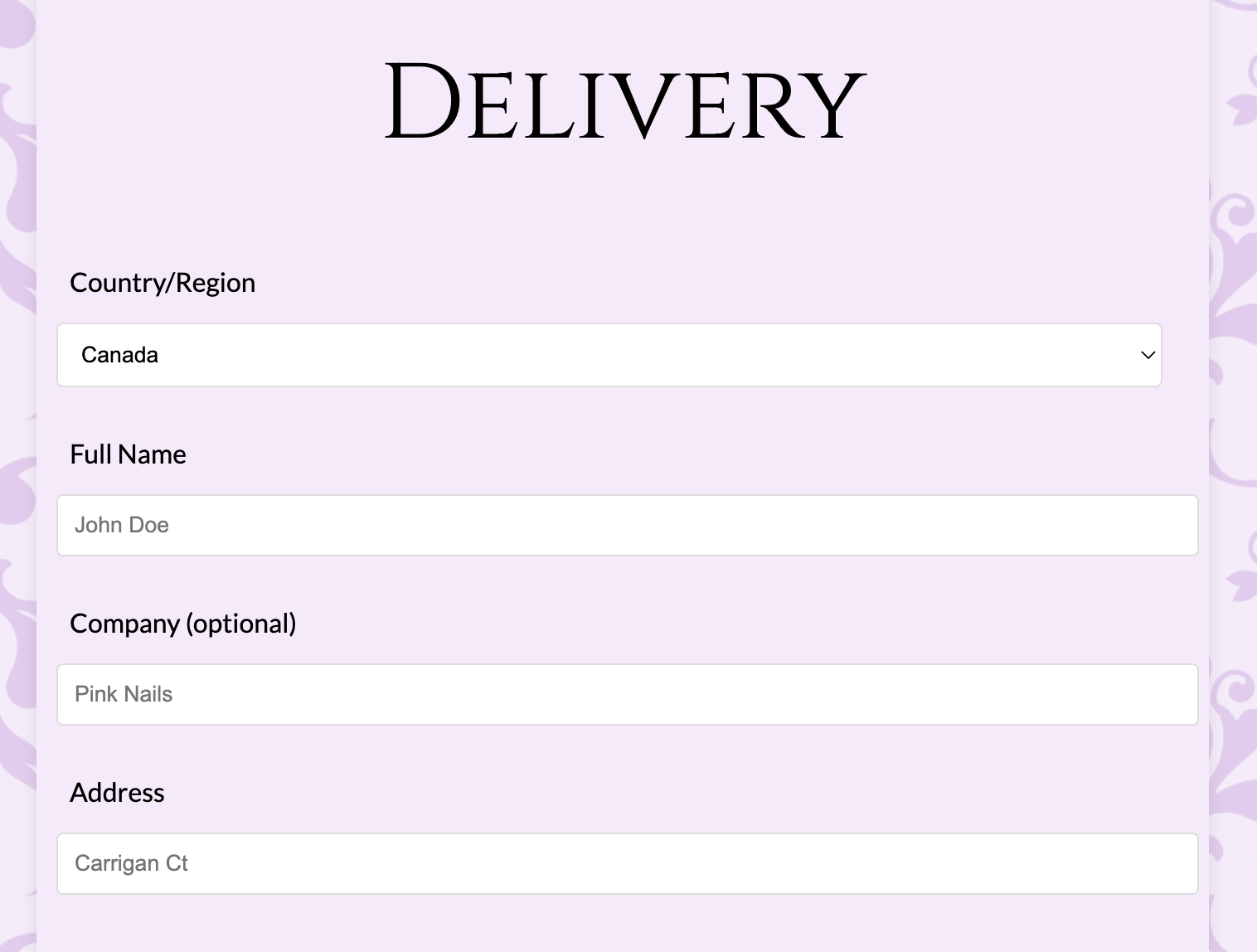
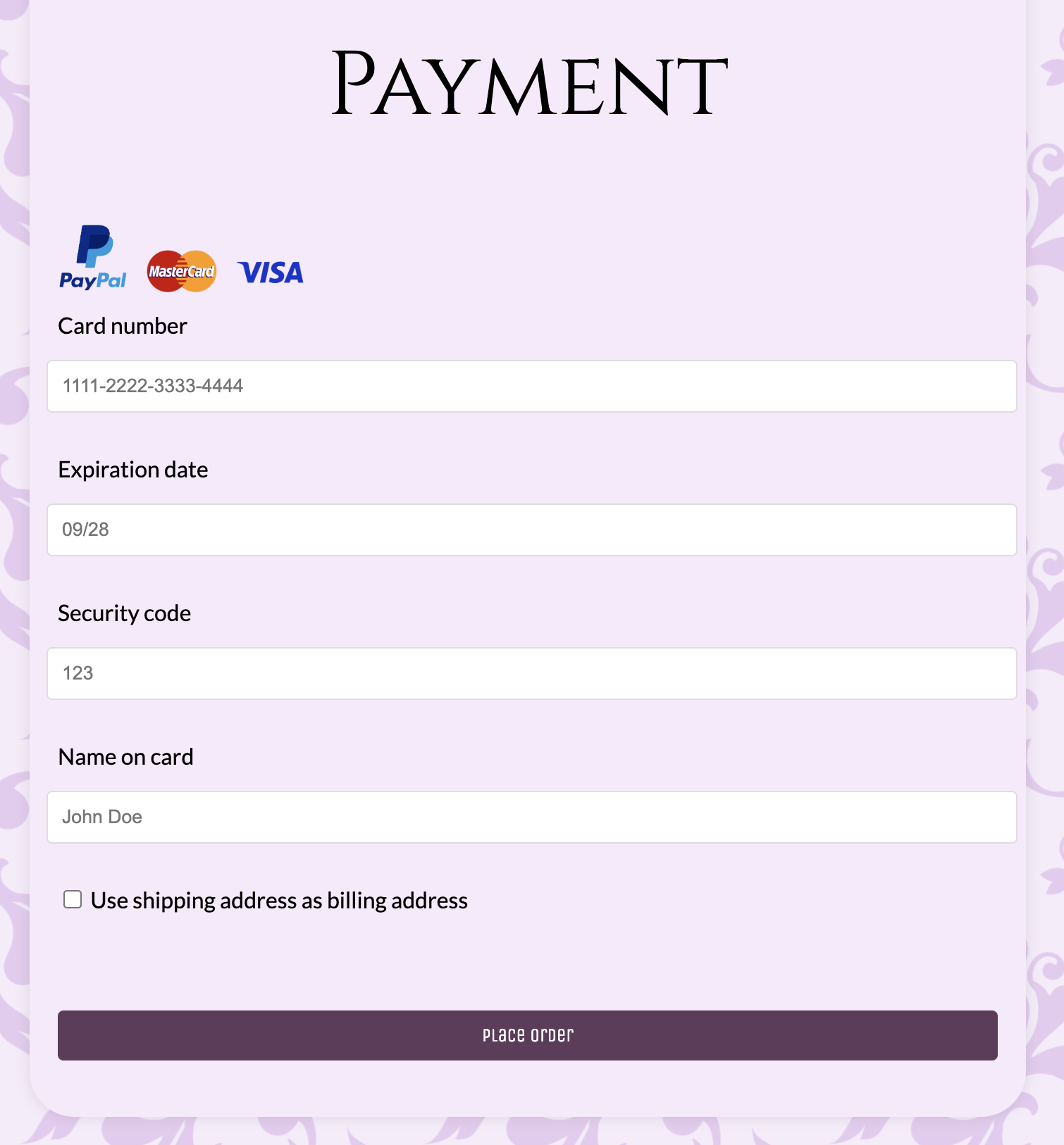
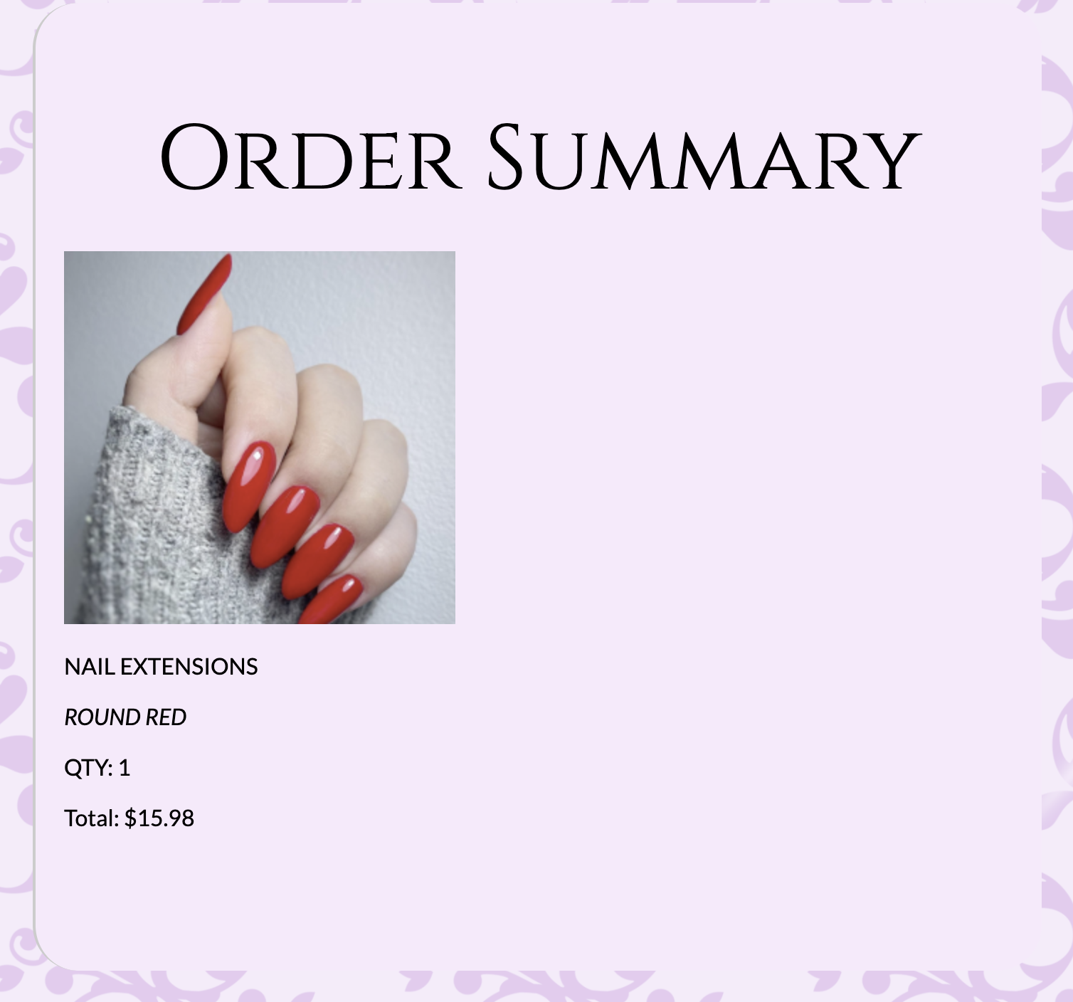
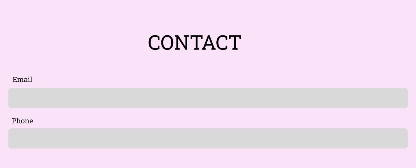
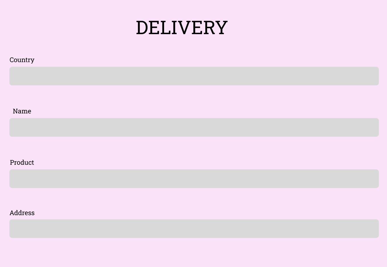
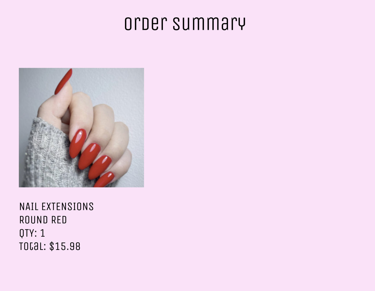
The next step was to create rough low-fidelity mockups in Figma of the checkout page. I broke everything into different mockups before putting it together. The goal was to have all the essentials of a well-made checkout page: Contact Section, Delivery Section, Payment Section, and an Overview Section.
Creating these mockups was important to visualize the layout and structure before implementation. It allowed me to see how different elements would fit together and identify potential issues early. By experimenting with different layouts, I could find what worked best and avoid designs that didn’t meet the project’s needs. These mockups made the development process more efficient and ensured a cohesive and functional checkout page.
Responsive Design
Creating a responsive checkout page was essential to ensure users on different devices could interact with our webpage smoothly and effectively. By implementing responsive design techniques, we ensured the layout adjusted seamlessly to various screen sizes.
To enhance responsiveness, we utilized media queries. For example, on screens smaller than 40rem (approximately 640px), the flex direction of the .payment-container switches to a column layout, making it more suitable for narrow screens.
Responsive Layout Adjustment for Payment Container:
@media (max-width: 40rem) {
    .payment-container {
        flex-direction: column;
    }
    .payment-form {
        max-width: 120rem;
    }
}
Challenges and Solutions
Initially, I struggled with creating a grid that flowed smoothly throughout the page and with adding selection boxes inside the form. These issues affected the layout and functionality of the checkout page.
To overcome these challenges, I educated myself on better CSS methods and strategies:
- CSS Grid Layout: Learned to use CSS Grid for creating a more flexible and responsive grid system.
- Flexbox: Utilized Flexbox for aligning and distributing space within the containers.
- Form Styling: Improved my knowledge on styling form elements, specifically selection boxes, using custom CSS and built-in browser styles.
Flexbox for Payment Container:
.payment-container {
    border-radius: 2rem;
    display: flex;
    justify-content: space-between;
    padding: 1.25rem;
    gap: 2.5rem;
}
Form Styling:
input[type="text"],
input[type="email"], select {
    width: 100%;
    padding: 0.625rem;
    margin: 0.625rem 0 1.25rem -0.5rem;
    border: 0.0625rem solid #ddd;
    border-radius: 0.25rem;
}
Final Design
The final steps involved using the planned typography, color scheme, and mockups to create a functioning and easy-to-use checkout page through HTML and CSS. This process built on the initial planning of fonts and colors, as well as the mockups that defined the layout and structure. By aligning with the project goals, the final design aimed to ensure a seamless and efficient checkout experience for users.
Following these steps, the images below showcase the final implementation of the project.