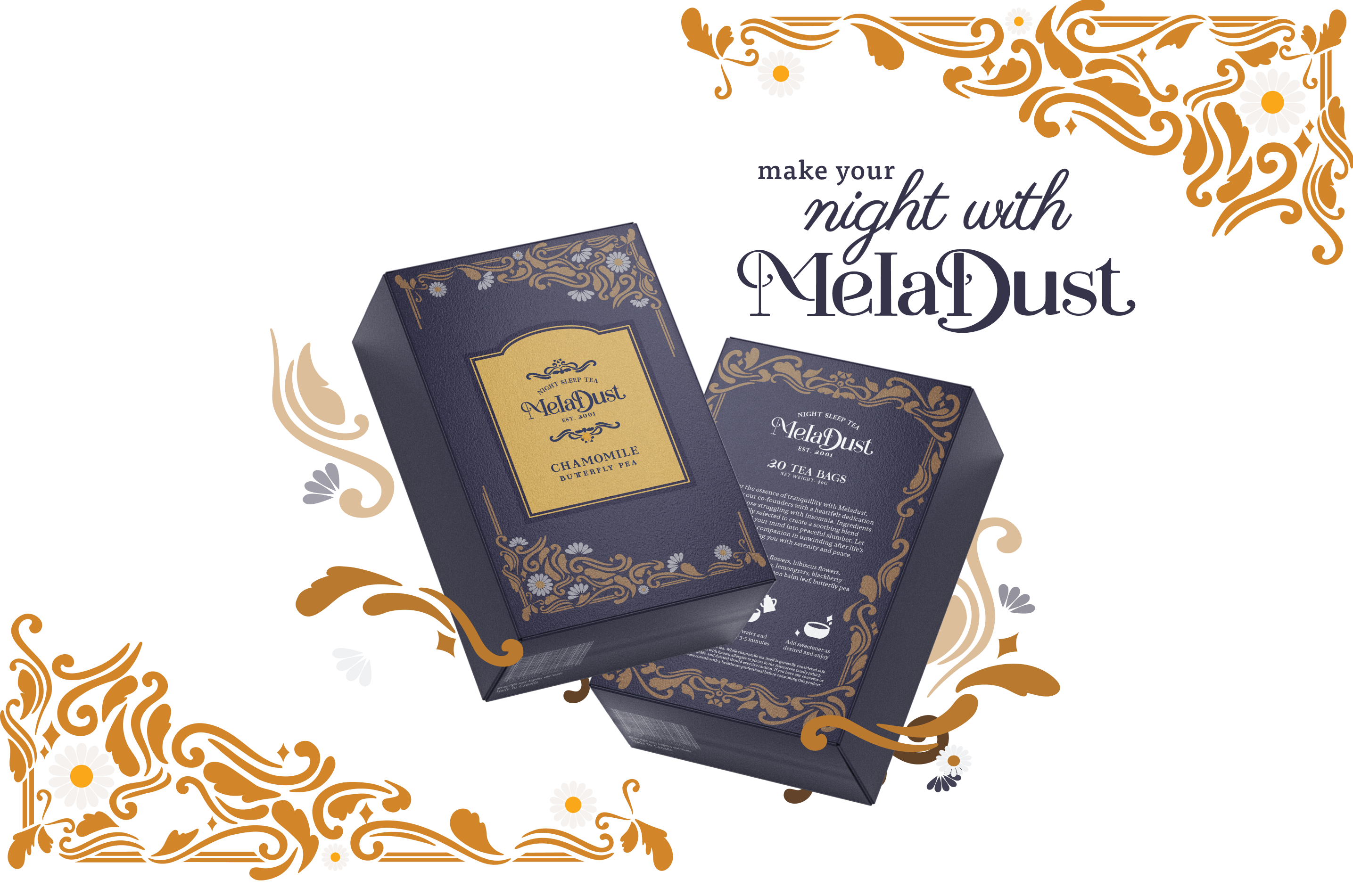

Meladust is created through the mission of empowering individuals to combat insomnia and improve their sleep quality.
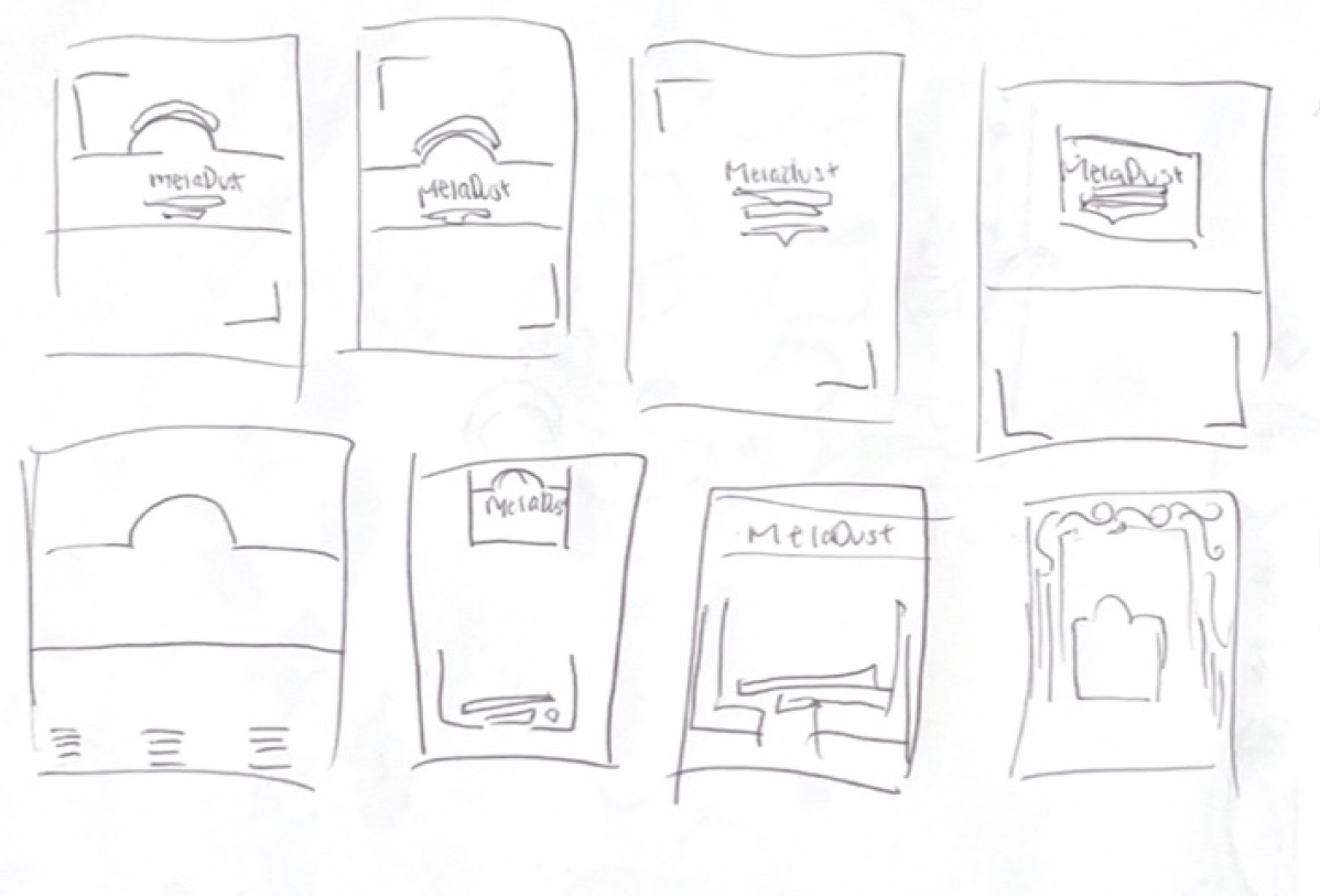
In the initial research, there was various of exploration on investigating how this sleep tea would look like. Through looking at key identifiers for sleep or different ways to reinterprete tea boxes; the meladust brand was created through many logo and layout iterations.

Meladust's brand places a strong emphasis on customer education, competitor analysis, and the selection of key, sleep-inducing ingredients. The artistic vision behind Meladust is inspired by the elegance of the Art Nouveau era, characterized by its iconic floral motifs. By incorporating this style with a modern twist, I decided to add a contrasting dark backgrounds with light, delicate elements, giving the product a distinct look that balances vintage aesthetics with contemporary design.
Through a detailed study of the competitive landscape, we noticed the prevalent use of calming colors like blue, purple, and black, along with sleep-related symbols such as moons and stars. Brands like DavidsTea and Celestial Seasonings influenced our design floral motifs.
This approach is reflected throughout the packaging, where interwoven flower patterns and a refined color scheme emphasize the soothing and luxurious qualities of sleep teas.
For the final teas the three main flavors that were settled upon were: Chamomile Tea, to alleviate anxiety and reduce blood pressure; Magnolia Tea, known for its stress-relieving and antioxidant properties; and Lavender Tea, celebrated for its stress-reducing and immunity-boosting effects.
From the research, we set to create a distinctive palette that is welcoming yet elegant to be suitable for consumers of all ages. This blends accessibility with sophistication and highlights Meladust's commitment to quality sleep solutions.