the team.
- Therese Wong
- Amanda Eng
- Daniel Cherkezov
- Summayyah Memon (myself)
timeline.
- 4-week visual design exploration
my duties.
- Art Direction
- Visual Design
tools.
- Figma
- Adobe Photoshop
my contribution.
I co-directed the art direction by focusing on type and colour while ensuring its consistency throughout the various phases of this design exploration.
initiating the poster exploration.
Considering the posters were intended for the 2023 AIGA Annual Conference in New York City, our design strategy focused on using large-scale typography and high-contrast colors. This approach ensured our design would be prominent and eye-catching in the bustling city environment. I began by creating posters adhering to the overall design strategy.
week 1
In Week 1, for the poster on the left, I experimented with overlapping text and imagery to achieve a dynamic composition. For the poster on the right, I opted for a more minimalist approach, emphasizing simplicity while drawing the viewer's attention to the conference name as the focal point of the design.
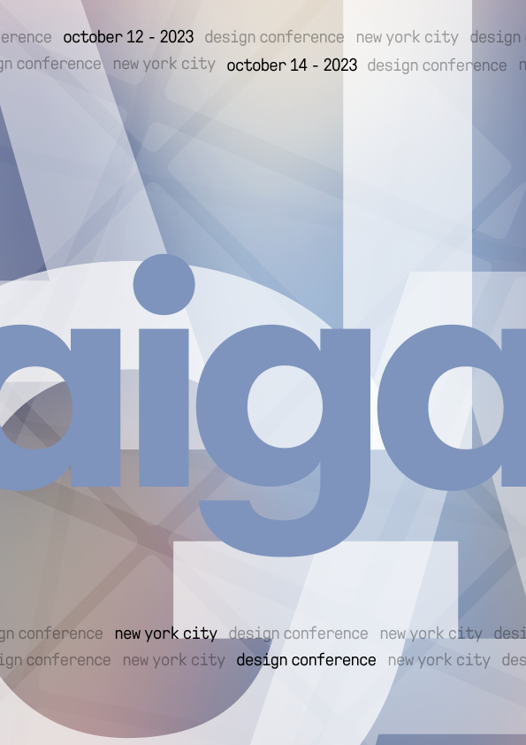
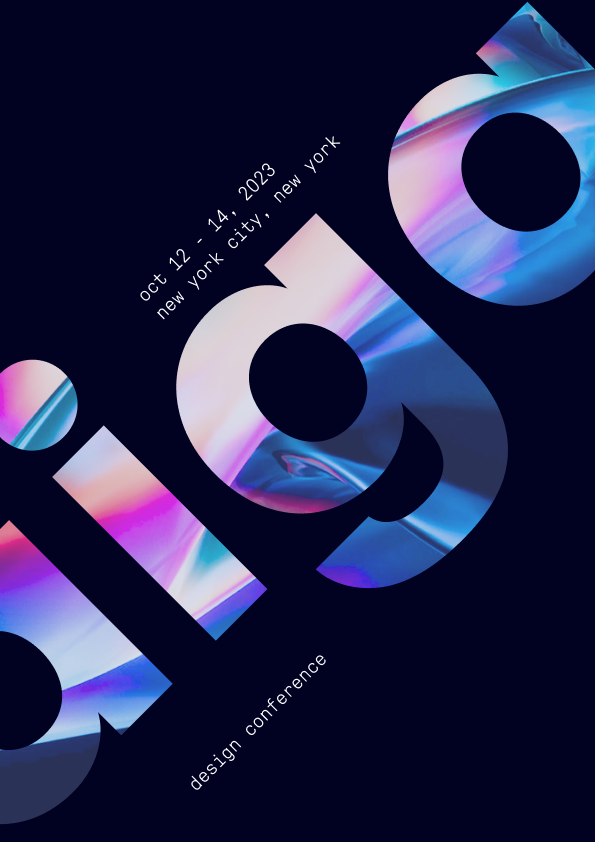
week 2
In Week 2, after receiving feedback and doing additional research on poster layouts, I experimented with incorporating images and shapes to enhance the layout and provide a clearer structure for breaking up the text.
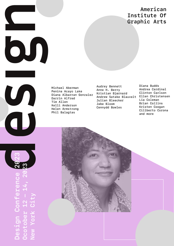
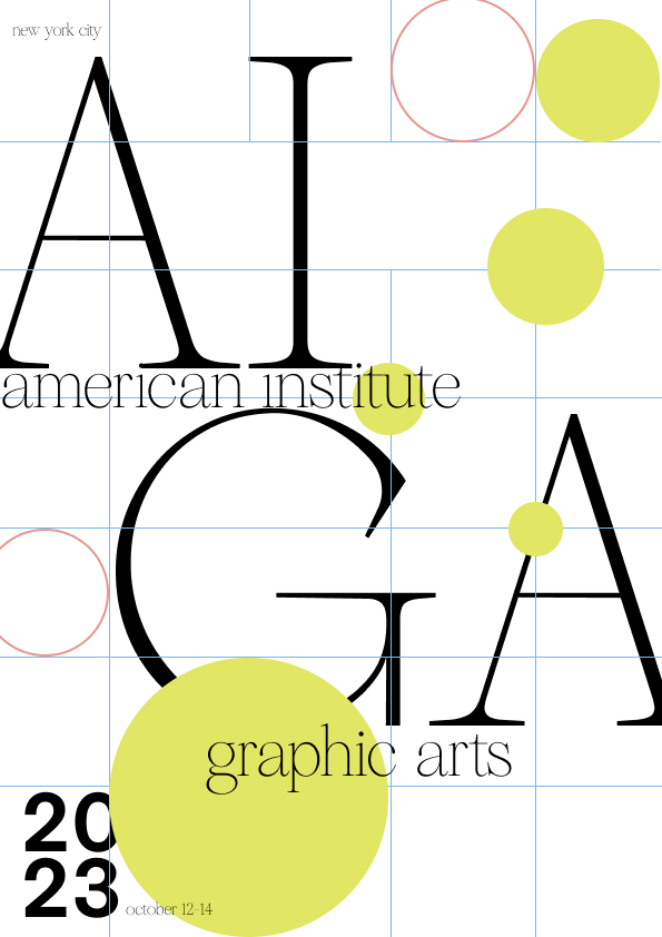
iterating.
The initial set of posters I created aligned with our design strategy, showcasing a diverse range of ideas and design directions. However, this diversity lacked a clear direction, making it challenging to progress effectively. Reflecting on this, I realized the importance of establishing constraints to guide our creative process. It became clear that we needed to focus on selecting specific typography and color schemes to create a strong foundation for the design as we moved forward.
font exploration
After conducting typographic research, I concluded that our main font should be a serif font, due to their high-level contrast and dynamic interplay of thick and thin strokes in their letterforms. This led to the selection of Reckless Neue, a typeface with a notable transition between its vertical and horizontal strokes, lending it both elegance and readability. Its sharp serifs and refined curves establish a strong visual hierarchy, making it ideal for large-scale use and key focal points. Given this reasoning we chose Reckless Neue.
To complement Reckless Neue, I selected TWK Everett Mono as the secondary font. As a monospaced typeface, its evenly spaced characters and uniform stroke widths balance the visual complexity of the serif font. This pairing creates a synergy where the high-contrast serifs bring sophistication, and the monospaced sans-serif offers clarity.


final poster designs.
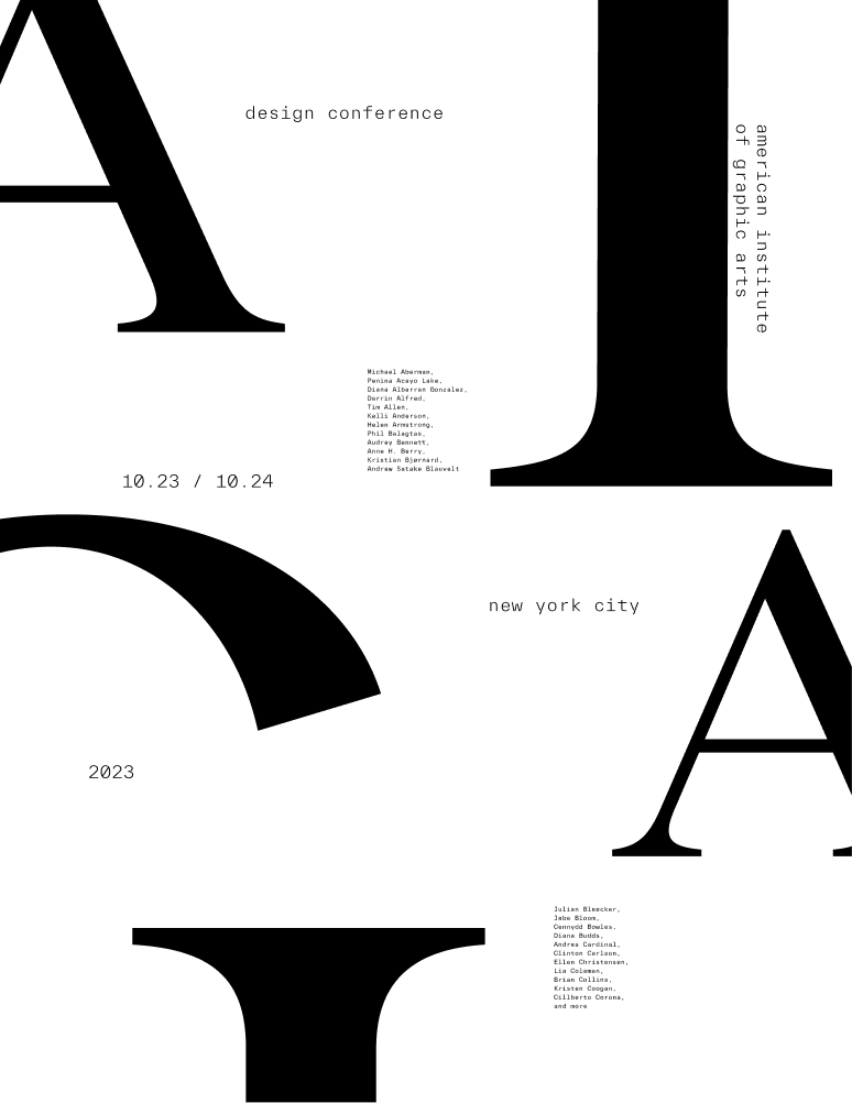
With the new fonts selected, I chose to work exclusively with black and white to concentrate on the visual relationship between the fonts, white space, and text elements on the poster. This resulted in a final poster that balances hierarchy and type while enticing users with its asymmetrical look.

colour exploration
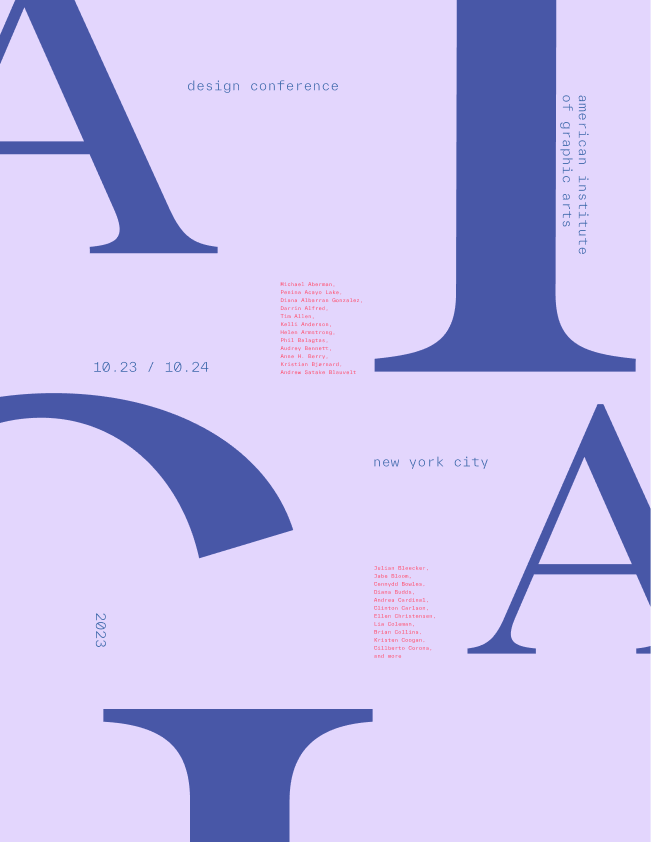
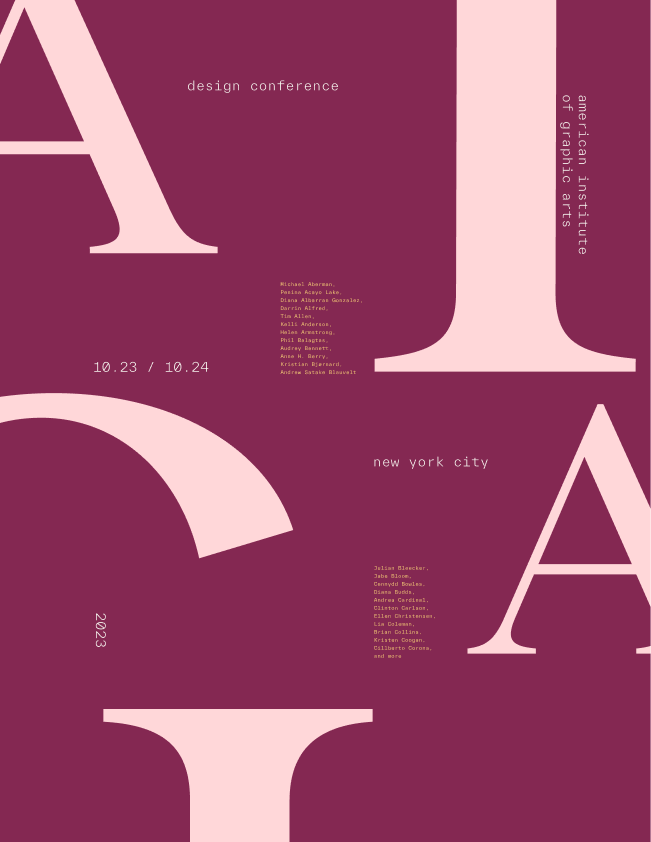
Although black and white provided good contrast, I wanted to explore various color palettes to see how the poster design could be elevated even more. I experimented with many color palettes—soft, bold, and pastel—of which two examples can be seen on the right. However, none of them seemed to fully capture the essence I was aiming for.
final blue poster
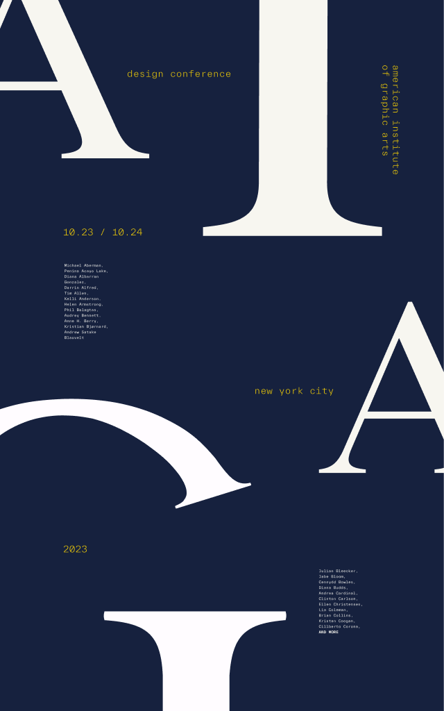
I found inspiration in Anna Kulacheck, a graphic designer and art director known for her impactful use of color, typography, and shapes to craft compelling visual narratives. After exploring her work, I experimented with opposing colors on the color wheel to achieve the contrast I envisioned. I chose dark navy blue for the background to create a rich, less harsh contrast than white. Golden yellow became the accent color for its striking contrast with blue and ability to grab attention subtly. Lastly, I used off-white for the text to ensure clear readability and a balanced, sophisticated look.

translating designs to assets.
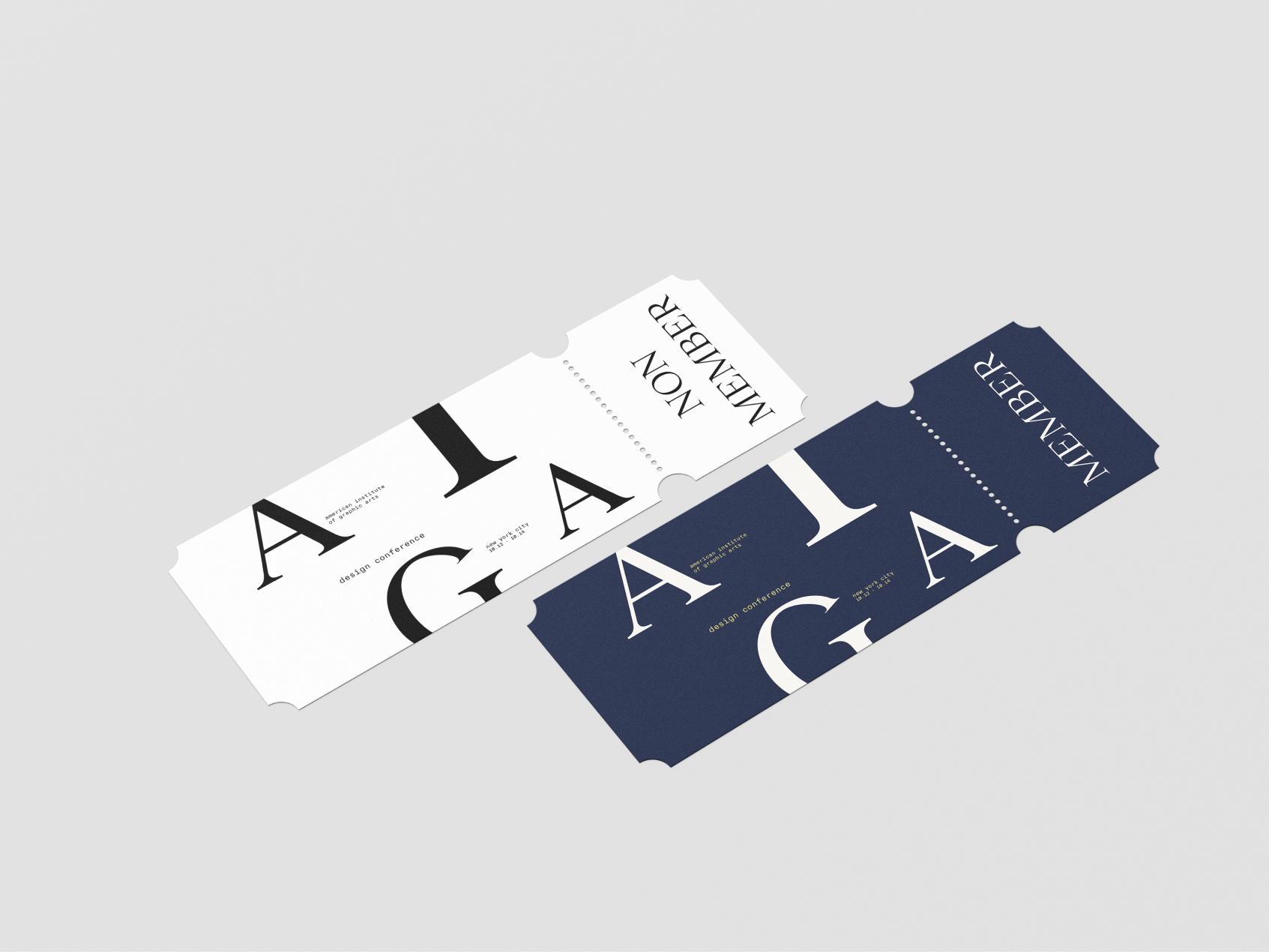
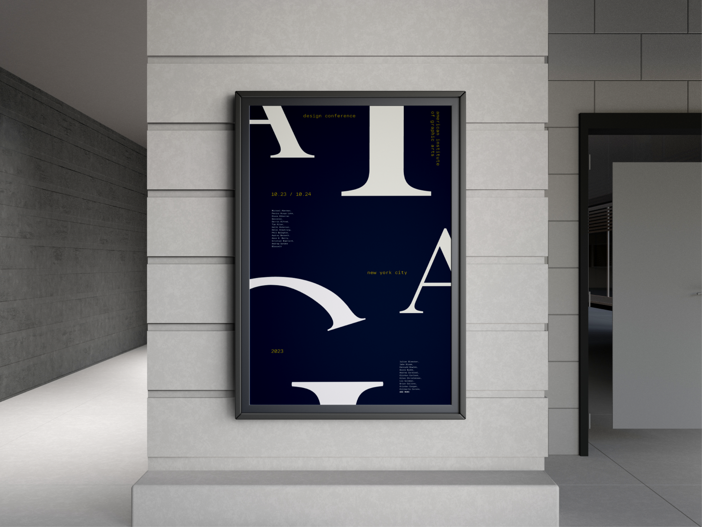
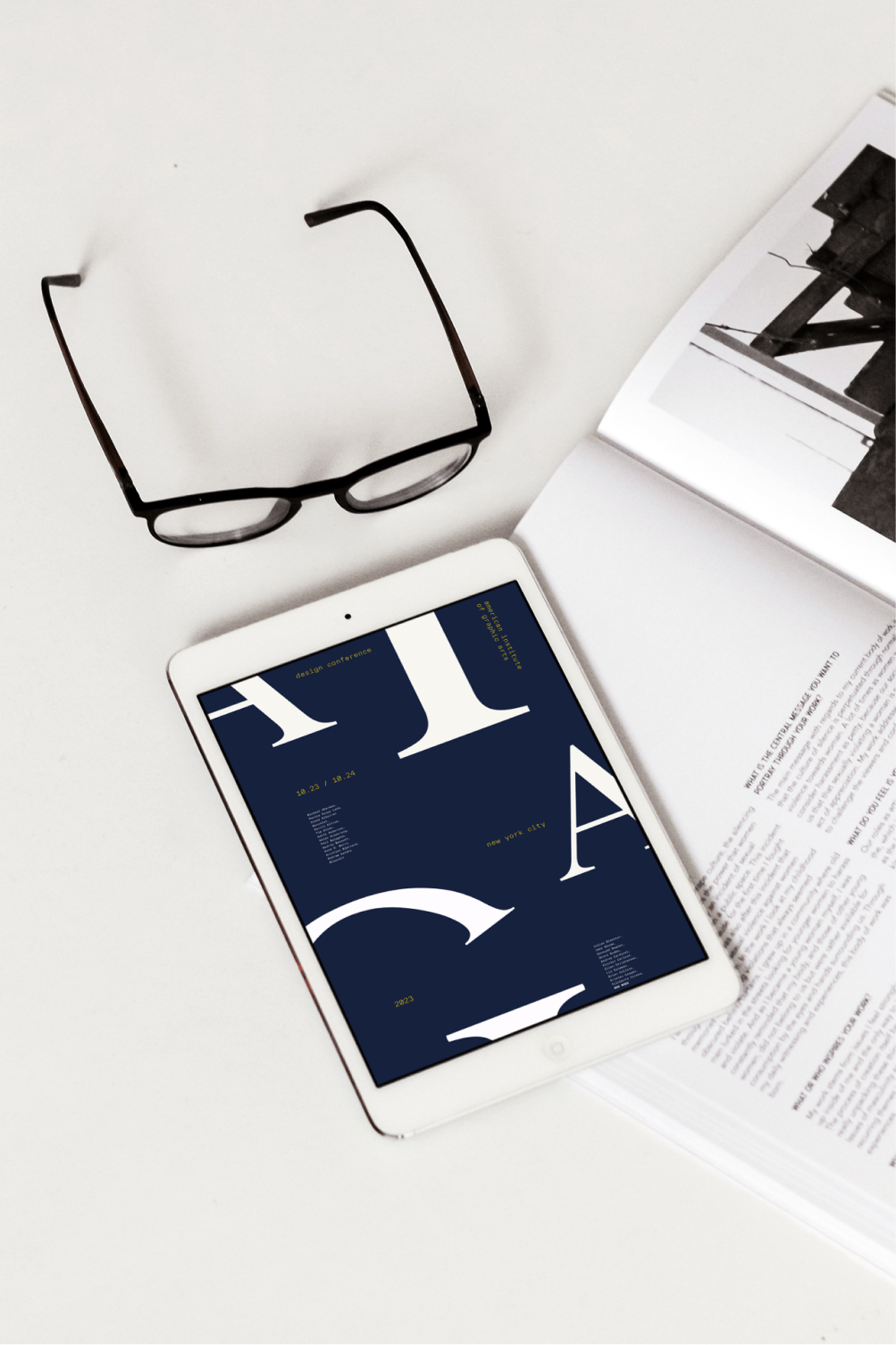
I designed assets for AIGA, including street posters, online magazines, and event tickets, to test the adaptability and versatility of my design, experimenting with its seamless transition across different platforms.
reflection & takeaways.
Ultimately, this project highlighted the importance of iteration, and a process of asking the right questions and immersing myself in the shoes of participants to understand how users might perceive our design. As my first experience leading an art direction, I developed project and time management skills and, most importantly, learned the critical role of communication in achieving milestones within tight deadlines.