the team.
- Therese Wong
- Amanda Eng
- Daniel Cherkezov
- Summayyah Memon (myself)
timeline.
- 4-week visual design exploration
my duties.
- Art Direction
- Visual Design
tools.
- Figma
- Adobe Photoshop
my contribution.
I co-directed the art direction for the design exploration by conducting an in-depth colour and font analysis and applying through the various phases of this 4 week exploration.
initiating the poster exploration.
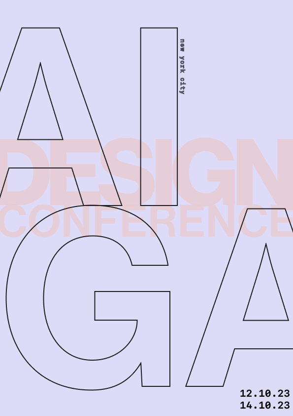
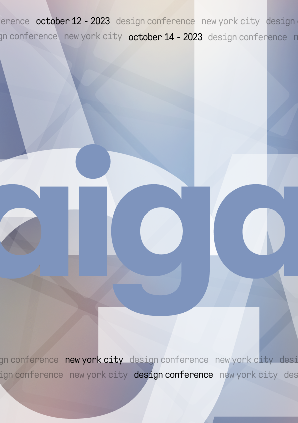
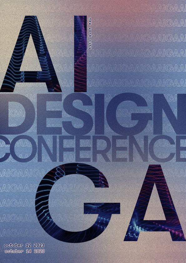
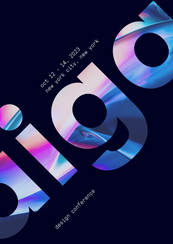
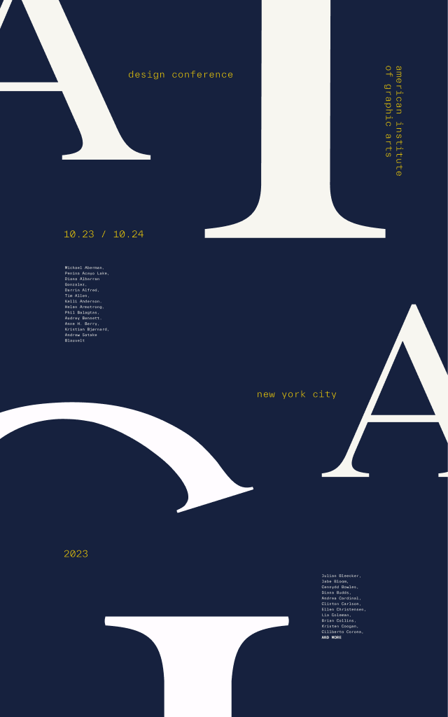
Considering the posters were intended for the 2023 AIGA Annual Conference in New York City, our design strategy focused on using large-scale typography and high-contrast colors. This approach ensured our design would be prominent and eye-catching in the bustling city environment. I began by creating posters that adhered to the overall strategy, focusing more on the approach than on intentional colors and fonts.
week 1
week 2
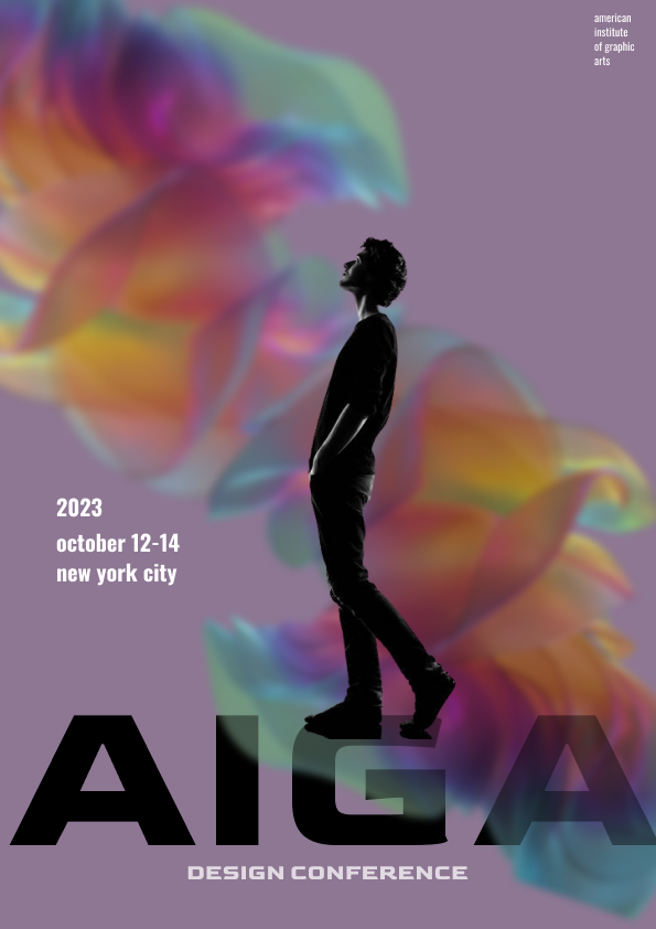
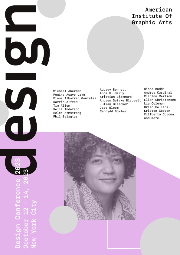
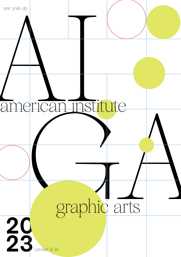
iterating.
The initial set of posters I created aligned with our design strategy, but was advised to push the typography scale further to amplify the letterforms. This feedback made me realize that having a solid font pairing was crucial for success in this exploration phase.
After conducting typographic research, I concluded that our main font should be a serif font, due to their high-level contrast and the use of thick and thin strokes in their letterforms. Given this reasoning we chose Reckless Neue. To complement the sharpness and curves, I chose TWK Everett Mono as the secondary font.


final poster designs.
With the new fonts selected, I chose to work exclusively with black and white to concentrate on how the font pairing could be effectively laid out on the poster. With this, I ended up with my final poster and it shares a balance of hierarchy and type while enticing users to read the poster due to its asymmetrical look.
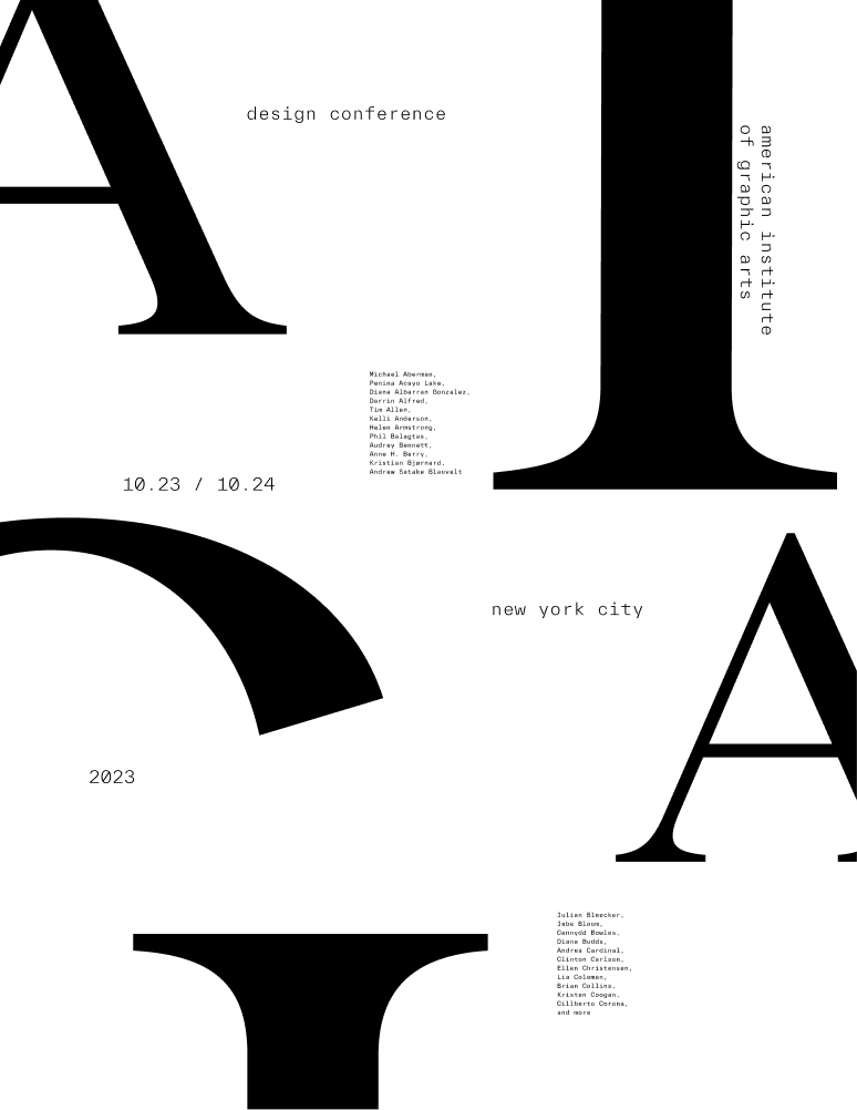

Although black and white provided good contrast, I wanted to explore various color palettes to see how the poster design could be elevated even more. I experimented with many color palettes—soft, bold, and pastel. However, none of them seemed to fully capture the essence I was aiming for.
colour exploration
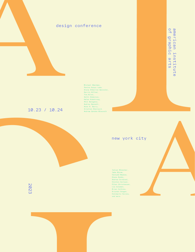
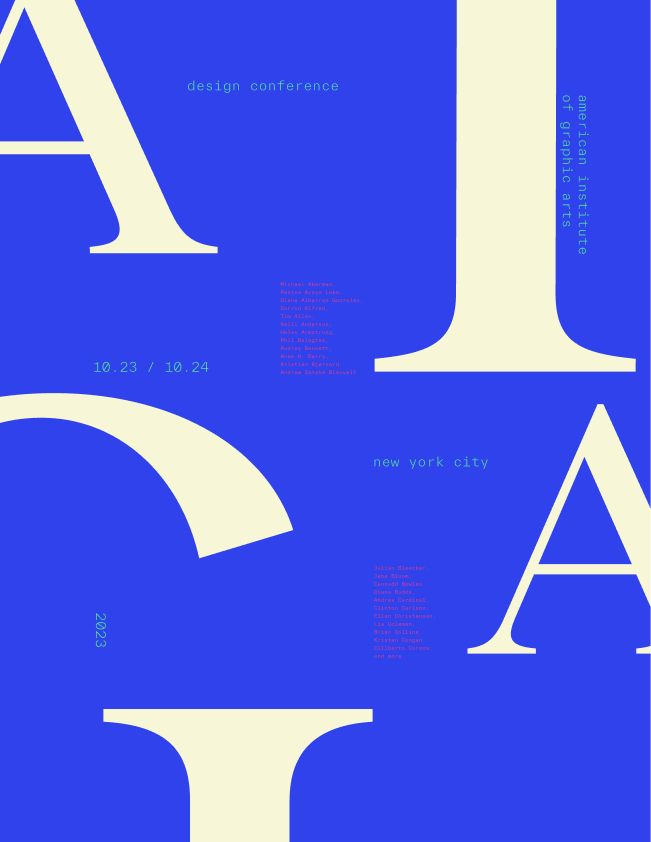
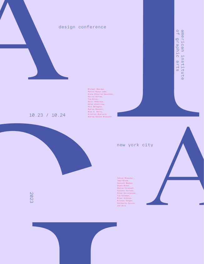
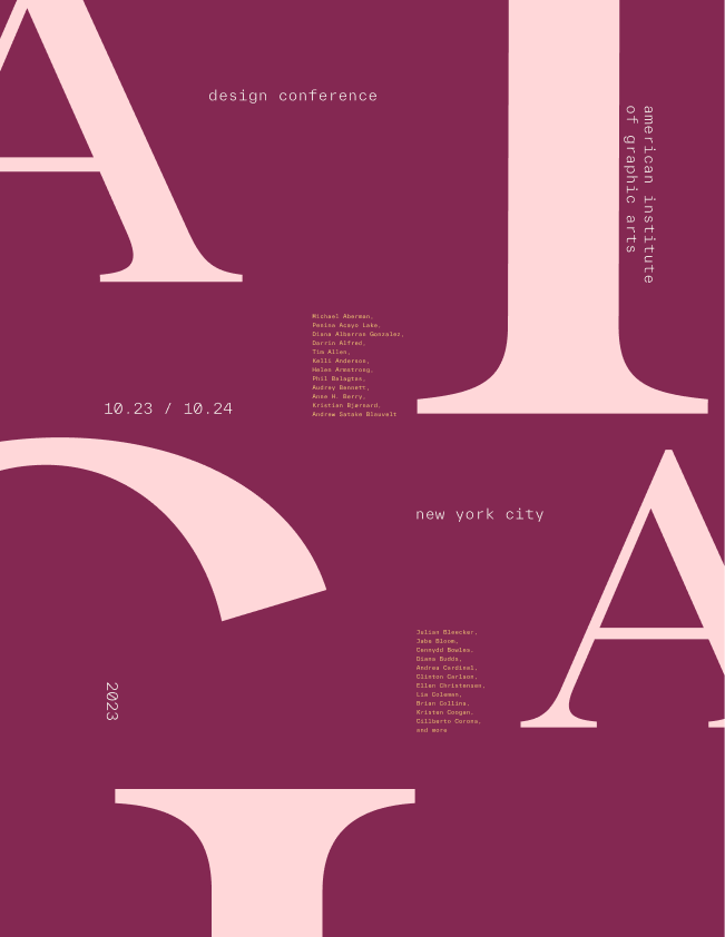
I found inspiration in Anna Kulacheck, a graphic designer and art director known for her impactful use of color, typography, and shapes to craft compelling visual narratives. After exploring her work, I experimented with opposing colors on the color wheel to achieve the contrast I envisioned. I chose dark navy blue for the background to create a rich, less harsh contrast than white. Golden yellow became the accent color for its striking contrast with blue and ability to grab attention subtly. Lastly, I used off-white for the text to ensure clear readability and a balanced, sophisticated look.

translating designs to assets.
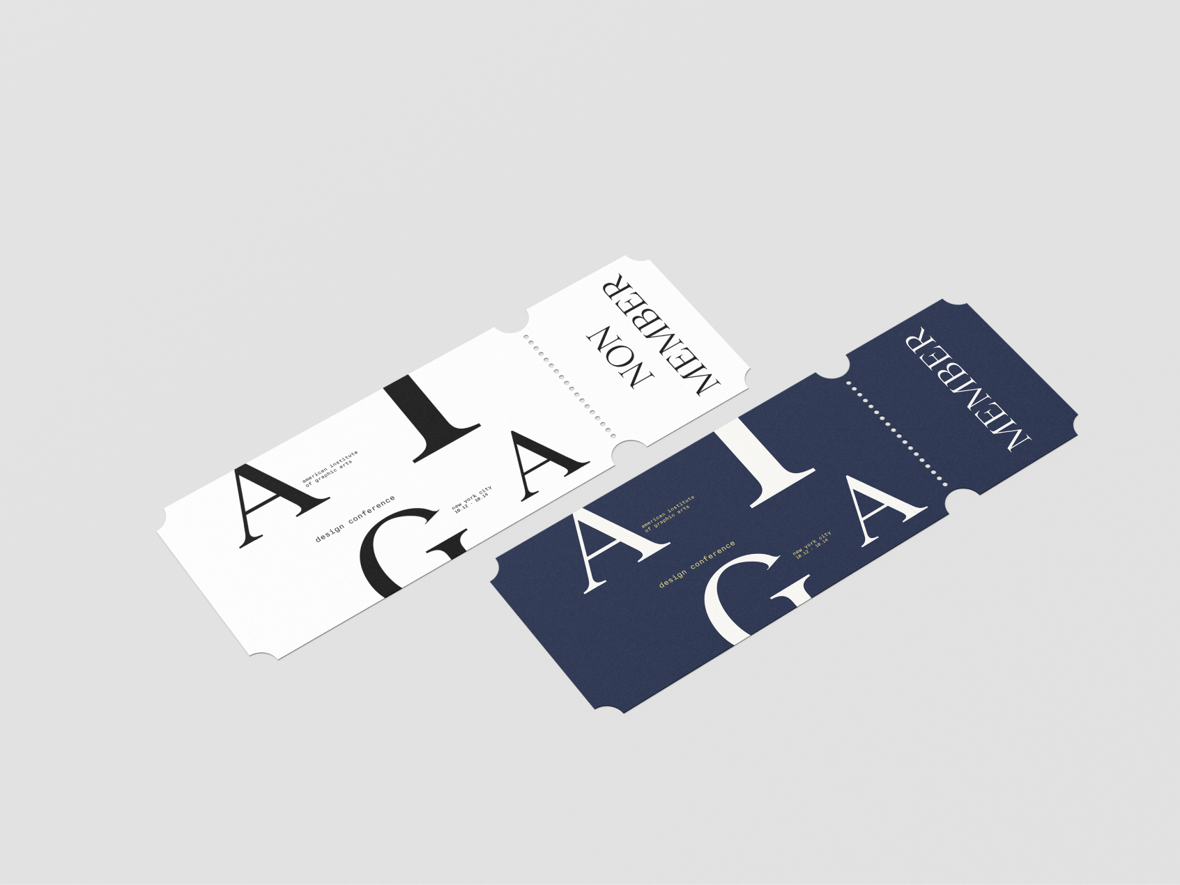
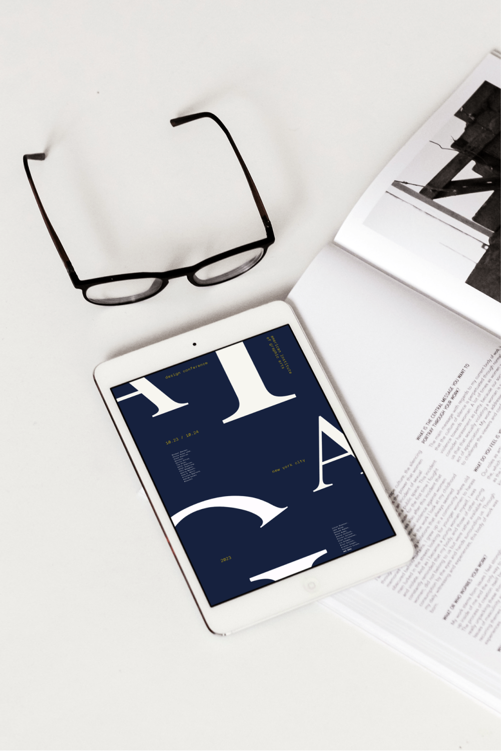
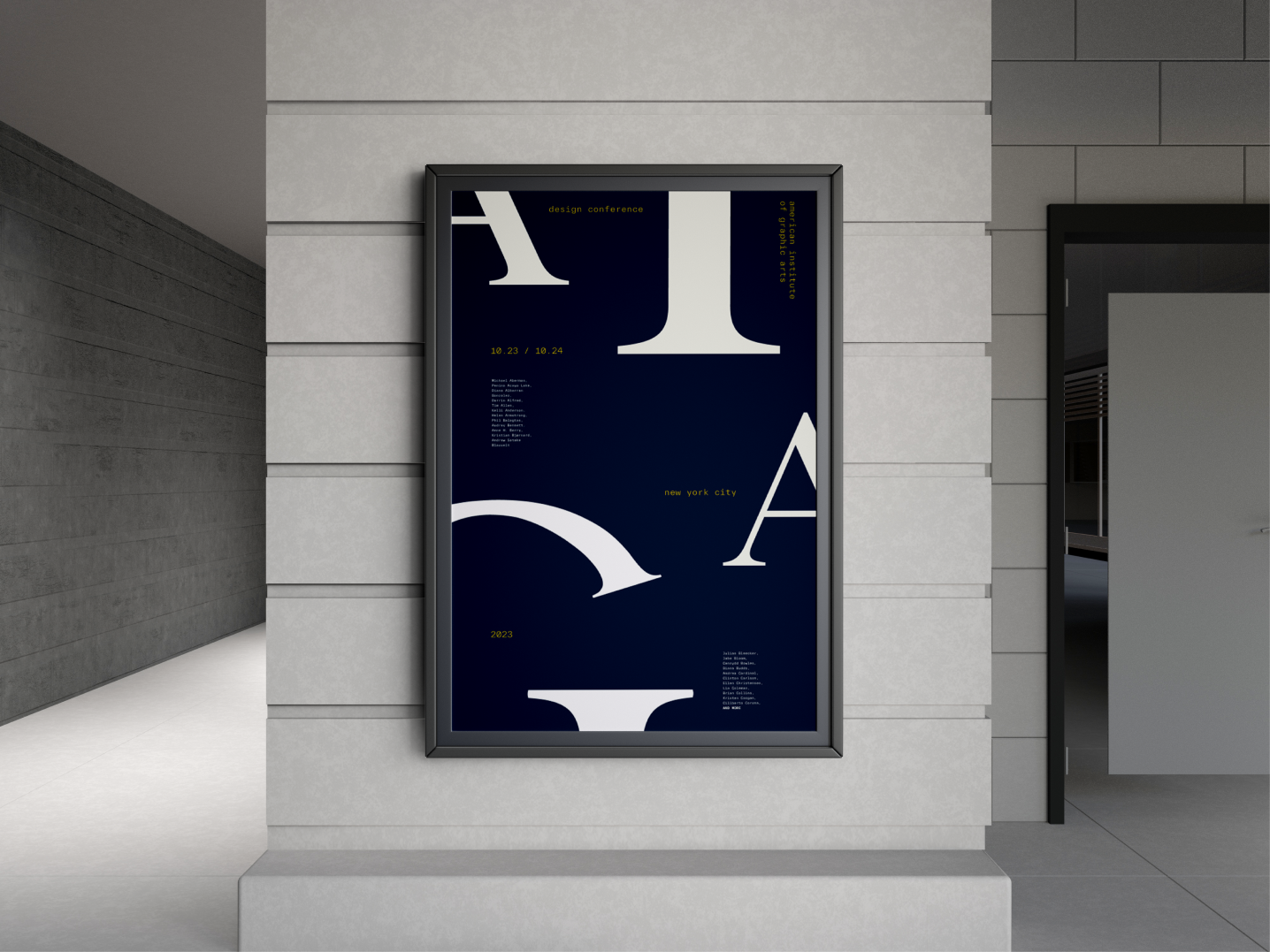
I designed assets for AIGA, including street posters, online magazines, and event tickets, to test the adaptability and versatility of my design, experimenting with its seamless transition across different platforms.
reflection & takeaways.
Ultimately, this project highlighted the importance of iteration, feedback, and teamwork in the design process. It was a process of asking the right questions and immersing myself in the shoes of participants to understand how users might perceive our design. As my first experience leading an art direction, I developed project and time management skills and, most importantly, learned the critical role of communication in achieving milestones within tight deadlines.