the team.
- Therese Wong
- Amanda Eng
- Daniel Cherkezov
timeline.
- 4-week visual design exploration
my duties.
- Art Direction
- Visual Design
tools.
- Figma
- Adobe Photoshop
my contribution.
I co-directed the art direction for the design exploration by conducting an in-depth colour and font analysis and applying through the various phases of this 4 week exploration.
initiating the poster exploration.
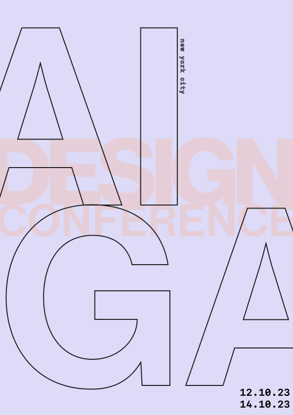
Considering the posters were intended for the 2023 AIGA Annual Conference in New York City, our design strategy focused on using large-scale typography and high-contrast colors. This approach ensured our design would be prominent and eye-catching in the bustling city environment. I began by creating posters that adhered to the overall strategy, focusing more on the approach than on intentional colors and fonts.
week 1
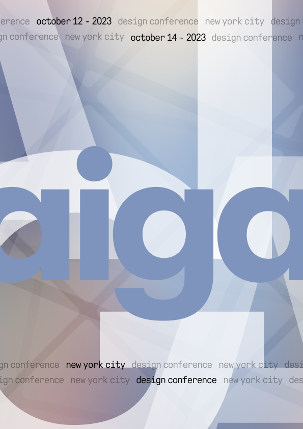
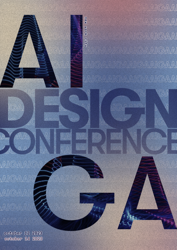
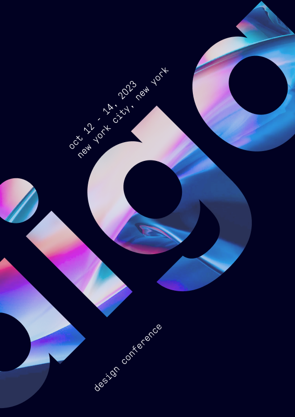
week 2
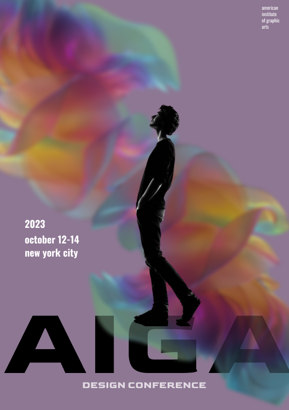
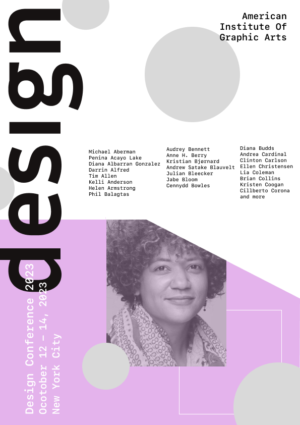
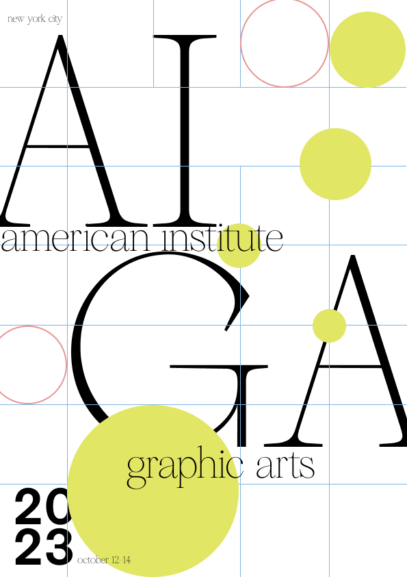
iterating.
The initial set of posters I created aligned with our design strategy, but was advised to push the typography scale further to amplify the letterforms. This feedback made me realize that having a solid font pairing was crucial for success in this exploration phase.
After conducting typographic research, I concluded that our main font should be a serif font, due to their high-level contrast and the use of thick and thin strokes in their letterforms. Given this reasoning we chose Reckless Neue. To complement the sharpness and curves, I chose TWK Everett Mono as the secondary font.


final poster designs.
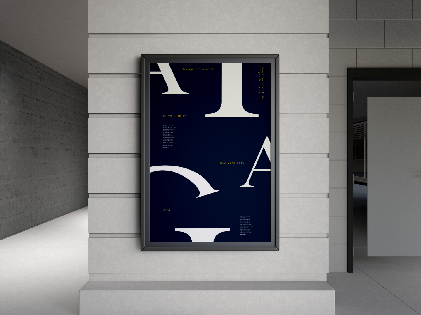
With the new fonts selected, I chose to exclude colors and work exclusively with black and white and concentrate on how the font pairing could be effectively laid out on the poster. With this I ended up with my final poster and it shares a balance of hierarchy and type while enticing users to read the poster due to its asymmetrical look.
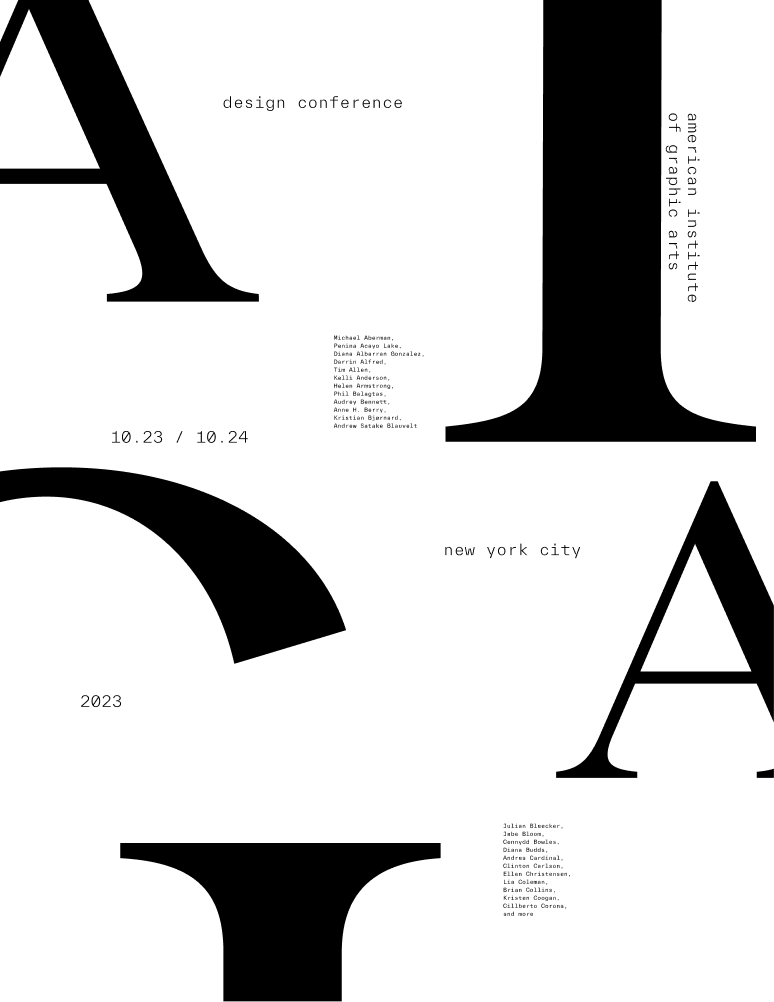
Although black and white provided good contrast, I wanted to explore various color palettes to see how the poster design could be elevated even more. I experimented with many color palettes—soft, bold, and pastel. However, none of them seemed to fully capture the essence I was aiming for.
After much trial and error, I decided to blend different hues and tones to create a unique palette. Dark Blue as the Base: The deep blue background provides a rich contrast, making it visually appealing and less harsh than white.
Yellow for Accent: Yellow is a high-contrast color against dark blue and grabs attention without being overwhelming.
White for Legibility: White text and design elements ensure clear readability, maintaining a balanced and sophisticated look.
translating designs to assets.
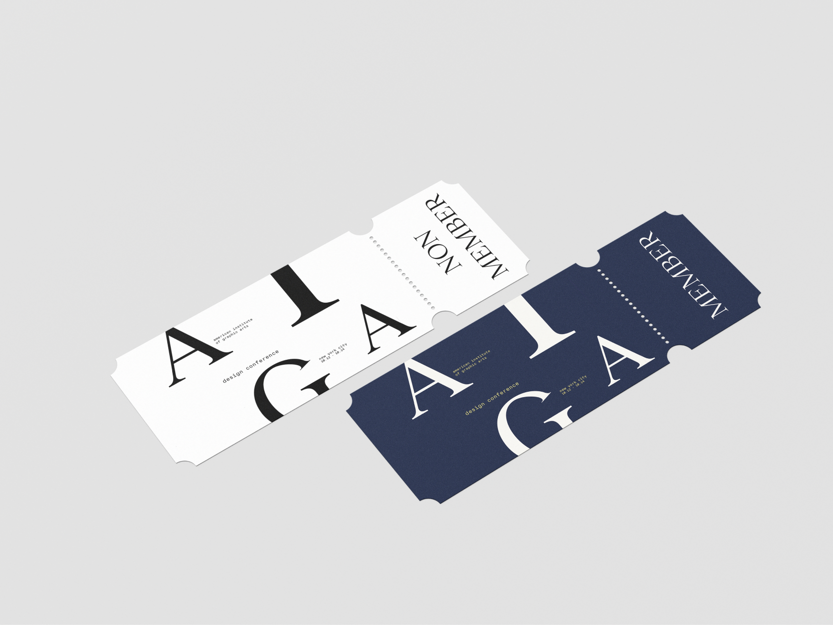
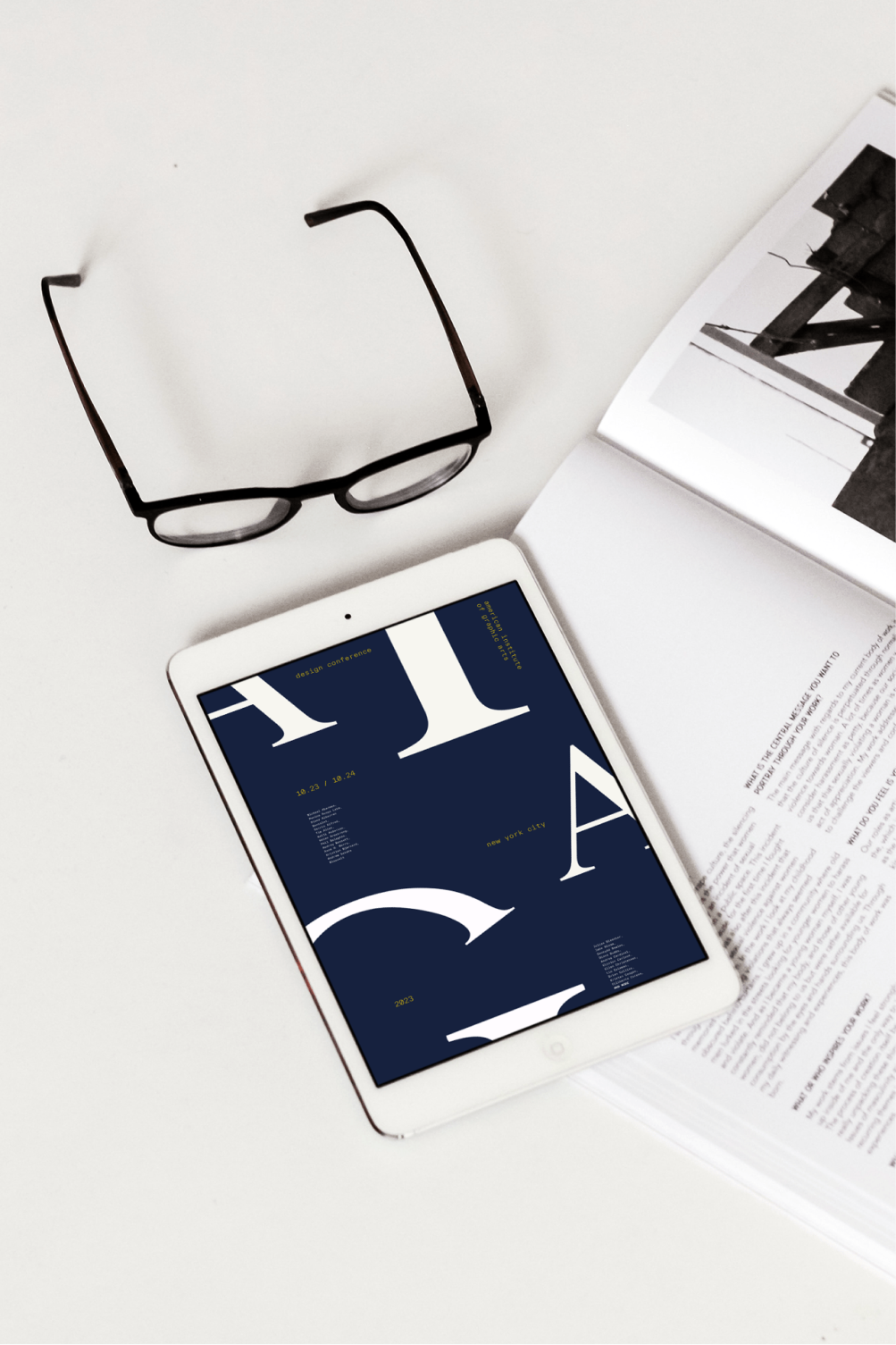
Once the poster design was nailed down, I wanted to test the adptability and versatility of my design and translated the poster into multiple asset. Through this I was able to experiment with various mediums and got an understanding of how my design would need to change - in terms of scability and even colour based on the mockup. In the context of AIGA I decided to apply the design to street posters, online magazines, and event tickets.
