
Roles
Art Director + UI Designer
Team
Mahla Aghapour, Melika Rezazadeh, Sadra Almasi
Duration
Spring 2023, 5 weeks (Academic Project)
Fuorisalone is an annual event held during Milan Design Week, showcasing a diverse range of interactive installations, exhibitions, and cultural events. It is a platform for emerging and established designers, artists, and innovators to present their latest creations and ideas in design and creativity.
As a pre-event entry to Fuorisalone’s interactive installations, our microsite offers visitors a preview of upcoming exhibitions before Milan Design Week. Over five weeks, we used art direction to craft a distinctive microsite, dedicating the first three weeks to immersive visual discovery and creative exploration, followed by two weeks of refining interactions and prototyping to deliver an engaging user experience.

The project began with an in-depth study of designers Chris Ashworth and Ellen Lupton to uncover design principles and properties. Building on this foundation, I explored various art directions, experimenting with color schemes, typography, and layouts to craft an effective visual identity for the microsite. This process balanced creativity and functionality, pushing creative boundaries while maintaining a cohesive design.


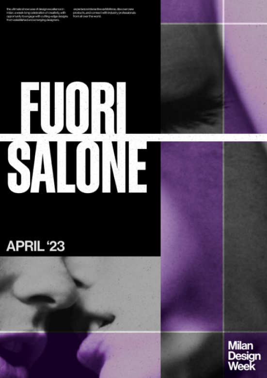
As a team, we chose this direction because it combined bold visual expressiveness with practicality for digital implementation. The strong typography and layered textures created a striking aesthetic, while the grid-based structure ensured adaptability across screen sizes and clarity in navigation. The consistent use of purple as an accent color established a cohesive visual identity, making it well-suited for an engaging and intuitive microsite experience. This design effectively translated the dynamic essence of Fuorisalone into a format optimized for digital interaction.


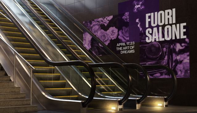
To transfer the Fuorisalone design from print to digital, I began by identifying the core visual elements from the poster—its bold purple accent, typography, and layered textures. These elements formed the foundation for the microsite’s design.
This project strengthened my expertise in visual design and art direction, emphasizing the importance of consistency and adaptability. By developing a cohesive visual theme and translating it seamlessly into the microsite, I crafted an engaging and user-friendly experience. This process highlighted the value of unifying design elements across media to ensure both visual impact and functional clarity.
A key challenge in the project was ensuring the microsite's bold visual theme did not hinder its usability. While the initial designs were visually striking, they posed navigation challenges, making the user experience less intuitive. To address this, I refined the layout to streamline navigation and adjusted interactive elements to improve clarity and responsiveness. These changes allowed the microsite to maintain its strong visual appeal while ensuring it remained user-friendly, creating a seamless balance between aesthetic expression and functionality.