Overview: Mosaic is the result of a process focused on understanding our target client's needs. Our four-member team started without a clear goal but gradually developed one through research, analysis, and building a solid foundation before diving into design. We focused on understanding our clients and their pain points, combining hard and soft skills to tackle the challenges. This project was a demonstration of what a career as a UX Designer involves, serving as an end-to-end case study that showcases our Design thinking.
Our Goal: Our goal is to propose and design a creative, innovative solution to address a specific problem faced by a particular audience dealing with a unique situation. In our case, our target audience is beginner filmmakers who often struggle with budgeting, leading to project delays, financial problems, and shortfalls.
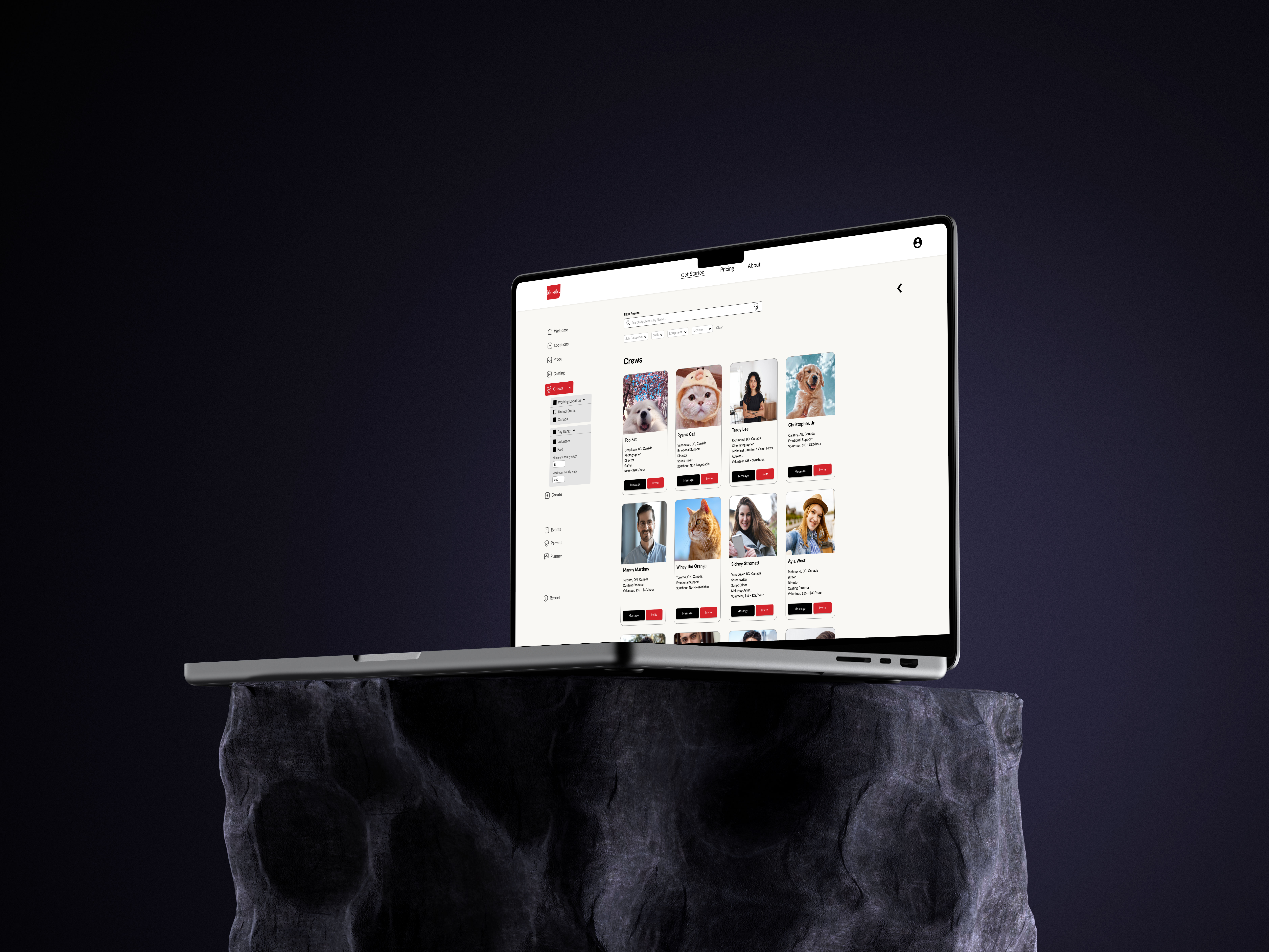
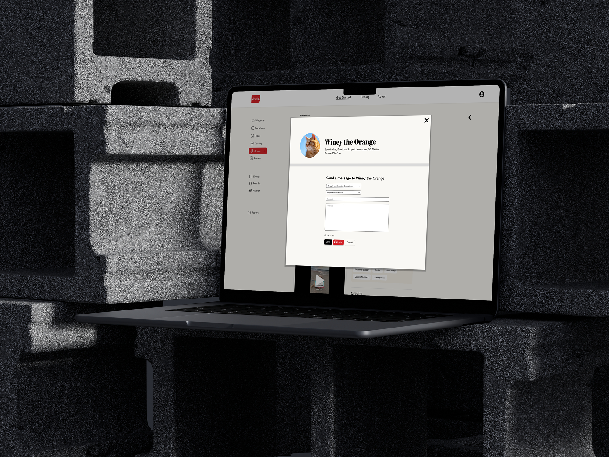
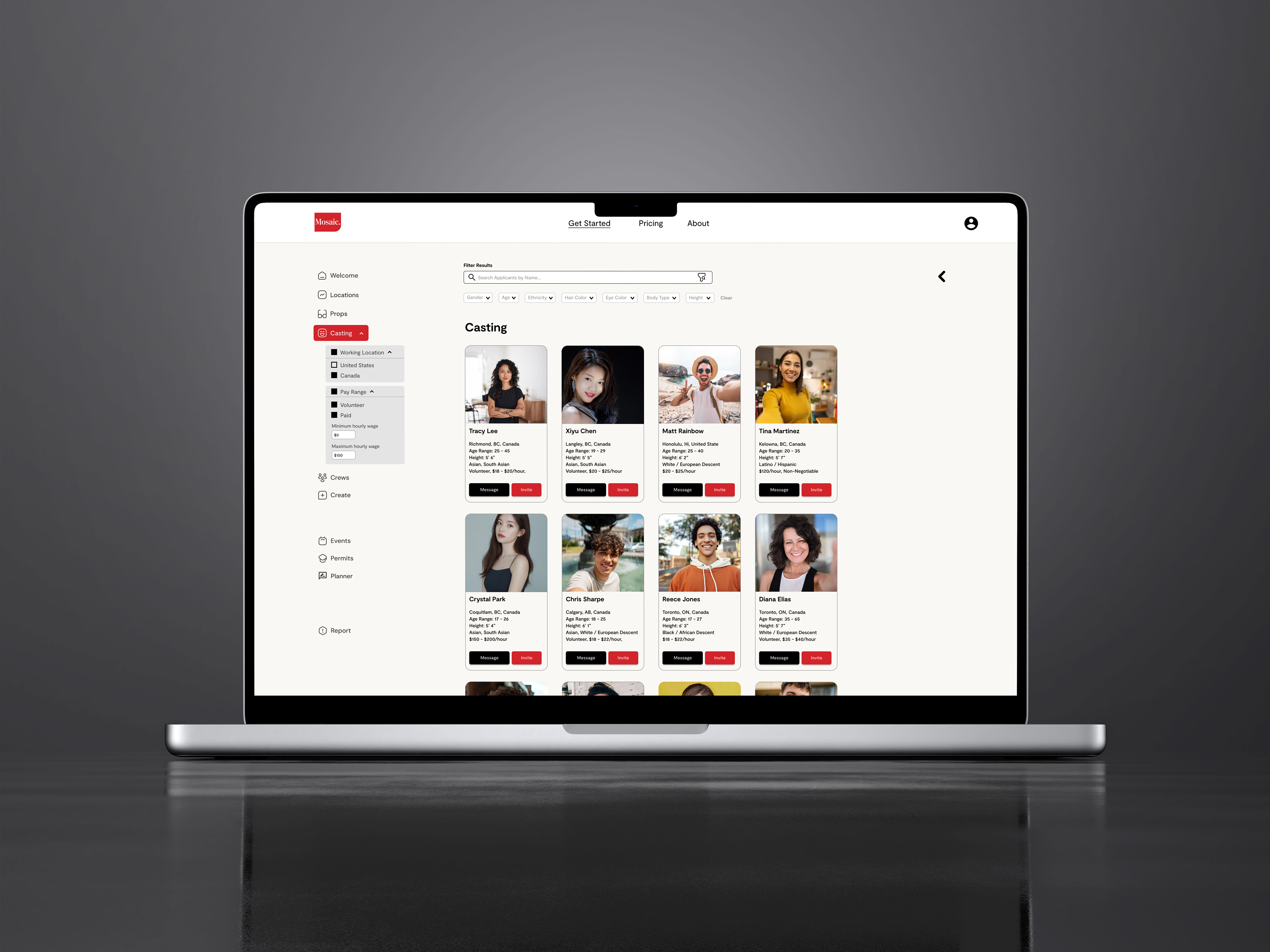
Mosaic's casting page was inspired by Backstage and my Eunoia project. It features a vertical selection list on the left and main content in the center, allowing users to easily navigate and see updates in real-time. This helps new filmmakers filter potential casts by criteria like location, pay range, and specific characteristics (e.g., eye color, ethnicity). Inspired by Backstage, users can "message" casts to negotiate before sending scripts, and "invite" them once confirmed, automatically adding them to the budget list for easy management.
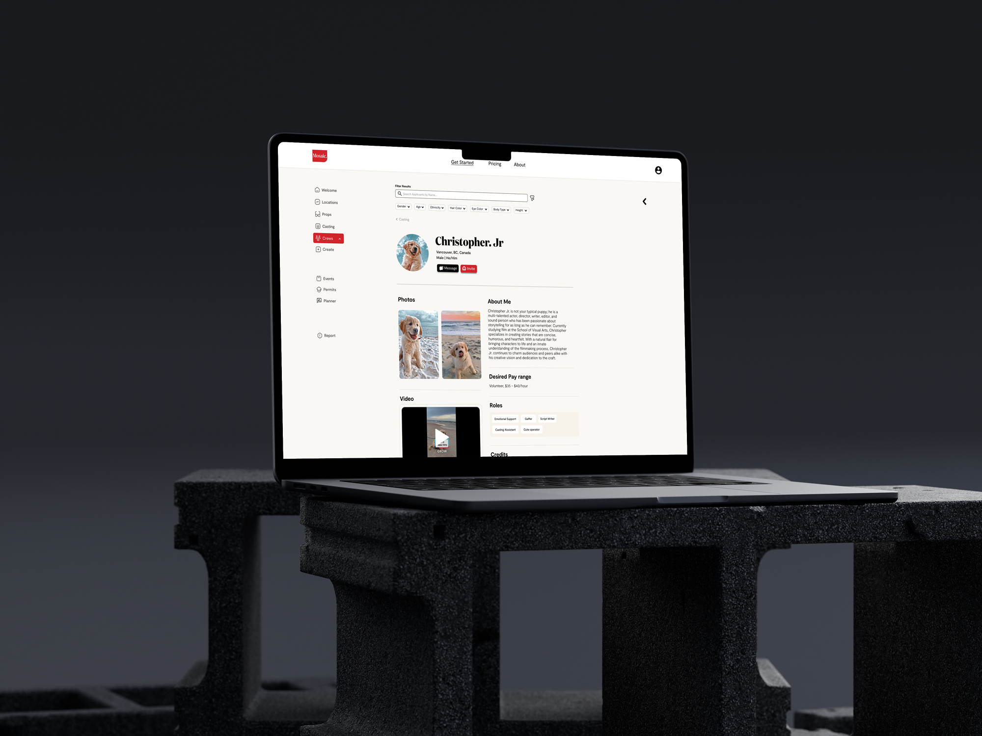
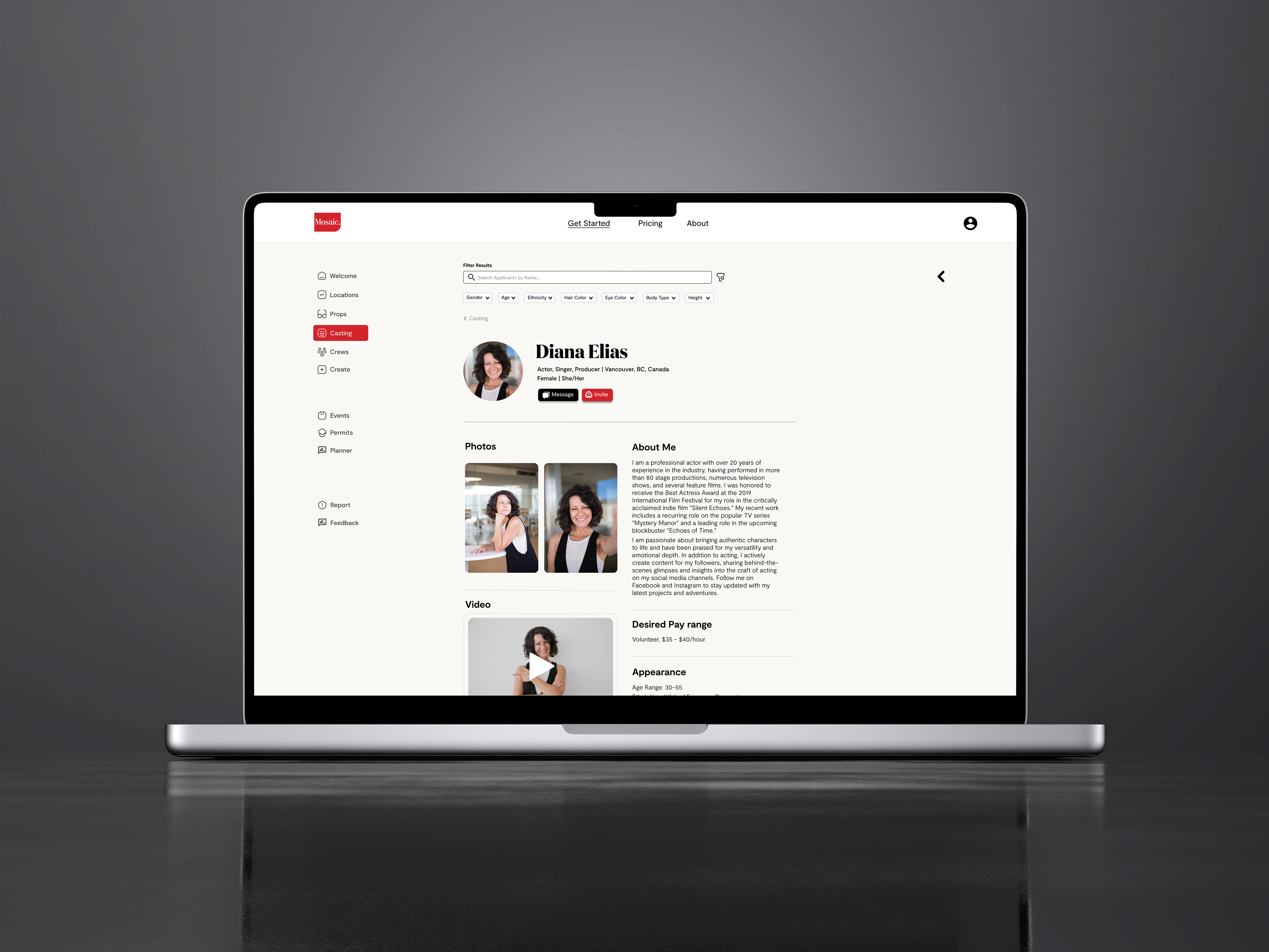
By clicking on a desired cast, new filmmakers are taken to the cast's detail page, where they can review information. The page has two columns that display components like photos, bio, demo reels, appearance details, and filming experience. My vision was to let casts arrange these components freely, allowing them to highlight the parts they want filmmakers to notice first.
UI/UX designer, researcher, interviewer
4 months
After the ideation process, we aimed to help new filmmakers optimize their experience submitting films to the Vancouver International Film Festival (VIFF). At this stage, I felt confused and uncertain. Unlike typical projects where we are given a problem to solve, this one required us to identify the problem through research. This gave me anxiety because I wasn't sure what direction to take. However, this experience taught me that, as a UX designer, embracing uncertainty is essential. It allows for exploring different ideas and possibilities. For example, while we initially focused on helping filmmakers with VIFF, our research led us to shift in a different direction.
After receiving peer feedback, we realized we were limiting ourselves by focusing solely on VIFF instead of keeping a broader perspective. I learned the importance of starting with a general approach to avoid being stuck with limited ideas. Throughout the project, we continuously updated our "How might we" statement based on ongoing research. I also learned to let go of ideas I was attached to, as they often aren't the best ones. It's crucial to accept the sunk cost of time and effort if a path leads to a dead end. I discovered that I had been designing based on my own assumptions, but after interviewing several new filmmakers, I realized their struggles were different from what I had imagined.
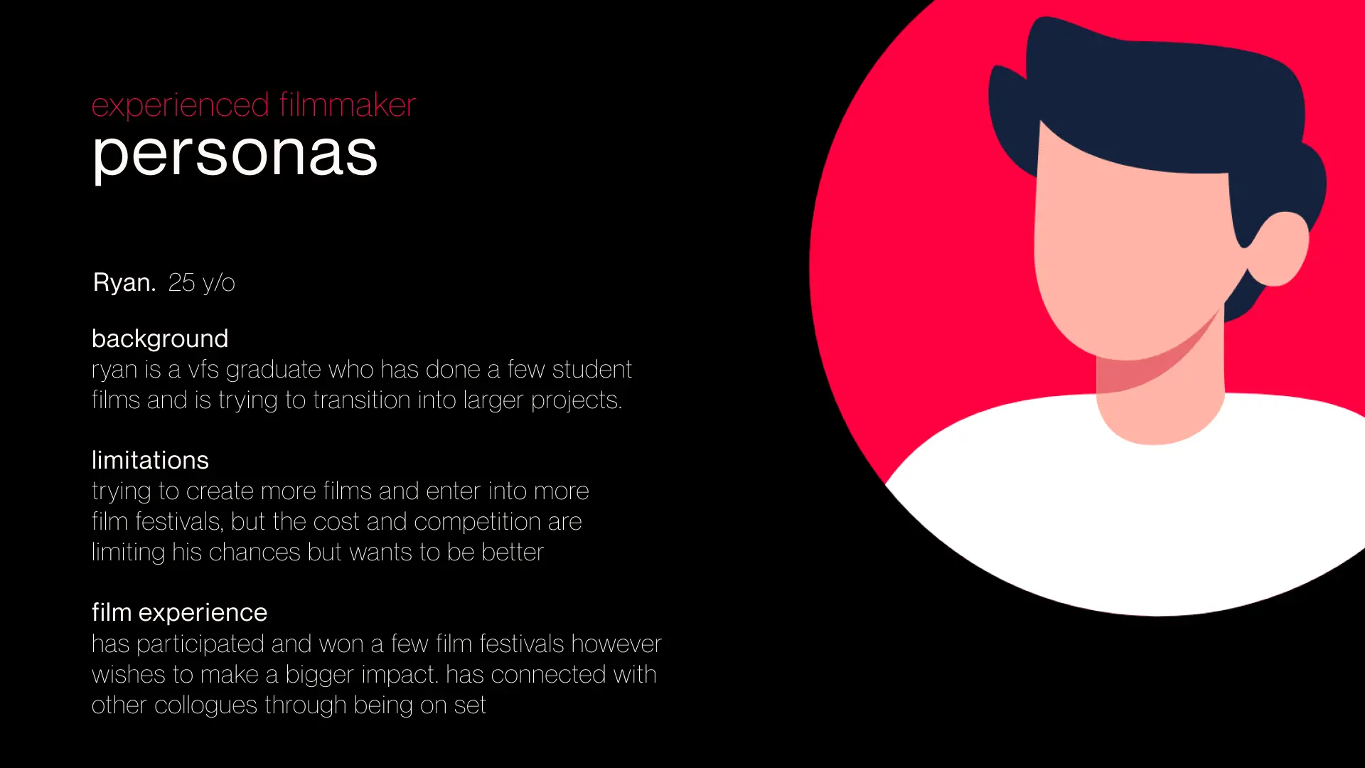
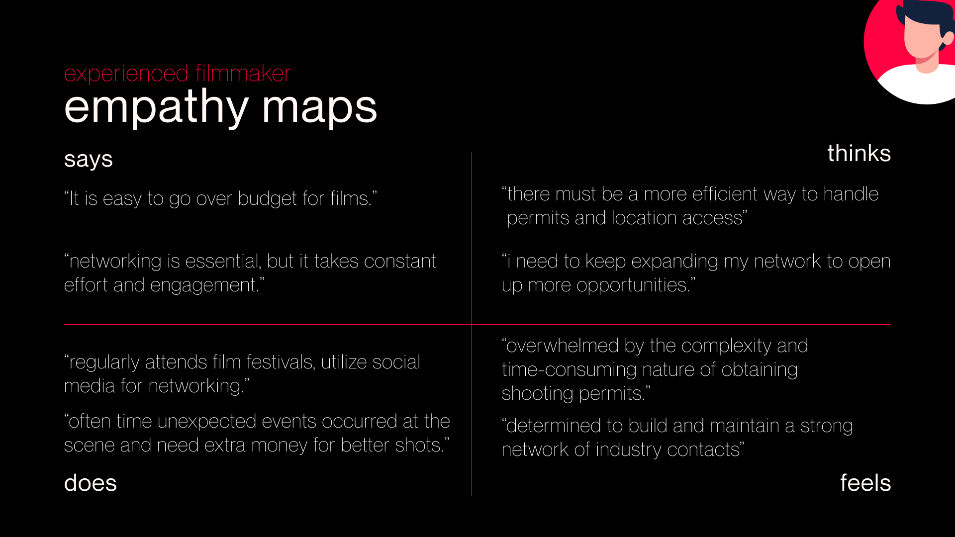
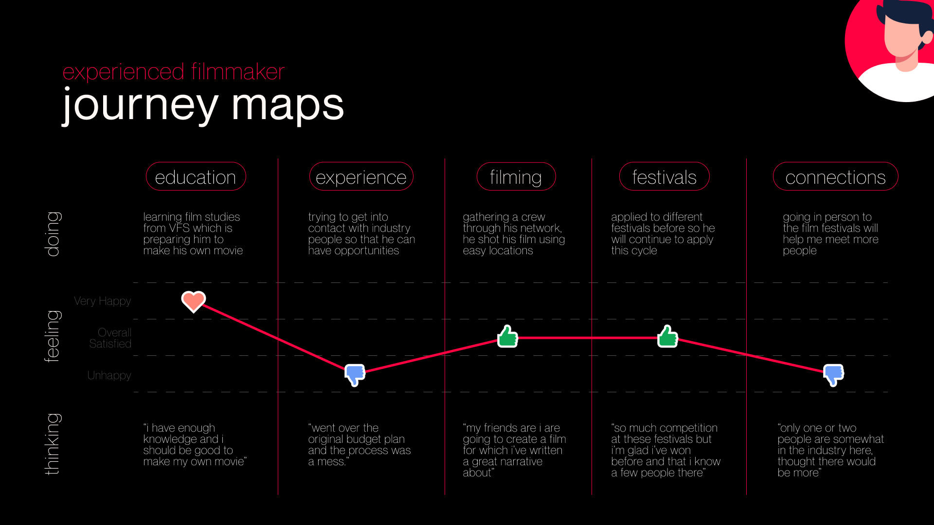
During the interviews, we were careful to avoid leading questions. I let interviewees elaborate by focusing on the what, how, and why of topics that seemed to resonate with them. This approach helped us gather more valuable and honest insights. I also enjoyed sorting data with my team, as we got to recall, classify, and categorize it into meaningful information. After thematic grouping, we identified five key challenges faced by new filmmakers: promoting opportunities, budgeting, networking, film festivals, and getting permits for shooting, which led to our persona Ryan, along with his empathy maps and journey maps.
The creation of the persona is incredibly valuable, as it is the most accurate persona I have ever created without my biased assumptions, purely based on the data and information we gathered and analyzed. The process of gathering information from our interviewees, sorting and analyzing the data, summarizing their pain points, and creating the persona guided my vision away from the uncertainties I had at the beginning of this project. It has been an amazing experience to list hypotheses and conduct research to prove or disprove these hypotheses and assumptions about our target audience. This learning process has enriched me, helping me understand and aspire to create solutions for our audience.
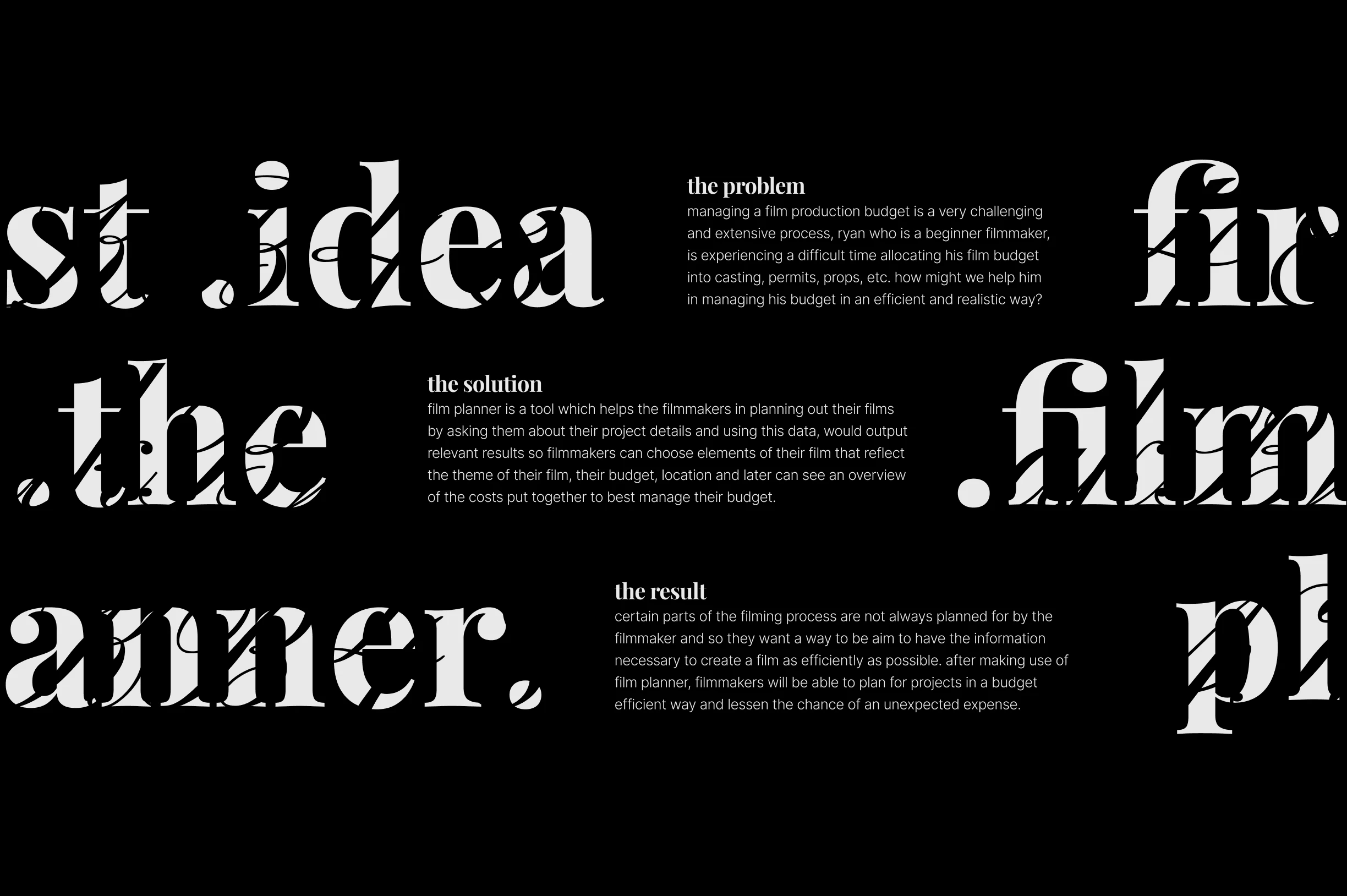
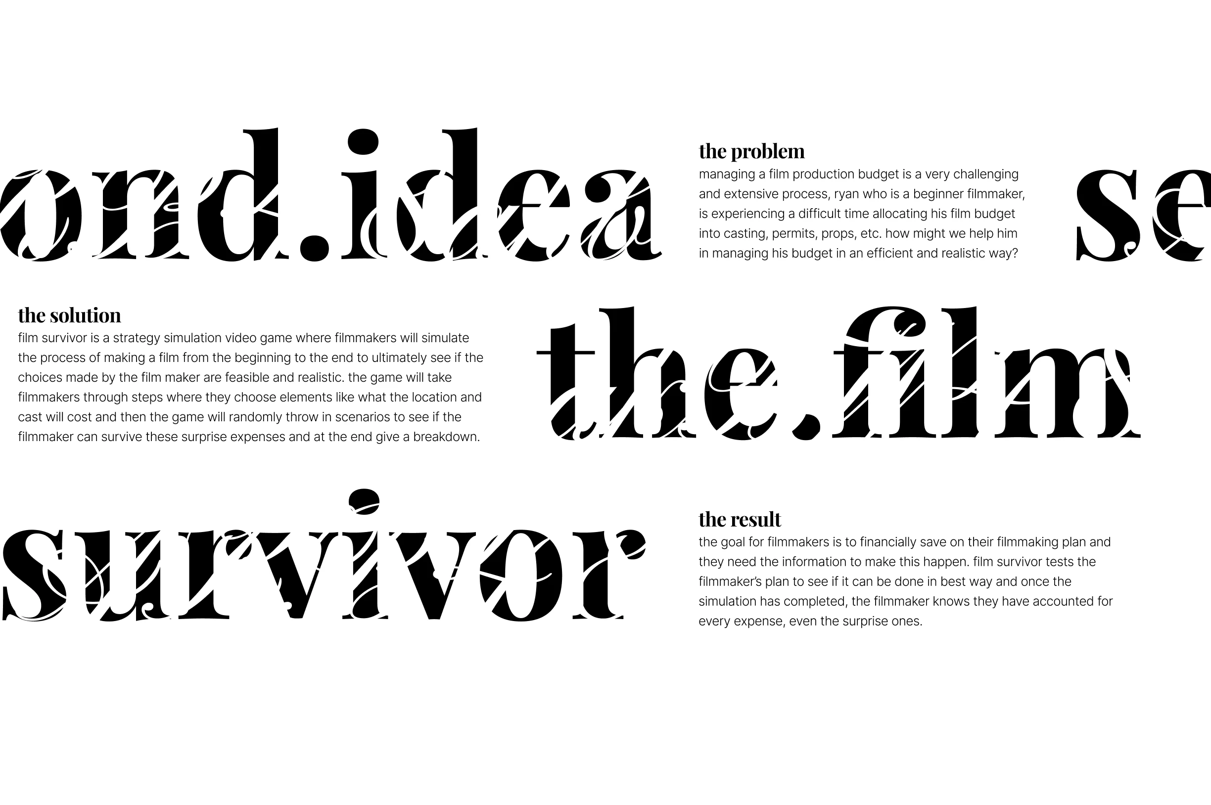
During the design process, I contributed to the poster design and proposed a bold idea: a strategy simulation game to educate new filmmakers. The game would guide them through decisions like choosing locations and cast, while introducing surprise expenses to teach budgeting skills. Although it was well-received, we had to let go of this idea due to time constraints. Instead, we opted for a more practical solution: a planning tool that helps filmmakers manage their budget by inputting project details and providing relevant options for elements like theme, budget, and location, with an overview of the costs.
After deciding on our final solution, a filmmaker budget planner tool, I was responsible for the high-fidelity design of the cast and crew planning pages. These pages allow new filmmakers to contact potential cast and crew, review their abilities and pay range, and easily manage their budget by adding confirmed members to the budget list for detailed budget management.
The crew planning page is similar to the cast planning page. Inspired by Backstage, Mosaic users have different profile sections: filmmaker, cast, and crew. This means new filmmakers might see the same person listed as both cast and crew, with different information depending on their role preferences. I created a consistent layout and design for both pages, with the only difference being how users filter selections, such as by skillset or whether they have their own equipment.
Working on Mosaic was a transformative experience that taught me to embrace ambiguity and adapt as the project evolved. Initially, identifying the problem through research instead of starting with a predefined issue was challenging, but it helped me grow in understanding user needs without bias. Creating personas based on gathered data, conducting unbiased interviews, and collaborating with my team to analyze findings were crucial in forming a strong foundation for our solution. While I initially proposed a bold idea—a strategy simulation game for new filmmakers—time constraints required us to pivot to a practical filmmaker budget planner. This experience taught me the importance of balancing creativity with feasibility and reinforced the need for adaptability in design.
Throughout the project, I was responsible for designing the high-fidelity cast and crew planning pages, inspired by Backstage. This required ensuring a consistent yet user-friendly layout that allowed new filmmakers to easily filter and manage their selections. Collaborating closely with my team, I learned the value of diverse input and the power of inclusion in creating meaningful solutions. The entire process—from ideation to prototyping and feedback—deepened my understanding of user-centered design and highlighted the significance of empathy, teamwork, and adaptability. Mosaic not only strengthened my technical skills but also enriched my ability to create solutions that genuinely address user pain points.