UI Design for SFU
Description
In my Project Management course at SFU Beedie School of Business, me and my teammates have proposed a new application named SFU Connect. I was the lead designer, where I created and supported my teammates in creating the mockup.
Skills
- The main skills include ideation, creating medium-fidelity sketches, and using Figma to create the application's UI.
- Time management is crucial as there were five people on our team with very different schedules and abilities. We had to schedule more buffer time for skill support and mini-tutorial sessions so everyone understood what to do.
Objective
The objective of this project is an app to help create a community after the pandemic that supports students' education by providing advice from others, supporting students' mental health, creating long-term friendships, and providing a safe and convenient space for students to meet new people. Our objectives are to connect with 2,000 students at SFU over a two-year time period and create a supportive and safe environment for students to build friendships.
Logging in & MFA
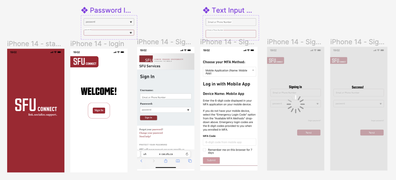
We first thought of the idea to link our prototype to multifactor authetication(MFA), as it will make our application more secure and it will seem more like an acutal application created by SFU. However, one of the challenges was to link to the actual MFA as you can see on the right. If we insert and iteraction that links to a separate page, we are unable to go back to our prototype. Therefore,after a lot of research and trials, I came up with the idea to have a sign in with user name and password interaction on Figma and link to a screenshot of SFU MFA, and once the user taps sign in, it would resume to the next frame on Figma to mimic something we were trying to acheive.


Toggle Switches for on and off
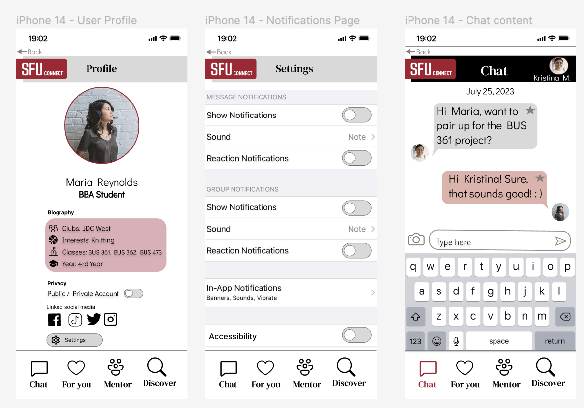
Our other idea is to make the application customizable as everyone have different preferences. My team wanted toggle buttons to indicate if a certain setting was turned on or off as you can see on the left. However, I had a hard time creating the visual indication of the toggle switch as this is a complex interaction. I then searched up the interaction online and watched multiple tutorials and customized the actual interaction to fit our style.
Loading Animation
We have thought of to provide interaction feedback for the users so that they will know if they have clicked onto something to be more responsive. We were stuck on how to display that the system is loading to process information to be more realistic. In real life, systems often have delay or display that it is processing. Our team wanted something similar, but I could not create a system indicator by percentage until a short time constraint. Therefore, I found gif animations to mimic the loading screen of the system.

Final Thoughts
In the future, I would provide wireframes and reference images for the stakeholders so that it will be easier for them to interpret and picture the outcome of the design. Also, I would research more on different kinds of typography and layouts as I believe a stronger typography and layout could further attract attention. I will also explore different interaction methods and animations for more complex design.
Moreover, this design was more challenging than academic projects as there are different stakeholders involved and they all emphasizes on different aspects. For example some wanted to make sure more information are included, some would like the text summer camp be larger to make sure participants know what they are signing up for, some would like to make sure it is legible and aesthetically pleasing. It is hard to gain a balance between them and also to align everyone's expectations. Moreover, was hard to find images to work with that does not have copyright and suits the theme but with simple design so that I could design the topography on top of it.