Type Specimen Poster - PUB 131
This project is an individually completed type specimen poster created for a publishing class. For this project, we had to pick a typeface and design a poster based on its history, showcasing one letter form on the poster along with different font weights.
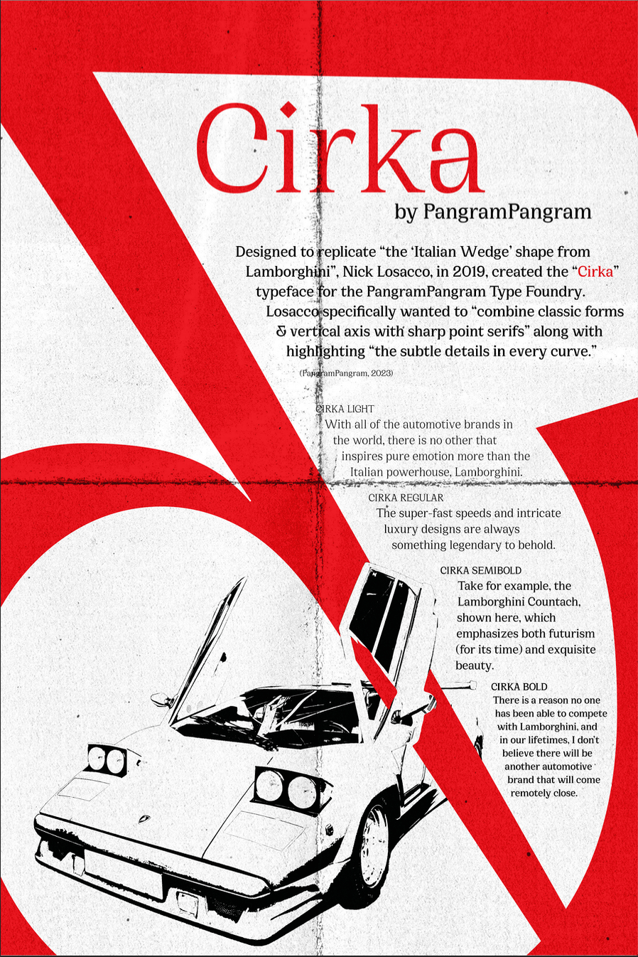
Initially, I wasn't sure which typeface to explore as there are many with detailed and vast histories; however, I decided to take one that, although not popular, was from a type foundry I admire – Cirka, by PangramPangram. From their website, they highlighted how they designed it to be “reminiscent of the ‘Italian Wedge’ shape from Lamborghini” (PangramPangram, 2023) with its “curves and spikey serifs” (PangramPangram, 2023). Upon reading this, I decided I needed to highlight the iconicity of Lamborghini and sportscars in general within my poster.

To do this, I laid out the entire alphabet (along with numbers and symbols) in an Adobe Illustrator file and recoloured the ones I found the most interesting; I chose this specific colour of red to play into the stereotype of the colour of sportscars. After some deliberation, I decided to use the ampersand symbol, as it contained all of the features described by PangramPangram above while also having a pseudo-racetrack silhouette.

While working on the poster layout, I struggled with creating proper balance; the right side was very text-heavy, but it enhanced the wedge shape with the ampersand axis stroke, and the left side was too barren. To fix this, I added a fill to the ampersand (to play into the "in-your-face" feeling of sportscars) along with an image of a Lamborghini Countach to the bottom left. Finally, I overlayed a folded-paper texture and added a threshold adjustment to the Countach to make it appear like this was a sports car poster that was stored away for many years.
Final Poster