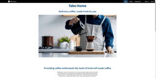
Take Home is an e-commerce website focusing on coffee beans and coffee accessories selling. The
website introduces the company and provides an intuitive shopping process flow. It aims to build an
accessible shopping experience for users who have different needs and use different devices.
This is a school project for the Web Design and Development course, I worked with one teammate to
create a coffee accessories company website by HTML, CSS and JavaScript. I was mainly responsible
for the designing and coding of the product list page, product detail page, and navigation bars.
Initial Step
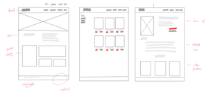
Creating wireframes
I started the project from discussed with my teammate to establish the topic of our website. I
sketched the low-fidelity layout wireframes on paper to visualize my initial design ideas. The
wireframes helped me establish the initial structure and hierarchy of the website. I also used
it in
the group discussion to help communicate my ideas with the teammate, then proceeded with the
modification and iteration design.
Low-fidelity website wireframes sketches
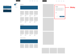
Based on the refined sketches, I built the high-fidelity wireframes on Figma. It better reveals
the
appearance of the final work and can help guide the later code implementation.
High-fidelity website wireframes
Code Implementation
Establishing style-guide template
I collaborated with my teammate on Github to keep updating my teammate's work progress. We first
created a style-guide template to unite the style of the website's essential components.
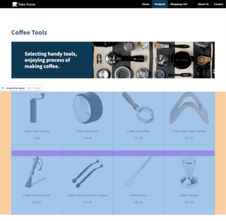
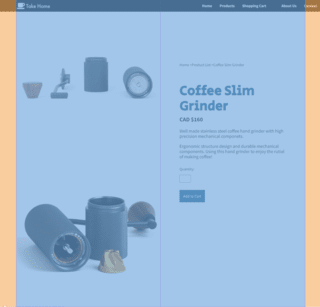
Image responsiveness
Then I make the HTML files to implement the website structure and construct the website
hierarchy
for the
product list and detail page. I applied the responsive images to allow the images to fit
different
sizes of browser windows and increase the website performance. It will make it easier for users
to
access this website in different scenarios.
Here is a video clip shows the responsive design on the product
list page
Responsive design on the product list page
Here is a video clip shows the responsive design on the product
detail page
Responsive design on the project detail page
Grid layout
I used the Grid property in the CSS files to set up the page layouts for the content placement.
It's
also easy to be adjusted for the different window sizes to maintain the website's
responsiveness.
Grid layout in product list pageGrid layout in product detail page
JavaScript Function
I used JavaScript to allow the main menu can be expanded or collapsed to adapt to the smaller
screens
on mobile devices. It can ensure the same user experience on different hardware platforms.
Here is a video clip shows the nav bar function in differnet browser
sizes
Responsive design of main menu bar
Reflection
The website received feedback that the visual style was inconsistent, and some of the functions
didn't
work
properly without JavaScript support. I followed these suggestions to adjust the image and text
size
to
make
the overall visual style more unified. In terms of the website accessibility, I added an extra
breadcrumb
menu for the web page navigation to maintain the website usability when JavaScript is
unavailable.
Breadcrumb menu under the main menu bar
Final Work
Here is a video clip shows the entire usage process of the website