Paint Stars is a fictional organization that was developed for an academic project taken in Summer 2018. The goal of the project was to design a logo, cover letter, and a business card within a timeframe of three weeks for a fictional business the team would like clients to invest in. When picking roles for the project, I tasked myself with designing the logo because I wanted to challenge myself in seeing whether I could successfully communicate the motto, theme, and vision of the company through the logo.
Tools used: Photoshop and Illustrator Team: Tammy Aderibigbe and Prince Kayanza
DESIGN PROCESS
Sketching
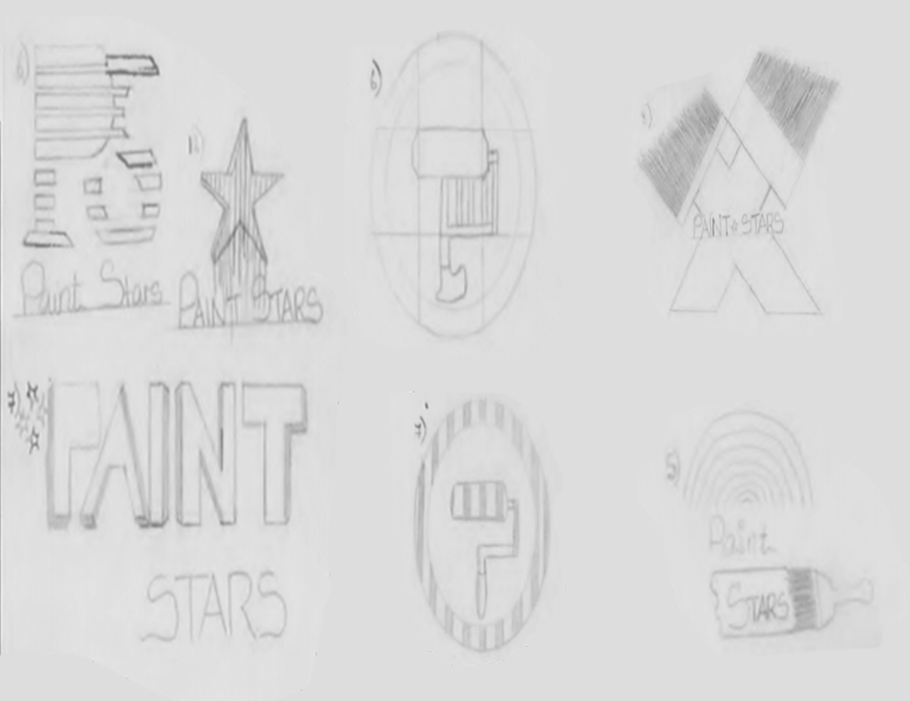
During the iteration sketches, I explored multi forms ranging from shapes only to a mixture of text and shapes (Figure A); this helped me grasp whether text, shape or a mixture of both would be the best option to help make audience’s know that the company is a paint company at first glance. In addition, I experiemented with mainly simple form sketches because I wanted to design sketches that could be easily translated in Illustration while still leaving room for improvement.

Decisions, Feedback & Solutions
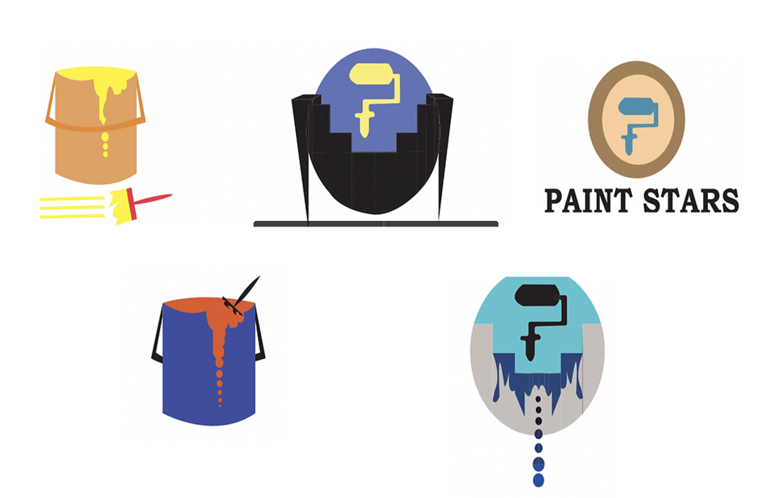
The three sketched designs the team believed were the best were transformed digitally in Illustrator (Figure B). Then I narrowed down to two designs and improved on them based on the feedback gotten from our instructor. Some of these feedbacks were “the yellow used initially was hard to see on screen, having the brush at the bottom of the paint bucket made it feel like they were two different logos, some of the structures of the logo were complicated and didn’t really translate to what the company is about.” The reason why I did not pick the roller brush in a double circle is due to the fact that I could not experiment with the graphic much in terms of creating paint drips like the other design. Though the brush was enough to create the feeling that we were a paint company it gave a falsehood that the company sold brushes and not paint, which is why the dripping of paint was key in our design so that audiences know that the company is not only focused on paint brush but on paints.

Based on the feedback, I went back to the drawing board and experimented with some colours schemes and used adobe color as a guiding tool; in terms of colour schemes, I had to decide whether I wanted a monohromatic, complementary or triad colour- I ended up picking complementary colours because I wanted some design elements to stand out from others without overloading the graphic with so much colours. In addition, I played around with how certain elements (e.g the paint brush, the drip of the paint) were presented with the overall design.
FINAL DESIGN
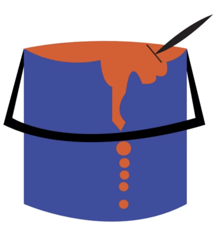
The final logo (Figure C) was chosen because my teammate and I felt that the logo emphasizes simplicity and boldness. In addition, we used the chosen colours orange, bluish-purple and black because we felt that colours imitate the ideology of warmth, balance, freedom, and fun.

REFLECTION
Though I was quite happy with the final design of the ‘Paint Stars’ logo, I believe the logo still needs an improvement in its overall look because I feel like the logo looks more like a drawing of a paint bucket with paint in it and less like a logo design that give the company a unique identity. What could be improved on to make the logo seems unique is having the top half of the paint bucket with the name of the logo at the bottom. This way when audiences see just the top half of the logo being used in products they quickly able to identify it with the brand.
Connect with me through email.