Background
This video is a movie teaser trailer for the film Harry Potter and the Deathly Hallows Part 2. Using Abobe Premiere Pro, After Effects, and Audition, I edited the clip sequences, edited audio, and created the date, copy, and title cards.
Storyboarding
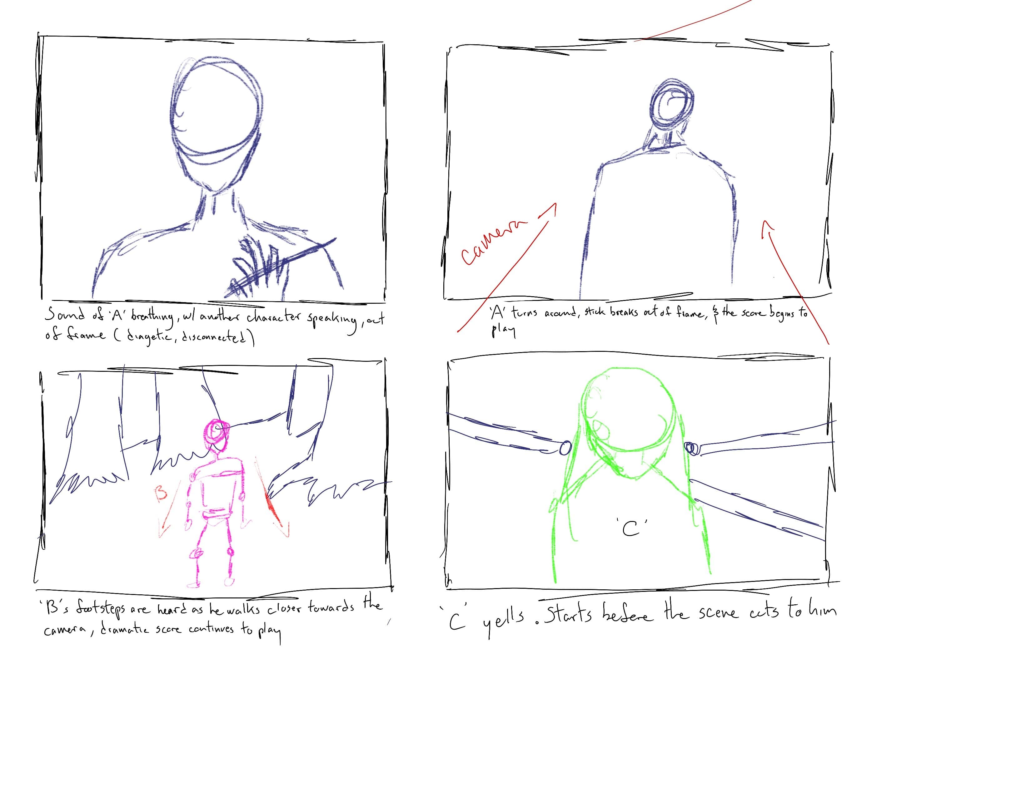
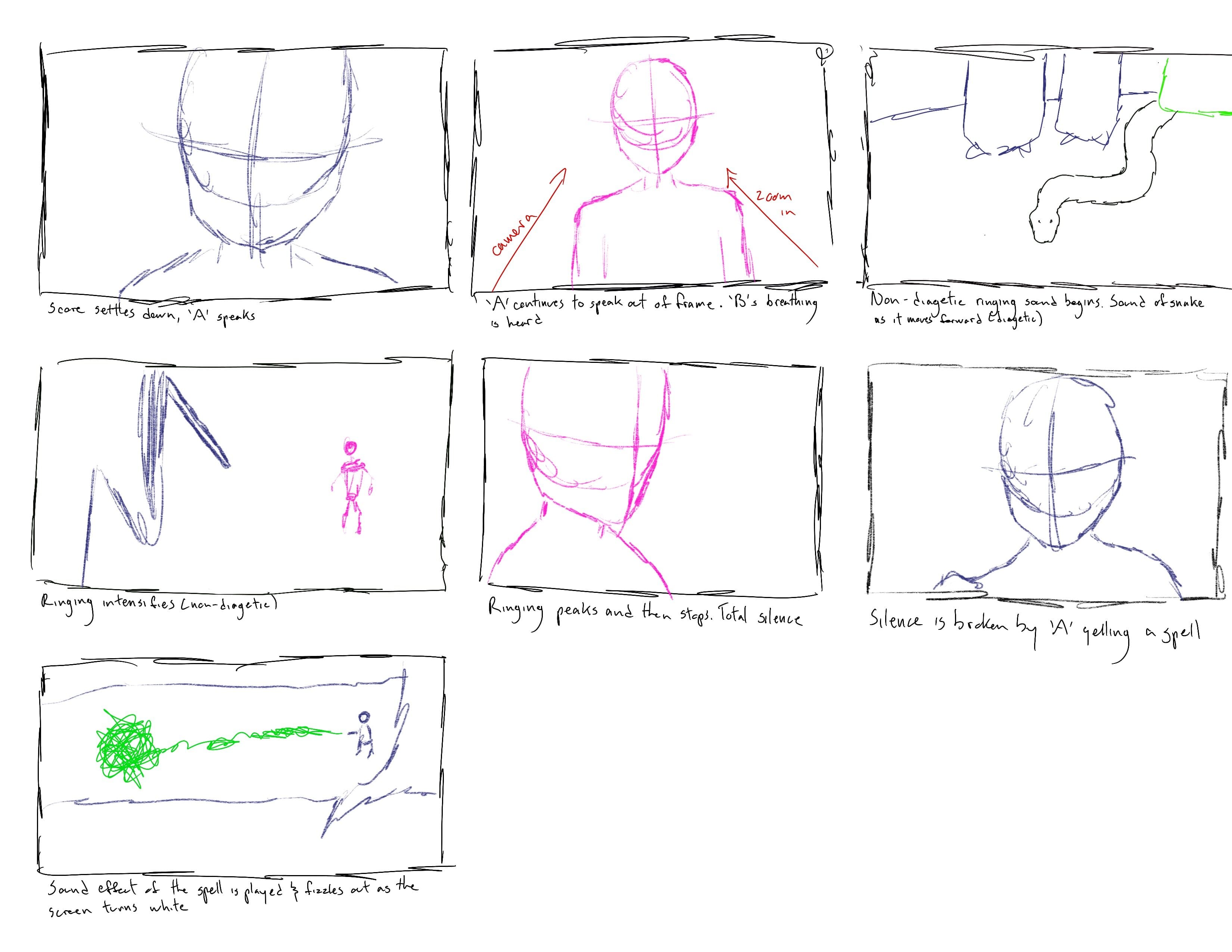
I started off drawing some rough storyboards to get an idea of how some scenes may look cut together in a sequence. These storyboards made note of character blocking and movement, camera movement, and sound. The storyboards below detail a confrontation between the film’s main protagonist and antagonist. While not every shot from this storyboard was used in the final trailer, they allowed me to see how certain shots can help tell the narrative of the film in the trailer.
Narrative Arc
In order to establish the narrative of the film in a short time frame, I used the classic narrative arc of an exposition, rising action, and climax. As this film is a sequel and the second part of a two-parter, the trailer starts off with dialogue recapping an important event from the previous film. This helps viewers recall events of the previous film or summarize them to allow new viewers to watch it as a stand alone film. It also helps establish the threat of the main antagonist.

Single character shots are then placed of major characters, intercut with copy cards detailing the scale of this series finale. Heavy emphasis is given to this in the copy cards to help communicate the scale of this film.

As the music intensifies, action scenes are placed. The music used for this trailer is L'Orchestra Cinematique's soundtrack used in Fantastic Beasts: The Crimes of Grindelwald. I chose this soundtrack as it includes the classic leitmotif of Hedwig's Theme used throughout the Harry Potter series. As the trailer comes to a close, the final confrontation between the main protagonist and antagonist is teased, serving as the climax of the trailer.
Copy, Date, and Title Cards
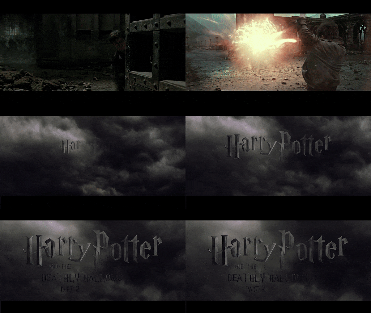
To create the copy cards, I used After Effects. Using the Harry Potter font, I applied hard bezels to the text to give it a 3D look. A glass, metallic effect was applied to the text so that it can reflect the background. The background of the copy cards is a dark cloudy sky, to match the ominous tone and colour palette of the film. The movement of the text and background was done by scaling each element over time for a simple parallax effect. As the text and background scale up, the light source of the background travels across the text.
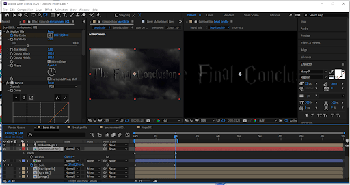
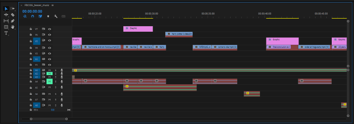
After collecting all the film clips, making the copy cards, and editing the audio, I edited the sequence in Premiere Pro.
Reflection
The project was successful overall in communicating the overall premise of the film. Revisiting this project, I would like to spend more time on the pre-production process, particularly drawing more storyboards. Having only drawn a few rough storyboards of select scenes made the production process longer, as I had to cut and view how different edits would look during the production phase.
Planning out the sequences beforehand would have sped this process up and also allowed me to quickly view different variations of sequences as well. While this worked out fine for a shorter project like this one, it is an important habit to form as larger editing projects will be much more difficult without a detailed pre-production plan
Back to top