Background
In a digital images class, I created a kinetic typography video using a scene from Frozen. Using Adobe After Effects, I was able to create an engaging video using only text and images.
Typography
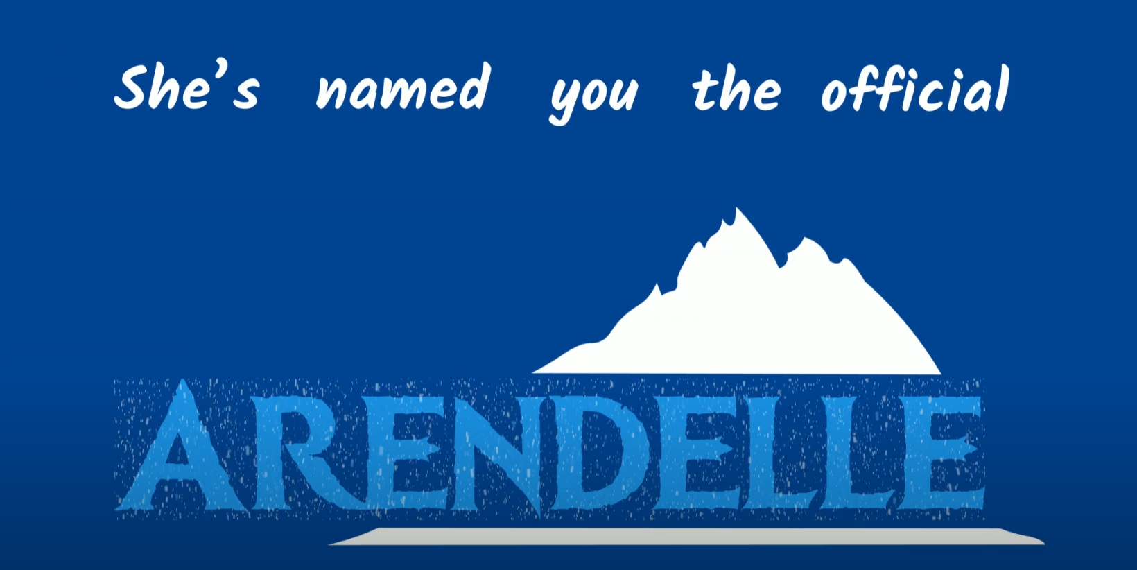
For this kinetic typography project, I started with choosing the fonts used in the video. There are two characters in the video, Anna and Kristoff. For Anna, I chose the Kalam font family since it had a fun, relaxed feel to it which matched Anna's personality. For Kristoff, I used the Impact font family, a strong and bold sans-serif font to match the strong and independent nature of Kristoff. The font Ice Kingdom, which is the font used on the official Frozen movie posters, is also used. This was only for specific words such as "Queen" and "Arendelle."

Animation and Effects
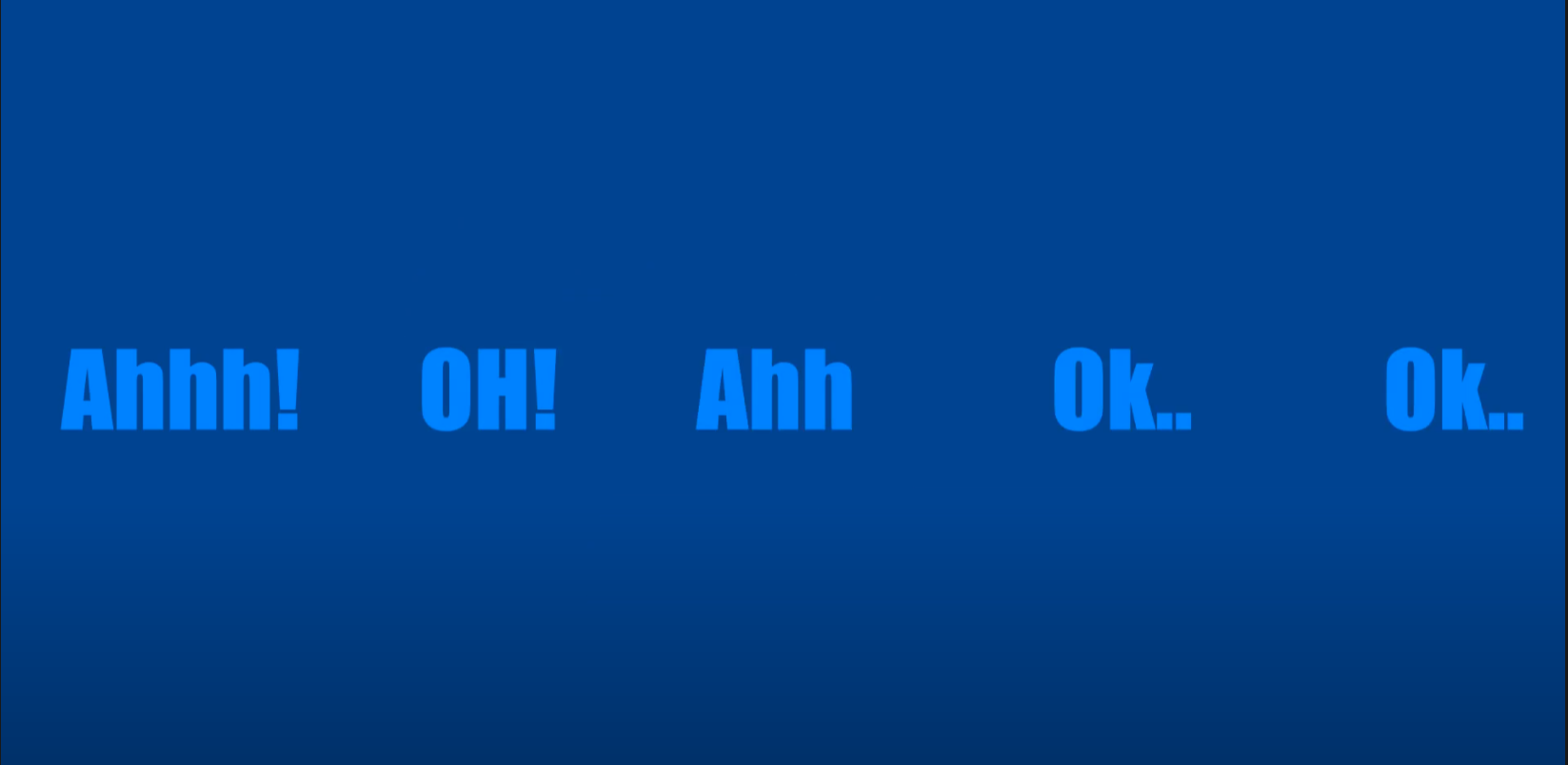
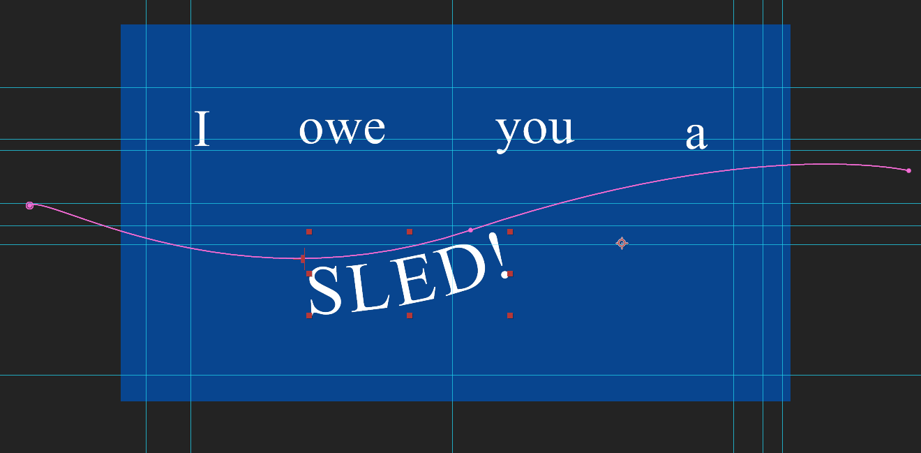
When animating the video, I animated the text first before placing any images in. In the video clip, the characters often speak very fast. This proved difficult to animate but I found that having the words just appear out on the screen was the most effective way to show the speed at which the characters were talking. Some of the text was animated on a masked path using the pen tool. This was usually used for long drawn out words where I would have the text travel across the screen in a line. Paths also were used for words like “woops” and “love”. For the word “woops,” a curved line was used to show the fluctuation in Anna’s voice when spoken. For “love,” the path draws a heart. The word “sled” also travelled along a curved line to mimic a sled gliding through.
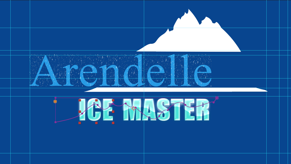
To make the words "ice master" look like real ice, I originally tried to find a font that mimicked the look of ice. Instead, I applied the bevel and emboss preset to the text and manipulated the values to get a clear, matte look. For the overlaying ice animation, I drew a masked path around the areas of the text the ice should appear and then animated the opacity to get the growing ice effect.
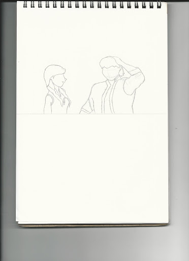
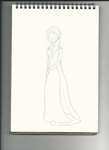
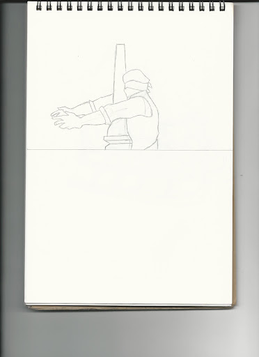
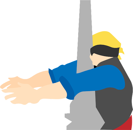
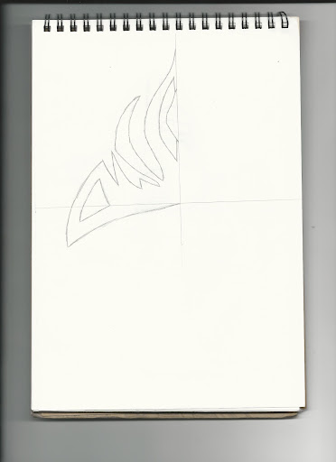
Illustrations and Graphics
For the illustrations, I sketched out the images on paper and then recreated them in Adobe Illustrator. I kept major details out of the images to maintain a minimalist style to the video. As the main focus of kinetic typography should be on the animation of the text, having detailed images may take away the attention from the text.


Reflection
This project was successful in that I was able to communicate the tone and playfulness of the original scene. Revisiting this project, I would like to explore more effects and animations for typography. Adding animations and effects to words was difficult for this project as the dialogue is quite fast. Adding effects to words that linger or when there are brief pauses in speak could have made for a more visually interesting piece. Also, as the focus is on the typography, there were opportunities to experiment with text hierarchy and composition.
Back to top