
May 2020
Graphic Design
Adobe Illustrator
This project was a logo for a hair stylist. After sketching out many variations of potential logos, I finalized the logo in Adobe Illustrator. This logo is meant to be used on various marketing materials such as business cards and price lists.
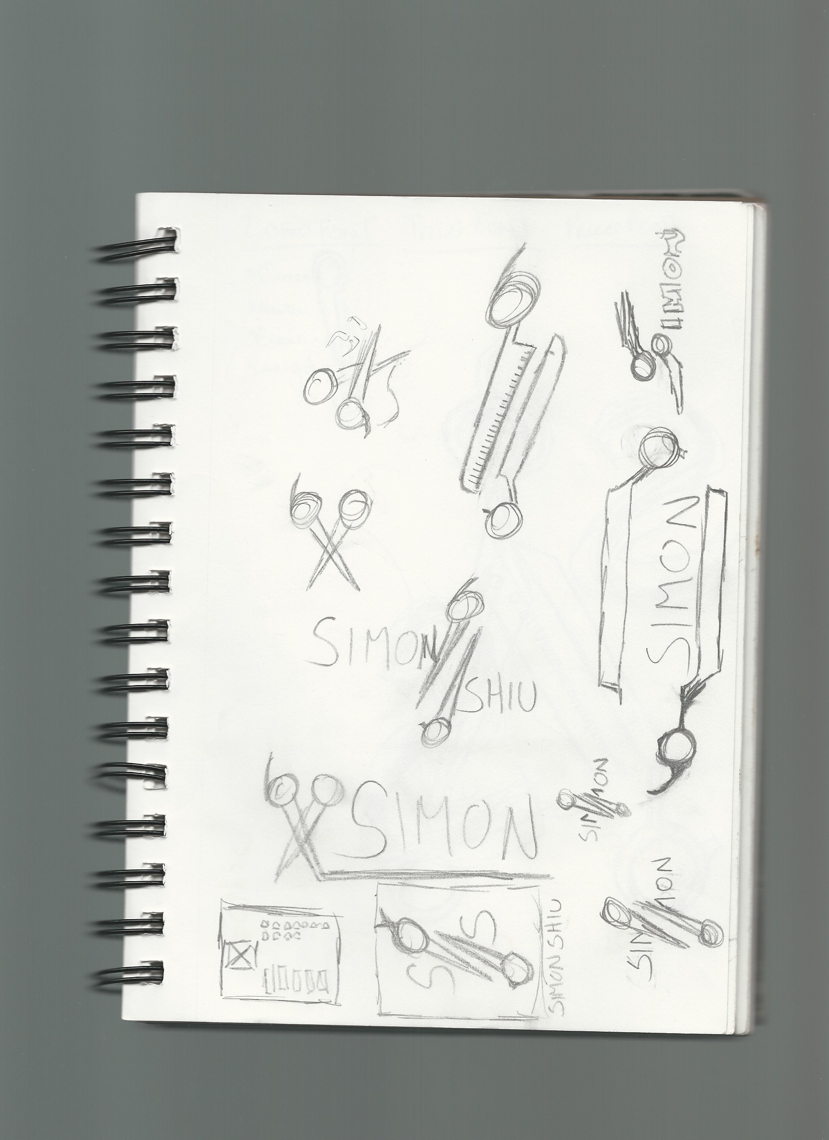
The task was to create a logo using the client’s name or initials. I sketched out various iterations of logos on paper. These included using a pair of hair styling shears to split the first and last names or the initials ‘SS.’ To make the shears more unique, I experimented with splitting the pieces of the shears and rotating them to further exaggerate the splitting effect.

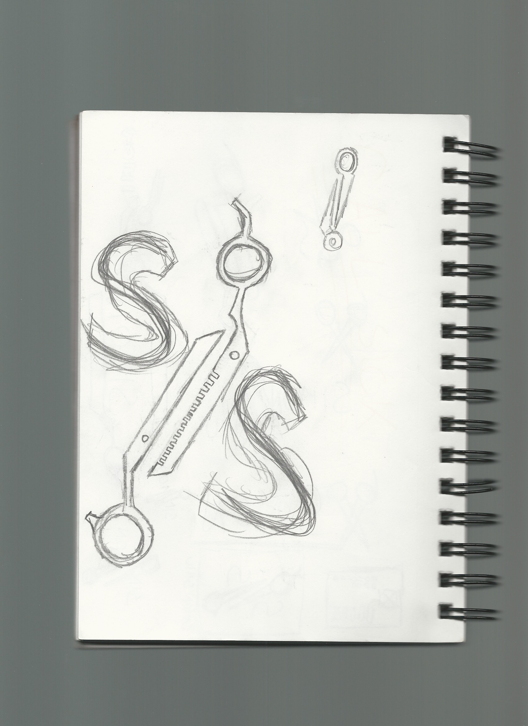
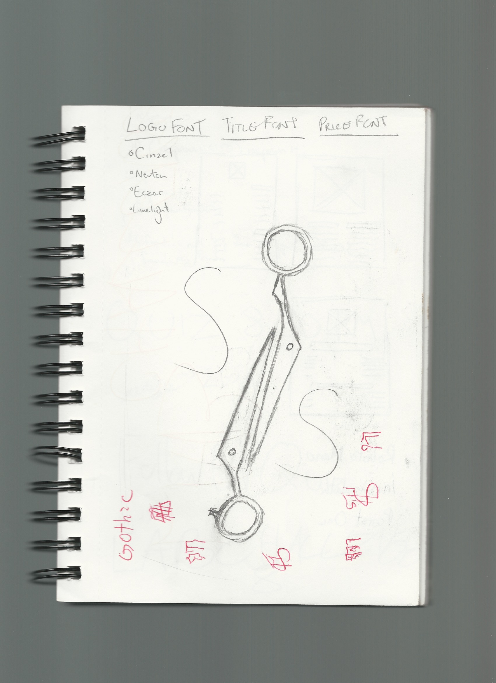
I settled on using the client’s initials to make a monogram logo, as this allowed the logo to be scaled across various sizes and still be legible. The two final sketches had the deconstructed shears splitting the two S’s. I sketched out two different styles of hair styling shears - one more detailed with the teeth on the blade and the other more simple with just a clean edge.


For the monogram logo, I used Cinzel Black. Cinzel is a serif font with sharp angles on the tails. This serif font helped communicate the sophistication of the client, whose skills range from classy business cuts to technical, expressive styling. Using the black variation gave the initials enough body and thickness to be legible at various sizes. For the words, I chose Merriweather Bold. Merriweather is another serif font with a softer tail and corners tapering off in a curve. This font matched the style of the monogram Cinzel font. The bold variation again helped with legibility.
The client wanted the logo to be green. As the client had recently become an independent hair stylist, I chose a bluish seafoam green as the main colour for the logo. This colour represents self-creativity and freedom, traits that the client values. Other colours in the the palette include white and a dark grey to be used in background applications. I chose this grey over black as the light shade works well with the seafoam green, not making the logo’s brightness too jarring on a dark background.

After selecting the fonts and finalizing the sketches, I designed the logo in Adobe Illustrator. I started with creating the deconstructed scissors. At this point, the design did not read as a pair of hair styling shears. The client’s identity as a hair stylist was not properly communicated. To solve this issue, I simply took the two halves of the scissors and turned them into a regular pair of scissors. Now it was clear that the scissors were meant for hair styling.
After finalizing the design of the scissors, I placed the initials on opposite sides of the scissors with a slight edge cutting off part of the letters. I added in the colours the logo and the logo is complete.

This project allowed me to explore the design process in graphic design. Sketching out several different logos helped with choosing a direction to go with the final design. Redoing this project, I would like to reevaluate the font choice of the words under the logo. A sans serif font may have been better to contrast the serif font used in the logo. Merriweather Sans could be a good option here. Overall, I was able to refine my graphic design skills through sketching during ideation as well as techniques in Illustrator.
Back to top