Jewelry Ecommerce Website
Designed and developed a mock product website for selling South-Asian jewelry, completed during a class at SFU for Web Development and Design. This project was done in a team of two with Lina Dang-Nguyen.
Coming from a computer science background, my personal goal for this project was to combine my skill in programming with my passion for design.
Roles
Front-End Developer - UX/UI Designer
Tools
HTML - CSS - Figma - Git

Ideation
Coming up with the Idea
The goal of the project was to create a responsive ecommence site for any fictional company of choice. When brainstorming art directions and company ideas, I came up with the idea to create a website that sells South-Asian jewelry as I noticed a lack of trendy and chic website designs for Indian jewelry. A lot of websites on the current web were dated and lacked a cohesive design.
Challenges
Designing a modern site for traditional jewelry
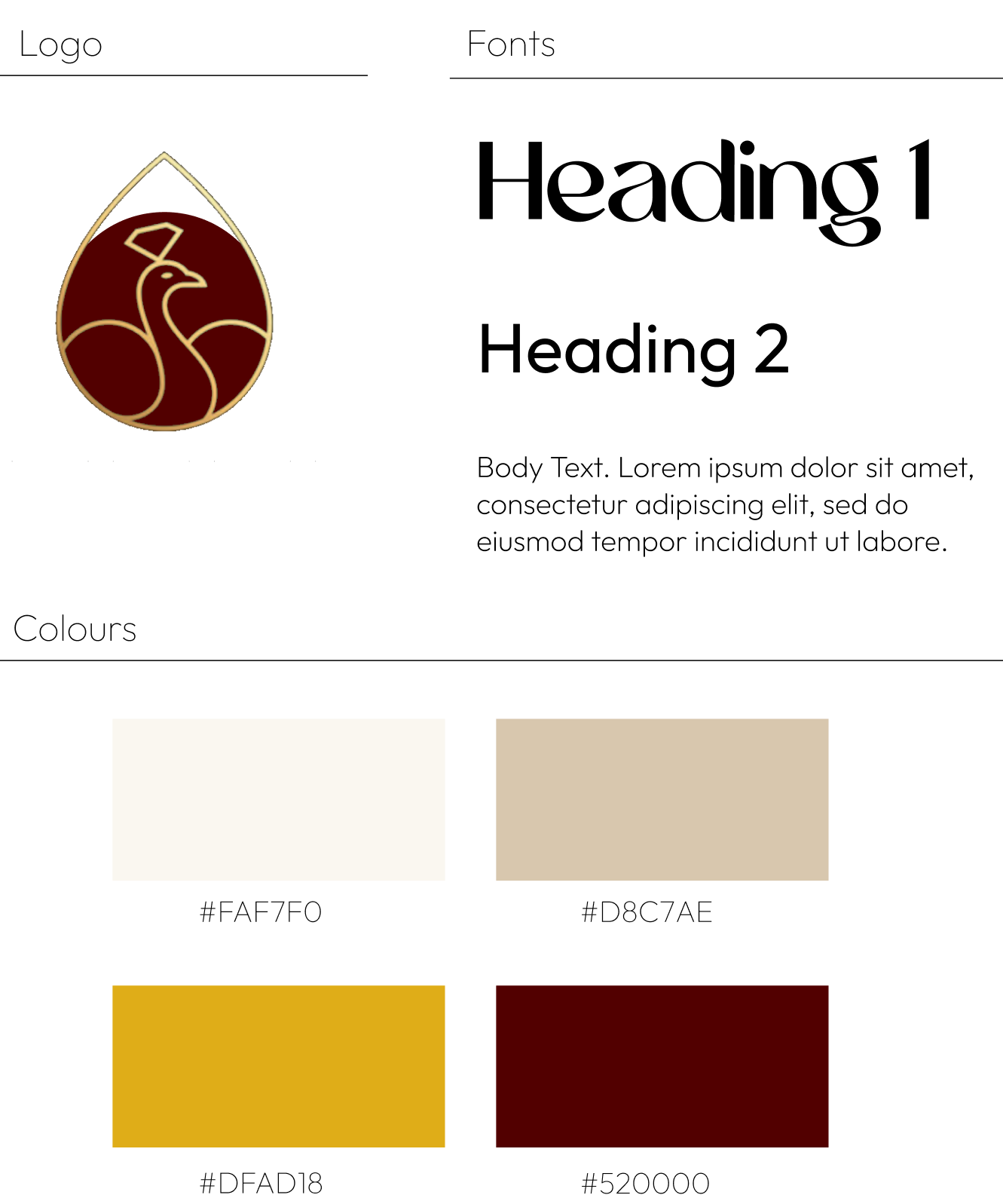
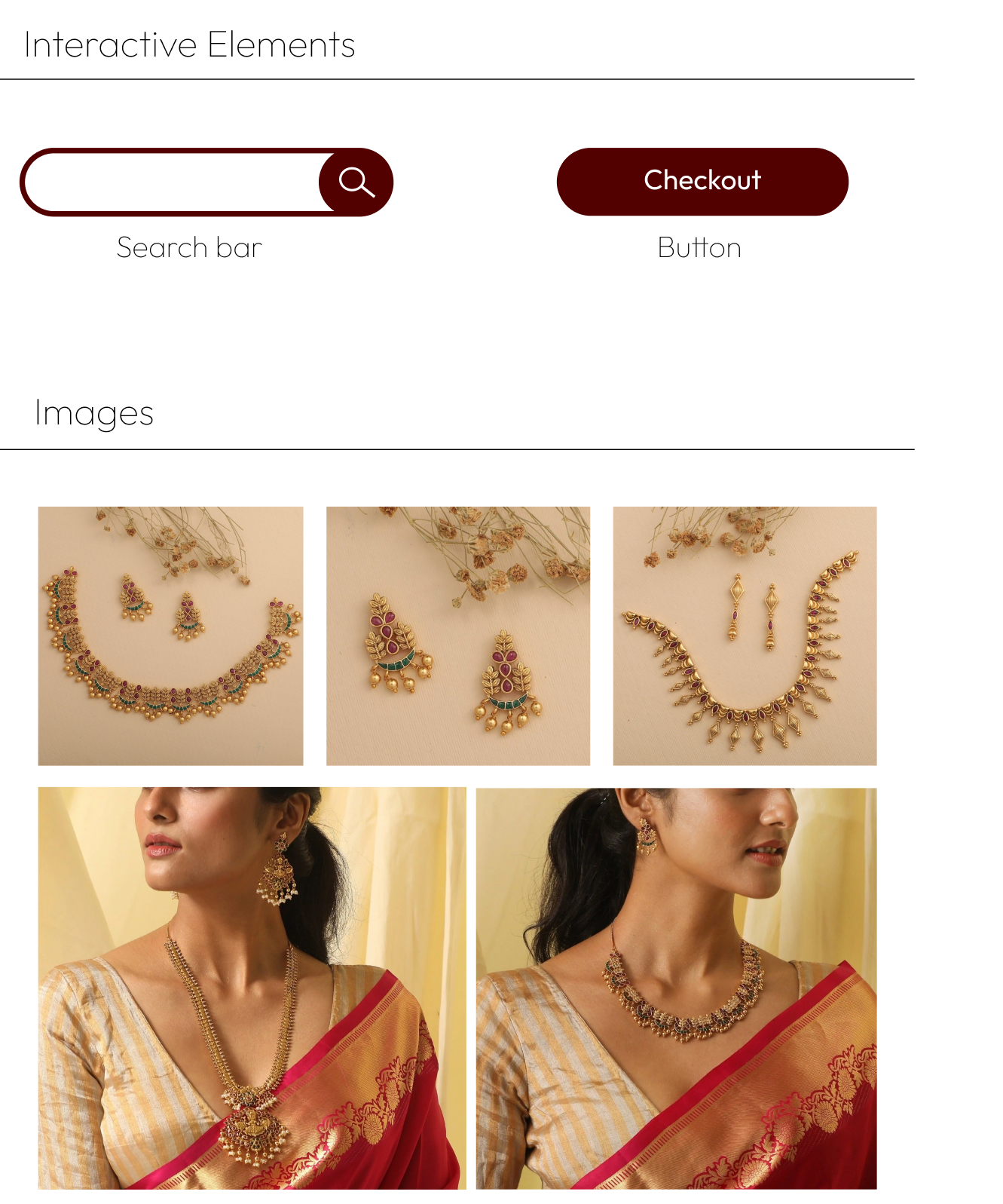
There were many challenges that came when designing the UI and making design aesthetic decisions. I wanted the keep the site simple and modern which is challenging as Indian jewelry is very extravagant, colourful and traditional. To work with this contrast, I made sure UI elements took from both the traditional and modern side. For example, the main body font of the website is simple and modern but its paired with traditional indian bridal colours (dark red and gold). Below is the style guide I created for some of the design elements.
Style Guide
Starting responsive
This was my first time working with responsive web design techniques where I quickly learned the importance of starting responsive. Some initial designs and layouts looked great in Figma and on a large screen size, but when taking a small mobile screen into consideration, the design was not an efficient use of space. Due to this, my teammate and I had to refactor some design decisions to allow for a more seamless transition between screen sizes. Below is my product page design for different screen sizes.
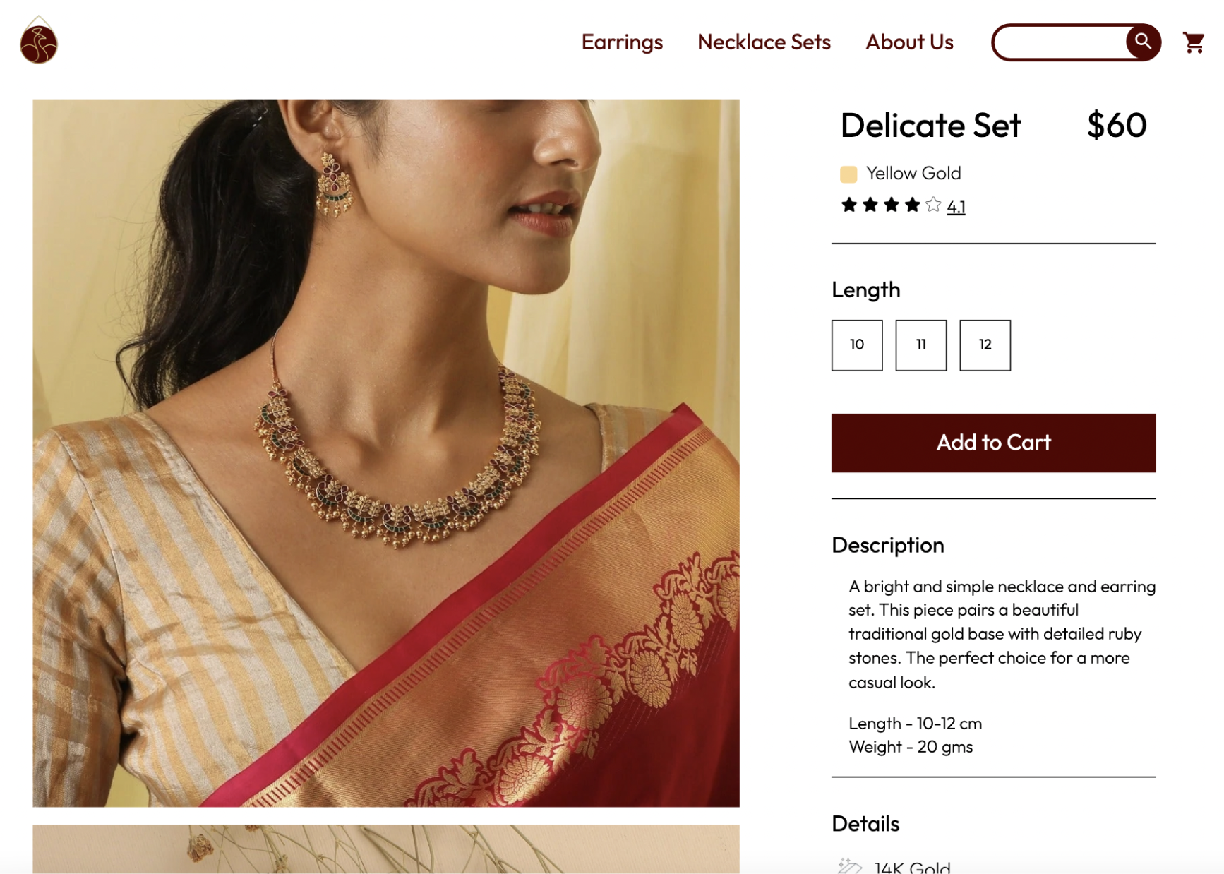
Browser Layout
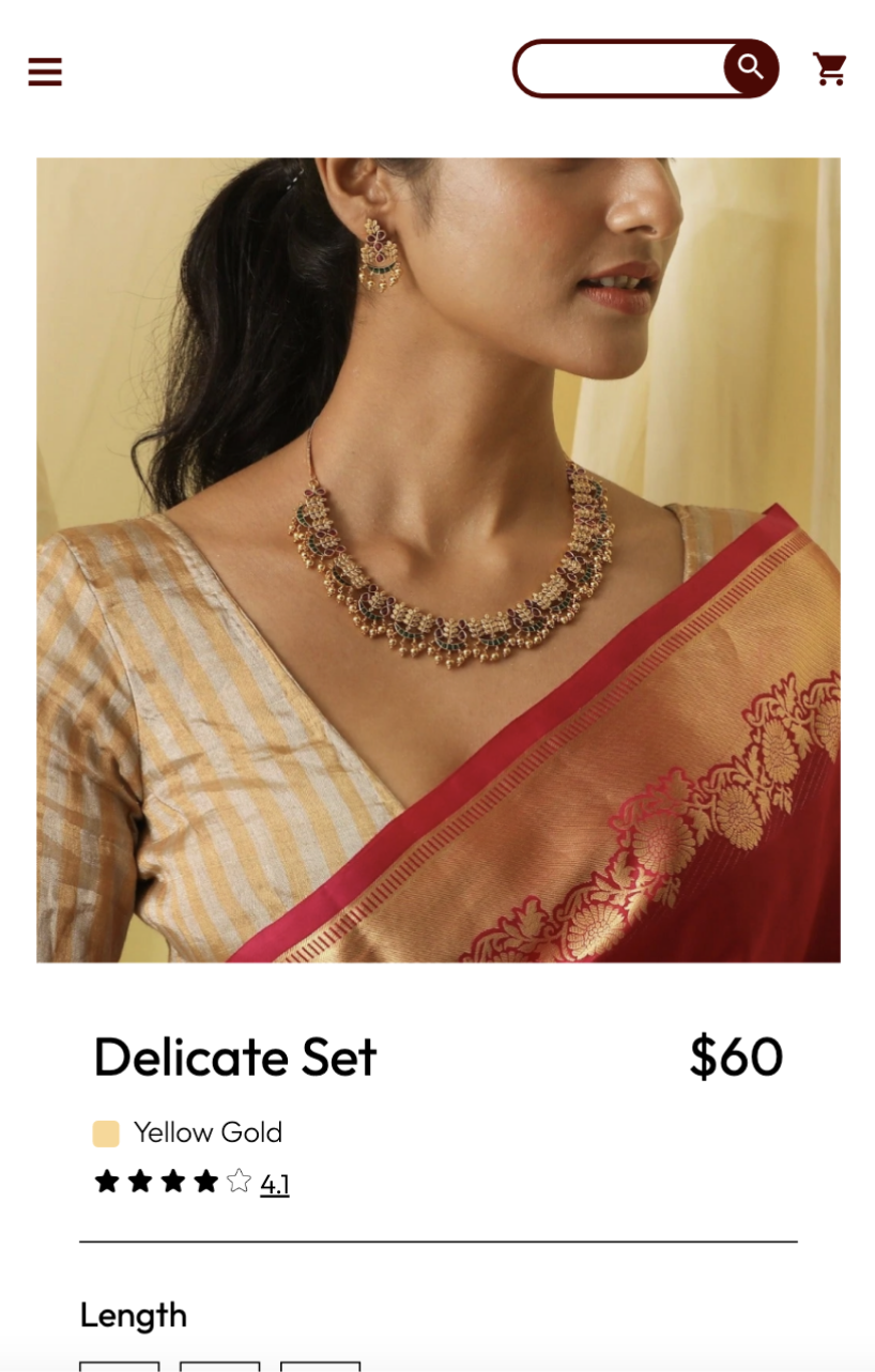
Mobile Layout
Coding Media Queries
I previously had some experience with CSS media queries, but when I used them my websites had harsh transitions between screen sizes. For this project, I learned how to effectively use CSS media queries in combination with adaptive layouts. I was able to have my layouts gradually scale with the screen to allow for a more fluid website. Below, is a video of my product page layout I developed, where you can see a smooth transition between responsive breakpoints.

Responsive Layout
Reflection
Combining Development with Design
With a strong computer science background, I usually don’t combine the coding and design aspect of my projects, I usually focus on one at a time. During this project, I got to experience combining both the design and code simultaneously. After completing this project, I'm more confident in my web development and design skills. I learned how important responsive web design is and how to more efficiently create web applications.