The Ignite Syringe Extender Instruction Card is a printed card I created during my co-op term as a Graphic Designer at Precision NanoSystems (PNI) that explains how to use the new extenders with certain syringes on the Ignite Instrument.
Throughout the project, I had to consider several things, such as the size of the packaging the card will go into, my understanding of how the extender works, making sure that PNI’s brand colours were used, and that the design was laid out in a way that no important content is interfered by the fold of the card.
Illustration Design
One of the major tasks I had to accomplish was to recreate the syringe extender into a vector illustration and create diagrams for each step of the instructions.
Initial Sketches and Ideation
Since I haven’t seen the product in person, the Product Manager who requested this project and I felt that it was a good idea to see how the extender works in person. When I did so, I was able to better visualize how it is used and then translate them into a visual representation of each step of the instructions. With the knowledge I had of how the syringe extender works, initial sketches were developed.
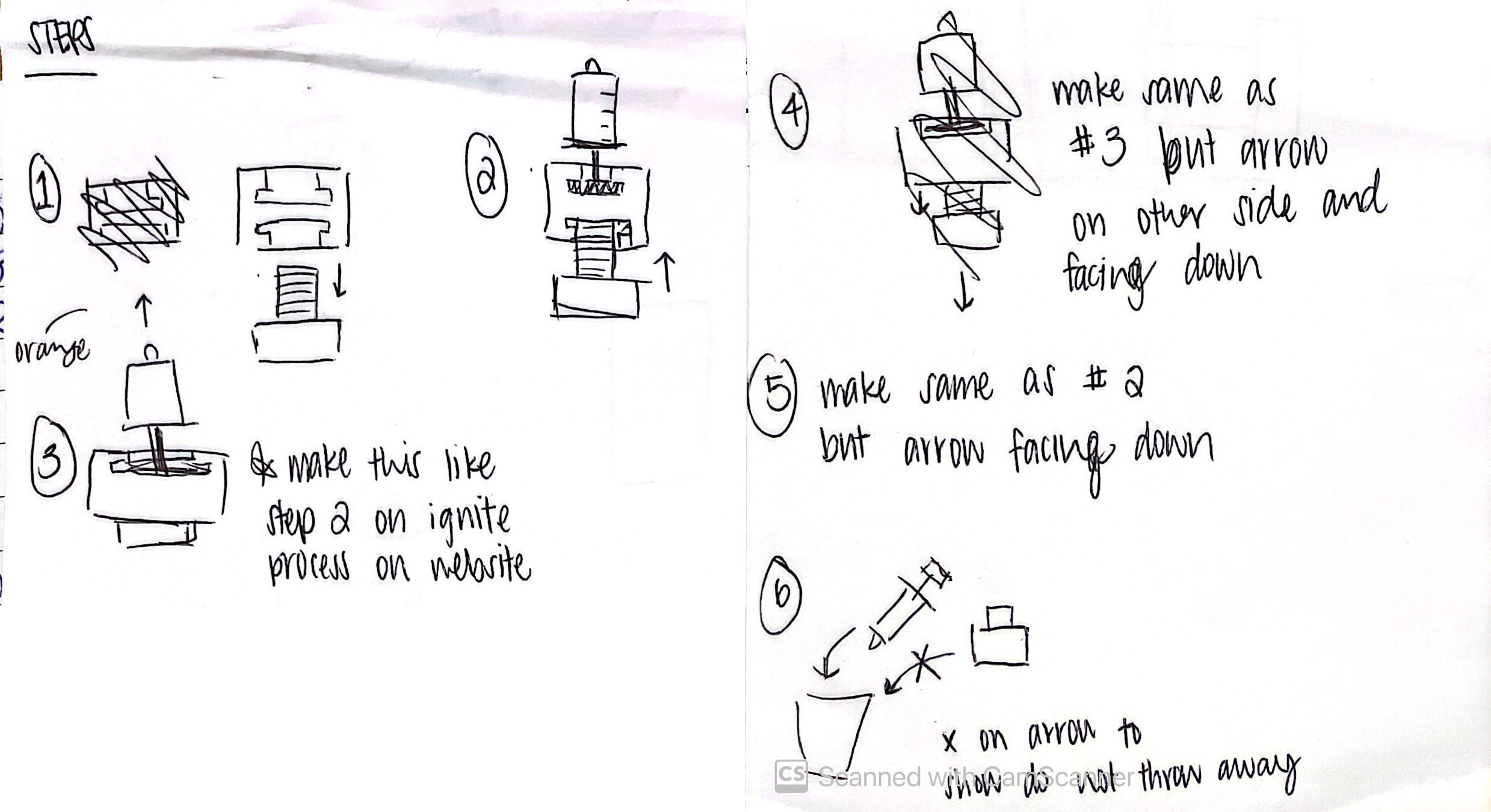
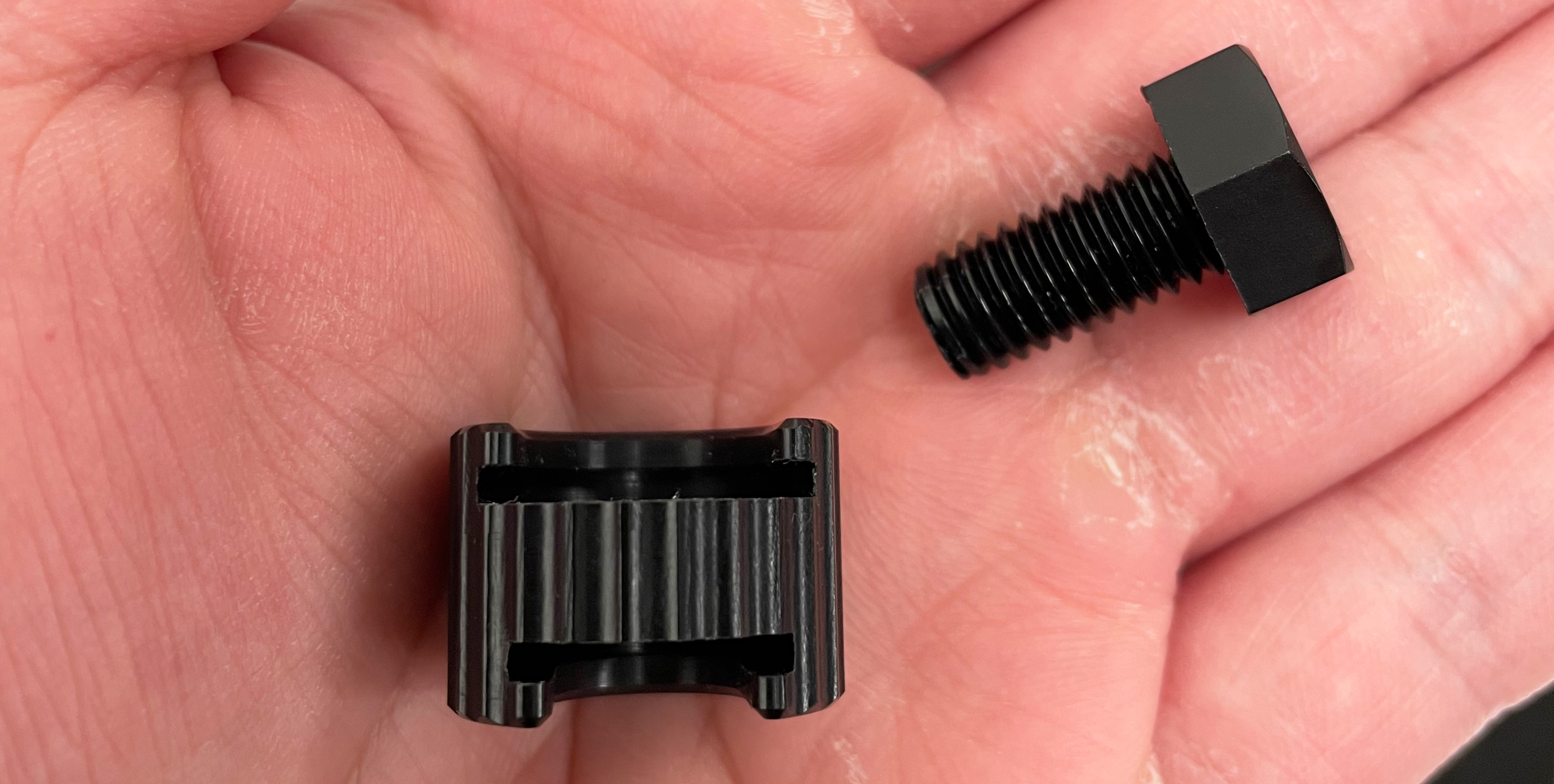
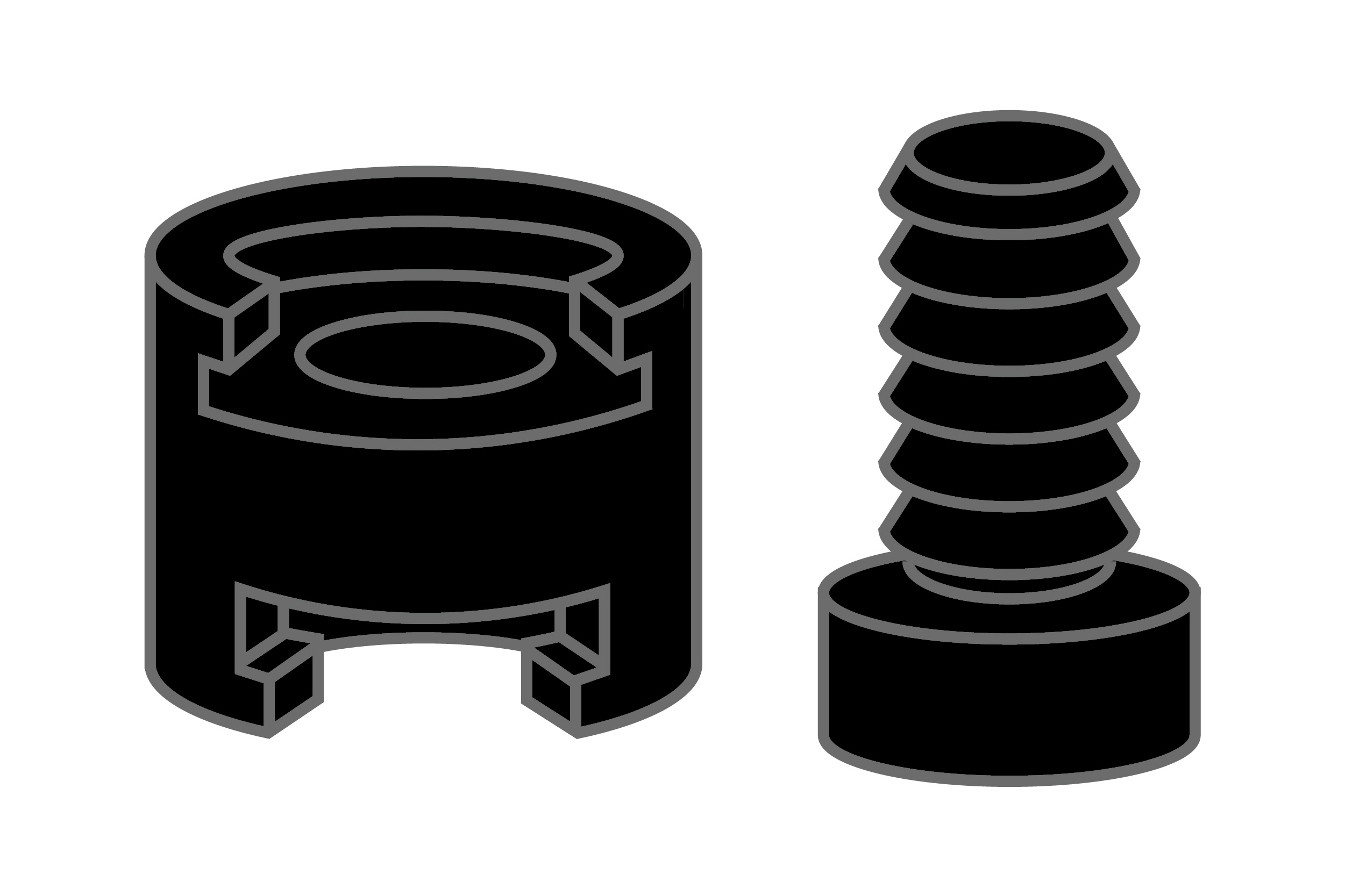
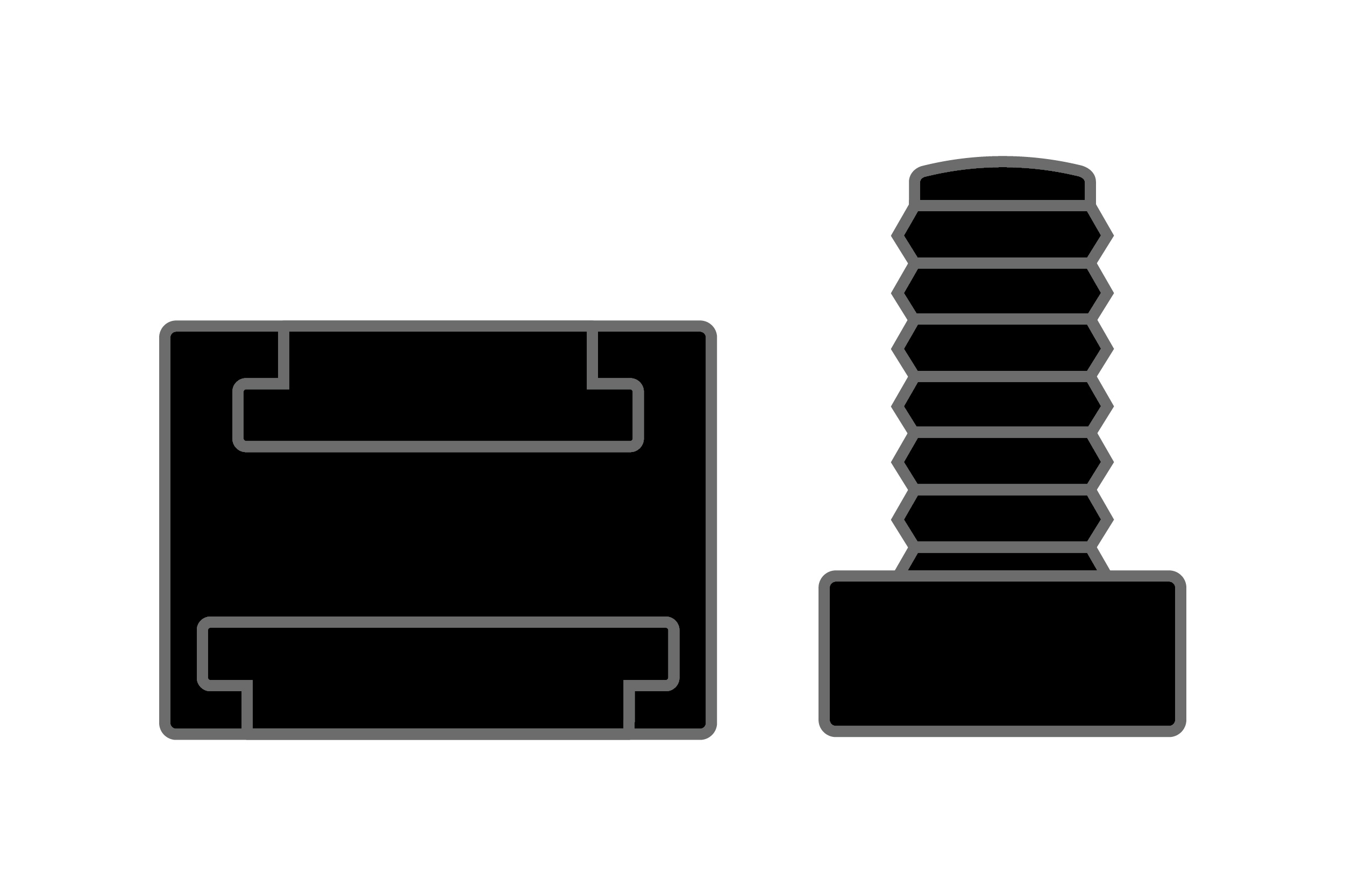
Drawing Vector Illustrations
PNI’s illustration style is very simple. Considering that the syringe extender is a new product, I had to create a brand new vector illustration for it. Using the images I took of the item, I created a 3D version to help explicitly show the parts of the extender since it was a required section of the card, and a 2D version to be consistent with the other assets used in the diagrams for each instructed step. However, after some discussion with my team, the Product Manager and my colleague on the Graphic Design team, I realized that this resulted in inconsistency in the style of the other illustrations in the card. Therefore, I opted to use the 2D version throughout the card as it can still illustrate the parts of the extender, and will make the overall graphics for the card more consistent.
Takeaways
Although creating a 3D illustration of the extender is a great asset to have, the 2D version was sufficient in demonstrating the different parts of the extender. In addition, considering that the diagrams for each step were 2D illustrations, having even just one 3D illustration would make the graphics on the card slightly inconsistent with each other. Regardless, the 3D illustration did help me practice in creating 3D illustrations in Adobe Illustrator.
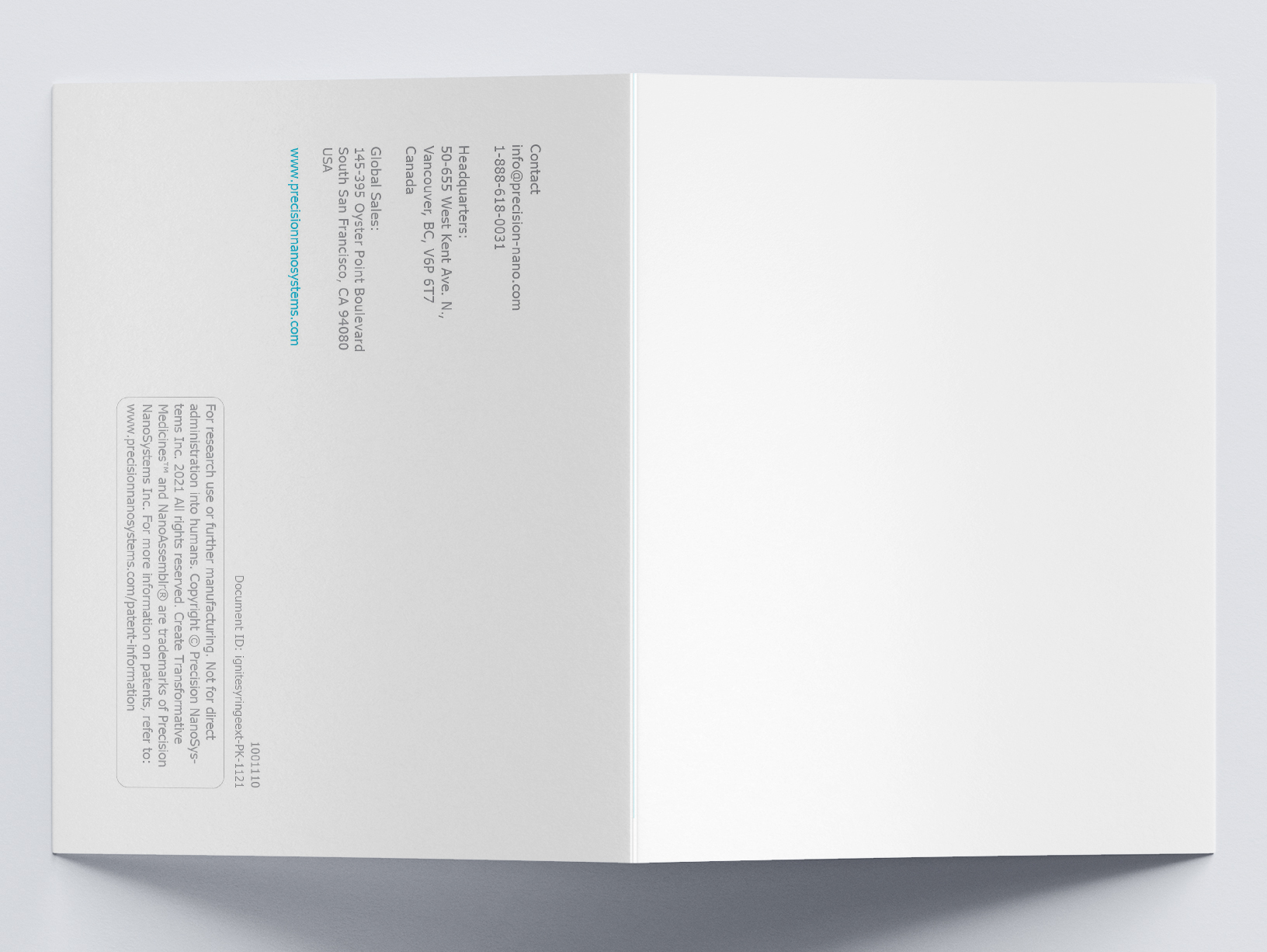
Approving Print
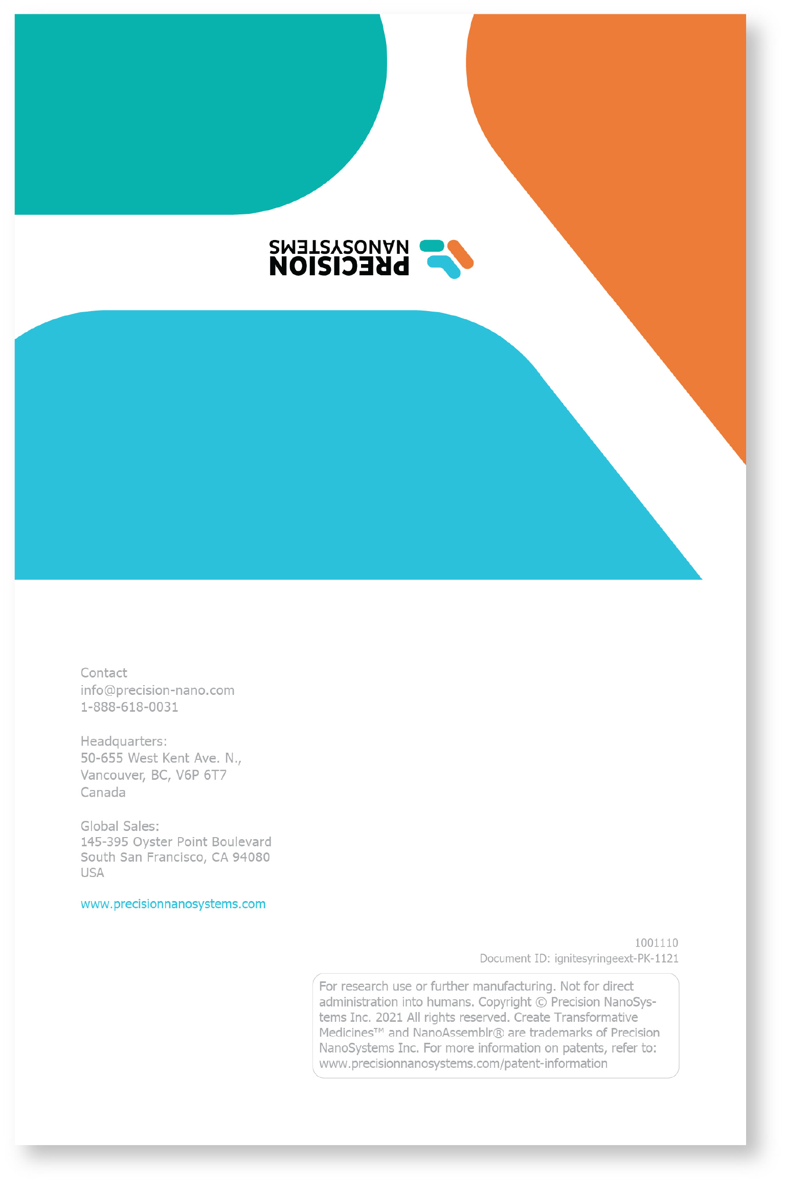
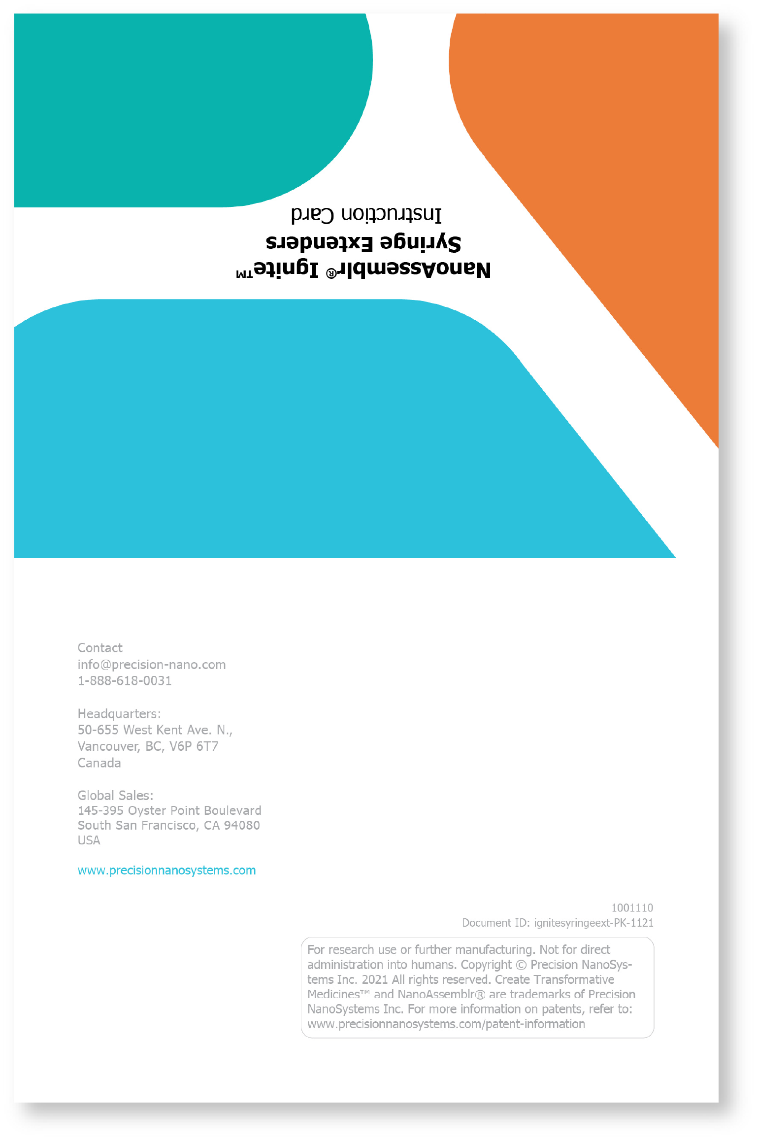
Another challenge I faced occurred after I had the first set of proofs printed from the printing company. The purpose of these proofs was for the team to review how the card looks when printed and to see if we need to make any changes before making a bulk order. While reviewing, I realized that the first draft was designed as if it was intended to be a digital file, so the back page had a lot of blank space. After seeing the proofs folded in half as they were supposed to be, the “front cover” was blank.
Ideation for the Front Cover
After presenting the proofs to my team, we decided to add a graphic to the front cover. I presented my first two ideas to them: the first one having two different variations of the PNI logo, and the other just having the name of the card in the brand colour of the Ignite instrument. I explained that I got these ideas from the other notice insert documents I designed previously. After discussing these iterations with them, we came up with the idea of combining the first two ideas to make the third iteration, and this was a good idea because it combined company brand and the name of the card so that customers will know what this card is for.
Takeaways
This front cover added more visuals and PNI branding to the document. It also helped me realize that designing for print is quite different than digital in how customers would view the document. By having the name of the printed card on the front, customers will be able to tell immediately what that card is. If the document was only for digital view, the front cover graphic wouldn’t have been necessary since the first page already has the title of the document.
Reflection
There were many overall takeaways from this project. For one, I was able to build on my communication skills as I had to communicate with multiple people outside of my department and outside of the company (i.e. the printing company, ColorTime). In addition, although the project was individual in a sense where I designed the card myself, I was still able to collaborate with a team and discuss ideas with them. These skills will be beneficial in the future when more people are involved with bigger projects. As mentioned earlier, this project allowed me to relearn that design for print is different than designing for digital—the way it will be viewed by users will be different. Because I was mainly designing digital documents during the COVID-19 pandemic, I had to reset my mind to design for print instead. This is one thing I would change if I were to do this project again—I would sit back and really think about the scope of the project, it’s intended audience, and how it will be shared with them. Doing so will allow me to execute the project more efficiently.