Process Analysis
A process analysis of my project from IAT 334 -- Interface Design.
CLOTHING APP
Overview
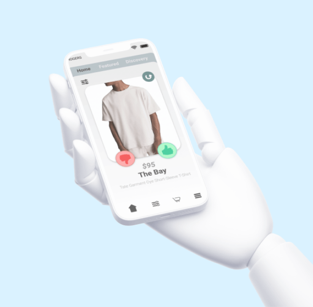
For this team-based final project, my group and I developed a mobile application for a fictional company called Intrigue. It’s an app that allows users to ‘like’ or ‘dislike’ clothing items and, based on their preferences, it's algorithm returns items that they may like. We mainly worked with Figma and Protopie for this project.
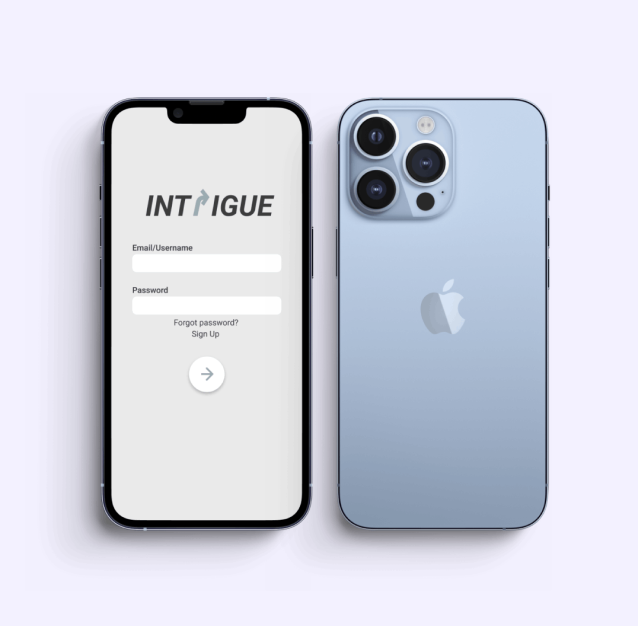
Initial Prototype
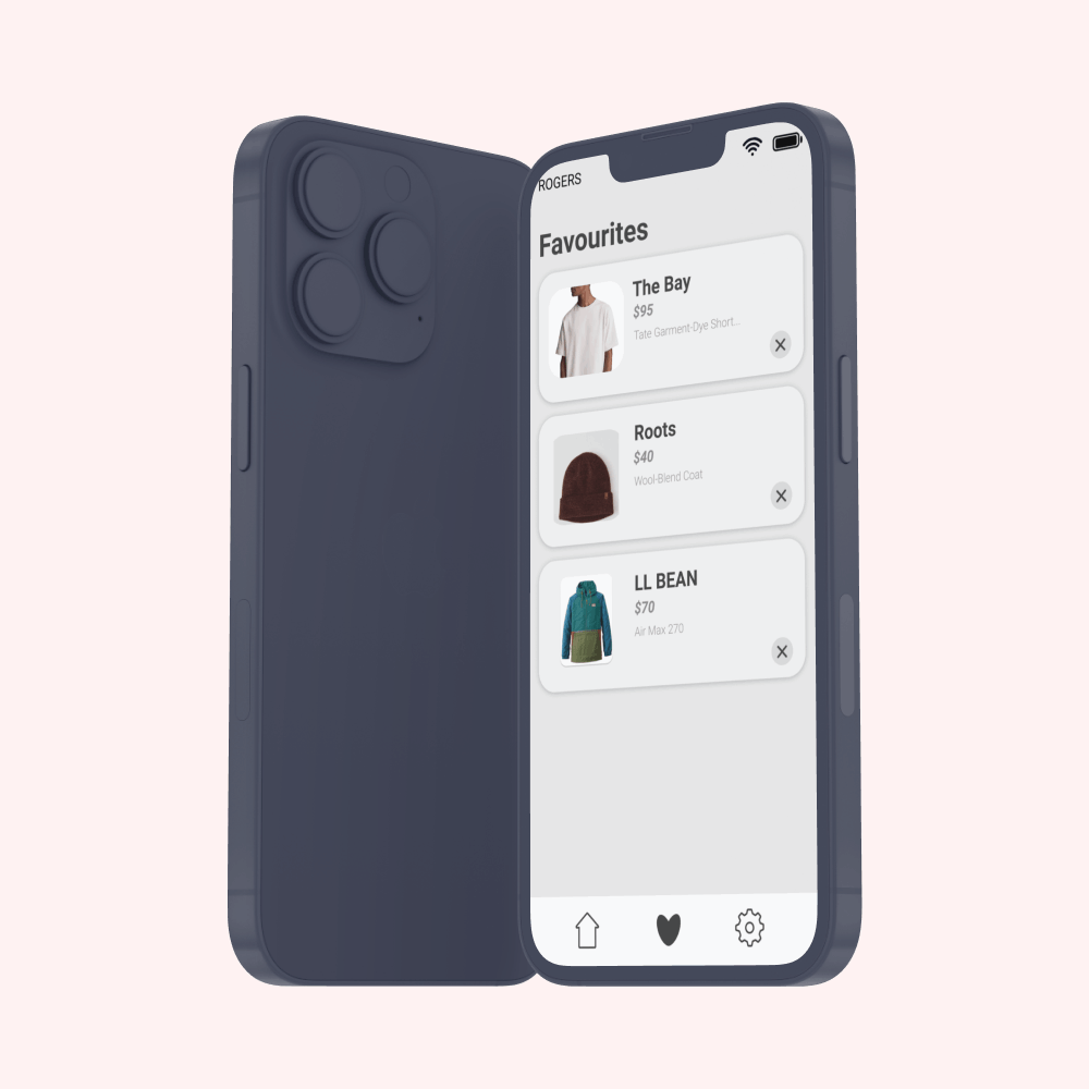
We created several screens: a home screen, a more-information screen, a filters screen and a favourites screen. With our initial prototype, we noticed that some users found the filters confusing by having both the search icon and the "+" symbol next to the clothing categories. Additionally, users expressed how there were several design inconsistencies. For example, the icons at the bottom of the app were visually different from one another.
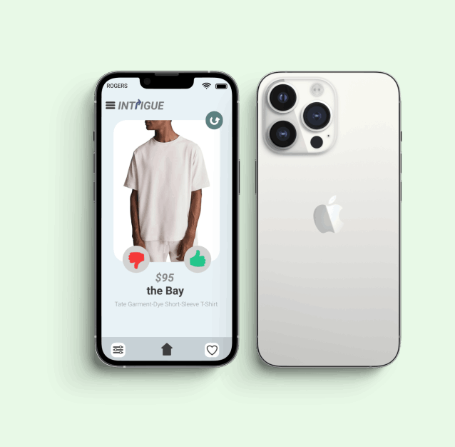
Final Prototype
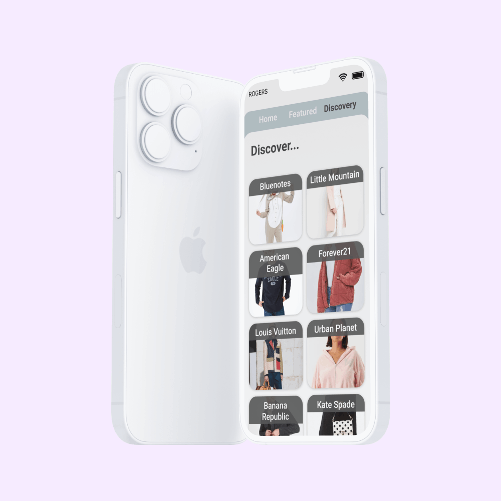
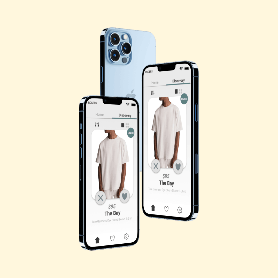
For our final prototype, we created a more minimalistic design by removing the search icon and "+" symbol. We found that doing this created less confusion for users. We also ensured that all the pages appeared cohesive and we adjusted any visuals that looked out of place such as the four icons that are at the bottom of the app. Additionally, we created another screen–-a discovery screen-–that allows users to find new clothing items posted by numerous brands. We thought this feature could help users discover different articles of clothing that they normally wouldn’t see on their home page and allow them to step outside their comfort zone.
