Case Study
Buzzed
User Interface, User Experience, Branding
Teammates
Ben Kwok
David Mercado
Class
Interface Design
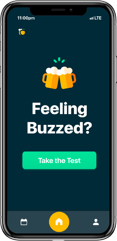
Buzzed is a smartphone sobriety checker that helps young adults make responsible decisions on how to get back home after a night out of casual drinking.
By conducting 2 physical sobriety tests using integrated smartphone sensors, Buzzed provides educated recommendations on how to safely get home, encouraging young adults to make smarter decisions for themselves and those around them.
My main role was leading Buzzed’s art direction, visual identity and ensuring a natural and uncomplicated UI since users would be under the influence while using the app.
Problem
The concept behind Buzzed was to help vulnerable individuals under the influence make a critical decision, which meant Buzzed had to maintain a strong sense of professionalism to establish trust and credibility. Moreover, this meant that the UI and the usability of Buzzed must be so simple and intuitive that even a person under the influence could use it. Buzzed had to be engaging enough to encourage its usage, while being able to relay critical information easily but effectively.
Process
The first iterations of Buzzed’s UI were not meeting the goal’s requirements. As seen in Figures 2 and 3, the sobriety testing process and results screen were cluttered, ambiguous, and presented an excess of text for users who’s reading capabilities are compromised. Moreover, I addressed how a surplus of colour and incorrect uses of colour affect the intuitiveness and visual language of the UI.
Process
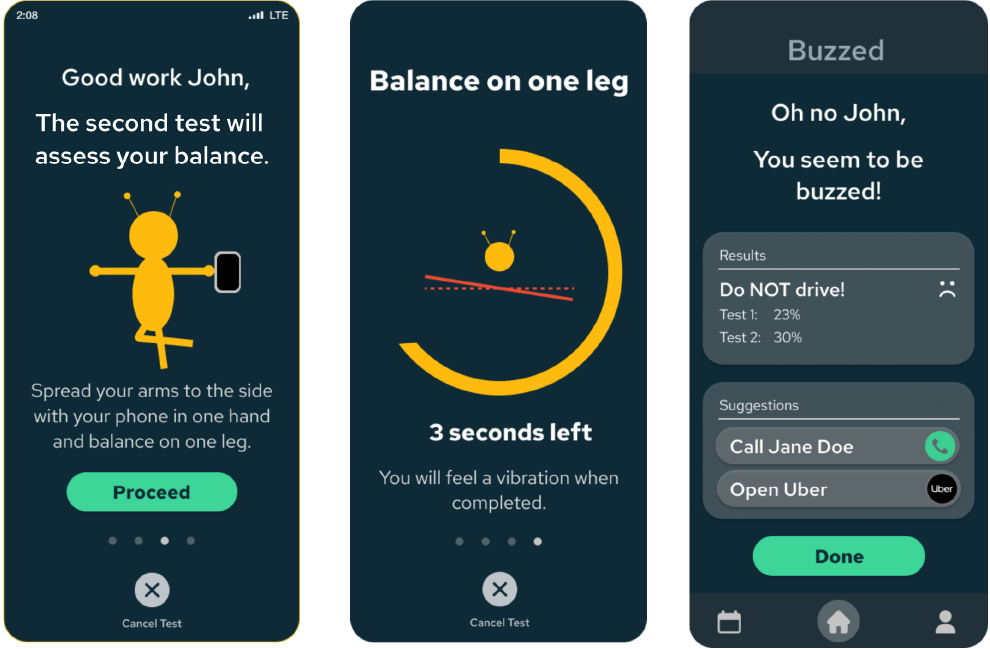
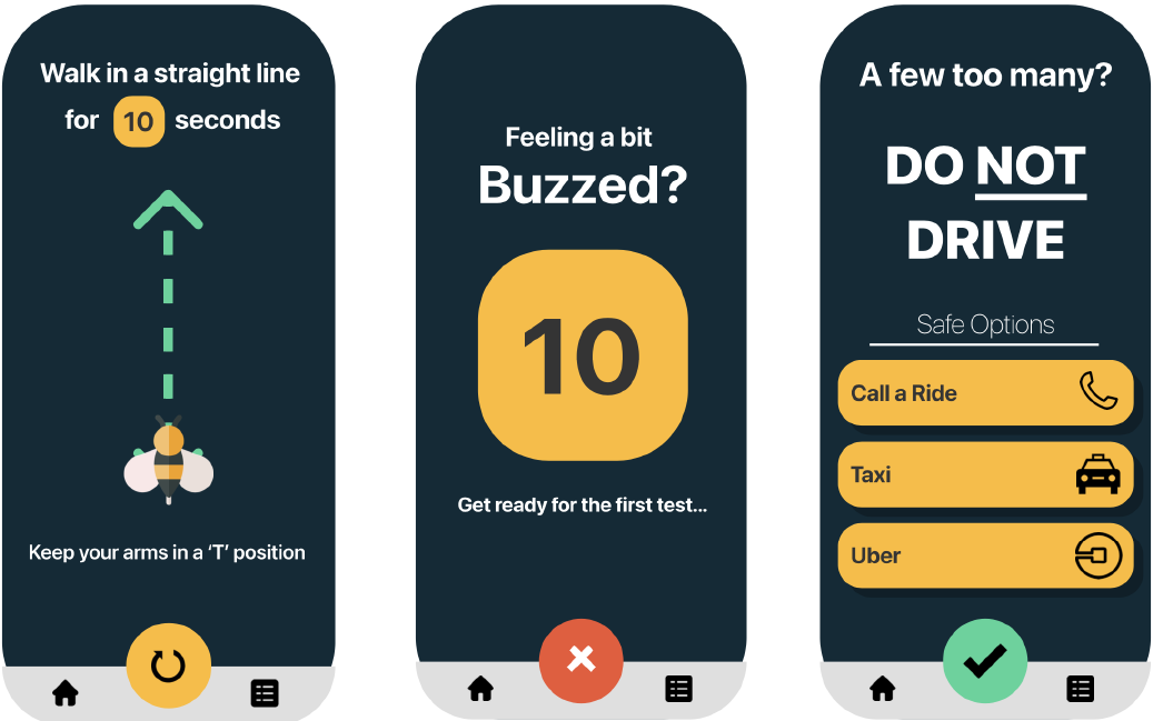
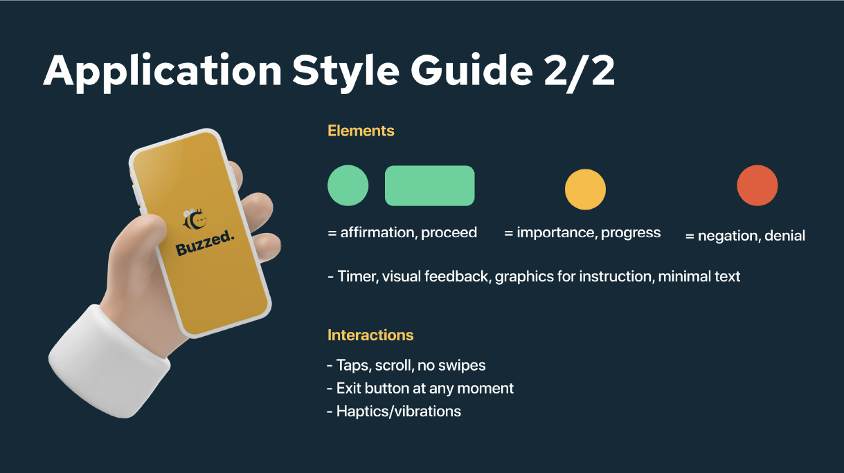
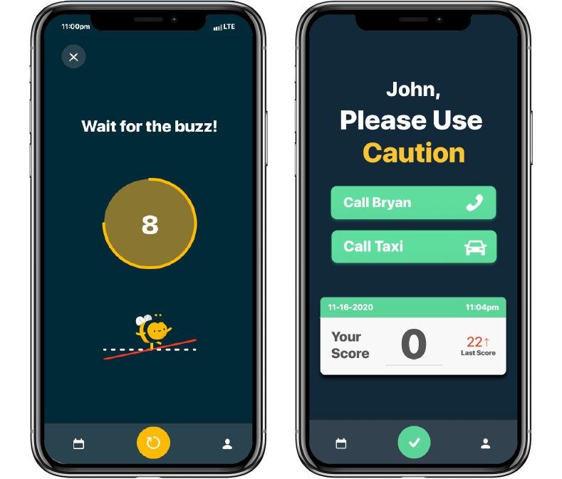
To address this, I produced a style guide depicting the analogy of a stop light to ensure that color was implemented only when it was crucial. Red indicates stop, cancel, and alert; yellow indicates progress, slowing down and time passing; green indicates affirmation and to proceed (see figure #)
Process
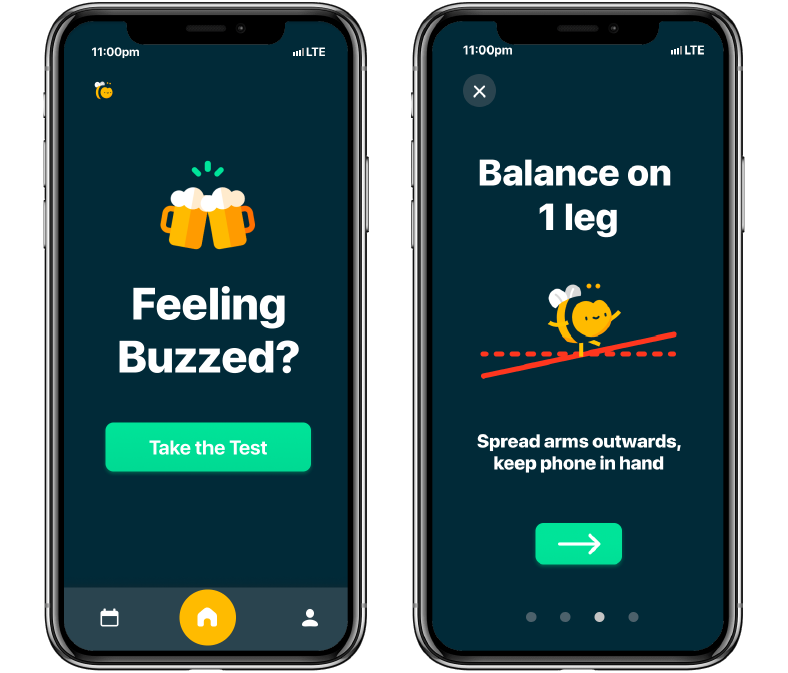
I also proposed to update our old app icon to a more inviting and clean bee not only to provide Buzzed with a higher sense of professionalism upon first impression, but also to serve as a guide to engage users to complete the sobriety tests. The bee being a guide is crucial to the process of Buzzed, since the bee demonstrates how to perform the tests, is the main source of visual feedback, and stays alongside throughout the testing to encourage completion (figure#).
Solution
While using Illustrator and Protopie to combine all the proposed elements in a functioning mockup, my solution to building an engaging, clear and intuitive testing process, was to enhance and increase strong visual queues and feedback rather than text heavy instructions and unclear interactive elements. The “stoplight” colours aided in providing guidance of when to proceed, slow down, or take precaution during the tests without being excessive or overwhelming (Figure #).
Conclusion
The final iteration of Buzzed included a fully functioning mobile prototype on Protopie and a promotional website promoting the application.
Click to visit:
Learnings
Producing Buzzed’s style guide and components of the interface taught me how visual elements in design and their placements should be purposeful and ultimately strive to accomplish a goal. I learned while some interfaces and elements may look appealing and colourful, implementation without reasoning can lead to unforeseen issues in intuitiveness, effectiveness and branding.