Pedal2Play
BUS 238 - Entrepreneur and Innovation
Pedal2Play is a fitness-focused start-up company dedicated to providing an alternative fitness method to local youths in the efforts of their home to prevent child obesity and other chronic diseases. My role as the visual designer is to create a visual identity for the brand and design visual materials for consumers managing their products.
Ideation Process
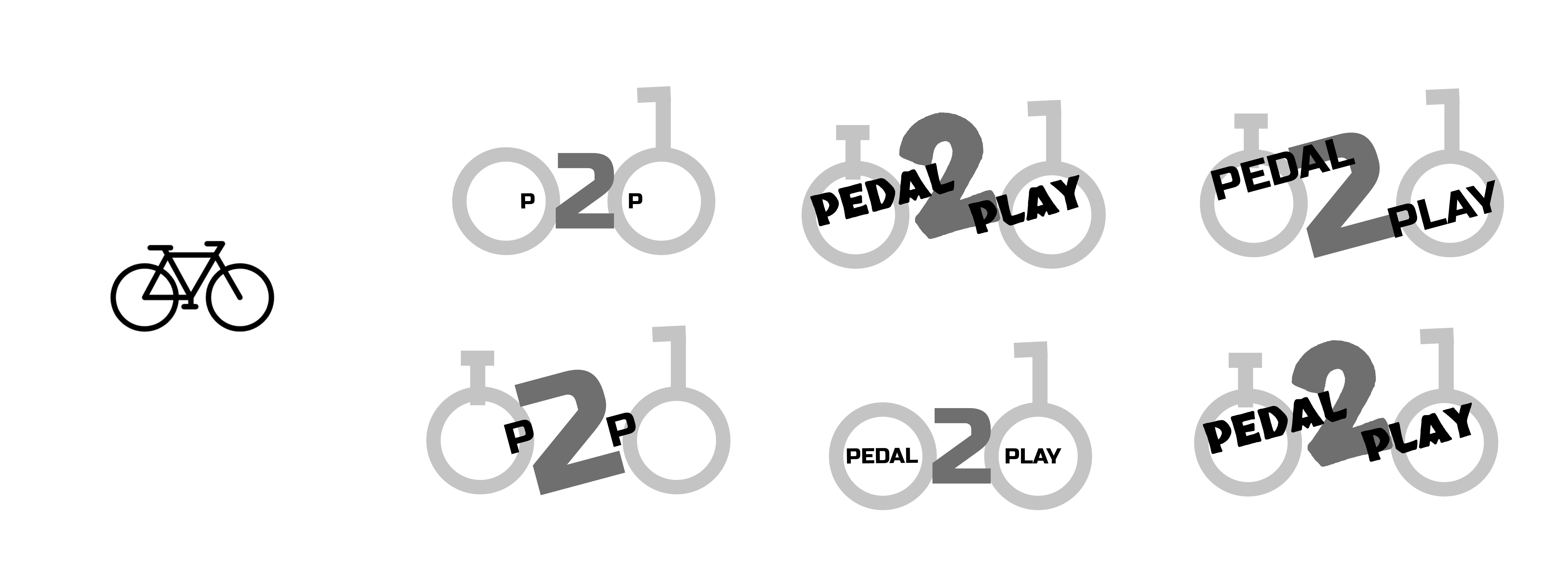
I was inspired by a simple bike since the product is a bicycle. So I started off creating outlines of bikes and incorporating elements of the name within the design.

Afterwards, when the team and I selected the version we liked the most, I created more detailed iterations and added colour to specific elements that wanted to be highlighted.

Color Scheme

I wanted to go with a modernistic colour palette, which contained blue, black and white. Black and white is a basic combination that works well with many different colours, and I also wanted the main colour - blue - to be the focal point of the logo. So the final colour scheme decision was made between two colours, which were blue and green. I chose blue over green because the outdoor is also mainly green, which didn't resonate well with the indoor bicycle product. In addition, blue is an attractive colour that isn't too overpowering to the eye and signifies an open flow of communication. We want our consumers to experience while using the product.
Logo and Brand Language

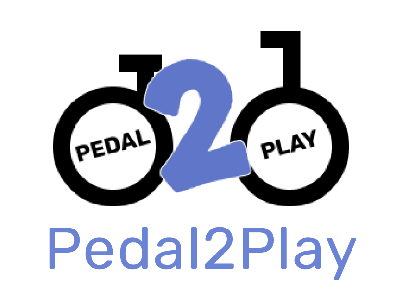
The logo and brand language is influenced by the simplicity of a bicycle. For example, the words "PEDAL" and "PLAY" are placed diagonally to represent the spoke and chain of the bike. The "2" in the middle acts as the bicycle's frame, which holds it all together and symbolizes how the product allows for social connection from consumers to friends.
Applications
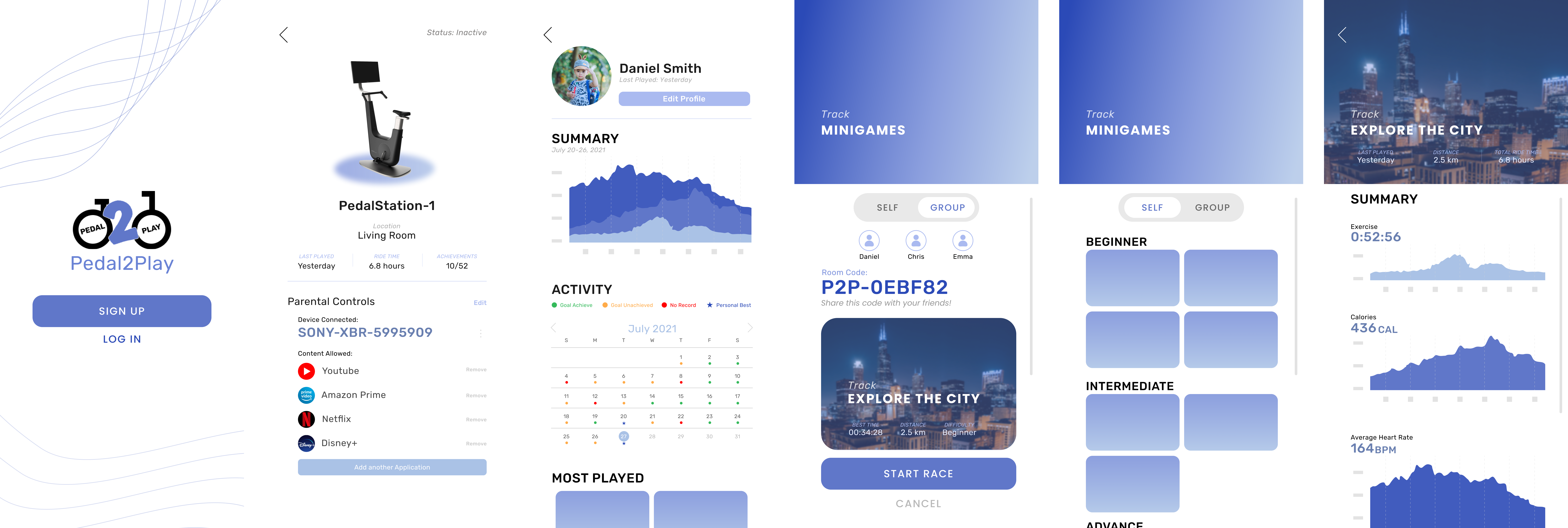
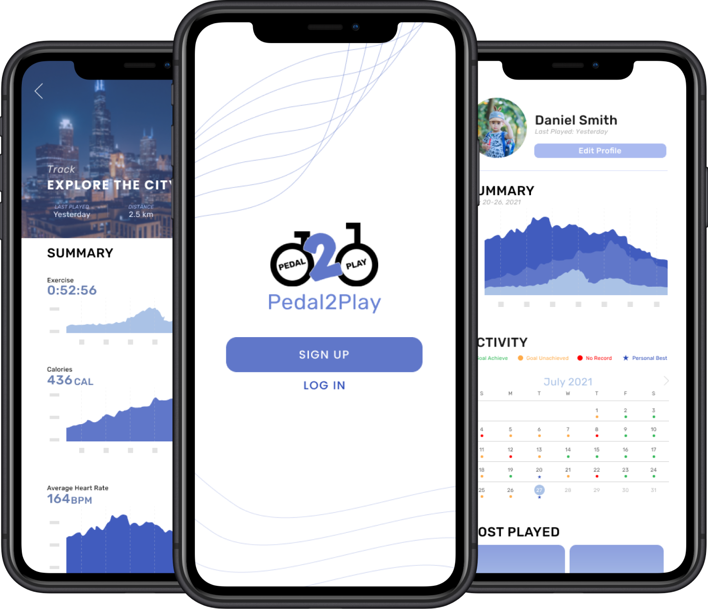
This is the application design for Pedal2Play. The layout was made simple and easy to read for parents or youth to understand how our product affects. The graphics are simplistic and display important data that users wanting to collect.
