

Serenity


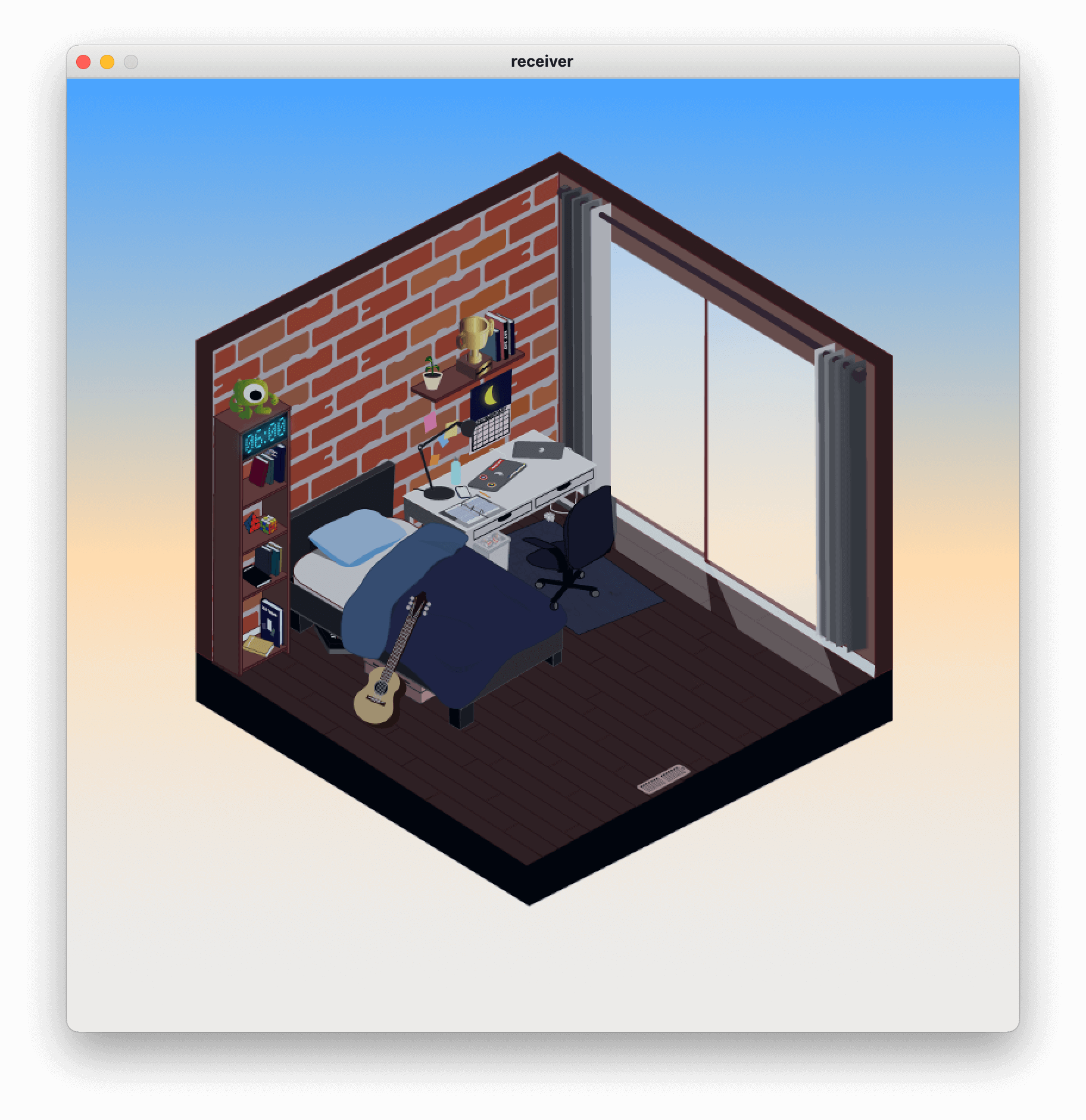
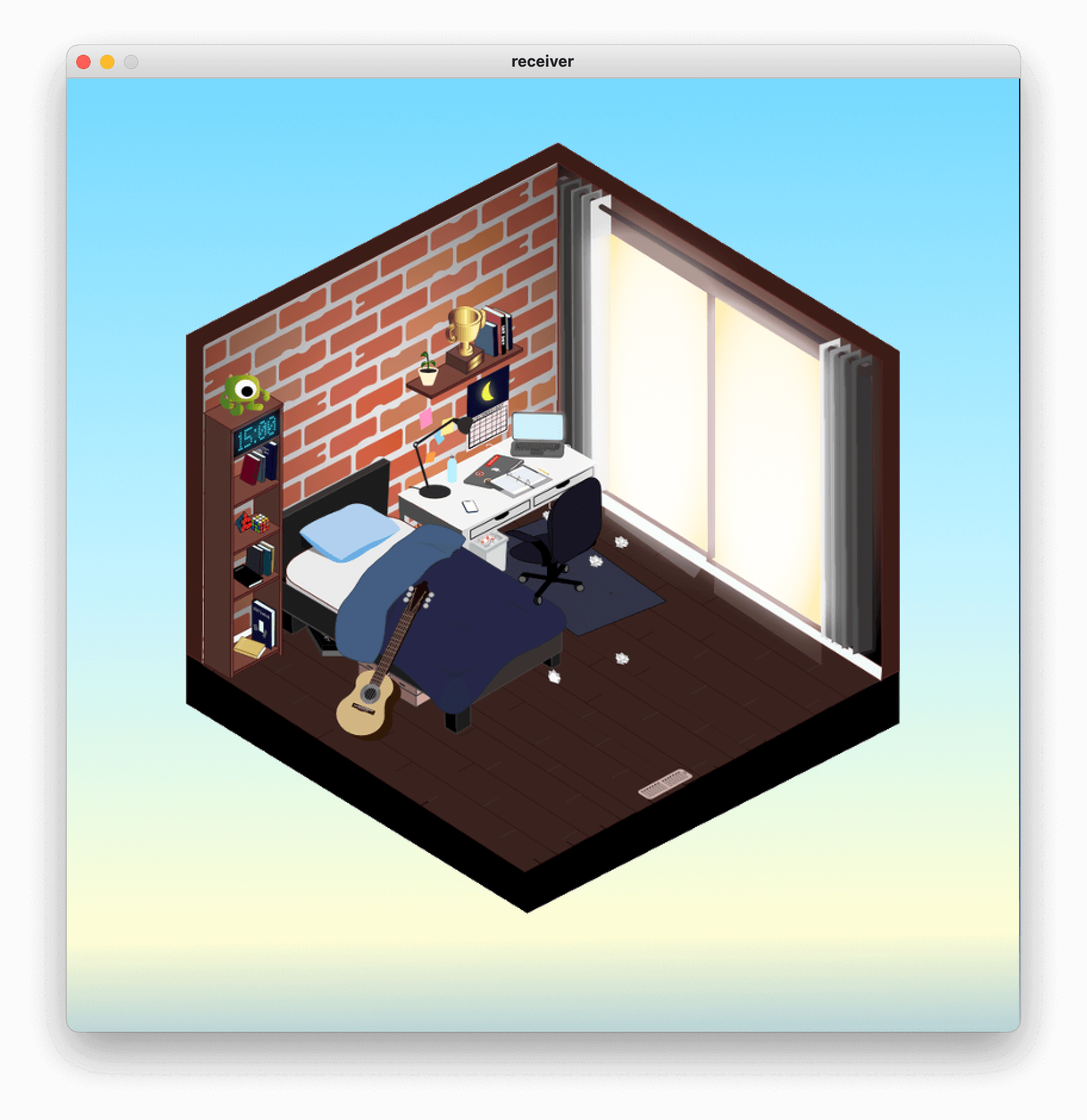
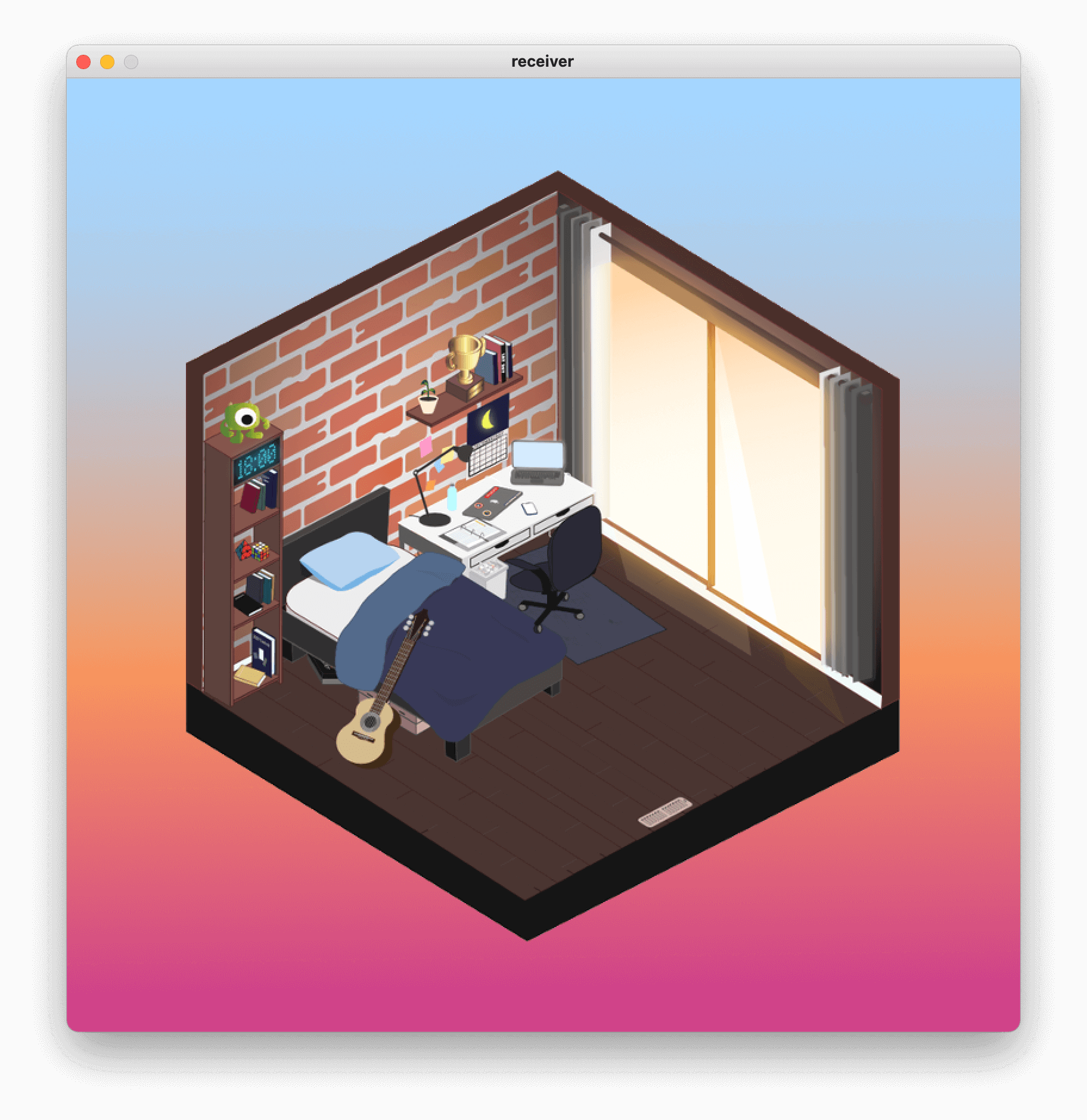
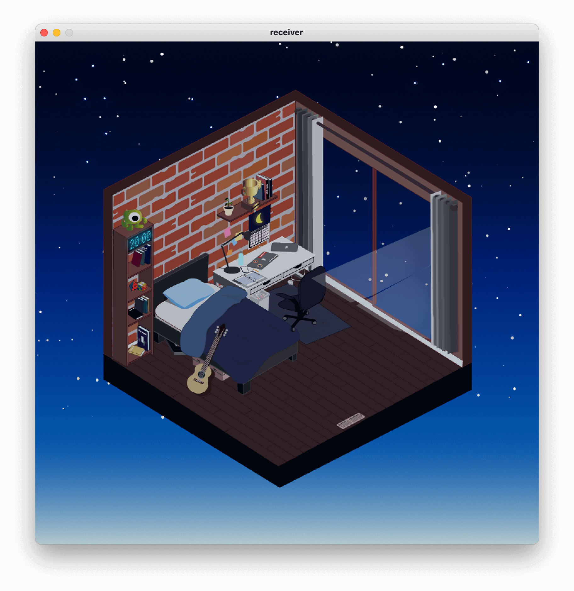
In a course about developing interactive technological systems, we were given the task of creating a system in which you interact with a physical component that would produce a result on-screen. My Partner, Liam Tangilag, and I wanted to create a simulation of a room where the user would see the effects of time passing by each hour.
I was in charge of creating the visual assets and providing the art direction for the project.
How can I design the room in a way that is simplistic yet effective in its ability to distinguish time progressing?
How can I design the room where most of the objects are visible to the user?
What object's can be used to show time progressing?
What knowledge that I have obtained from previous courses can I apply to this project?
I opted to stick with a simplistic rendition by only using three-tones maximum for each object. These three tones would represent the light hitting the different surfaces of the object, resulting in the object appearing ‘physically’ present within the room.
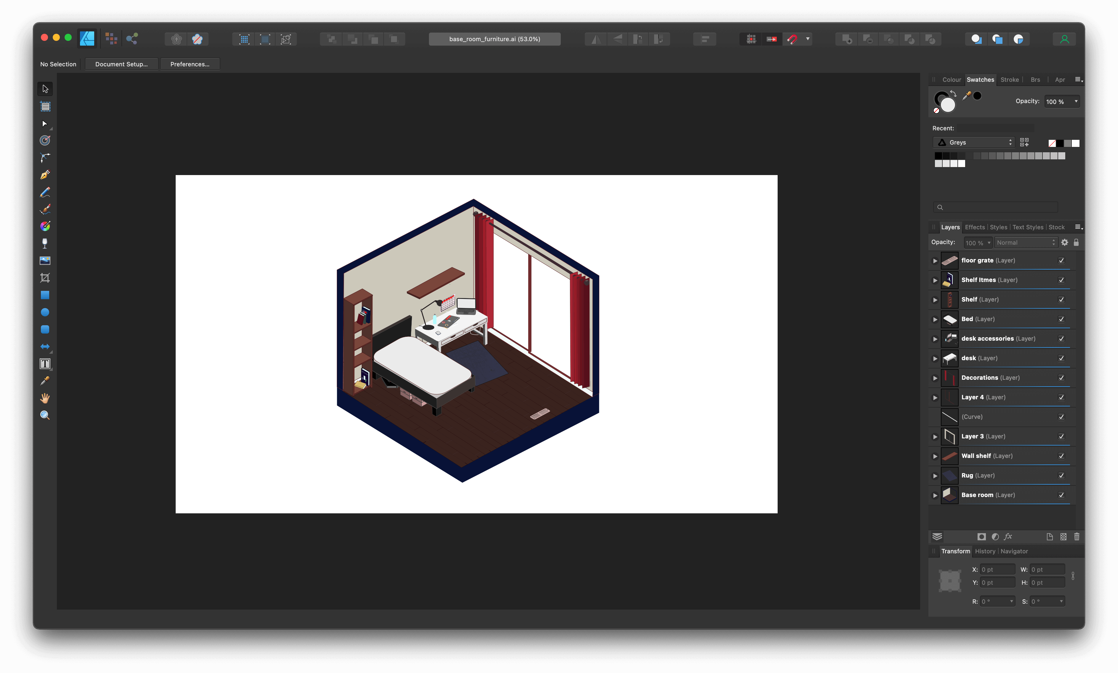
Thinking back to my spatial thinking course, I decided to design the room in an isometric view as it allows for the user to see as many details as possible without any obstruction blocking the view. An isometric view allows for all the proportions of an object to be preserved rather than skewed. If I were to use a skewed perspective, there would be two vanishing points within the horizontal plane and the closer an object is to one of these points, the more difficult it is to see.
I would then move objects that are more likely to be moved to different positions throughout the day, such as a chair or a phone. This helps simulate the effect of time progressing throughout the day. To further achieve this effect, I would introduce light rays that would be coming through the window and adjust the angle of them every hour.
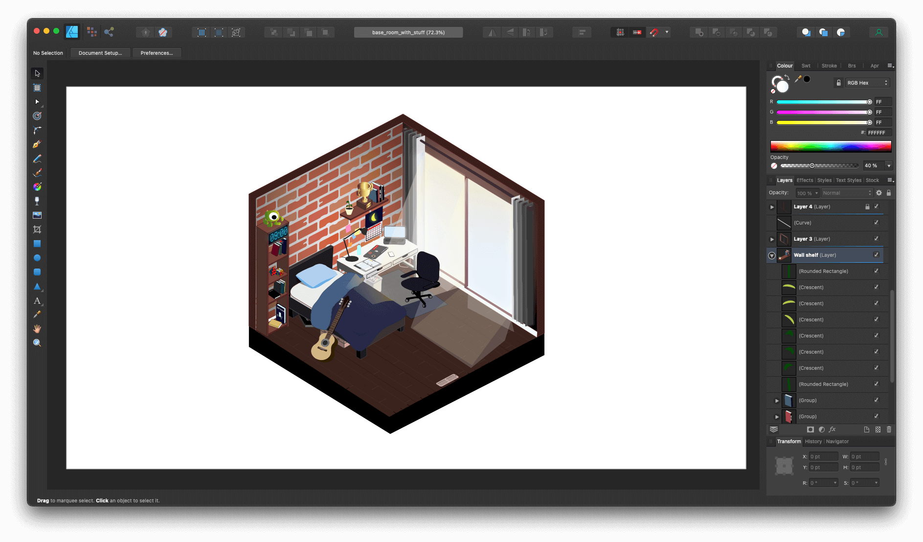
By the end, I was able to apply knowledge from previous material to design a room that effectively communicates time progressing. I learned that by simplifying the design, it allows for me to choose what is absolutely essential for the design in order for it to convey the emotions and its message to the audience.
