Basic Graphical Statistics
-
Bar Charts
Bar charts are a way to represent categorical data visually, in a horizontal or vertical display. Bars can be single, stacked, or grouped. By looking through the whole chart, it is easy to see the distribution of the dataset.
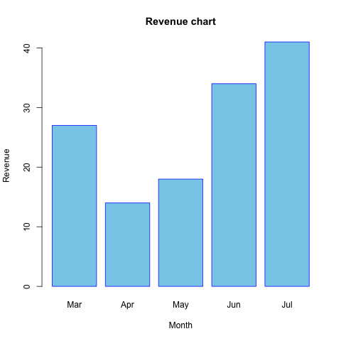 A bar chart of (fictional) revenue from March to July.
Example
Bar Graph Maker
This website allows users to customize a bar chart. The website includes an introduction of how to create the chart.
Author: © Rapid Tables.com.
-
Pie Charts
Pie charts are an alternative way of representing categorical data visually, where the information is shown in percentages. A pie chart looks like a circular pie which has been cut into several slices. Each slice of pie represents a different category. By looking through the whole chart, it is easy to see the ratio of every category in the dataset.
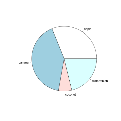 A pie chart of (fictional) quantities of fruit at a market.
Example
Pie Chart Maker
This website allows users to customize a pie chart. The website includes an introduction of how to create the chart.
Author: © Rapid Tables.com.
-
Histograms
A histogram gives a visual representation of the distribution of quantitative data. In a histogram, each bar groups numbers into ranges. Taller bars show that more data falls in that range. Histograms look similar to bar graphs, but histograms display the distribution of continuous data.
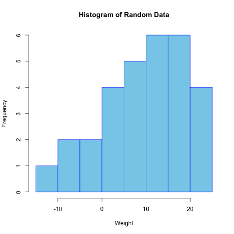 A histogram for a set of randomly generated numbers.
Example
Histogram Maker
This website allows users to load examples, or insert their own data, to generate a histogram. The website includes a summary table for the histogram, and an accompanying explanation.
Author: Statistics Kingdom.
-
Box Plots
In descriptive statistics, a box plot (or boxplot) displays the main properties of a dataset through its quartiles. The box spans from the first quartile to the third quartile, with a horizontal line representing the median. Whiskers extending from the box indicate variability outside the upper and lower quartiles. Outliers that differ significantly from the rest of the dataset may be plotted as individual points beyond the whiskers in the box plot.
Box plots can be drawn either horizontally or vertically. The shape of the box plot indicates the degree of spread and skewness of the data, which are usually described using the five-number summary.
The five numbers are:
- Minimum (Q0 or 0th percentile): The lowest data point in the dataset, excluding any outliers.
- Maximum (Q4 or 100th percentile): The highest data point in the dataset, excluding any outliers.
- Median (Q2 or 50th percentile): The middle value in the dataset.
- First quartile (Q1 or 25th percentile): The lower quartile is the median of the lower half of the dataset.
- Third quartile (Q3 or 75th percentile): The upper quartile is the median of the upper half of the dataset.
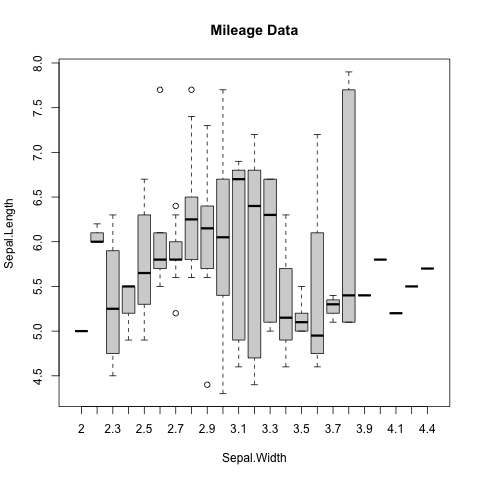 Box plot for the iris dataset (Anderson, 1936; Fisher, 1936).
Example
Advanced Box Plot Maker
This website allows users to load examples, or insert their own data, to generate a box plot. The website includes a summary table for the box plot, and an accompanying explanation.
Author: Statistics Kingdom.
-
Scatterplots
Scatterplots display relationships between two numerical variables. A scatterplot displays data paired using a horizontal axis (the x-axis) and a vertical axis (the y-axis). The position of each dot on the horizontal and vertical axis indicates values for an individual data point.
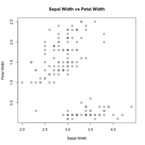 Scatterplot for the iris dataset (Anderson, 1936; Fisher, 1936).
Example
Scatterplot Maker
This website allows users to customize a scatterplot. The website includes an introduction of how to create the plot.
Author: © Rapid Tables.com.