
Bad examples of information architecture
This website lists mistakes about information architecture, but the website itself contains mistakes. The whole site is full of text without even one single image. That can bore audience and interfere their interests in browsing the site. Usually, a more visual way that to illustrate a concept or an example could attract more attention from audience. What's more, the layout and alignment of text is such a mass that distract audience from moving through the content.

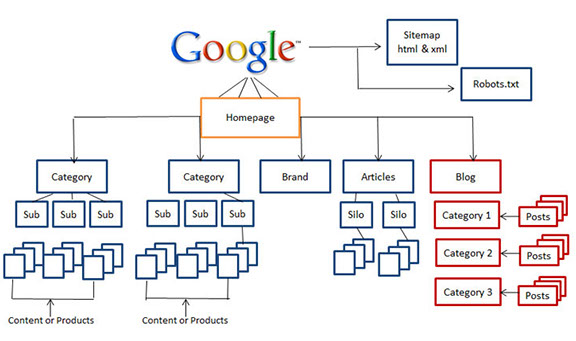
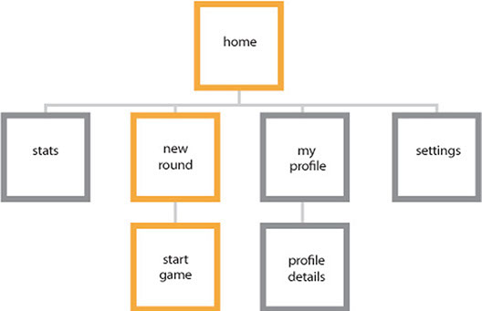
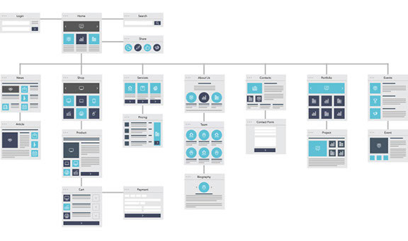
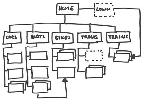
Some examples of information architecture
Reference:
http://bccart87.claudiajacques.com/resources/information-architecture/
http://www.blog.skytopper.com/tag/architecture/
http://msalmanshakeel.blogspot.ca/2013/04/windows-phone-design-process.html
https://www.nngroup.com/articles/top-10-ia-mistakes/