visier analyses file management system
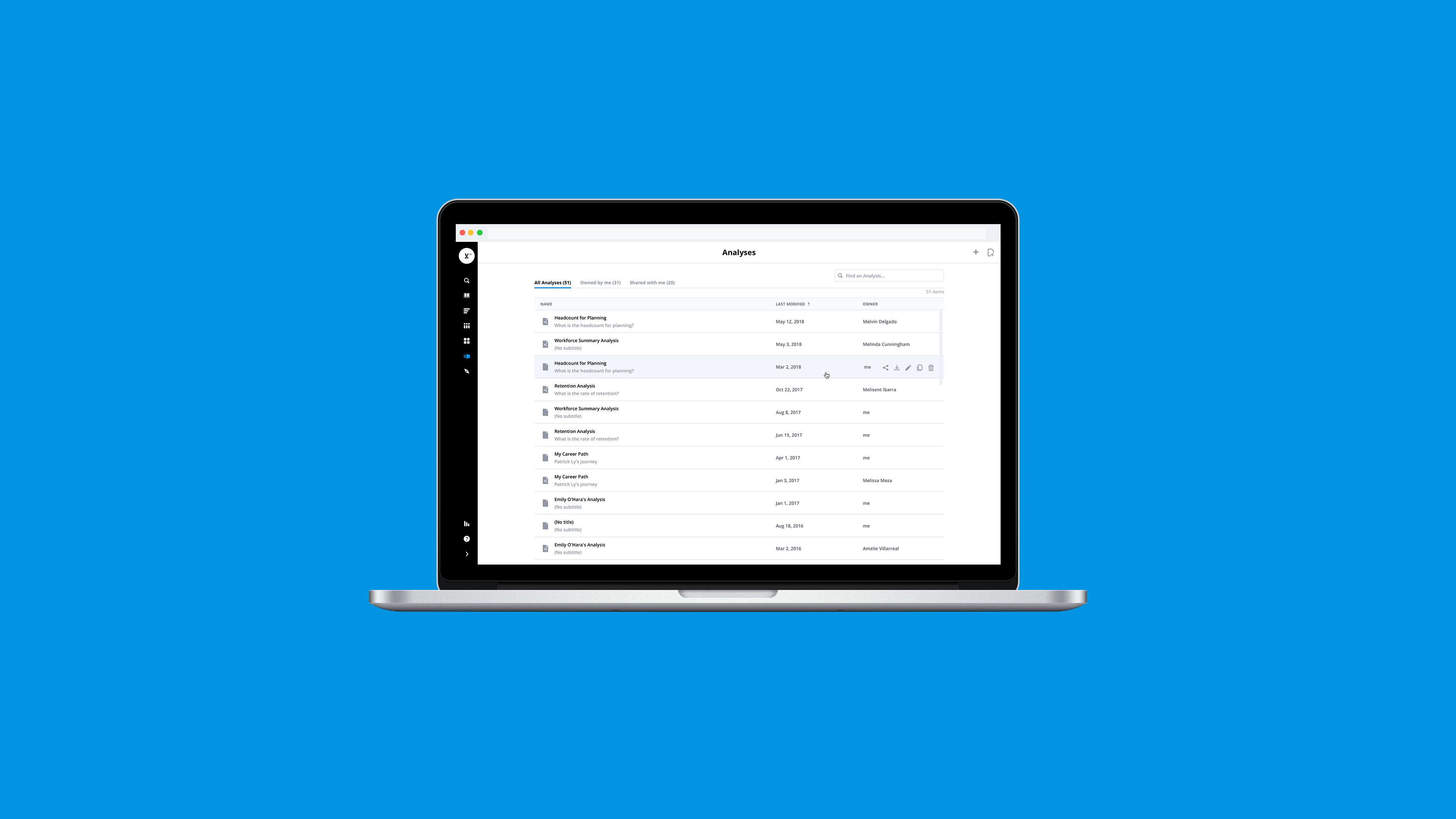
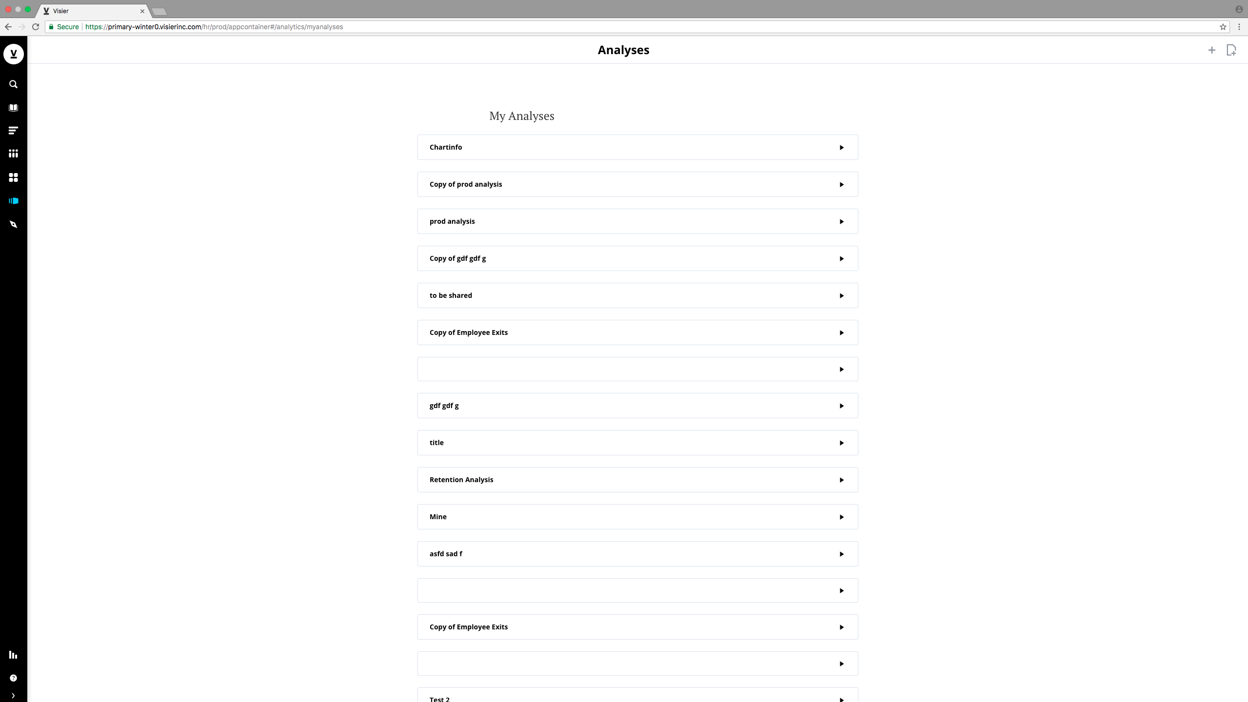
A redesigned file management system for user created documents (analyses) in Visier’s primary application: Visier People. The goal is to improve on the existing file management experience to better help HR analysts effectively manage and delegate analyses to the right people.
- Roles: Interaction Design, Visual Design
- Tools: Sketch
- Year: 2018
- Context: Internship (2 months)
- Team: Chuiee Yang, Max Bitel
problem
Before this project, the user experience for file management was difficult to navigate and lacked the core functionality of common file management systems such as Google Drive and Dropbox. The experience of creating, reading, updating, and deleting documents was inconsistent, difficult to access, and tedious to scan.
design process
research + audit
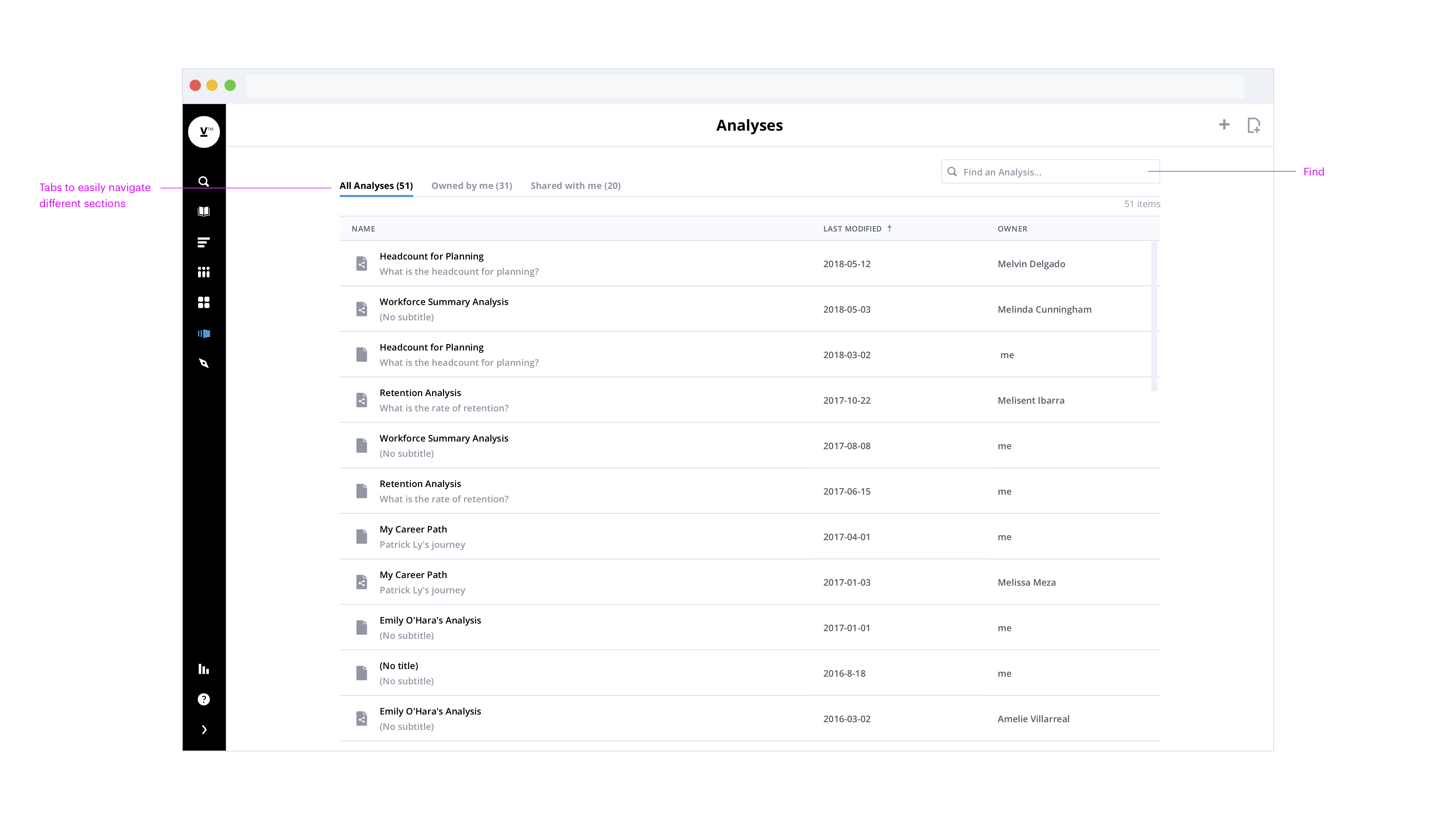
Before diving into user experience and interaction design, I analyzed the commonalities between existing file management systems and email clients. Examples I’ve looked at include: Google Drive, Gmail, Dropbox, and Jira by Atlassian. I identified common user interface and interaction patterns between each application to see how it might fit within our current design system, and made sure I understood the design decisions made.
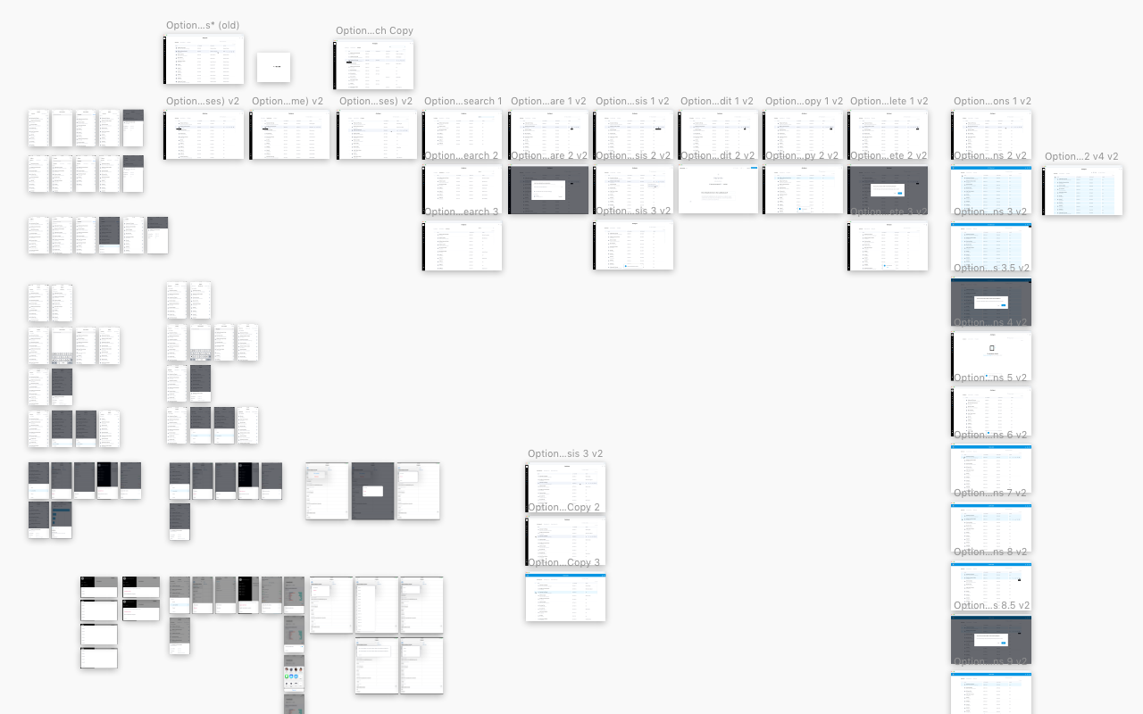
explorations
After auditing existing file management systems, I created multiple iterations on Sketch to explore different visual and interaction options and prepared them for design feedback sessions.
peer feedback
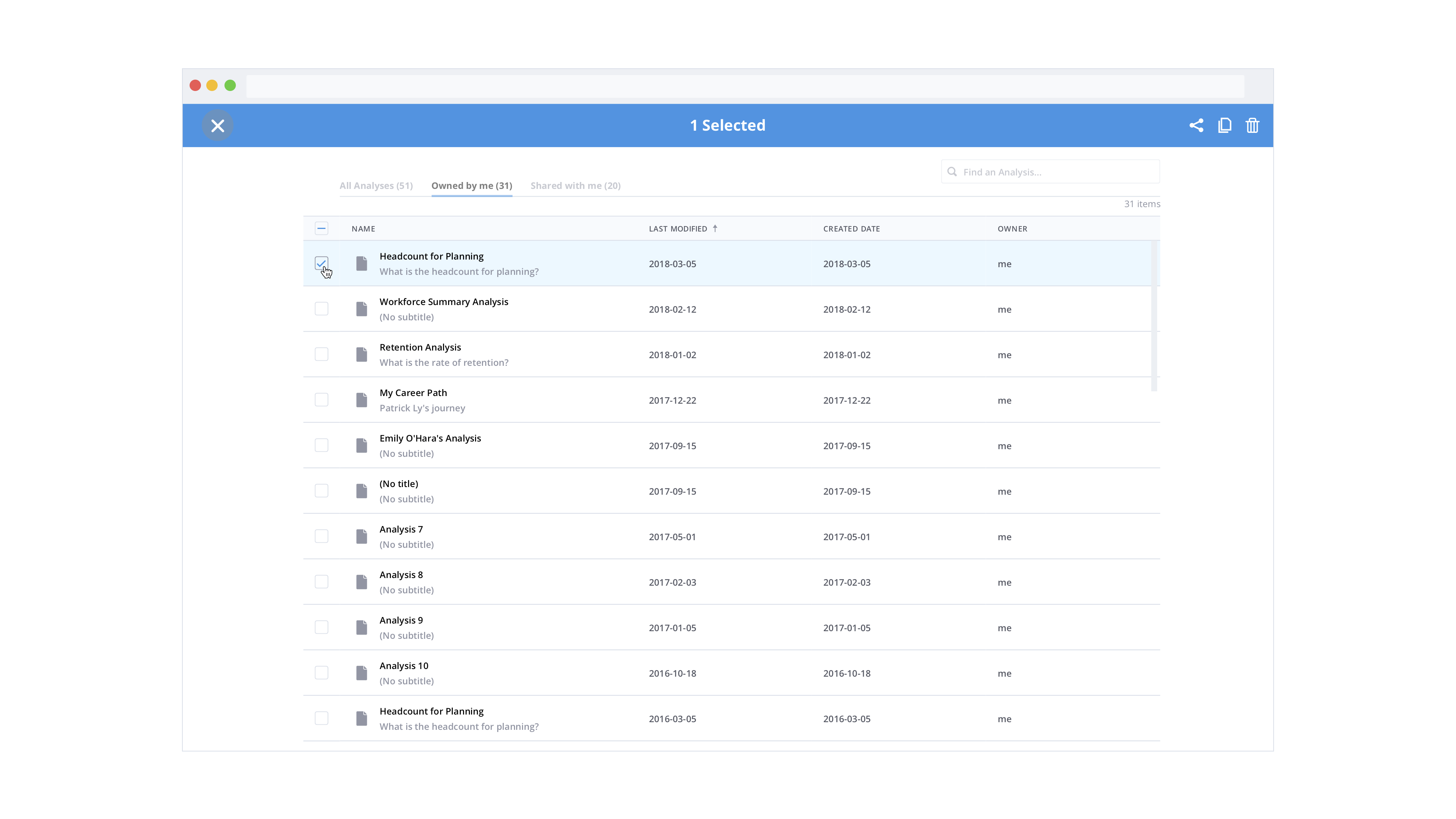
An important aspect of this project was getting feedback from other designers when there wasn’t a clear-cut choice for a particular iteration. An example was when I had to choose between two approaches for a multi selection pattern: an adapted version of Dropbox’s pattern versus Google Drive’s pattern. Dropbox uses a checkbox layout for multi selection, while Google Drive uses the standard desktop file manager metaphor for multi selection (‘shift’ key multi-select).
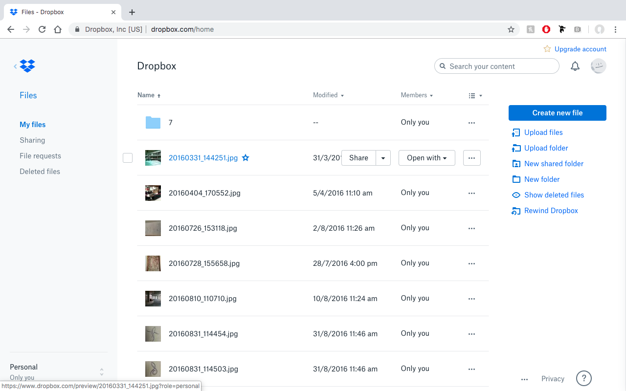
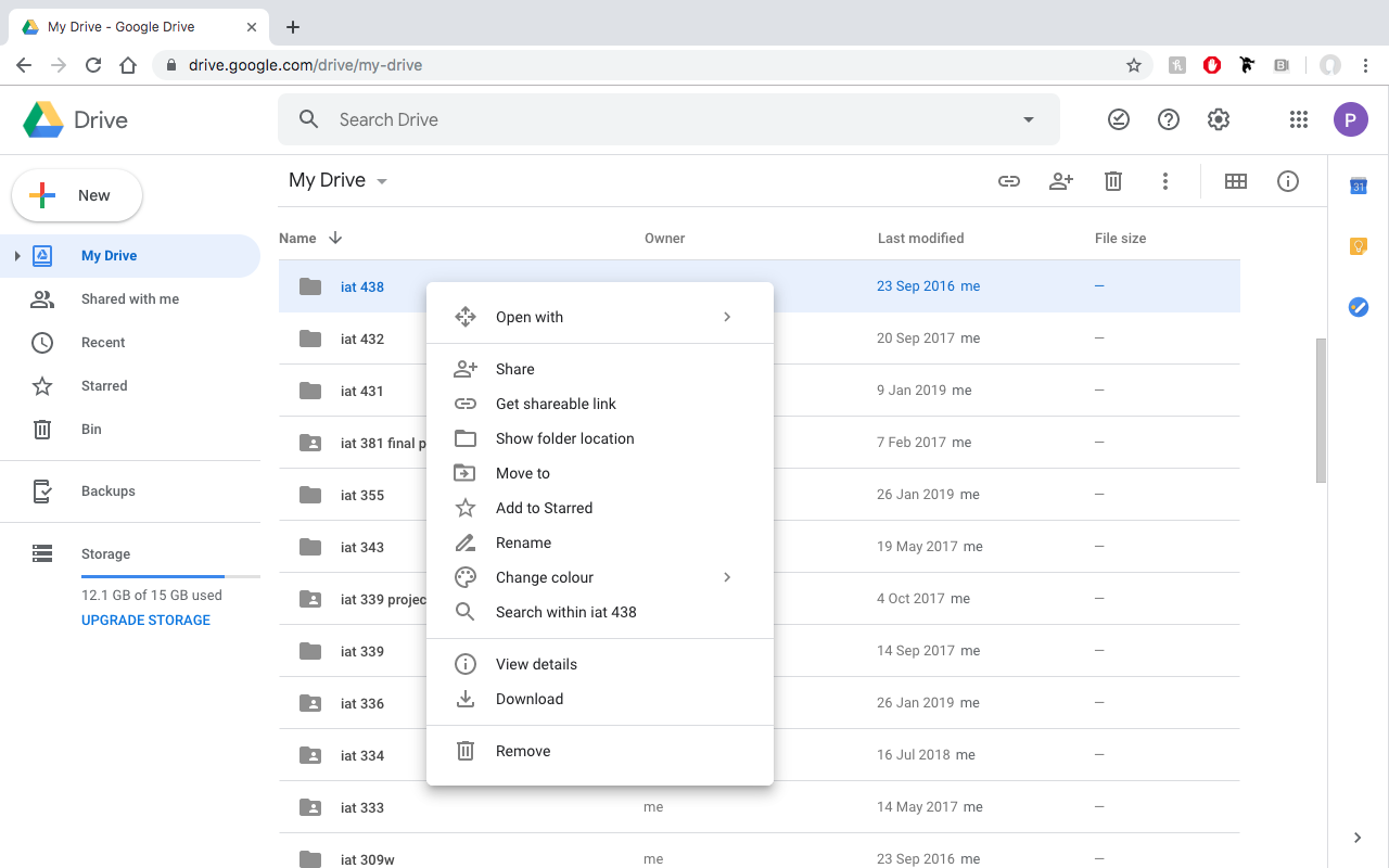
After our feedback session weighing out the pros and cons of each approach, I came to a conclusion that Dropbox’s pattern better aligned with our application, since Google Drive’s pattern is heavily dependent on a custom right click menu that allows the desktop file manager metaphor to work effectively. Our application currently doesn’t support a custom right-click menu, so Dropbox’s pattern better aligned within the scope of the project.