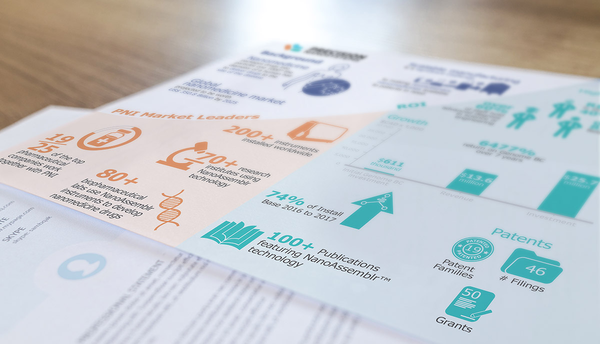
COMPANY GROWTH INFOGRAPHIC
Context
During my internship working at Precision NanoSystems, the COO tasked me to create a printed infographic depicting the growth of the company, as well as basic information on the nanomedicine market. Created from start to finish within four days.
My role
I was the sole designer for this particular project. As such, I was tasked with conceptualizing and creating the infographic. In addition, my responsibility also involved communicating with Precision Nanosystems (PNI) workers in order to compile and visualize data. The primary software used was Adobe Illustrator.
Ideation
As the requirement of the project involved fitting an abundant amount of information on a letter sized page, determining an effective layout was my first and foremost priority. I first drafted potential layouts and icons before presenting the sketches to PNI’s marketing manager and technical marketing specialist.
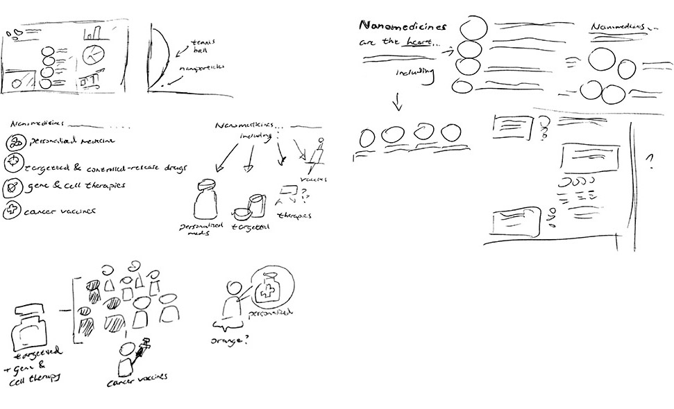
Layout
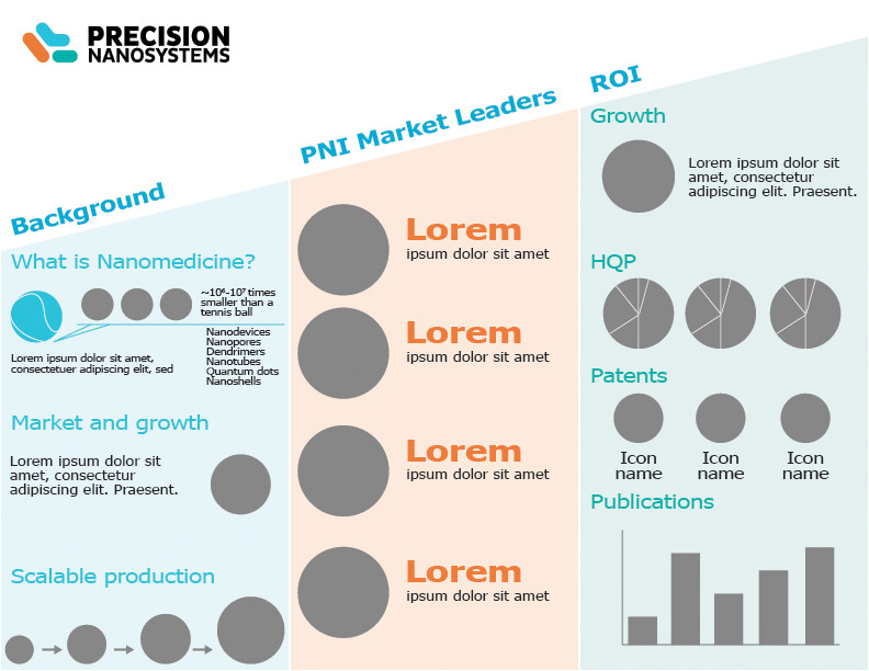
Afterwards, I took the design to Adobe Illustrator to create a low fidelity digital mockup of the infographic in order to better convey my intentions on the layout.
The project’s short timeframe meant that my usual process of presenting finalized drafts and discussing design direction to relevant stakeholders during meetings was not feasible. Consequently, I had to adopt a different and unfamiliar workflow from this point on in order to deliver the infographic on time.
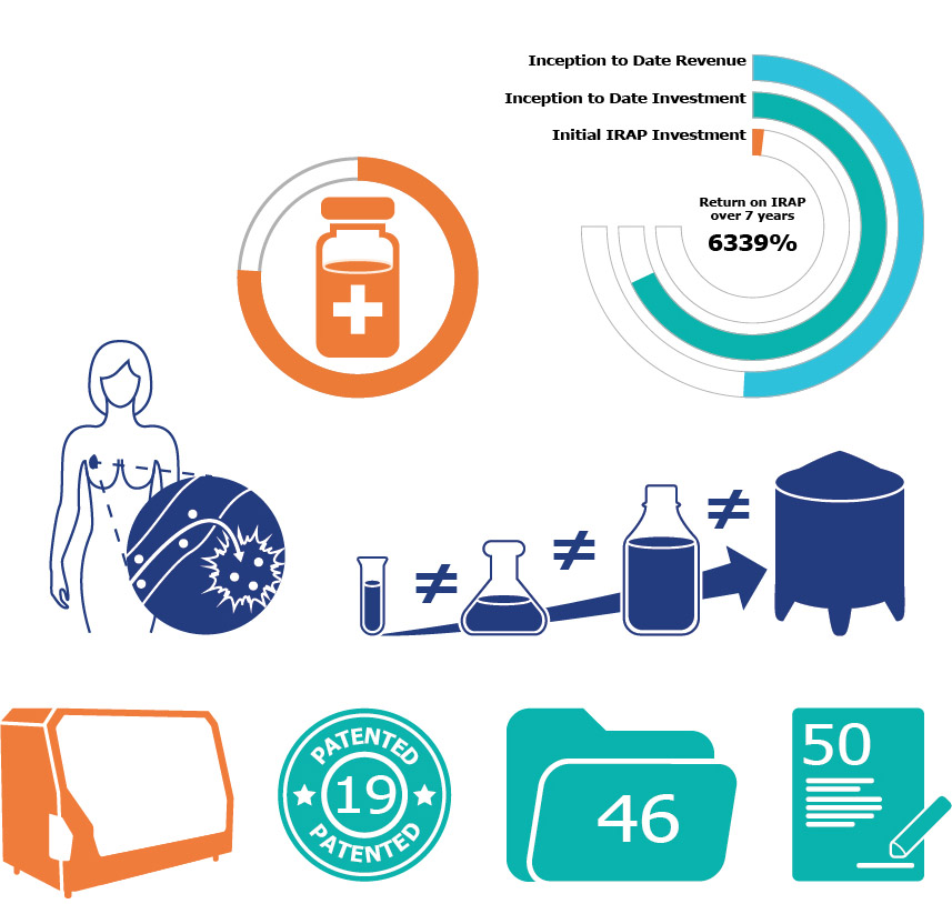
Asset Creation
To maximize on efficiency, I sent out the digital layout to PNI’s marketing manager and technical marketing specialist to review individually and worked on creating the necessary icons in Illustrator in the meantime. As I am not familiar with nanomedicine, I communicated with PNI's experts to better understand concepts in order to design meaningful icons.
First Iteration
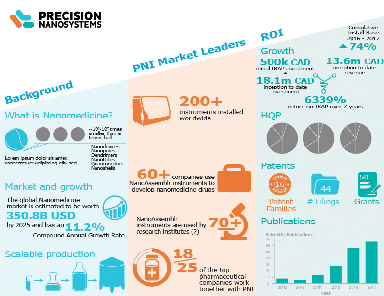
After receiving approval on the layout and icons, I created a draft of the infographic. The design is split into four sections; one to communicate the potentials of the nanomedicine market and three to portray different aspects of PNI’s growth.
Final Iteration
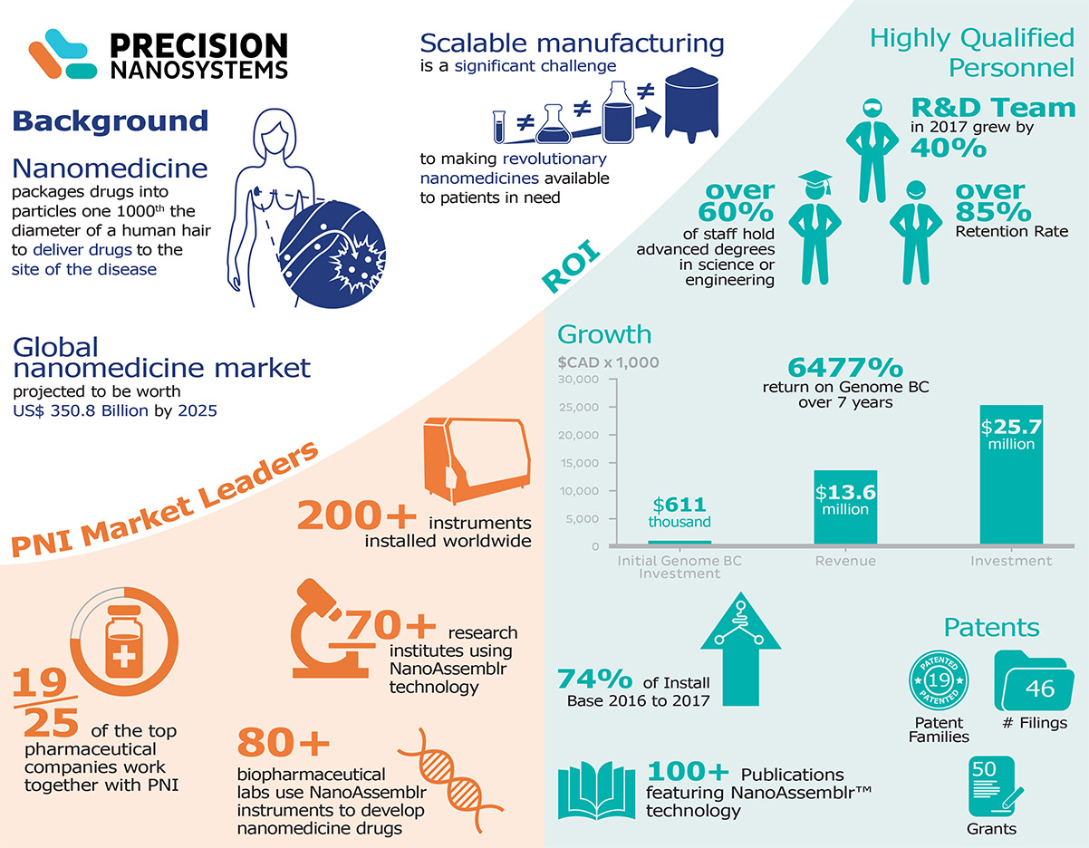
The final iteration saw modifications in the layout in order to capitalize on the space in the top left section. A darker blue was used to make certain content more readable and the coloured backgrounds were curved to better represent a sense of growth.
Results
The final design was then presented to and approved by PNI’s COO. The infographic has since then been used as a primary document to communicate the vast amounts of data regarding PNI’s growth to prospective stakeholders and clients.
Final Thoughts
As this project was required to be completed within an extremely tight timeframe, I was forced to adopt a different workflow from what I am used to in order to meet the deadline. This situation has taught me that it is not possible to use the same process for every single project, as there may be situations where refusing to alter one's workflow may result in heavy consequences.
However, in hindsight, I feel that I had made the mistake of committing to unfinalized ideas. This issue is especially prevalent in the icons, as there are a significant amount of unused assets that I had created but was rejected for various reasons. Had I spent more time sketching and discussing icon concepts with the relevant parties, I likely would have had a considerable amount of time to focus elsewhere in the project.